Ed Hawkins
banner
edhawkins.org
Ed Hawkins
@edhawkins.org

Climate scientist at the National Centre for Atmospheric Science, University of Reading | IPCC AR6 Lead Author | MBE | Views own | https://edhawkins.org

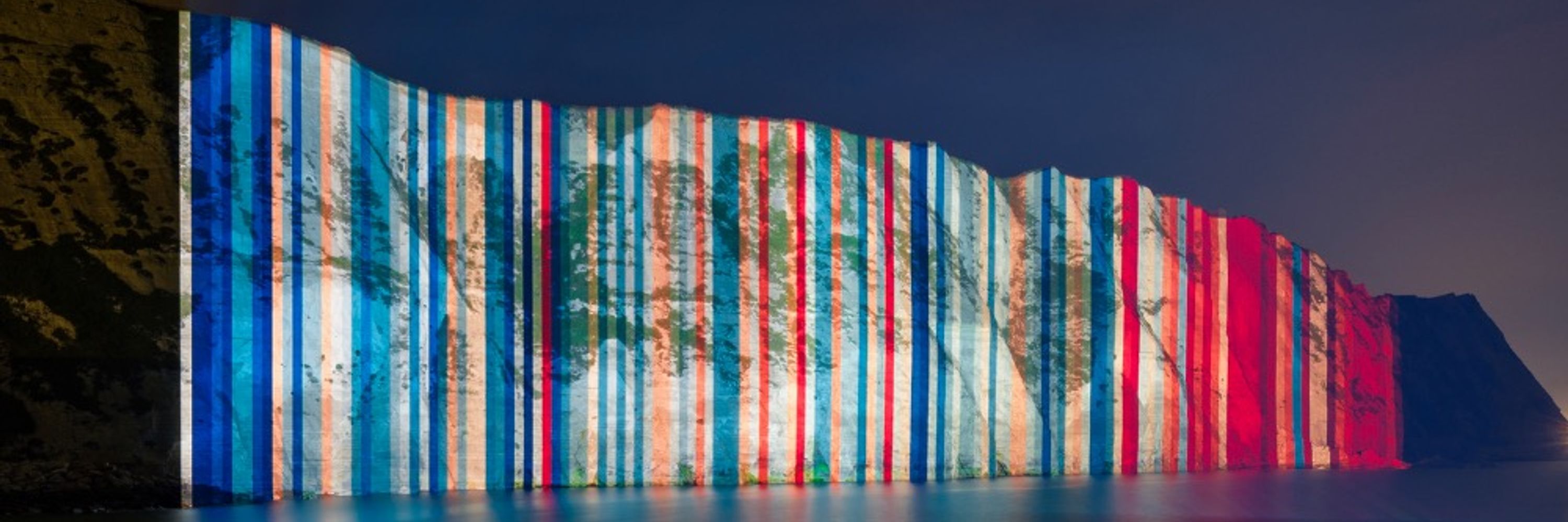
Warming Stripes: http://www.ShowYourStripes.info

Edward Hawkins is a British climate scientist who is Professor of climate science at the University of Reading, principal research scientist at the National Centre for Atmospheric Science (NCAS), editor of Climate Lab Book blog and lead scientist for the Weather Rescue citizen science project. He is known for his data visualizations of climate change for the general public such as warming stripes and climate spirals. .. more

Environmental science 47%
Geology 18%
Pinned
Putting the hot & dry summer of 1976 into context

50 years after the extreme summer for the UK and Ireland, what can we still learn?

climatelabbook.substack.com/p/the-summer...

Inside the Intergovernmental Panel on Climate Change (IPCC)

EVENT: Public talk by Jim Skea, chair of the IPCC

PLACE: University of Reading

DATE: 9th Feb, 6.30pm

DETAILS: www.reading.ac.uk/events/Feed/...
IPCC Public Lecture 2026 - University of Reading
www.reading.ac.uk

Reposted by Rosie A. Fisher

This will be an excellent conference for anyone interested in climate data and data visualisation.
Join us in Bologna, Italy, 4–6 Nov 2026 for Visualising Climate — the first global conference fully dedicated to climate data visualization and its power to transform public understanding of a changing planet. Come see the data.
visualisingclimate.org
#VisualisingClimate2026 #DataVis #ClimateCrisis

Reposted by Tuomas Mattila

I have versions starting in 1961, e.g. for SW England
Join us in Bologna, Italy, 4–6 Nov 2026 for Visualising Climate — the first global conference fully dedicated to climate data visualization and its power to transform public understanding of a changing planet. Come see the data.
visualisingclimate.org
#VisualisingClimate2026 #DataVis #ClimateCrisis

I think the policy community would benefit from knowing earlier to (potentially) add urgency to discussions (for some nations).

What does 1.5°C even mean anyway?

Lengthy new community effort to discuss definitions, meanings, uncertainties & monitoring how close we might be to global temperature levels given in the Paris Agreement.

Led expertly by Peter Thorne [@peterthorne.bsky.social]: essd.copernicus.org/preprints/es...
How well can we quantify when 1.5 °C of global warming has been exceeded?
Abstract. Parties to the 2015 Paris Agreement agreed to limit the long-term increase in global average temperature to well below 2 °C and pursue efforts to keep temperatures below 1.5 °C relative to p...
essd.copernicus.org

Good luck to the reviewers…
New discussion paper just dropped that’s taken shall we say a little work to get this far … essd.copernicus.org/preprints/es... please be kind. Not on an at all sensitive topic in the slightest.
How well can we quantify when 1.5 °C of global warming has been exceeded?
Abstract. Parties to the 2015 Paris Agreement agreed to limit the long-term increase in global average temperature to well below 2 °C and pursue efforts to keep temperatures below 1.5 °C relative to p...
essd.copernicus.org

We need to adapt to this changing climate, and ensure that our infrastructure is resilient.

We will see more of these events, and they will continue to become more extreme until we halt climate change by reaching global net-zero emissions.

We will regret not acting sooner, and not acting faster.
When it rains, it now rains more.

For those experiencing the flooding in south-west England, it is worth remembering that rainfall in winter has increased by about 25% overall.

And, the rainfall has also become more intense: when it rains, it now rains more, increasing the risk of flooding.

Have seen lots of people asking for feels like temperature so it is obviously used a lot. But I think wind gusts are arguably more important than wind speed for making decisions.

There was a long public beta test last year before the official launch. Many of the issues being raised now were also raised then but not changed.

Great - thanks! 👏

Indeed. And sometimes - I’ve not worked out when yet - you get two equally baffling bars
Other oddities:

1) If you go into the detailed carousels for, say, rainfall, they don’t scroll seamlessly to the next day. You have to select the next day separately.

2) What do these bars supposedly represent for today’s and yesterday’s temperature? Meaningless dataviz and waste of space.

Reposted by Ed Hawkins

🚨 NEW STUDY: As Australia prepares for another heatwave, our latest study found the early January heatwave which hit SE Australia was made 5x more likely due to climate change. What was once a relatively rare 1-in-25-year event is now expected about every 5 years. 🧵 1/6

Yes - agreed - that should be there. Still no pressure map or data either which lots of people have asked for.

Also not improved: the intrusive ads which are likely to make this app unusable for me.

The @metoffice.gov.uk have just tweaked their app.

Improved: forecast maps scrolling better but not as clean as last app version. ‘Feels like’ temperature back on main carousel.

Not fixed yet: No wind gusts on carousel. Locations list still awful design. Warnings list & map should be more visible.
So… the @metoffice.gov.uk app redesign - is it just a bit worse or much much worse?

Thanks - good to hear though the new version is not yet on the iOS app store as far as I can see.
Trump: "I haven't been able to find any windfarms in China."

Reality: China has far more windfarms than any other country on Earth

Great - thanks! Is it the same for the grids?

Is the Berkeley Earth data for 2025 completely updated yet please? I can't see the annual or monthly averages including December here yet? storage.googleapis.com/berkeley-ear...

Agree that is a huge shame. Did you see that the Belgian Met Office have rebooted a version of it: wow.meteo.be/en/
WOW-BE: the weather together!
WOW-BE is the crowdsourcing platform of the Royal Meteorological Institute of Belgium.
wow.meteo.be

The torrent of 1* and 2* reviews on the app store are likely to be noticed @metoffice.gov.uk? And, yes, some of the pushback is because it is new and unfamiliar but sadly I think some of the issues go beyond that.

Overall it feels as though the app has been designed to present less information in the same space, with a focus on nowcasting. And maybe that is what the majority of users want, but for many it will feel like dumbing down.

(Plus the beautifully elegant beach forecasts have vanished.)

Other oddities:

1) If you go into the detailed carousels for, say, rainfall, they don’t scroll seamlessly to the next day. You have to select the next day separately.

2) What do these bars supposedly represent for today’s and yesterday’s temperature? Meaningless dataviz and waste of space.

You ‘just’ need to pay the £8 annual subscription then. /sarc