


Reenie Beanie 🏳️⚧️
@reeniebeenie.bsky.social
genderfluid soup of draconic origin 🐉
#reenieart
comms open! 2/5 slots filled https://ko-fi.com/reenbeen
38 | asexual | ageplayer | autistic | disabled | plural | VERY annoying | ACAB
🔞 minors DNI
If kink bothers you, block and move along
#reenieart
comms open! 2/5 slots filled https://ko-fi.com/reenbeen
38 | asexual | ageplayer | autistic | disabled | plural | VERY annoying | ACAB
🔞 minors DNI
If kink bothers you, block and move along
Pinned
reminder that this is an adults only account. while some of the things I talk about do apply to people of all ages, please do not follow me unless you are over 18. thanks 💖
I think some biological essentialist ideas of what hormones do slip through in our assumptions about them, even in trans spaces at times
like I did my shot yesterday and I'm not as painfully hungry? yet my appetite is way bigger
I don't think T is necessarily the hungry/horny hormone
like I did my shot yesterday and I'm not as painfully hungry? yet my appetite is way bigger
I don't think T is necessarily the hungry/horny hormone
December 6, 2025 at 10:16 PM
I think some biological essentialist ideas of what hormones do slip through in our assumptions about them, even in trans spaces at times
like I did my shot yesterday and I'm not as painfully hungry? yet my appetite is way bigger
I don't think T is necessarily the hungry/horny hormone
like I did my shot yesterday and I'm not as painfully hungry? yet my appetite is way bigger
I don't think T is necessarily the hungry/horny hormone
Reposted by Reenie Beanie 🏳️⚧️
And here's tonight's drawing! 😄
Unfortunately, dragons have zero privacy, so if they want to sneak a sandwich, they'd better be prepared to be swarmed by their kobolds!!! 😮
Unfortunately, dragons have zero privacy, so if they want to sneak a sandwich, they'd better be prepared to be swarmed by their kobolds!!! 😮

December 5, 2025 at 8:32 AM
And here's tonight's drawing! 😄
Unfortunately, dragons have zero privacy, so if they want to sneak a sandwich, they'd better be prepared to be swarmed by their kobolds!!! 😮
Unfortunately, dragons have zero privacy, so if they want to sneak a sandwich, they'd better be prepared to be swarmed by their kobolds!!! 😮
if i ever make a reenie fursuit, it is going to have a squeaker in it and that will be my sole means of communication
December 6, 2025 at 8:56 PM
if i ever make a reenie fursuit, it is going to have a squeaker in it and that will be my sole means of communication
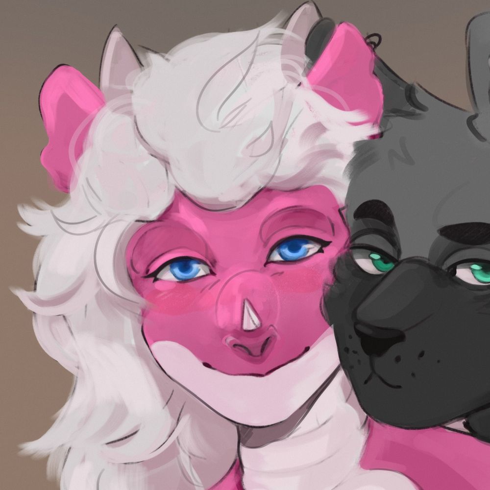
even my cuter OCs I like to give a lil beefiness to. I think it enhances the cuteness
December 6, 2025 at 8:37 PM
even my cuter OCs I like to give a lil beefiness to. I think it enhances the cuteness
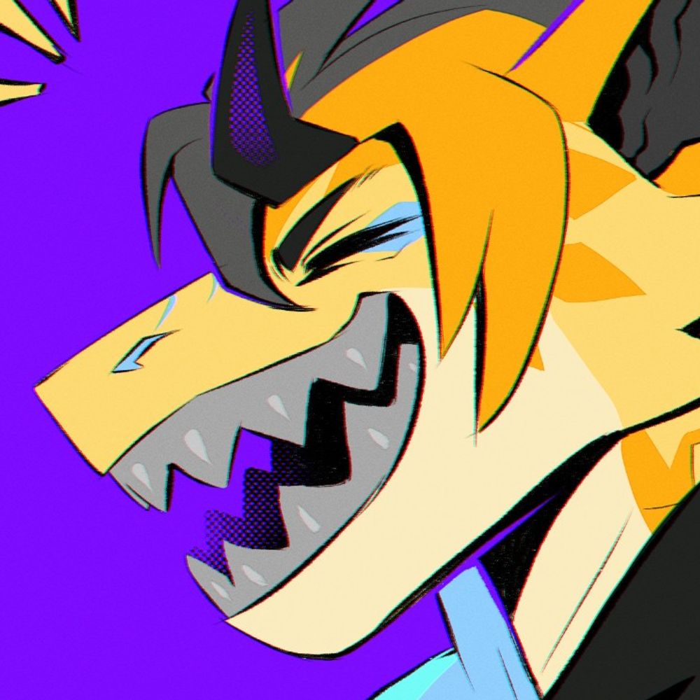
girl dragons
FERAL girl dragons
feral girl dragons with visible musculature
FERAL girl dragons
feral girl dragons with visible musculature
December 6, 2025 at 8:31 PM
girl dragons
FERAL girl dragons
feral girl dragons with visible musculature
FERAL girl dragons
feral girl dragons with visible musculature
Reposted by Reenie Beanie 🏳️⚧️

December 6, 2025 at 6:12 PM
Reposted by Reenie Beanie 🏳️⚧️

being a furry for more than a few years DOES change you, it does reveal things about your nature that mundane society works very hard to bury, it IS an engine that reveals hidden truths, and thats why conservatives are starting to notice it and are quite afraid of it
December 6, 2025 at 7:17 PM
being a furry for more than a few years DOES change you, it does reveal things about your nature that mundane society works very hard to bury, it IS an engine that reveals hidden truths, and thats why conservatives are starting to notice it and are quite afraid of it
Reposted by Reenie Beanie 🏳️⚧️

New lem refsheet!!


December 6, 2025 at 6:09 PM
New lem refsheet!!
*hunches over my tablet for several hours a day for four days*
why does my back hurt 0.=.o it is a mysteryyyyyyy
why does my back hurt 0.=.o it is a mysteryyyyyyy
December 6, 2025 at 6:39 PM
*hunches over my tablet for several hours a day for four days*
why does my back hurt 0.=.o it is a mysteryyyyyyy
why does my back hurt 0.=.o it is a mysteryyyyyyy
colors don't actually exist. the sooner you realize this, the better your art. We all process color differently, color
blind ppl exist and are not shown adequate support, and we can't verify that my blue is the same as your blue
blind ppl exist and are not shown adequate support, and we can't verify that my blue is the same as your blue
December 6, 2025 at 6:33 PM
colors don't actually exist. the sooner you realize this, the better your art. We all process color differently, color
blind ppl exist and are not shown adequate support, and we can't verify that my blue is the same as your blue
blind ppl exist and are not shown adequate support, and we can't verify that my blue is the same as your blue
and also, contrast comes in many forms!
contrast between values is an obvious one. But contrast between levels of saturation is equally important. A brightly colored character stands out much better against a desaturated background. lower saturation can also read as bright without pushing lightness
contrast between values is an obvious one. But contrast between levels of saturation is equally important. A brightly colored character stands out much better against a desaturated background. lower saturation can also read as bright without pushing lightness
Contrast.
If you use a blue character on a blue background nobody can see anything.
Make background color opposite character color on the wheel. They'll have contrast & make the focal point easy to see. If it's not realistic it doesn't matter.
When you are practiced enough you can make it subtle.
If you use a blue character on a blue background nobody can see anything.
Make background color opposite character color on the wheel. They'll have contrast & make the focal point easy to see. If it's not realistic it doesn't matter.
When you are practiced enough you can make it subtle.
Share your knowledge if/when you can. Teaching other people how to do what you do doesn’t lessen your art - it just means more and better art for everyone.
I appreciate when people are willing to tell me about their brushes, how they study, etc… I want to put that back out into the world.
I appreciate when people are willing to tell me about their brushes, how they study, etc… I want to put that back out into the world.
December 6, 2025 at 6:28 PM
and also, contrast comes in many forms!
contrast between values is an obvious one. But contrast between levels of saturation is equally important. A brightly colored character stands out much better against a desaturated background. lower saturation can also read as bright without pushing lightness
contrast between values is an obvious one. But contrast between levels of saturation is equally important. A brightly colored character stands out much better against a desaturated background. lower saturation can also read as bright without pushing lightness
Reposted by Reenie Beanie 🏳️⚧️

Contrast.
If you use a blue character on a blue background nobody can see anything.
Make background color opposite character color on the wheel. They'll have contrast & make the focal point easy to see. If it's not realistic it doesn't matter.
When you are practiced enough you can make it subtle.
If you use a blue character on a blue background nobody can see anything.
Make background color opposite character color on the wheel. They'll have contrast & make the focal point easy to see. If it's not realistic it doesn't matter.
When you are practiced enough you can make it subtle.
Share your knowledge if/when you can. Teaching other people how to do what you do doesn’t lessen your art - it just means more and better art for everyone.
I appreciate when people are willing to tell me about their brushes, how they study, etc… I want to put that back out into the world.
I appreciate when people are willing to tell me about their brushes, how they study, etc… I want to put that back out into the world.

December 6, 2025 at 6:13 PM
Contrast.
If you use a blue character on a blue background nobody can see anything.
Make background color opposite character color on the wheel. They'll have contrast & make the focal point easy to see. If it's not realistic it doesn't matter.
When you are practiced enough you can make it subtle.
If you use a blue character on a blue background nobody can see anything.
Make background color opposite character color on the wheel. They'll have contrast & make the focal point easy to see. If it's not realistic it doesn't matter.
When you are practiced enough you can make it subtle.
Reposted by Reenie Beanie 🏳️⚧️

December 5, 2025 at 9:25 PM
Reposted by Reenie Beanie 🏳️⚧️

Reshiram
After all, he won my heart...
After all, he won my heart...

November 6, 2025 at 9:46 PM
Reshiram
After all, he won my heart...
After all, he won my heart...
Reposted by Reenie Beanie 🏳️⚧️
If you only support autistic humans when we’re regulated in the way you want us to be, charming, and grateful, than you don’t support autistic people.
You support yourself and use autistic people as a currency for your own faux progressive values.
You support yourself and use autistic people as a currency for your own faux progressive values.
December 6, 2025 at 5:36 PM
If you only support autistic humans when we’re regulated in the way you want us to be, charming, and grateful, than you don’t support autistic people.
You support yourself and use autistic people as a currency for your own faux progressive values.
You support yourself and use autistic people as a currency for your own faux progressive values.
Reposted by Reenie Beanie 🏳️⚧️
Dragonsona Update! I hope you like him!

December 6, 2025 at 4:32 PM
Dragonsona Update! I hope you like him!
im more interested in the meme itself than the point about AI, tho it is a valid point. art is frustrating, no doubt. It is difficult to make it look like how you want it to, yes. But it WILL start looking how you want it to if you let go of the urge to crumple 10000 balls of paper and throw em away
Being unable to tolerate frustration + chasing social media clout gotta be a big reason why ppl jumped on the gen ai machine to churn out slop

December 6, 2025 at 5:38 PM
im more interested in the meme itself than the point about AI, tho it is a valid point. art is frustrating, no doubt. It is difficult to make it look like how you want it to, yes. But it WILL start looking how you want it to if you let go of the urge to crumple 10000 balls of paper and throw em away
Reposted by Reenie Beanie 🏳️⚧️
Being unable to tolerate frustration + chasing social media clout gotta be a big reason why ppl jumped on the gen ai machine to churn out slop
December 6, 2025 at 1:44 PM
Being unable to tolerate frustration + chasing social media clout gotta be a big reason why ppl jumped on the gen ai machine to churn out slop
Reposted by Reenie Beanie 🏳️⚧️
When I say "Bing Bong!" this is what I'm quoting

Instead of a song being stuck in my head, today what's stuck in my head is the "fuck ya life. bing-bong!" pigeon video.
December 6, 2025 at 5:25 PM
When I say "Bing Bong!" this is what I'm quoting

Mega Mix Megaman 3 OST Techno Remix (Extended Version by 11AngeNoir)
YouTube video by Capitaine Albator
youtu.be
December 6, 2025 at 5:27 PM
Reposted by Reenie Beanie 🏳️⚧️


I would lose all restraint if they made a kobold plushie that had a customizable mane
*wistful sigh*
*wistful sigh*
December 6, 2025 at 3:27 PM
I would lose all restraint if they made a kobold plushie that had a customizable mane
*wistful sigh*
*wistful sigh*
Reposted by Reenie Beanie 🏳️⚧️

when a queer creator, especially a furry creator, has a kink account or NSFW account separate from their main, it's your duty as a bystander to shut the fuck up and keep going instead of Moral panicking abt it and sexually harassing that person by "exposing" their fetishes and porn to random people
December 6, 2025 at 4:49 AM
when a queer creator, especially a furry creator, has a kink account or NSFW account separate from their main, it's your duty as a bystander to shut the fuck up and keep going instead of Moral panicking abt it and sexually harassing that person by "exposing" their fetishes and porn to random people
Reposted by Reenie Beanie 🏳️⚧️

Hey so, with my housing situation up in the air, I'm really stressing over money for food and car maintenance. My birthday is coming up, and it'd be nice to get some financial security as a gift. 🦇
CA: $SybilBat
ko-fi.com/sybilbat
CA: $SybilBat
ko-fi.com/sybilbat

Buy Sybil a Coffee
Become a supporter of Sybil today!
ko-fi.com
December 1, 2025 at 7:22 PM
Hey so, with my housing situation up in the air, I'm really stressing over money for food and car maintenance. My birthday is coming up, and it'd be nice to get some financial security as a gift. 🦇
CA: $SybilBat
ko-fi.com/sybilbat
CA: $SybilBat
ko-fi.com/sybilbat
Reposted by Reenie Beanie 🏳️⚧️

December 4, 2025 at 10:04 PM