


Matthew Kay
@mjskay.com
Assoc Prof Computer Science and Communication Studies at Northwestern. Infovis, HCI. Author of tidybayes & ggdist R pkgs. he/him. 🏳️🌈 https://mjskay.com/
Co-director https://mucollective.northwestern.edu
Co-founder https://journalovi.org
Co-director https://mucollective.northwestern.edu
Co-founder https://journalovi.org
Pinned
Matthew Kay
@mjskay.com
· Sep 7


I work in #datavis, best known for uncertainty vis: see my work on election forecast vis (forecasts.cs.northwestern.edu), this talk (youtu.be/E1kSnWvqCw0), or my lab (mucollective.northwestern.edu)
I like writing #rstats 📦s: ggdist (mjskay.github.io/ggdist), tidybayes, ggblend, posterior::rvar...
I like writing #rstats 📦s: ggdist (mjskay.github.io/ggdist), tidybayes, ggblend, posterior::rvar...
Reposted by Matthew Kay

you should support liberal currents!
November 26, 2025 at 4:02 PM
you should support liberal currents!
Reposted by Matthew Kay

Once upon a time you might’ve found me mustering a utilitarian defense of Facebook’s research ethics, but 10 years later it’s obvious they have no interest in critical research, user safety, or innovating on social networking if it gets in the way of using metaverse or AI to serve more ads.

Meta halted internal research that purportedly showed (young) people who stopped using Facebook became less depressed and anxious, according to an unredacted legal filing released on Friday. www.cnbc.com/2025/11/23/m...

Meta halted internal research suggesting social media harm, court filing alleges
Meta is alleged to have halted internal research suggesting social media harm, according to court documents.
www.cnbc.com
November 24, 2025 at 1:54 AM
Once upon a time you might’ve found me mustering a utilitarian defense of Facebook’s research ethics, but 10 years later it’s obvious they have no interest in critical research, user safety, or innovating on social networking if it gets in the way of using metaverse or AI to serve more ads.
I'm probably in the minority here but even quarters feel too long for academic terms
Like I'm tired of teaching a class by week 8
Like I'm tired of teaching a class by week 8
November 20, 2025 at 10:40 PM
I'm probably in the minority here but even quarters feel too long for academic terms
Like I'm tired of teaching a class by week 8
Like I'm tired of teaching a class by week 8
Reposted by Matthew Kay

This study show that using poems to jailbreak LLMs is... super effective? What the heck.

November 20, 2025 at 5:36 PM
This study show that using poems to jailbreak LLMs is... super effective? What the heck.
Reposted by Matthew Kay

Good morning. I've got a banger new post out today that develops a new method for placing voters on the left-right ideological spectrum, and adds a new, "non-ideological"/affordability axis to usual way we chart & think about US voters (esp swing voters). www.gelliottmorris.com/p/not-just-l...

Not just left vs right: Most voters think about affordability and material wellbeing, not in ideological terms
Most voters want a party that emphasizes cost of living issues and makes the world a better place. Few Americans think in solidly ideologically terms. "Moderates" are mostly non-ideological.
www.gelliottmorris.com
November 20, 2025 at 1:00 PM
Good morning. I've got a banger new post out today that develops a new method for placing voters on the left-right ideological spectrum, and adds a new, "non-ideological"/affordability axis to usual way we chart & think about US voters (esp swing voters). www.gelliottmorris.com/p/not-just-l...
Reposted by Matthew Kay

Cook County has an active infill rail station study underway. Put dots on the map where you want a new train station. cook-rail-survey-hntbcorp.hub.arcgis.com
Cook County Rail Survey
Take the Cook County Rail Infill Station Study Survey for where you'd like to see rail stations.
cook-rail-survey-hntbcorp.hub.arcgis.com
November 19, 2025 at 10:59 PM
Cook County has an active infill rail station study underway. Put dots on the map where you want a new train station. cook-rail-survey-hntbcorp.hub.arcgis.com
Reposted by Matthew Kay

This maddens me. As if Harvard didn't play a role in its faculty getting chummy with rich and unscrupulous donors. So now they'll scapegoat the faculty (who do share the blame) and the institution will not have to take any accountability for creating the circumstances and incentivizing all of this.
Harvard To Launch New Investigation Into Epstein’s Ties to Summers, Other University Affiliates | News | The Harvard Crimson
Harvard will open a new probe into former University President Lawrence H. Summers’ connections with convicted child sex trafficker Jeffrey E. Epstein, after newly released documents revealed the two ...
www.thecrimson.com
November 19, 2025 at 3:54 PM
This maddens me. As if Harvard didn't play a role in its faculty getting chummy with rich and unscrupulous donors. So now they'll scapegoat the faculty (who do share the blame) and the institution will not have to take any accountability for creating the circumstances and incentivizing all of this.
Reposted by Matthew Kay

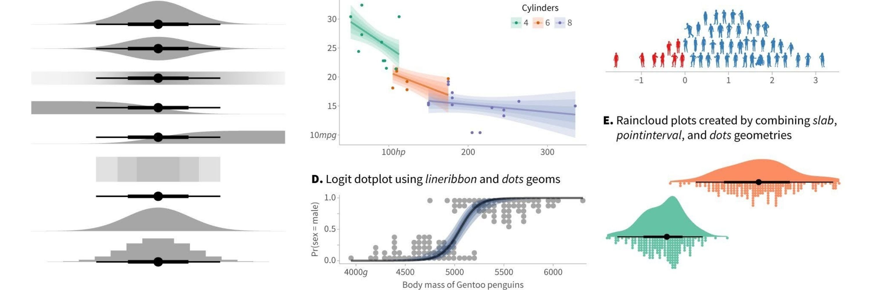
The default prior for the intercept in both {rstanarm} and {brms} are very wide.
Counterintuitively - being on the logit scale, this is actually translates to a **strong** prior that p(y=1) is near 1 or near 0.
Always check your priors!
#rstats
Counterintuitively - being on the logit scale, this is actually translates to a **strong** prior that p(y=1) is near 1 or near 0.
Always check your priors!
#rstats


November 18, 2025 at 2:01 PM
The default prior for the intercept in both {rstanarm} and {brms} are very wide.
Counterintuitively - being on the logit scale, this is actually translates to a **strong** prior that p(y=1) is near 1 or near 0.
Always check your priors!
#rstats
Counterintuitively - being on the logit scale, this is actually translates to a **strong** prior that p(y=1) is near 1 or near 0.
Always check your priors!
#rstats
Reposted by Matthew Kay

A senior academic using mentoring as leverage to obtain sex is a contemptible abuser of power.
Summers conferred with Epstein frequently about how to extract sexual favors from a Harvard econ grad (AB '04, PhD '09)
The grad is from China
Epstein and Summers referred to her by the codename "Peril"
Racism and sexual exploitation in one efficient package
bit.ly/3LHpin8
The grad is from China
Epstein and Summers referred to her by the codename "Peril"
Racism and sexual exploitation in one efficient package
bit.ly/3LHpin8
As Summers Sought Clandestine Relationship With Woman He Called a Mentee, Epstein Was His ‘Wing Man’ | News | The Harvard Crimson
When former Harvard President Lawrence H. Summers was pursuing a romantic relationship with a woman he described as a mentee, he turned to a longtime associate for guidance: convicted sex offender Jef...
bit.ly
November 17, 2025 at 8:07 AM
A senior academic using mentoring as leverage to obtain sex is a contemptible abuser of power.
Reposted by Matthew Kay

morbidly sociologically curious about whether there's a relationship between this and the clustering of right wingers on Truth Social + exodus of libs and the left from Twitter, etc

“.. It's still overwhelmingly pro-Trump — but less relevant .. These days, MAGA can spend more time eating its own than feasting on liberals or establishment Republicans.”
@axios.com
www.axios.com/newsletters/...
@axios.com
www.axios.com/newsletters/...

November 16, 2025 at 3:00 PM
morbidly sociologically curious about whether there's a relationship between this and the clustering of right wingers on Truth Social + exodus of libs and the left from Twitter, etc
Reposted by Matthew Kay

VIS 2025 wrapped! Our OPC team introduced two experiments: student reviewers (20% uptake, successful mentorship model) and public peer reviews (16 papers, 52 reviews on OSF). Both continue next year. Thanks to our IPC and the incredible Petra Specht. #ieeevis 🎢 ieeevis.org/year/2025/bl...
Road's End - Reflections on the VIS 2025 Review Process
IEEE VIS 2025 in Vienna has come to a close and we—Niklas Elmqvist, Holger Theisel, and Melanie Tory, the 2025 Overall Papers Chairs (OPCs)—have reached the ...
ieeevis.org
November 15, 2025 at 9:00 AM
VIS 2025 wrapped! Our OPC team introduced two experiments: student reviewers (20% uptake, successful mentorship model) and public peer reviews (16 papers, 52 reviews on OSF). Both continue next year. Thanks to our IPC and the incredible Petra Specht. #ieeevis 🎢 ieeevis.org/year/2025/bl...
Reposted by Matthew Kay

crazy how much this bugs me now that someone pointed it out. if i worked at the white house, i would find this ugly, but not as annoying as i do now. ignorance is really bliss bc they more you learn, the more you just walk around thinking "collar gap" and "kerning is off."

November 12, 2025 at 6:44 AM
crazy how much this bugs me now that someone pointed it out. if i worked at the white house, i would find this ugly, but not as annoying as i do now. ignorance is really bliss bc they more you learn, the more you just walk around thinking "collar gap" and "kerning is off."
The font would appear to be English 111 Adagio CE, available for the highly presidential sum of just $39.75 USD
Note "The" is not kerned correctly
(see perspective-corrected still for reference)
Note "The" is not kerned correctly
(see perspective-corrected still for reference)


November 12, 2025 at 5:11 AM
The font would appear to be English 111 Adagio CE, available for the highly presidential sum of just $39.75 USD
Note "The" is not kerned correctly
(see perspective-corrected still for reference)
Note "The" is not kerned correctly
(see perspective-corrected still for reference)
Reposted by Matthew Kay

After yesterday’s surrender, we’re launching the largest Democratic primary program that we’ve ever run.
We will not back any Senate primary candidate unless they call for Schumer to step down as Minority Leader.
If you’re as pissed as we are, join this campaign to rebuild the Democratic Party. 👇
We will not back any Senate primary candidate unless they call for Schumer to step down as Minority Leader.
If you’re as pissed as we are, join this campaign to rebuild the Democratic Party. 👇

Democratic leaders have failed us again. It's time to get new leaders.
After yet another capitulation by Chuck Schumer and Senate Democrats, it's clear we need new leadership capable of mounting a serious opposition to Trump's authoritarian regime. We're launching our la...
www.indivisible2026.org
November 11, 2025 at 12:00 AM
After yesterday’s surrender, we’re launching the largest Democratic primary program that we’ve ever run.
We will not back any Senate primary candidate unless they call for Schumer to step down as Minority Leader.
If you’re as pissed as we are, join this campaign to rebuild the Democratic Party. 👇
We will not back any Senate primary candidate unless they call for Schumer to step down as Minority Leader.
If you’re as pissed as we are, join this campaign to rebuild the Democratic Party. 👇
Reposted by Matthew Kay
I scribbled down all my shutdown-related intrusive thoughts and put them in a blog post.
open.substack.com/pub/davekarp...
open.substack.com/pub/davekarp...

The Shutdown Surrender
I just... I mean... Whatever.
open.substack.com
November 10, 2025 at 4:44 PM
I scribbled down all my shutdown-related intrusive thoughts and put them in a blog post.
open.substack.com/pub/davekarp...
open.substack.com/pub/davekarp...
Reposted by Matthew Kay

#BREAKING: Justice Jackson has issued an "administrative" stay, temporarily pausing a district court order that would've required the USDA to continue using contingency funds to pay SNAP benefits.
The stay expires 48 hours after the First Circuit rules on USDA's request for a stay pending appeal.
The stay expires 48 hours after the First Circuit rules on USDA's request for a stay pending appeal.


November 8, 2025 at 2:28 AM
#BREAKING: Justice Jackson has issued an "administrative" stay, temporarily pausing a district court order that would've required the USDA to continue using contingency funds to pay SNAP benefits.
The stay expires 48 hours after the First Circuit rules on USDA's request for a stay pending appeal.
The stay expires 48 hours after the First Circuit rules on USDA's request for a stay pending appeal.
Realtor Rococo
November 6, 2025 at 11:15 PM
Realtor Rococo

Reposted by Matthew Kay

New blog post: open-source software packages have surprising problems with the way they calculate weighted medians and other quantiles.
www.practicalsignificance.com/posts/weight...
#rstats #julialang
www.practicalsignificance.com/posts/weight...
#rstats #julialang
Weighted Quantile Weirdness and Bugs – Practical Significance
Computing quantiles is surprisingly complicated. It gets much weirder when you use weights, and popular software behaves in surprising ways that might trouble you.
www.practicalsignificance.com
November 5, 2025 at 4:30 PM
New blog post: open-source software packages have surprising problems with the way they calculate weighted medians and other quantiles.
www.practicalsignificance.com/posts/weight...
#rstats #julialang
www.practicalsignificance.com/posts/weight...
#rstats #julialang
Reposted by Matthew Kay

Know this, I will be saying "bring the flavor to the rice" for the next, oh, 5 years

I knew it would take less than a day for a tiktok dj to make something.
November 5, 2025 at 2:45 PM
Know this, I will be saying "bring the flavor to the rice" for the next, oh, 5 years
Reposted by Matthew Kay

WOW. 81% of women 18-29 voted for Mamdani, 80% for Sherril, and 78% for Spanberger.
Gen Z women aren't playing around.
Gen Z women aren't playing around.
November 5, 2025 at 4:07 AM
WOW. 81% of women 18-29 voted for Mamdani, 80% for Sherril, and 78% for Spanberger.
Gen Z women aren't playing around.
Gen Z women aren't playing around.
Reposted by Matthew Kay

For years, but especially for the past year, Democrats have been in thrall to the idea that they need to chase an imagined median voter, and adopt that voter’s positions. Mamdani’s victory shows another way: hold principles, and persuade people to share them.
I wrote about Zohran’s victory. www.theguardian.com/commentisfre...

Mamdani’s victory is a rebuke to the failed strategies of the Democratic party | Moira Donegan
The Democratic party appears listless and unprincipled, unwilling to fight because they do not believe in anything. Zohran Mamdani is the opposite of this
www.theguardian.com
November 5, 2025 at 6:13 AM
For years, but especially for the past year, Democrats have been in thrall to the idea that they need to chase an imagined median voter, and adopt that voter’s positions. Mamdani’s victory shows another way: hold principles, and persuade people to share them.
Reposted by Matthew Kay

A message from CTA Acting President Nora Leerhsen:
"No service cuts. No layoffs. In fact, CTA will grow."
"No service cuts. No layoffs. In fact, CTA will grow."


November 4, 2025 at 10:45 PM
A message from CTA Acting President Nora Leerhsen:
"No service cuts. No layoffs. In fact, CTA will grow."
"No service cuts. No layoffs. In fact, CTA will grow."