


Had some fun with today's #TidyTuesday dataset! Here is an annotated streamgraph displaying chess players' age versus title.

September 23, 2025 at 6:10 AM
Had some fun with today's #TidyTuesday dataset! Here is an annotated streamgraph displaying chess players' age versus title.

#TidyTuesday Week 32, 2025 - Extreme Weather Attribution Studies 📊
Streamgraph of Carbon Brief’s event-focused attribution studies (2008–2024), counting studies by event year across regions for the top four event types.
🔗: andresgonzalezstats.com/visualizatio...
Streamgraph of Carbon Brief’s event-focused attribution studies (2008–2024), counting studies by event year across regions for the top four event types.
🔗: andresgonzalezstats.com/visualizatio...

August 19, 2025 at 11:51 PM
#TidyTuesday Week 32, 2025 - Extreme Weather Attribution Studies 📊
Streamgraph of Carbon Brief’s event-focused attribution studies (2008–2024), counting studies by event year across regions for the top four event types.
🔗: andresgonzalezstats.com/visualizatio...
Streamgraph of Carbon Brief’s event-focused attribution studies (2008–2024), counting studies by event year across regions for the top four event types.
🔗: andresgonzalezstats.com/visualizatio...
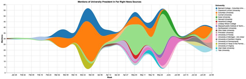
Do online news mentions in the far right predict or respond to Trump regime attacks on university presidents? Poking around with some @mediacloud.bsky.social data this week. This chart shows top 25 colleges mentioned since Jan, via entity extraction and heuristic name linking.
July 17, 2025 at 1:03 PM
Do online news mentions in the far right predict or respond to Trump regime attacks on university presidents? Poking around with some @mediacloud.bsky.social data this week. This chart shows top 25 colleges mentioned since Jan, via entity extraction and heuristic name linking.

Ethiopia: Streamgraph: EHAGL | IGAD - Refugees and Asylum Seekers By Country of Origin | 1970 - 2024 #Refugees
Ethiopia: Streamgraph: EHAGL | IGAD - Refugees and Asylum Seekers By Country of Origin | 1970 - 2024
reliefweb.int
June 24, 2025 at 1:34 PM
Ethiopia: Streamgraph: EHAGL | IGAD - Refugees and Asylum Seekers By Country of Origin | 1970 - 2024 #Refugees

Great 'streamgraph' on the rise, fall and rise of nuclear in the UK.
The rise, fall and rise of UK nuclear power
The green light given to Sizewell C and other small modular reactors somewhat revives the UK’s nuclear capacity after decades of decline, albeit at a lower peak than the 1990s
Streamgraph for @carbonbrief.org #dataviz
www.carbonbrief.org/chart-the-ri...
The green light given to Sizewell C and other small modular reactors somewhat revives the UK’s nuclear capacity after decades of decline, albeit at a lower peak than the 1990s
Streamgraph for @carbonbrief.org #dataviz
www.carbonbrief.org/chart-the-ri...

June 20, 2025 at 9:19 AM
Great 'streamgraph' on the rise, fall and rise of nuclear in the UK.

The rise, fall and rise of UK nuclear power
The green light given to Sizewell C and other small modular reactors somewhat revives the UK’s nuclear capacity after decades of decline, albeit at a lower peak than the 1990s
Streamgraph for @carbonbrief.org #dataviz
www.carbonbrief.org/chart-the-ri...
The green light given to Sizewell C and other small modular reactors somewhat revives the UK’s nuclear capacity after decades of decline, albeit at a lower peak than the 1990s
Streamgraph for @carbonbrief.org #dataviz
www.carbonbrief.org/chart-the-ri...
June 17, 2025 at 10:45 AM
The rise, fall and rise of UK nuclear power
The green light given to Sizewell C and other small modular reactors somewhat revives the UK’s nuclear capacity after decades of decline, albeit at a lower peak than the 1990s
Streamgraph for @carbonbrief.org #dataviz
www.carbonbrief.org/chart-the-ri...
The green light given to Sizewell C and other small modular reactors somewhat revives the UK’s nuclear capacity after decades of decline, albeit at a lower peak than the 1990s
Streamgraph for @carbonbrief.org #dataviz
www.carbonbrief.org/chart-the-ri...

🧪🍎📊
#30DayChartChallenge | Day 19: Smooth
Nothing smoother than a streamgraph!
This one shows 28 years of global eating habits. We eat more of everything now.
I made falafel yesterday and wondered: why are beans & legumes still so underrated?
Interactive 📊: www.lumipie.com/data-vis/str...
#30DayChartChallenge | Day 19: Smooth
Nothing smoother than a streamgraph!
This one shows 28 years of global eating habits. We eat more of everything now.
I made falafel yesterday and wondered: why are beans & legumes still so underrated?
Interactive 📊: www.lumipie.com/data-vis/str...

April 29, 2025 at 7:23 AM
🧪🍎📊
#30DayChartChallenge | Day 19: Smooth
Nothing smoother than a streamgraph!
This one shows 28 years of global eating habits. We eat more of everything now.
I made falafel yesterday and wondered: why are beans & legumes still so underrated?
Interactive 📊: www.lumipie.com/data-vis/str...
#30DayChartChallenge | Day 19: Smooth
Nothing smoother than a streamgraph!
This one shows 28 years of global eating habits. We eat more of everything now.
I made falafel yesterday and wondered: why are beans & legumes still so underrated?
Interactive 📊: www.lumipie.com/data-vis/str...

Links to interactive versions:
1. Stacked ordered area chart: public.flourish.studio/visualisatio...
2. Stacked ordered % area chart: public.flourish.studio/visualisatio...
3. Ordered streamgraph: public.flourish.studio/visualisatio...
1. Stacked ordered area chart: public.flourish.studio/visualisatio...
2. Stacked ordered % area chart: public.flourish.studio/visualisatio...
3. Ordered streamgraph: public.flourish.studio/visualisatio...

GHED Timeseries 01
A Flourish data visualization by Al Raven
public.flourish.studio
April 24, 2025 at 1:50 PM
Links to interactive versions:
1. Stacked ordered area chart: public.flourish.studio/visualisatio...
2. Stacked ordered % area chart: public.flourish.studio/visualisatio...
3. Ordered streamgraph: public.flourish.studio/visualisatio...
1. Stacked ordered area chart: public.flourish.studio/visualisatio...
2. Stacked ordered % area chart: public.flourish.studio/visualisatio...
3. Ordered streamgraph: public.flourish.studio/visualisatio...
My last contribution to this year's #30DayChartChallenge (thread)⬇️
For this day n° 24 I wanted to use the WHO's Global Health Expenditure Database and I created multiple charts to compare how efficient they are from a visual communication standpoint.
What do you think (there are 2 more below)?
For this day n° 24 I wanted to use the WHO's Global Health Expenditure Database and I created multiple charts to compare how efficient they are from a visual communication standpoint.
What do you think (there are 2 more below)?


April 24, 2025 at 1:49 PM
My last contribution to this year's #30DayChartChallenge (thread)⬇️
For this day n° 24 I wanted to use the WHO's Global Health Expenditure Database and I created multiple charts to compare how efficient they are from a visual communication standpoint.
What do you think (there are 2 more below)?
For this day n° 24 I wanted to use the WHO's Global Health Expenditure Database and I created multiple charts to compare how efficient they are from a visual communication standpoint.
What do you think (there are 2 more below)?

#TidyTuesday week 12 - Text data from Amazon's annual reports. Created this proportional streamgraph of the positive and negative words with {ggstream} and also added the word cloud.
#rstats #DataViz #Figma
#rstats #DataViz #Figma

March 25, 2025 at 1:35 PM
#TidyTuesday week 12 - Text data from Amazon's annual reports. Created this proportional streamgraph of the positive and negative words with {ggstream} and also added the word cloud.
#rstats #DataViz #Figma
#rstats #DataViz #Figma

🚨New #dataviz on Pokémon GO Revenue over time!
🔗: tabsoft.co/4kWhjj3
🛠️: built with @dataoutsider's vizmath package (find it on pypi!)
#datafam #tableau #python #streamgraph #pokemonGO #pokemon
🔗: tabsoft.co/4kWhjj3
🛠️: built with @dataoutsider's vizmath package (find it on pypi!)
#datafam #tableau #python #streamgraph #pokemonGO #pokemon

March 17, 2025 at 3:48 PM
🚨New #dataviz on Pokémon GO Revenue over time!
🔗: tabsoft.co/4kWhjj3
🛠️: built with @dataoutsider's vizmath package (find it on pypi!)
#datafam #tableau #python #streamgraph #pokemonGO #pokemon
🔗: tabsoft.co/4kWhjj3
🛠️: built with @dataoutsider's vizmath package (find it on pypi!)
#datafam #tableau #python #streamgraph #pokemonGO #pokemon

That activity gave us increased insight into the most prolific vulns being exploited, w/far more malicious sources being identified daily. We've also reduced the ⏱️ to threat intel value to minutes vs ~hour (so high-fidelity blocklists provide nigh instant coverage if SOC teams use them).
4/6
4/6

February 27, 2025 at 2:29 PM
That activity gave us increased insight into the most prolific vulns being exploited, w/far more malicious sources being identified daily. We've also reduced the ⏱️ to threat intel value to minutes vs ~hour (so high-fidelity blocklists provide nigh instant coverage if SOC teams use them).
4/6
4/6

That activity gave us increased insight into the most prolific vulns being exploited, w/far more malicious sources being identified daily. We've also reduced the ⏱️ to threat intel value to minutes vs ~hour (so high-fidelity blocklists provide nigh instant coverage if SOC teams use them).
4/6
4/6

February 27, 2025 at 2:29 PM
That activity gave us increased insight into the most prolific vulns being exploited, w/far more malicious sources being identified daily. We've also reduced the ⏱️ to threat intel value to minutes vs ~hour (so high-fidelity blocklists provide nigh instant coverage if SOC teams use them).
4/6
4/6

📊 #SWDchallenge Feb 2025 | reclaim the streamgraph
Analyzing 5 major U.S. fresh vegetable crops from @USDA data using streamgraph. Sweet corn & tomatoes lead production with 60K+ acres each by 2022.
.
🔗:
stevenponce.netlify.app/data_visuali...
.
#SWDchallenge | #dataviz | #rstats | #ggplot2
Analyzing 5 major U.S. fresh vegetable crops from @USDA data using streamgraph. Sweet corn & tomatoes lead production with 60K+ acres each by 2022.
.
🔗:
stevenponce.netlify.app/data_visuali...
.
#SWDchallenge | #dataviz | #rstats | #ggplot2

February 1, 2025 at 8:36 PM
📊 #SWDchallenge Feb 2025 | reclaim the streamgraph
Analyzing 5 major U.S. fresh vegetable crops from @USDA data using streamgraph. Sweet corn & tomatoes lead production with 60K+ acres each by 2022.
.
🔗:
stevenponce.netlify.app/data_visuali...
.
#SWDchallenge | #dataviz | #rstats | #ggplot2
Analyzing 5 major U.S. fresh vegetable crops from @USDA data using streamgraph. Sweet corn & tomatoes lead production with 60K+ acres each by 2022.
.
🔗:
stevenponce.netlify.app/data_visuali...
.
#SWDchallenge | #dataviz | #rstats | #ggplot2

🚀 Day 06
It's the 1st of February ("White rabbits")!
[Its superstition to say beginning of the month 😁].
That means Storytelling with #data has its monthly #dataviz challenge!
This month its creating a #streamgraph plot.
Check out the challenge!
community.storytellingwithdata.com/challenges/f...
It's the 1st of February ("White rabbits")!
[Its superstition to say beginning of the month 😁].
That means Storytelling with #data has its monthly #dataviz challenge!
This month its creating a #streamgraph plot.
Check out the challenge!
community.storytellingwithdata.com/challenges/f...

storytelling with data
Join the SWD community to practice and be supported in your journey to better data storytelling. Are you interested in improving your personal data visualization and communication skills? Join our com...
community.storytellingwithdata.com
February 1, 2025 at 3:31 PM
🚀 Day 06
It's the 1st of February ("White rabbits")!
[Its superstition to say beginning of the month 😁].
That means Storytelling with #data has its monthly #dataviz challenge!
This month its creating a #streamgraph plot.
Check out the challenge!
community.storytellingwithdata.com/challenges/f...
It's the 1st of February ("White rabbits")!
[Its superstition to say beginning of the month 😁].
That means Storytelling with #data has its monthly #dataviz challenge!
This month its creating a #streamgraph plot.
Check out the challenge!
community.storytellingwithdata.com/challenges/f...

Love this chart but also the stacked layouts make it hard to tell what was the cause of an aggregate decline and the default interpolation of d3.area makes it really screw up when there are precipitous declines in bump area and streamgraph-like charts that are super distracting.


January 3, 2025 at 6:16 PM
Love this chart but also the stacked layouts make it hard to tell what was the cause of an aggregate decline and the default interpolation of d3.area makes it really screw up when there are precipitous declines in bump area and streamgraph-like charts that are super distracting.

Ooh, nice! I love a streamgraph!
January 2, 2025 at 8:44 PM
Ooh, nice! I love a streamgraph!

last.fm's playback report easily knocked spotify wrapped out of the water this year. engaging visuals, fun stats, and well...they actually use the full year of listening. for folks looking for more #dataviz on their listening habits, i highly recommend hooking up your music services.


January 2, 2025 at 7:54 PM

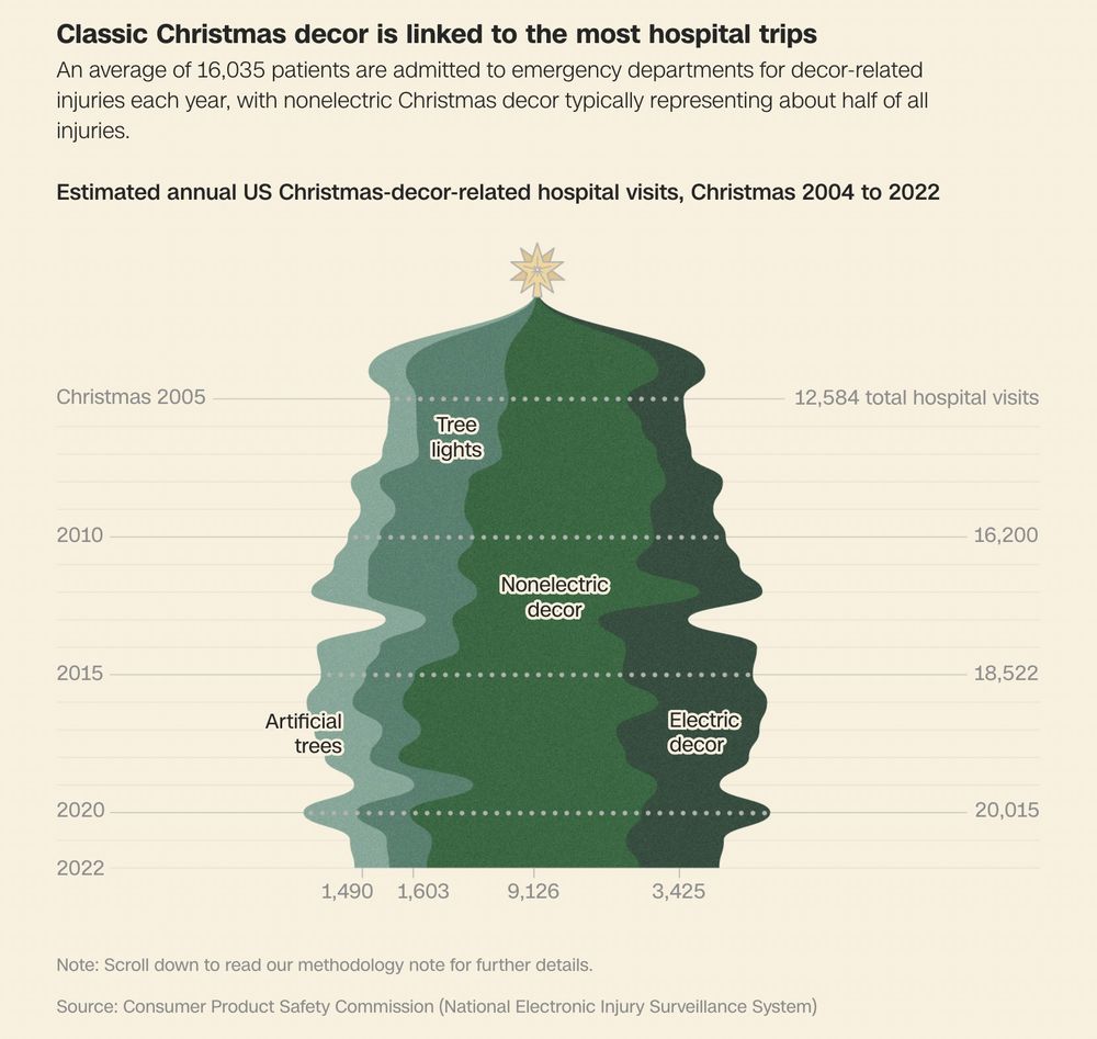
with Christmas over, decor is starting to come down, and hopefully *carefully* 🎄🎄🎄
👉 accidents related to Christmas trees, lights and ornaments send thousands of Americans to emergency departments each year
👉 accidents related to Christmas trees, lights and ornaments send thousands of Americans to emergency departments each year
December 29, 2024 at 5:59 PM
with Christmas over, decor is starting to come down, and hopefully *carefully* 🎄🎄🎄
👉 accidents related to Christmas trees, lights and ornaments send thousands of Americans to emergency departments each year
👉 accidents related to Christmas trees, lights and ornaments send thousands of Americans to emergency departments each year

Just for the fun of it: Years ago Curran Kelleher (unfortunately not on BlueSky) created a d3 label repo that can be used for steam graphs:
github.com/curran/d3-ar...
based on this paper:
leebyron.com/streamgraph/
Demonstrated on this code snipped:
vizhub.com/curran/6b0cd...
-- end of 🧵🧵🧵
github.com/curran/d3-ar...
based on this paper:
leebyron.com/streamgraph/
Demonstrated on this code snipped:
vizhub.com/curran/6b0cd...
-- end of 🧵🧵🧵

GitHub - curran/d3-area-label: A library for placing labels in areas.
A library for placing labels in areas. Contribute to curran/d3-area-label development by creating an account on GitHub.
github.com
December 3, 2024 at 12:56 AM
Just for the fun of it: Years ago Curran Kelleher (unfortunately not on BlueSky) created a d3 label repo that can be used for steam graphs:
github.com/curran/d3-ar...
based on this paper:
leebyron.com/streamgraph/
Demonstrated on this code snipped:
vizhub.com/curran/6b0cd...
-- end of 🧵🧵🧵
github.com/curran/d3-ar...
based on this paper:
leebyron.com/streamgraph/
Demonstrated on this code snipped:
vizhub.com/curran/6b0cd...
-- end of 🧵🧵🧵

✨ Interactive CV Journey ✨
Today, I created a visual interactive CV to showcase how mathematics, social sciences, and photography have been the pillars of my career and life. 🌟
Do you happen to know how to make tooltips work with streamgraph and GGPlot?
📊, #dataviz, #datavis, #R, #Florish
Today, I created a visual interactive CV to showcase how mathematics, social sciences, and photography have been the pillars of my career and life. 🌟
Do you happen to know how to make tooltips work with streamgraph and GGPlot?
📊, #dataviz, #datavis, #R, #Florish
November 17, 2024 at 9:13 PM

#30DayMapChallenge Day 6: Raster
I like grid maps for mapping tasks where landmass is not of primary importance. And a gridmap is just a coarse raster.
Here are C0₂ emissions since 1800. See observablehq.com/@jwolondon/t... for an interactive animated version to see trends over time and space.
I like grid maps for mapping tasks where landmass is not of primary importance. And a gridmap is just a coarse raster.
Here are C0₂ emissions since 1800. See observablehq.com/@jwolondon/t... for an interactive animated version to see trends over time and space.

November 6, 2024 at 4:10 PM
#30DayMapChallenge Day 6: Raster
I like grid maps for mapping tasks where landmass is not of primary importance. And a gridmap is just a coarse raster.
Here are C0₂ emissions since 1800. See observablehq.com/@jwolondon/t... for an interactive animated version to see trends over time and space.
I like grid maps for mapping tasks where landmass is not of primary importance. And a gridmap is just a coarse raster.
Here are C0₂ emissions since 1800. See observablehq.com/@jwolondon/t... for an interactive animated version to see trends over time and space.
Here is my #viz for the #SWDchallenge– AUG 2024 | visualize the olympics
.
The data for this month's challenge comes from rgriffin via Kaggle.
.
Disclaimer: This chart is more aesthetic than informative (quantitative).
.
📂: github.com/poncest/SWDc...
.
The data for this month's challenge comes from rgriffin via Kaggle.
.
Disclaimer: This chart is more aesthetic than informative (quantitative).
.
📂: github.com/poncest/SWDc...

August 2, 2024 at 9:13 PM
Here is my #viz for the #SWDchallenge– AUG 2024 | visualize the olympics
.
The data for this month's challenge comes from rgriffin via Kaggle.
.
Disclaimer: This chart is more aesthetic than informative (quantitative).
.
📂: github.com/poncest/SWDc...
.
The data for this month's challenge comes from rgriffin via Kaggle.
.
Disclaimer: This chart is more aesthetic than informative (quantitative).
.
📂: github.com/poncest/SWDc...

*** #NewDataViz ***
#Day2 of #30DayChartChallenge
#neo
This is my first attempt at creating a #streamgraph and would love to hear your #feedback.
Tableau Link: public.tableau.com/views/WhereD...
Thank you, Cédric Scherer and all the other organizers of this challenge.
#tableau #datafam #figma
#Day2 of #30DayChartChallenge
#neo
This is my first attempt at creating a #streamgraph and would love to hear your #feedback.
Tableau Link: public.tableau.com/views/WhereD...
Thank you, Cédric Scherer and all the other organizers of this challenge.
#tableau #datafam #figma

April 2, 2024 at 5:02 PM
*** #NewDataViz ***
#Day2 of #30DayChartChallenge
#neo
This is my first attempt at creating a #streamgraph and would love to hear your #feedback.
Tableau Link: public.tableau.com/views/WhereD...
Thank you, Cédric Scherer and all the other organizers of this challenge.
#tableau #datafam #figma
#Day2 of #30DayChartChallenge
#neo
This is my first attempt at creating a #streamgraph and would love to hear your #feedback.
Tableau Link: public.tableau.com/views/WhereD...
Thank you, Cédric Scherer and all the other organizers of this challenge.
#tableau #datafam #figma

And what about these team profiles? 😍


January 18, 2024 at 3:05 PM
And what about these team profiles? 😍