


One of the things that has been on my to do list for a very long time, is building a gallery of all of the charts I've made across #TidyTuesday, #30DayChartChallenge, #30DayMapChallenge, and other miscellaneous projects 📊
And it's finally here!
Link: nrennie.rbind.io/viz-gallery/
#DataViz #RStats
And it's finally here!
Link: nrennie.rbind.io/viz-gallery/
#DataViz #RStats

Data Visualisation Gallery
Gallery of data visualisations created by Nicola Rennie.
nrennie.rbind.io
November 26, 2025 at 1:33 PM
One of the things that has been on my to do list for a very long time, is building a gallery of all of the charts I've made across #TidyTuesday, #30DayChartChallenge, #30DayMapChallenge, and other miscellaneous projects 📊
And it's finally here!
Link: nrennie.rbind.io/viz-gallery/
#DataViz #RStats
And it's finally here!
Link: nrennie.rbind.io/viz-gallery/
#DataViz #RStats


#30DayChartChallenge | Day 17 - Networks
Once again I forgot to post here.. For this prompt, I worked on my first R project. I only had time to reproduce the map from one of @milos-makes-maps.bsky.social's amazing tutorials and play with colors
📊 Made with R
Once again I forgot to post here.. For this prompt, I worked on my first R project. I only had time to reproduce the map from one of @milos-makes-maps.bsky.social's amazing tutorials and play with colors
📊 Made with R

April 19, 2024 at 9:00 PM
#30DayChartChallenge | Day 17 - Networks
Once again I forgot to post here.. For this prompt, I worked on my first R project. I only had time to reproduce the map from one of @milos-makes-maps.bsky.social's amazing tutorials and play with colors
📊 Made with R
Once again I forgot to post here.. For this prompt, I worked on my first R project. I only had time to reproduce the map from one of @milos-makes-maps.bsky.social's amazing tutorials and play with colors
📊 Made with R

Day 29 of #30DayChartChallenge - black'n'white
I used to love watching Laurel & Hardy films when I was a kid so it was pretty easy to find a dataset for the penultimate day's theme. Here's a look at the ratings for the duo's short vs movies.
#dataviz #rstats #ggplot2
I used to love watching Laurel & Hardy films when I was a kid so it was pretty easy to find a dataset for the penultimate day's theme. Here's a look at the ratings for the duo's short vs movies.
#dataviz #rstats #ggplot2

May 16, 2024 at 10:40 PM
Day 29 of #30DayChartChallenge - black'n'white
I used to love watching Laurel & Hardy films when I was a kid so it was pretty easy to find a dataset for the penultimate day's theme. Here's a look at the ratings for the duo's short vs movies.
#dataviz #rstats #ggplot2
I used to love watching Laurel & Hardy films when I was a kid so it was pretty easy to find a dataset for the penultimate day's theme. Here's a look at the ratings for the duo's short vs movies.
#dataviz #rstats #ggplot2

2/2 post for day 20 of #30DayChartChallenge. Looking at US military aid & "smart" weapons supply during the same time period as the attacks and casualties in 1/2.
Stopping at that and hoping to do better for another prompt.
#dataviz
#ceasefireNOW
Stopping at that and hoping to do better for another prompt.
#dataviz
#ceasefireNOW


April 22, 2024 at 5:03 PM
2/2 post for day 20 of #30DayChartChallenge. Looking at US military aid & "smart" weapons supply during the same time period as the attacks and casualties in 1/2.
Stopping at that and hoping to do better for another prompt.
#dataviz
#ceasefireNOW
Stopping at that and hoping to do better for another prompt.
#dataviz
#ceasefireNOW

Day 4 of the #30DayChartChallenge! 📊
Today's theme: Big or Small 🔠
I visualized the most spoken languages in Europe (2022) with word sizes — more speakers, bigger word! A fun way to show linguistic diversity.🌍🗣️
#DataViz #Charts #Graphane
You can see it in:
playground.graphane.dev/editor/g71r3...
Today's theme: Big or Small 🔠
I visualized the most spoken languages in Europe (2022) with word sizes — more speakers, bigger word! A fun way to show linguistic diversity.🌍🗣️
#DataViz #Charts #Graphane
You can see it in:
playground.graphane.dev/editor/g71r3...

April 4, 2025 at 8:08 AM
Day 4 of the #30DayChartChallenge! 📊
Today's theme: Big or Small 🔠
I visualized the most spoken languages in Europe (2022) with word sizes — more speakers, bigger word! A fun way to show linguistic diversity.🌍🗣️
#DataViz #Charts #Graphane
You can see it in:
playground.graphane.dev/editor/g71r3...
Today's theme: Big or Small 🔠
I visualized the most spoken languages in Europe (2022) with word sizes — more speakers, bigger word! A fun way to show linguistic diversity.🌍🗣️
#DataViz #Charts #Graphane
You can see it in:
playground.graphane.dev/editor/g71r3...

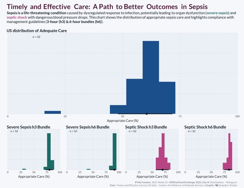
An analysis of how US healthcare facilities are performing on critical sepsis care guidelines for #30DayChartChallenge #Day8: Distributions - Histogram & #TidyTuesday week 14.
Data: Timely and Effective Care by US state
Code: github.com/rajodm/TidyT...
#dataviz #rstats #ggplot2
Data: Timely and Effective Care by US state
Code: github.com/rajodm/TidyT...
#dataviz #rstats #ggplot2
April 8, 2025 at 10:00 AM
An analysis of how US healthcare facilities are performing on critical sepsis care guidelines for #30DayChartChallenge #Day8: Distributions - Histogram & #TidyTuesday week 14.
Data: Timely and Effective Care by US state
Code: github.com/rajodm/TidyT...
#dataviz #rstats #ggplot2
Data: Timely and Effective Care by US state
Code: github.com/rajodm/TidyT...
#dataviz #rstats #ggplot2
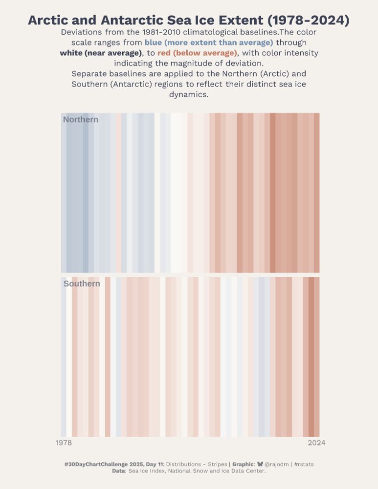
46 years of Arctic and Antarctic sea ice evolution for #30DayChartChallenge #Day11.
Prompt: Distributions - Stripes.
There's a clear decline of sea ice extent in the northern region, while the Antarctic displays no consistent trends.
#dataviz #rstats #ggplot2
Prompt: Distributions - Stripes.
There's a clear decline of sea ice extent in the northern region, while the Antarctic displays no consistent trends.
#dataviz #rstats #ggplot2
April 11, 2025 at 4:53 PM
46 years of Arctic and Antarctic sea ice evolution for #30DayChartChallenge #Day11.
Prompt: Distributions - Stripes.
There's a clear decline of sea ice extent in the northern region, while the Antarctic displays no consistent trends.
#dataviz #rstats #ggplot2
Prompt: Distributions - Stripes.
There's a clear decline of sea ice extent in the northern region, while the Antarctic displays no consistent trends.
#dataviz #rstats #ggplot2

#30DayChartChallenge – Day 8, Diverging
Qatar's population is heavily skewed toward working-age men, a reflection of its reliance on a massive male migrant workforce. This is how labour demand, not natural population growth, drives much of the country’s demographics.
Qatar's population is heavily skewed toward working-age men, a reflection of its reliance on a massive male migrant workforce. This is how labour demand, not natural population growth, drives much of the country’s demographics.

April 10, 2025 at 1:03 PM
#30DayChartChallenge – Day 8, Diverging
Qatar's population is heavily skewed toward working-age men, a reflection of its reliance on a massive male migrant workforce. This is how labour demand, not natural population growth, drives much of the country’s demographics.
Qatar's population is heavily skewed toward working-age men, a reflection of its reliance on a massive male migrant workforce. This is how labour demand, not natural population growth, drives much of the country’s demographics.

#30DayChartChallenge | Day 1 | Pat-to-Whole
Há alguns meses fiz uma coleta de dados sobre os jogos/categoria com mais streaming no mês. Se não me engano foi 03/2023.
Just Chatting foi a categoria streamada.
Há alguns meses fiz uma coleta de dados sobre os jogos/categoria com mais streaming no mês. Se não me engano foi 03/2023.
Just Chatting foi a categoria streamada.

April 2, 2024 at 2:30 AM
#30DayChartChallenge | Day 1 | Pat-to-Whole
Há alguns meses fiz uma coleta de dados sobre os jogos/categoria com mais streaming no mês. Se não me engano foi 03/2023.
Just Chatting foi a categoria streamada.
Há alguns meses fiz uma coleta de dados sobre os jogos/categoria com mais streaming no mês. Se não me engano foi 03/2023.
Just Chatting foi a categoria streamada.
#Day17 of the #30DayChartChallenge (networks)

April 18, 2024 at 9:02 PM
#Day17 of the #30DayChartChallenge (networks)

Sur un R du #30DayChartChallenge - Day 3 #circular plot here with circlize.
The most chosen combinations of school subjects in the final year of general high school in 2024 in France (in %)
Acronyms & Source: www.education.gouv.fr/les-choix-d-...
#rstats #dataviz #MathArt
The most chosen combinations of school subjects in the final year of general high school in 2024 in France (in %)
Acronyms & Source: www.education.gouv.fr/les-choix-d-...
#rstats #dataviz #MathArt

April 18, 2025 at 6:48 PM
Sur un R du #30DayChartChallenge - Day 3 #circular plot here with circlize.
The most chosen combinations of school subjects in the final year of general high school in 2024 in France (in %)
Acronyms & Source: www.education.gouv.fr/les-choix-d-...
#rstats #dataviz #MathArt
The most chosen combinations of school subjects in the final year of general high school in 2024 in France (in %)
Acronyms & Source: www.education.gouv.fr/les-choix-d-...
#rstats #dataviz #MathArt

Day 15 | Relationships – Complicated | #30DayChartChallenge. Visualization made with R using #tidyverse, #ggtext and #showtext . | Source: google trends trends.google.com/trends/explo...

April 15, 2025 at 12:45 AM
Day 15 | Relationships – Complicated | #30DayChartChallenge. Visualization made with R using #tidyverse, #ggtext and #showtext . | Source: google trends trends.google.com/trends/explo...

52% der Gemeinden sind somit recht klein (<2000EW). Mit Linz als 3. größte & Wels als 8. Stadt Österreichs und heterogenen Markt- & Stadtgemeinden dazwischen ist klar, dass Lösungen für die vielfältigen Herausforderungen in Regionen gedacht werden müssen
Tag 8 der #30DayChartChallenge Histogramme.
Tag 8 der #30DayChartChallenge Histogramme.
April 18, 2025 at 7:31 AM
52% der Gemeinden sind somit recht klein (<2000EW). Mit Linz als 3. größte & Wels als 8. Stadt Österreichs und heterogenen Markt- & Stadtgemeinden dazwischen ist klar, dass Lösungen für die vielfältigen Herausforderungen in Regionen gedacht werden müssen
Tag 8 der #30DayChartChallenge Histogramme.
Tag 8 der #30DayChartChallenge Histogramme.

#30DayChartChallenge D20: Urbanización 🇪🇸! ¿Cómo se reparte la gente en España? 🤔 Baja % en pueblos <5k, sube un poco en ciudades medianas (20k-100k). Grandes (>100k) estables ~40%. ¡No todo es irse a la capi! 😉
📂 Link: t.ly/AN1-q
#rstats #dataviz #INE #Demografia
📂 Link: t.ly/AN1-q
#rstats #dataviz #INE #Demografia

April 20, 2025 at 8:58 AM
#30DayChartChallenge D20: Urbanización 🇪🇸! ¿Cómo se reparte la gente en España? 🤔 Baja % en pueblos <5k, sube un poco en ciudades medianas (20k-100k). Grandes (>100k) estables ~40%. ¡No todo es irse a la capi! 😉
📂 Link: t.ly/AN1-q
#rstats #dataviz #INE #Demografia
📂 Link: t.ly/AN1-q
#rstats #dataviz #INE #Demografia

#30DayChartChallenge Day 4: Big or Small
Spent way too long thinking of the creative for this but it was fun showing how big the number of plastic bottles are compared to glass.
Writing custom force clusters and collisions in d3 force was spicy 🌶️
Website: thirty-web-charts.netlify.app/day4
Spent way too long thinking of the creative for this but it was fun showing how big the number of plastic bottles are compared to glass.
Writing custom force clusters and collisions in d3 force was spicy 🌶️
Website: thirty-web-charts.netlify.app/day4
April 8, 2025 at 2:47 AM
#30DayChartChallenge Day 4: Big or Small
Spent way too long thinking of the creative for this but it was fun showing how big the number of plastic bottles are compared to glass.
Writing custom force clusters and collisions in d3 force was spicy 🌶️
Website: thirty-web-charts.netlify.app/day4
Spent way too long thinking of the creative for this but it was fun showing how big the number of plastic bottles are compared to glass.
Writing custom force clusters and collisions in d3 force was spicy 🌶️
Website: thirty-web-charts.netlify.app/day4
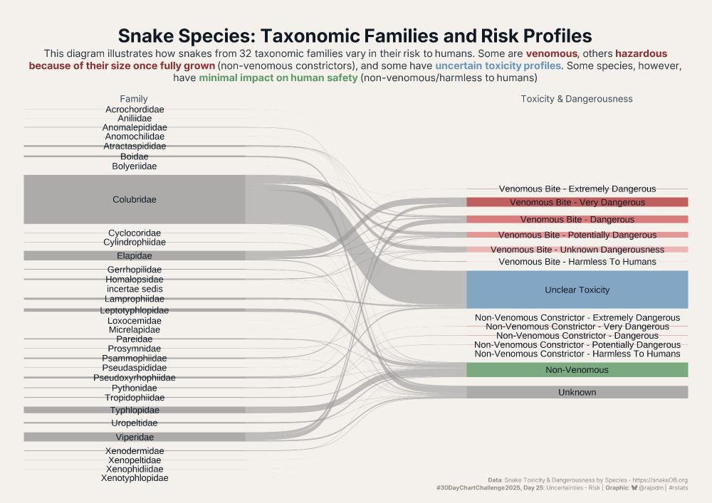
#30DayChartChallenge #Day25:
👉 Uncertainties - risk
📊🐍⚠️ Snakes: dangerousness and toxicity.
Are all snakes dangerous? Which snake families pose the greatest risk to humans? Are venomous snakes the only ones to fear?
#dataviz #rstats #ggplot2
👉 Uncertainties - risk
📊🐍⚠️ Snakes: dangerousness and toxicity.
Are all snakes dangerous? Which snake families pose the greatest risk to humans? Are venomous snakes the only ones to fear?
#dataviz #rstats #ggplot2
April 25, 2025 at 4:00 AM
#30DayChartChallenge #Day25:
👉 Uncertainties - risk
📊🐍⚠️ Snakes: dangerousness and toxicity.
Are all snakes dangerous? Which snake families pose the greatest risk to humans? Are venomous snakes the only ones to fear?
#dataviz #rstats #ggplot2
👉 Uncertainties - risk
📊🐍⚠️ Snakes: dangerousness and toxicity.
Are all snakes dangerous? Which snake families pose the greatest risk to humans? Are venomous snakes the only ones to fear?
#dataviz #rstats #ggplot2
#30DayChartChallenge - Day 23: log scale
Data on wildfire incidents attended by the fire and rescue services in England between 2009-2020.
#rstats #dataviz
Data on wildfire incidents attended by the fire and rescue services in England between 2009-2020.
#rstats #dataviz

April 27, 2025 at 10:05 PM
#30DayChartChallenge - Day 23: log scale
Data on wildfire incidents attended by the fire and rescue services in England between 2009-2020.
#rstats #dataviz
Data on wildfire incidents attended by the fire and rescue services in England between 2009-2020.
#rstats #dataviz
Day 22 | Timeseries – Stars | #30DayChartChallenge. Visualization made with R using #ggplot2, #dplyr, #showtext, #lubridate and #cranlogs. | Source: cranlogs R Package.

April 22, 2025 at 9:36 AM
Day 22 | Timeseries – Stars | #30DayChartChallenge. Visualization made with R using #ggplot2, #dplyr, #showtext, #lubridate and #cranlogs. | Source: cranlogs R Package.

Day 19 #30DayChartChallenge | Time-series: Smooth
This plot shows the daily closing price of the S&P500 Index since October 2024 with several different smoothing and trend estimation techniques. Shoutout to base R (lots of convenient smoothers in stats) and TTR.
This plot shows the daily closing price of the S&P500 Index since October 2024 with several different smoothing and trend estimation techniques. Shoutout to base R (lots of convenient smoothers in stats) and TTR.

April 23, 2025 at 8:41 PM
Day 19 #30DayChartChallenge | Time-series: Smooth
This plot shows the daily closing price of the S&P500 Index since October 2024 with several different smoothing and trend estimation techniques. Shoutout to base R (lots of convenient smoothers in stats) and TTR.
This plot shows the daily closing price of the S&P500 Index since October 2024 with several different smoothing and trend estimation techniques. Shoutout to base R (lots of convenient smoothers in stats) and TTR.

Prompt 19 | #30DayChartChallenge | smooth
(yes, I did 20 yesterday & today should be prompt 23 🤷♂️)
It's time series #dataviz of bachelor degs in 🇩🇰, overall & by sex. #rstats using danstat 📦
Most interesting thing for me was tech science degs. Read more in the post:
www.gregdubrow.io/posts/30-day...
(yes, I did 20 yesterday & today should be prompt 23 🤷♂️)
It's time series #dataviz of bachelor degs in 🇩🇰, overall & by sex. #rstats using danstat 📦
Most interesting thing for me was tech science degs. Read more in the post:
www.gregdubrow.io/posts/30-day...

April 23, 2025 at 12:03 PM
Prompt 19 | #30DayChartChallenge | smooth
(yes, I did 20 yesterday & today should be prompt 23 🤷♂️)
It's time series #dataviz of bachelor degs in 🇩🇰, overall & by sex. #rstats using danstat 📦
Most interesting thing for me was tech science degs. Read more in the post:
www.gregdubrow.io/posts/30-day...
(yes, I did 20 yesterday & today should be prompt 23 🤷♂️)
It's time series #dataviz of bachelor degs in 🇩🇰, overall & by sex. #rstats using danstat 📦
Most interesting thing for me was tech science degs. Read more in the post:
www.gregdubrow.io/posts/30-day...

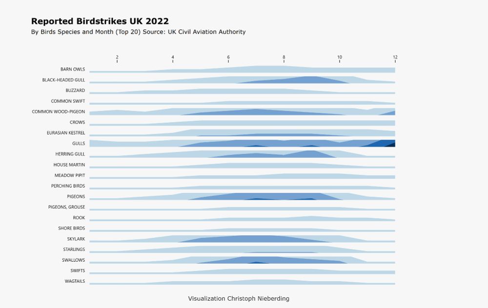
Day seventeen of the #30DayChartChallenge 2025
Topic: Relationships / Birds
Horizon charts are great for showing multiple time series in a limited amount of space. Sometimes, you really don’t have much room but still want to show the density or intensity of events over time.
#PowerBI #D3JS
Topic: Relationships / Birds
Horizon charts are great for showing multiple time series in a limited amount of space. Sometimes, you really don’t have much room but still want to show the density or intensity of events over time.
#PowerBI #D3JS
April 17, 2025 at 5:57 AM
Day seventeen of the #30DayChartChallenge 2025
Topic: Relationships / Birds
Horizon charts are great for showing multiple time series in a limited amount of space. Sometimes, you really don’t have much room but still want to show the density or intensity of events over time.
#PowerBI #D3JS
Topic: Relationships / Birds
Horizon charts are great for showing multiple time series in a limited amount of space. Sometimes, you really don’t have much room but still want to show the density or intensity of events over time.
#PowerBI #D3JS

Day 4 of #30DayChartChallenge: Big or Small 📊
Just 162k of the world’s largest farms (>1000 ha) control 38.6% of agricultural land. Meanwhile, 374M small farms (<1 ha) manage only 6.7% 🫣
I visualized this imbalance using a radial chart - form meets function 😅
Interactive app & link to paper below
Just 162k of the world’s largest farms (>1000 ha) control 38.6% of agricultural land. Meanwhile, 374M small farms (<1 ha) manage only 6.7% 🫣
I visualized this imbalance using a radial chart - form meets function 😅
Interactive app & link to paper below
April 4, 2025 at 9:08 AM
Day 4 of #30DayChartChallenge: Big or Small 📊
Just 162k of the world’s largest farms (>1000 ha) control 38.6% of agricultural land. Meanwhile, 374M small farms (<1 ha) manage only 6.7% 🫣
I visualized this imbalance using a radial chart - form meets function 😅
Interactive app & link to paper below
Just 162k of the world’s largest farms (>1000 ha) control 38.6% of agricultural land. Meanwhile, 374M small farms (<1 ha) manage only 6.7% 🫣
I visualized this imbalance using a radial chart - form meets function 😅
Interactive app & link to paper below

#30DayChartChallenge #Day28 Trend 🥳📈📊 #rstats
They turned two and realized that their age doubled in the past year. The kid is right to be concerned.
An inverse of this is why time flies as we get older. Each additional moment is a smaller and smaller fraction of our total experienced moments.
They turned two and realized that their age doubled in the past year. The kid is right to be concerned.
An inverse of this is why time flies as we get older. Each additional moment is a smaller and smaller fraction of our total experienced moments.

April 30, 2024 at 2:10 AM
#30DayChartChallenge #Day28 Trend 🥳📈📊 #rstats
They turned two and realized that their age doubled in the past year. The kid is right to be concerned.
An inverse of this is why time flies as we get older. Each additional moment is a smaller and smaller fraction of our total experienced moments.
They turned two and realized that their age doubled in the past year. The kid is right to be concerned.
An inverse of this is why time flies as we get older. Each additional moment is a smaller and smaller fraction of our total experienced moments.

#Day17 of the #30DayChartChallenge, networks
Paris 2024 Olympic venues and metro lines
Code: github.com/gkaramanis/3...
#RStats #ggplot2 #dataviz #Olympics 📊
Paris 2024 Olympic venues and metro lines
Code: github.com/gkaramanis/3...
#RStats #ggplot2 #dataviz #Olympics 📊

April 17, 2024 at 2:28 PM
#Day17 of the #30DayChartChallenge, networks
Paris 2024 Olympic venues and metro lines
Code: github.com/gkaramanis/3...
#RStats #ggplot2 #dataviz #Olympics 📊
Paris 2024 Olympic venues and metro lines
Code: github.com/gkaramanis/3...
#RStats #ggplot2 #dataviz #Olympics 📊