


Revisual Labs
@revisual.co
We’re an information design and development agency crafting memorable data stories. Rooted in India with a global outlook. 💻 https://revisual.co/ 💻
#dataviz #informationdesign
#dataviz #informationdesign
📊 Insight Out: Week 48 - Election graphics, Bihar 2025
Our team created 4 automated graphics for the elections, in collaboration with CVoter who provided the data behind the charts. These graphics were shown live on Mojo Story's YouTube channel.
Our team created 4 automated graphics for the elections, in collaboration with CVoter who provided the data behind the charts. These graphics were shown live on Mojo Story's YouTube channel.
November 14, 2025 at 1:28 PM
📊 Insight Out: Week 48 - Election graphics, Bihar 2025
Our team created 4 automated graphics for the elections, in collaboration with CVoter who provided the data behind the charts. These graphics were shown live on Mojo Story's YouTube channel.
Our team created 4 automated graphics for the elections, in collaboration with CVoter who provided the data behind the charts. These graphics were shown live on Mojo Story's YouTube channel.
If you haven't spotted it already, our chart gallery is up on our website. 🔍 Swipe to read about how it could be useful and click the link below to start browsing.
revisual.co/chart-gallery/
revisual.co/chart-gallery/


November 13, 2025 at 10:22 AM
If you haven't spotted it already, our chart gallery is up on our website. 🔍 Swipe to read about how it could be useful and click the link below to start browsing.
revisual.co/chart-gallery/
revisual.co/chart-gallery/
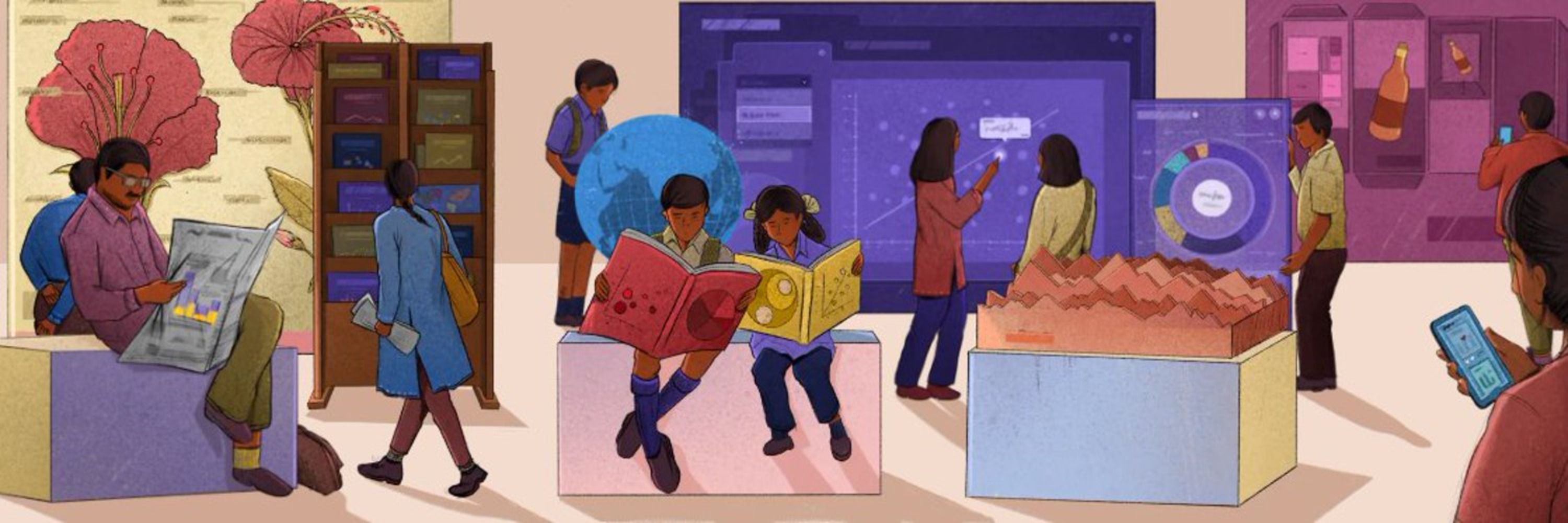
We’re kicking off a new series called ‘Journeys of Discovery,’ the idea for which came from Ipshita Raj, our youngest team member.


November 10, 2025 at 12:57 PM
We’re kicking off a new series called ‘Journeys of Discovery,’ the idea for which came from Ipshita Raj, our youngest team member.
And that's a wrap on October! ✨
With 13 members on board, we had a highly productive month at the studio. We launched 1 new project while keeping 6 others steadily humming along. All that work resulted in 321 code commits and required 6,858 Slack message exchanges.
With 13 members on board, we had a highly productive month at the studio. We launched 1 new project while keeping 6 others steadily humming along. All that work resulted in 321 code commits and required 6,858 Slack message exchanges.


November 5, 2025 at 10:26 AM
And that's a wrap on October! ✨
With 13 members on board, we had a highly productive month at the studio. We launched 1 new project while keeping 6 others steadily humming along. All that work resulted in 321 code commits and required 6,858 Slack message exchanges.
With 13 members on board, we had a highly productive month at the studio. We launched 1 new project while keeping 6 others steadily humming along. All that work resulted in 321 code commits and required 6,858 Slack message exchanges.
📊 Insight Out: Week 47 - Redesigning a waterfall chart
Today we’re spotlighting a chart we made for ICRIER’s State of India’s Digital Economy Report (SIDE), 2024.
Today we’re spotlighting a chart we made for ICRIER’s State of India’s Digital Economy Report (SIDE), 2024.


October 24, 2025 at 7:24 AM
📊 Insight Out: Week 47 - Redesigning a waterfall chart
Today we’re spotlighting a chart we made for ICRIER’s State of India’s Digital Economy Report (SIDE), 2024.
Today we’re spotlighting a chart we made for ICRIER’s State of India’s Digital Economy Report (SIDE), 2024.
In July, we published a set of video explainers in collaboration with Godrej Design Lab, the goal of which was to share key insights from their ‘Building A Climate Conscious India’ report focusing on low-carbon solutions for the buildings sector in India.


October 22, 2025 at 1:37 PM
In July, we published a set of video explainers in collaboration with Godrej Design Lab, the goal of which was to share key insights from their ‘Building A Climate Conscious India’ report focusing on low-carbon solutions for the buildings sector in India.
We wish you and your loved ones a very happy, prosperous and bright Diwali. 🪔 With a curious spark and clarity of thought, we hope to continue to enlighten one another in the pursuit to tell meaningful stories with data. ✨

October 20, 2025 at 6:41 AM
We wish you and your loved ones a very happy, prosperous and bright Diwali. 🪔 With a curious spark and clarity of thought, we hope to continue to enlighten one another in the pursuit to tell meaningful stories with data. ✨
We're finally back with another project post! Each of our projects have their own milestones and processes depending on the nature of the work, scope and more. In the first half of this year, we designed and developed an interactive dashboard of 100 impact stories by 3ie.


October 16, 2025 at 8:23 AM
We're finally back with another project post! Each of our projects have their own milestones and processes depending on the nature of the work, scope and more. In the first half of this year, we designed and developed an interactive dashboard of 100 impact stories by 3ie.
📊 Insight Out: Week 46 - An animated map showing the journeys of refugees from Ukraine to neighbouring countries.
This week, we're sharing a map created for IOM’s 'Journeys of Resilience', an interactive story about the lives of refugees from Ukraine, amidst the ongoing war.
This week, we're sharing a map created for IOM’s 'Journeys of Resilience', an interactive story about the lives of refugees from Ukraine, amidst the ongoing war.

October 10, 2025 at 1:13 PM
📊 Insight Out: Week 46 - An animated map showing the journeys of refugees from Ukraine to neighbouring countries.
This week, we're sharing a map created for IOM’s 'Journeys of Resilience', an interactive story about the lives of refugees from Ukraine, amidst the ongoing war.
This week, we're sharing a map created for IOM’s 'Journeys of Resilience', an interactive story about the lives of refugees from Ukraine, amidst the ongoing war.
Our team is growing–and how! Nearly a year after she completed her 2 month internship with us, @rashitries.bsky.social has officially joined the RVL team as a designer.


October 9, 2025 at 8:30 AM
Our team is growing–and how! Nearly a year after she completed her 2 month internship with us, @rashitries.bsky.social has officially joined the RVL team as a designer.
Reposted by Revisual Labs
What started as a chat over gobhi ke parathe has grown into VizChitra, India’s first community-run data visualization conference📈🎉
Here’s a peek at #VizChitra2025 in action👀 — the hands, minds & stories that made it all come alive 💡📊
Here’s a peek at #VizChitra2025 in action👀 — the hands, minds & stories that made it all come alive 💡📊

VizChitra 2025 Highlights | India's first community-run Data Visualisation Conference
YouTube video by VizChitra
www.youtube.com
October 6, 2025 at 3:38 PM
What started as a chat over gobhi ke parathe has grown into VizChitra, India’s first community-run data visualization conference📈🎉
Here’s a peek at #VizChitra2025 in action👀 — the hands, minds & stories that made it all come alive 💡📊
Here’s a peek at #VizChitra2025 in action👀 — the hands, minds & stories that made it all come alive 💡📊
Here’s what September looked like at our studio ✨


October 3, 2025 at 12:09 PM
Here’s what September looked like at our studio ✨
📊 Insight Out: Week 45 - Showing real-time data through an illustrated stacked bar.


September 25, 2025 at 9:07 AM
📊 Insight Out: Week 45 - Showing real-time data through an illustrated stacked bar.
There's been a LOT going on at our studio of late 👀 So we asked our team to share what they've been up to, and here's what they said 💬

September 9, 2025 at 10:19 AM
There's been a LOT going on at our studio of late 👀 So we asked our team to share what they've been up to, and here's what they said 💬
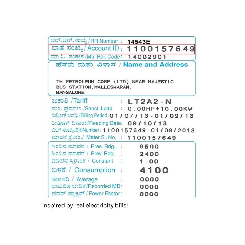
📊 Insight Out: Week 43 - Reimagining electricity bills as data visualisations 🧾


September 5, 2025 at 1:06 PM
📊 Insight Out: Week 43 - Reimagining electricity bills as data visualisations 🧾
August saw our studio juggle 7 projects, with one getting delivered across the finish line. With extra workload comes extra sets of hands, which led to 10 people working together at RVL last month!
The number of Slack messages & code commits are certainly proof of that 💬
The number of Slack messages & code commits are certainly proof of that 💬


September 2, 2025 at 12:53 PM
August saw our studio juggle 7 projects, with one getting delivered across the finish line. With extra workload comes extra sets of hands, which led to 10 people working together at RVL last month!
The number of Slack messages & code commits are certainly proof of that 💬
The number of Slack messages & code commits are certainly proof of that 💬
While we frequently share our studio's projects and milestones, we also do something else of immense value—Data Visualisation & Storytelling training 📊💬


August 25, 2025 at 11:05 AM
While we frequently share our studio's projects and milestones, we also do something else of immense value—Data Visualisation & Storytelling training 📊💬
📊 Insight Out: Week 43 - Using Charts to Navigate an Interface
August 21, 2025 at 11:31 AM
📊 Insight Out: Week 43 - Using Charts to Navigate an Interface
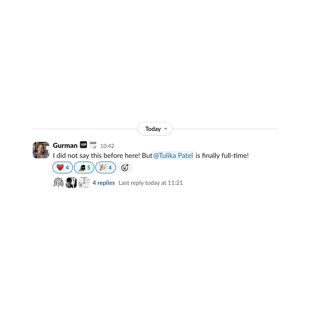
Introducing the newest addition to our team— Tulika Patel, a Visual Communication Designer from Varanasi, India.


August 19, 2025 at 12:29 PM
Introducing the newest addition to our team— Tulika Patel, a Visual Communication Designer from Varanasi, India.
📊 Insight Out: Week 42 - Tiny data visualisations that enable powerful analysis
August 8, 2025 at 11:14 AM
📊 Insight Out: Week 42 - Tiny data visualisations that enable powerful analysis
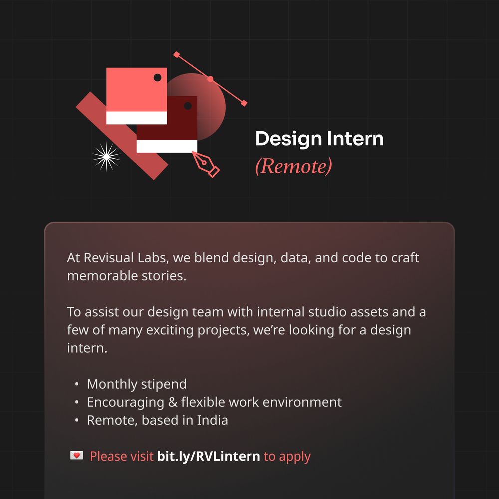
We’re on the lookout for a design intern to join our studio in September 2025 💫
Please read the job description and apply at: bit.ly/RVLintern
#hiring #internshipopportunity #design
Please read the job description and apply at: bit.ly/RVLintern
#hiring #internshipopportunity #design
August 6, 2025 at 9:33 AM
We’re on the lookout for a design intern to join our studio in September 2025 💫
Please read the job description and apply at: bit.ly/RVLintern
#hiring #internshipopportunity #design
Please read the job description and apply at: bit.ly/RVLintern
#hiring #internshipopportunity #design
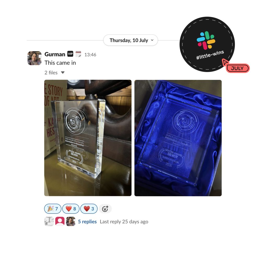
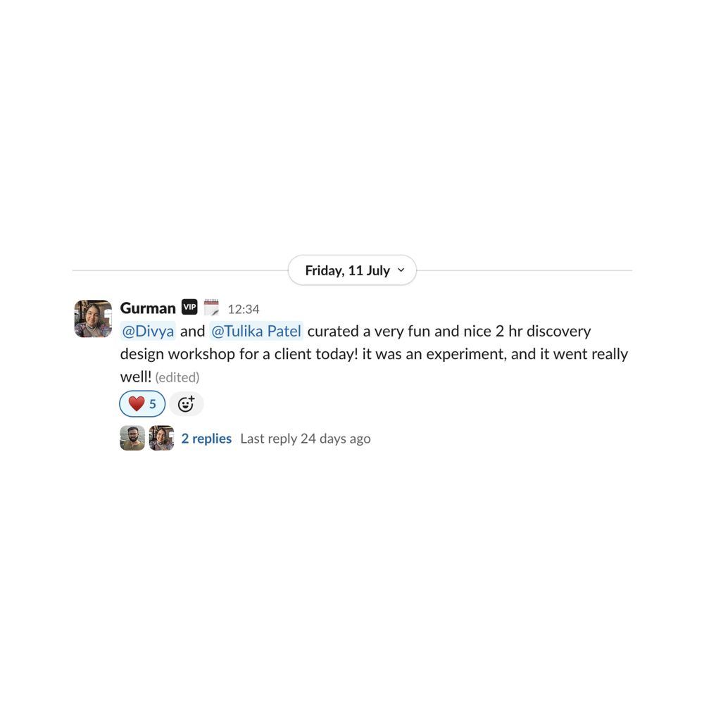
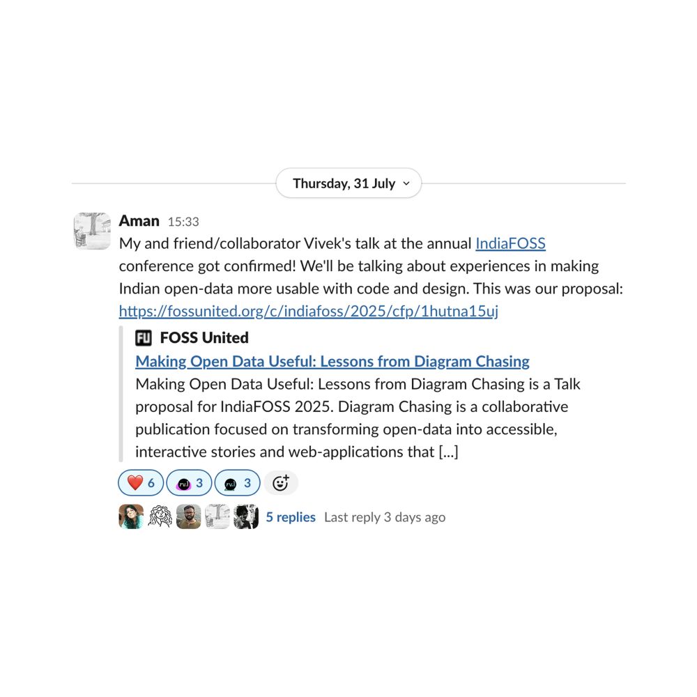
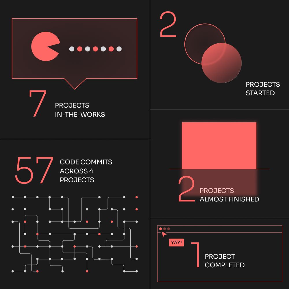
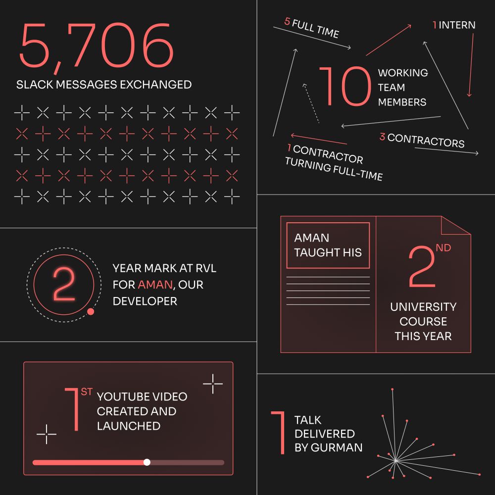
You’ve seen the number of our studio’s “little wins” every month—here’s a peek of what they looked like in July, straight from our little-wins slack channel ✨
August 4, 2025 at 1:41 PM
You’ve seen the number of our studio’s “little wins” every month—here’s a peek of what they looked like in July, straight from our little-wins slack channel ✨
July saw us juggle 7 projects at the studio—kicking off 2, wrapping up 1, and bringing another 2 closer to the finish line. 5,706 Slack messages and 57 code commits attest to our momentum over the month.
August 1, 2025 at 11:32 AM
July saw us juggle 7 projects at the studio—kicking off 2, wrapping up 1, and bringing another 2 closer to the finish line. 5,706 Slack messages and 57 code commits attest to our momentum over the month.
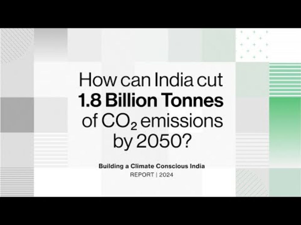
Building A Climate Conscious India
YouTube video by Godrej Design Lab
youtu.be
July 31, 2025 at 12:08 PM
📊 Insight Out: Week 41 - Turning a Treemap Into a Stack of Supply Boxes
This week, we’re spotlighting a chart we made for IOM UN Migration's “Journeys of Resilience” story, which visualises the types & distribution of humanitarian aid across Ukraine and its neighbouring countries.
This week, we’re spotlighting a chart we made for IOM UN Migration's “Journeys of Resilience” story, which visualises the types & distribution of humanitarian aid across Ukraine and its neighbouring countries.
July 23, 2025 at 12:35 PM
📊 Insight Out: Week 41 - Turning a Treemap Into a Stack of Supply Boxes
This week, we’re spotlighting a chart we made for IOM UN Migration's “Journeys of Resilience” story, which visualises the types & distribution of humanitarian aid across Ukraine and its neighbouring countries.
This week, we’re spotlighting a chart we made for IOM UN Migration's “Journeys of Resilience” story, which visualises the types & distribution of humanitarian aid across Ukraine and its neighbouring countries.