


Evan Peck
@peck.phd
🦬🏔️ @cuboulder.info science prof
Vis / HCI - Designing data for the public.
📊❤️ PI @informationvisions.bsky.social
Previously: Bucknell CS prof, Tufts CS PhD
🔗 https://peck.phd/
Vis / HCI - Designing data for the public.
📊❤️ PI @informationvisions.bsky.social
Previously: Bucknell CS prof, Tufts CS PhD
🔗 https://peck.phd/
Reposted by Evan Peck

Humans are bad at big numbers. Which makes it easier for billionaires (and trillionaires) to get away with hoarding wealth. Because most people just can't comprehend how much money that is.
So, I appreciate this WaPo effort to help people visualize what ridiculous amounts of wealth really mean.
So, I appreciate this WaPo effort to help people visualize what ridiculous amounts of wealth really mean.


November 19, 2025 at 5:51 PM
Humans are bad at big numbers. Which makes it easier for billionaires (and trillionaires) to get away with hoarding wealth. Because most people just can't comprehend how much money that is.
So, I appreciate this WaPo effort to help people visualize what ridiculous amounts of wealth really mean.
So, I appreciate this WaPo effort to help people visualize what ridiculous amounts of wealth really mean.
Reposted by Evan Peck
My new big visualization project is out: The Trans News Initiative, a collaboration between UM's School of Communication, the Trans Journalists Association, and Polygraph (The Pudding): transnewsinitiative.org Here's a piece about it in the Columbia Journalism Review: www.cjr.org/news/visuali...

Trans News Initiative
A database and analysis of news coverage affecting trans communities.
transnewsinitiative.org
November 18, 2025 at 5:56 PM
My new big visualization project is out: The Trans News Initiative, a collaboration between UM's School of Communication, the Trans Journalists Association, and Polygraph (The Pudding): transnewsinitiative.org Here's a piece about it in the Columbia Journalism Review: www.cjr.org/news/visuali...
My life can be summed up as "same logo, different colors"
🦬 I grew up in upstate NY (giant Bills fan)
🦬 I was a CS prof at Bucknell for almost 10 years
🦬 I am now an Info Sci prof at CU Boulder
🦬 I grew up in upstate NY (giant Bills fan)
🦬 I was a CS prof at Bucknell for almost 10 years
🦬 I am now an Info Sci prof at CU Boulder

November 14, 2025 at 7:43 PM
My life can be summed up as "same logo, different colors"
🦬 I grew up in upstate NY (giant Bills fan)
🦬 I was a CS prof at Bucknell for almost 10 years
🦬 I am now an Info Sci prof at CU Boulder
🦬 I grew up in upstate NY (giant Bills fan)
🦬 I was a CS prof at Bucknell for almost 10 years
🦬 I am now an Info Sci prof at CU Boulder

Can someone tell me what is going on with @economist.com's graphic department? This title also has nothing to do with the plotted data.
Are they using charts as clickbait for the article?
Are they using charts as clickbait for the article?

November 4, 2025 at 10:57 PM
Can someone tell me what is going on with @economist.com's graphic department? This title also has nothing to do with the plotted data.
Are they using charts as clickbait for the article?
Are they using charts as clickbait for the article?
Reposted by Evan Peck
Started a thread in the other place and bringing it over here - I really think we should be more vocal about the opportunities that lay at the intersection of these two options!
So I'm starting a live thread of new roles as I become aware of them - feel free to add / extend / share :
So I'm starting a live thread of new roles as I become aware of them - feel free to add / extend / share :

Life situations are bleak right now for a lot of people. In tech, the "Venn Diagram" of (1) positive work and (2) making enough money to support your family is increasingly non-overlapping. We all do what we can.
This image has been living in my mind rent-free for months.
This image has been living in my mind rent-free for months.

October 29, 2025 at 2:25 AM
Started a thread in the other place and bringing it over here - I really think we should be more vocal about the opportunities that lay at the intersection of these two options!
So I'm starting a live thread of new roles as I become aware of them - feel free to add / extend / share :
So I'm starting a live thread of new roles as I become aware of them - feel free to add / extend / share :
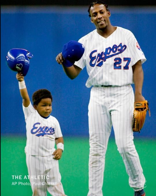
Rare baseball post: I grew up going to Montreal Expos games, and Vladimir Guerrero my all-time favorite ballplayer.
Its surreal to see his son, Vladdy Jr., now fill the baseball headlines.
Its surreal to see his son, Vladdy Jr., now fill the baseball headlines.

From @theathletic.com: There has never been a Hall of Famer who had a son who went on to become a Hall of Fame player.
Vladimir Guerrero Jr.’s big World Series swing adds fuel that he could be the first. nyti.ms/3JiHfHT
Vladimir Guerrero Jr.’s big World Series swing adds fuel that he could be the first. nyti.ms/3JiHfHT
October 30, 2025 at 12:47 AM
Rare baseball post: I grew up going to Montreal Expos games, and Vladimir Guerrero my all-time favorite ballplayer.
Its surreal to see his son, Vladdy Jr., now fill the baseball headlines.
Its surreal to see his son, Vladdy Jr., now fill the baseball headlines.
Bumping this because many of us can individually contribute clarity even when facing great uncertainty from the systems around us.
Given funding uncertainty, we wrote about why depts & faculty should try to communicate openly with PhD applicants about any changes to their admissions processes, including if it's "nothing has changed".
Let's do what we can (when we can) to prevent cascading anxiety.
cra.org/crn/2025/09/...
Let's do what we can (when we can) to prevent cascading anxiety.
cra.org/crn/2025/09/...

Guiding PhD Applicants with Clear Communication: CRA-E Calls for Openness in Computing Admissions
By Evan Peck, Associate Professor, University of Colorado, Boulder, CRA-E Board Member; Michael Hilton, Teaching Professor, Institute for Software Research, Carnegie Mellon University, CRA-E Co-Cha…
cra.org
October 29, 2025 at 3:02 AM
Bumping this because many of us can individually contribute clarity even when facing great uncertainty from the systems around us.
Reposted by Evan Peck

Today @urbaninstitute.bsky.social launches a new data tool: The American Affordability Tracker. We're collecting data that tracks the rising costs of a secure lifestyle, and indicators of financial distress that are contributing to a growing crisis. See the data here: www.urban.org/data-tools/a...
📊
📊


October 28, 2025 at 3:31 PM
Today @urbaninstitute.bsky.social launches a new data tool: The American Affordability Tracker. We're collecting data that tracks the rising costs of a secure lifestyle, and indicators of financial distress that are contributing to a growing crisis. See the data here: www.urban.org/data-tools/a...
📊
📊
This graph that the @economist.com is boosting on Facebook is irresponsible.
Titles create powerful frames in the way people interpret data (see: Kong et al 2019, www.hidykong.com/papers/Kong-...). This one tells a story that doesn't exist in the charted data.
Titles create powerful frames in the way people interpret data (see: Kong et al 2019, www.hidykong.com/papers/Kong-...). This one tells a story that doesn't exist in the charted data.

October 28, 2025 at 2:02 PM
This graph that the @economist.com is boosting on Facebook is irresponsible.
Titles create powerful frames in the way people interpret data (see: Kong et al 2019, www.hidykong.com/papers/Kong-...). This one tells a story that doesn't exist in the charted data.
Titles create powerful frames in the way people interpret data (see: Kong et al 2019, www.hidykong.com/papers/Kong-...). This one tells a story that doesn't exist in the charted data.
The static proportions of this chart were totally reasonable until today 😮


October 19, 2025 at 11:42 PM
The static proportions of this chart were totally reasonable until today 😮
My town needs an intervention.
What if I told you all these charts came from just the first 5 pages of our monthly sales tax update? 😱
🔗 www.erieco.gov/ArchiveCente...
What if I told you all these charts came from just the first 5 pages of our monthly sales tax update? 😱
🔗 www.erieco.gov/ArchiveCente...


October 19, 2025 at 10:18 PM
My town needs an intervention.
What if I told you all these charts came from just the first 5 pages of our monthly sales tax update? 😱
🔗 www.erieco.gov/ArchiveCente...
What if I told you all these charts came from just the first 5 pages of our monthly sales tax update? 😱
🔗 www.erieco.gov/ArchiveCente...
In an effort to be constructive (and not just critique), here are some quick redesigns based on the available data:
evanpeck.github.io/design/erie2...
evanpeck.github.io/design/erie2...
October 18, 2025 at 10:16 PM
In an effort to be constructive (and not just critique), here are some quick redesigns based on the available data:
evanpeck.github.io/design/erie2...
evanpeck.github.io/design/erie2...

All kinds of color associations going on in this choropleth.
I think of red as either a high value (vis associations) or incredibly colorful leaves (tree associations). Here, it means "still nice, but declining" leaf colors 🤔
(I still kind of love the fall colors style 🍁)
I think of red as either a high value (vis associations) or incredibly colorful leaves (tree associations). Here, it means "still nice, but declining" leaf colors 🤔
(I still kind of love the fall colors style 🍁)

October 17, 2025 at 7:29 PM
All kinds of color associations going on in this choropleth.
I think of red as either a high value (vis associations) or incredibly colorful leaves (tree associations). Here, it means "still nice, but declining" leaf colors 🤔
(I still kind of love the fall colors style 🍁)
I think of red as either a high value (vis associations) or incredibly colorful leaves (tree associations). Here, it means "still nice, but declining" leaf colors 🤔
(I still kind of love the fall colors style 🍁)
omg - this alt.vis paper about NASA-TLX was styled like the original NASA-TLX paper 😍
arxiv.org/pdf/2509.24643
arxiv.org/pdf/2509.24643
arxiv.org
October 3, 2025 at 9:00 PM
omg - this alt.vis paper about NASA-TLX was styled like the original NASA-TLX paper 😍
arxiv.org/pdf/2509.24643
arxiv.org/pdf/2509.24643
We're hiring a TT faculty position in Environmental Justice & Information/Technology. I love our interdisciplinary & collegial department - come join us or pass it onto someone who might!
jobs.colorado.edu/jobs/JobDeta...
jobs.colorado.edu/jobs/JobDeta...
Assistant Professor in Environmental Justice and Information/Technology
jobs.colorado.edu
September 25, 2025 at 9:54 PM
We're hiring a TT faculty position in Environmental Justice & Information/Technology. I love our interdisciplinary & collegial department - come join us or pass it onto someone who might!
jobs.colorado.edu/jobs/JobDeta...
jobs.colorado.edu/jobs/JobDeta...
Given funding uncertainty, we wrote about why depts & faculty should try to communicate openly with PhD applicants about any changes to their admissions processes, including if it's "nothing has changed".
Let's do what we can (when we can) to prevent cascading anxiety.
cra.org/crn/2025/09/...
Let's do what we can (when we can) to prevent cascading anxiety.
cra.org/crn/2025/09/...
Guiding PhD Applicants with Clear Communication: CRA-E Calls for Openness in Computing Admissions
By Evan Peck, Associate Professor, University of Colorado, Boulder, CRA-E Board Member; Michael Hilton, Teaching Professor, Institute for Software Research, Carnegie Mellon University, CRA-E Co-Cha…
cra.org
September 18, 2025 at 4:52 PM
Given funding uncertainty, we wrote about why depts & faculty should try to communicate openly with PhD applicants about any changes to their admissions processes, including if it's "nothing has changed".
Let's do what we can (when we can) to prevent cascading anxiety.
cra.org/crn/2025/09/...
Let's do what we can (when we can) to prevent cascading anxiety.
cra.org/crn/2025/09/...
Listen, everyone's mad that ChatGPT 5 can't capture the full nuance of their discipline. But what about its potential to rapidly develop compelling, engaging visuals for education?
It took me only a single prompt to create this emoji-based multiplication table for my child.
It took me only a single prompt to create this emoji-based multiplication table for my child.

August 11, 2025 at 2:52 PM
Listen, everyone's mad that ChatGPT 5 can't capture the full nuance of their discipline. But what about its potential to rapidly develop compelling, engaging visuals for education?
It took me only a single prompt to create this emoji-based multiplication table for my child.
It took me only a single prompt to create this emoji-based multiplication table for my child.
Reposted by Evan Peck

I feel terrible for the students described in this article, because they bought into the lie that they've been hearing from politicians for years - don't study humanities, study computers, and you will get a job. All these students did was listen to what we told them. www.nytimes.com/2025/08/10/t...

Goodbye, $165,000 Tech Jobs. Student Coders Seek Work at Chipotle.
www.nytimes.com
August 10, 2025 at 5:22 PM
I feel terrible for the students described in this article, because they bought into the lie that they've been hearing from politicians for years - don't study humanities, study computers, and you will get a job. All these students did was listen to what we told them. www.nytimes.com/2025/08/10/t...
I learned about Bill Collins today, CU's 1st black football captain. This image captures Bill at the 1969 Liberty Bowl coin-toss, standing in front of an all-white, never-integrated Alabama team that brought 40 players to stand opposite him.
▶️ youtu.be/RBNX8L5RTIA?...
🔗 cubuffs.com/news/2025/8/...
▶️ youtu.be/RBNX8L5RTIA?...
🔗 cubuffs.com/news/2025/8/...

August 6, 2025 at 5:22 PM
I learned about Bill Collins today, CU's 1st black football captain. This image captures Bill at the 1969 Liberty Bowl coin-toss, standing in front of an all-white, never-integrated Alabama team that brought 40 players to stand opposite him.
▶️ youtu.be/RBNX8L5RTIA?...
🔗 cubuffs.com/news/2025/8/...
▶️ youtu.be/RBNX8L5RTIA?...
🔗 cubuffs.com/news/2025/8/...
As I start building infrastructure for year 2 of my growing group, a shout-out to @jonfroehlich.bsky.social and the @makeabilitylab.bsky.social handbook for helping me reason through the implicit processes & practices that should be more visible to our lab.
🔗 docs.google.com/document/d/1...
🔗 docs.google.com/document/d/1...
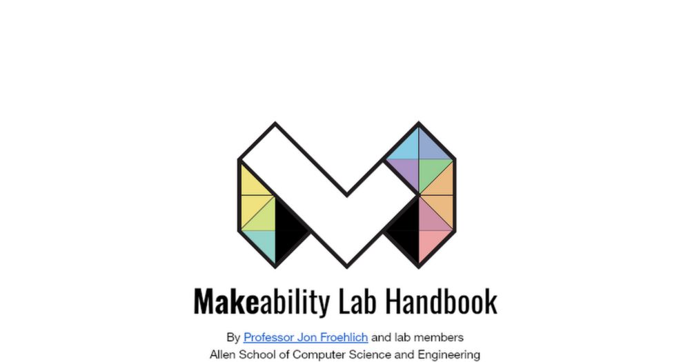
Makeability Lab Handbook
Makeability Lab Handbook By Professor Jon Froehlich and lab members
Allen School of Computer Science and Engineering
University of Washington Welcome to the Makeability Lab! 👋 We are so happy that yo...
docs.google.com
August 3, 2025 at 10:09 PM
As I start building infrastructure for year 2 of my growing group, a shout-out to @jonfroehlich.bsky.social and the @makeabilitylab.bsky.social handbook for helping me reason through the implicit processes & practices that should be more visible to our lab.
🔗 docs.google.com/document/d/1...
🔗 docs.google.com/document/d/1...
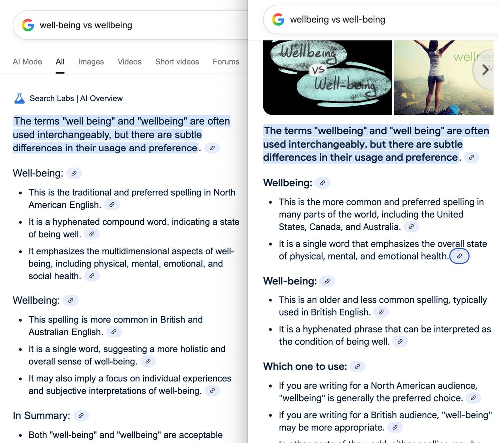
This wild AI example just happened to me + a colleague trying to decide on "wellbeing" or "well-being" for public material.
Depending on query framing, Google gives inverse recommendations for US audiences!
Almost as if its inferring my preference from order and trying to make me happy 🤔
Depending on query framing, Google gives inverse recommendations for US audiences!
Almost as if its inferring my preference from order and trying to make me happy 🤔
July 30, 2025 at 9:47 PM
This wild AI example just happened to me + a colleague trying to decide on "wellbeing" or "well-being" for public material.
Depending on query framing, Google gives inverse recommendations for US audiences!
Almost as if its inferring my preference from order and trying to make me happy 🤔
Depending on query framing, Google gives inverse recommendations for US audiences!
Almost as if its inferring my preference from order and trying to make me happy 🤔
As a fellow "personal & local vis" evangelist, this article is rich with great examples.

Data visualizations are some of the most powerful tools in a climate science communicator’s playbook. However, designing visuals that are clear to the public and policy makers is not a straightforward task, writes @rachitdubey.bsky.social .
So, what works?
So, what works?
How clear and simple data visualizations bring the climate crisis home
Climate change is a slow-moving disaster. We need graphics that capture both its pace and its impact.
thebulletin.org
July 30, 2025 at 2:51 AM
As a fellow "personal & local vis" evangelist, this article is rich with great examples.
ChatGPT is out here gifting my research to other folk today...
> "Studies like “Data is Personal” (Kovacs et al., 2019) show that data framed to reflect local or personal experience increases trust and perceived relevance."
(unfortunately, I'm actually flattered it surfaced in an unrelated query)
> "Studies like “Data is Personal” (Kovacs et al., 2019) show that data framed to reflect local or personal experience increases trust and perceived relevance."
(unfortunately, I'm actually flattered it surfaced in an unrelated query)
July 29, 2025 at 3:09 AM
ChatGPT is out here gifting my research to other folk today...
> "Studies like “Data is Personal” (Kovacs et al., 2019) show that data framed to reflect local or personal experience increases trust and perceived relevance."
(unfortunately, I'm actually flattered it surfaced in an unrelated query)
> "Studies like “Data is Personal” (Kovacs et al., 2019) show that data framed to reflect local or personal experience increases trust and perceived relevance."
(unfortunately, I'm actually flattered it surfaced in an unrelated query)