


Evan Peck
@peck.phd
🦬🏔️ @cuboulder.info science prof
Vis / HCI - Designing data for the public.
📊❤️ PI @informationvisions.bsky.social
Previously: Bucknell CS prof, Tufts CS PhD
🔗 https://peck.phd/
Vis / HCI - Designing data for the public.
📊❤️ PI @informationvisions.bsky.social
Previously: Bucknell CS prof, Tufts CS PhD
🔗 https://peck.phd/
My life can be summed up as "same logo, different colors"
🦬 I grew up in upstate NY (giant Bills fan)
🦬 I was a CS prof at Bucknell for almost 10 years
🦬 I am now an Info Sci prof at CU Boulder
🦬 I grew up in upstate NY (giant Bills fan)
🦬 I was a CS prof at Bucknell for almost 10 years
🦬 I am now an Info Sci prof at CU Boulder

November 14, 2025 at 7:43 PM
My life can be summed up as "same logo, different colors"
🦬 I grew up in upstate NY (giant Bills fan)
🦬 I was a CS prof at Bucknell for almost 10 years
🦬 I am now an Info Sci prof at CU Boulder
🦬 I grew up in upstate NY (giant Bills fan)
🦬 I was a CS prof at Bucknell for almost 10 years
🦬 I am now an Info Sci prof at CU Boulder

Can someone tell me what is going on with @economist.com's graphic department? This title also has nothing to do with the plotted data.
Are they using charts as clickbait for the article?
Are they using charts as clickbait for the article?

November 4, 2025 at 10:57 PM
Can someone tell me what is going on with @economist.com's graphic department? This title also has nothing to do with the plotted data.
Are they using charts as clickbait for the article?
Are they using charts as clickbait for the article?
This graph that the @economist.com is boosting on Facebook is irresponsible.
Titles create powerful frames in the way people interpret data (see: Kong et al 2019, www.hidykong.com/papers/Kong-...). This one tells a story that doesn't exist in the charted data.
Titles create powerful frames in the way people interpret data (see: Kong et al 2019, www.hidykong.com/papers/Kong-...). This one tells a story that doesn't exist in the charted data.

October 28, 2025 at 2:02 PM
This graph that the @economist.com is boosting on Facebook is irresponsible.
Titles create powerful frames in the way people interpret data (see: Kong et al 2019, www.hidykong.com/papers/Kong-...). This one tells a story that doesn't exist in the charted data.
Titles create powerful frames in the way people interpret data (see: Kong et al 2019, www.hidykong.com/papers/Kong-...). This one tells a story that doesn't exist in the charted data.
My town needs an intervention.
What if I told you all these charts came from just the first 5 pages of our monthly sales tax update? 😱
🔗 www.erieco.gov/ArchiveCente...
What if I told you all these charts came from just the first 5 pages of our monthly sales tax update? 😱
🔗 www.erieco.gov/ArchiveCente...


October 19, 2025 at 10:18 PM
My town needs an intervention.
What if I told you all these charts came from just the first 5 pages of our monthly sales tax update? 😱
🔗 www.erieco.gov/ArchiveCente...
What if I told you all these charts came from just the first 5 pages of our monthly sales tax update? 😱
🔗 www.erieco.gov/ArchiveCente...

The answer: So many that I stopped counting and did some math.
So if you guessed ~180, I both want to congratulate you and ask what kind of vis trauma you have experienced in the past.
So if you guessed ~180, I both want to congratulate you and ask what kind of vis trauma you have experienced in the past.

October 17, 2025 at 10:13 PM
The answer: So many that I stopped counting and did some math.
So if you guessed ~180, I both want to congratulate you and ask what kind of vis trauma you have experienced in the past.
So if you guessed ~180, I both want to congratulate you and ask what kind of vis trauma you have experienced in the past.

All kinds of color associations going on in this choropleth.
I think of red as either a high value (vis associations) or incredibly colorful leaves (tree associations). Here, it means "still nice, but declining" leaf colors 🤔
(I still kind of love the fall colors style 🍁)
I think of red as either a high value (vis associations) or incredibly colorful leaves (tree associations). Here, it means "still nice, but declining" leaf colors 🤔
(I still kind of love the fall colors style 🍁)

October 17, 2025 at 7:29 PM
All kinds of color associations going on in this choropleth.
I think of red as either a high value (vis associations) or incredibly colorful leaves (tree associations). Here, it means "still nice, but declining" leaf colors 🤔
(I still kind of love the fall colors style 🍁)
I think of red as either a high value (vis associations) or incredibly colorful leaves (tree associations). Here, it means "still nice, but declining" leaf colors 🤔
(I still kind of love the fall colors style 🍁)
Listen, everyone's mad that ChatGPT 5 can't capture the full nuance of their discipline. But what about its potential to rapidly develop compelling, engaging visuals for education?
It took me only a single prompt to create this emoji-based multiplication table for my child.
It took me only a single prompt to create this emoji-based multiplication table for my child.

August 11, 2025 at 2:52 PM
Listen, everyone's mad that ChatGPT 5 can't capture the full nuance of their discipline. But what about its potential to rapidly develop compelling, engaging visuals for education?
It took me only a single prompt to create this emoji-based multiplication table for my child.
It took me only a single prompt to create this emoji-based multiplication table for my child.
I learned about Bill Collins today, CU's 1st black football captain. This image captures Bill at the 1969 Liberty Bowl coin-toss, standing in front of an all-white, never-integrated Alabama team that brought 40 players to stand opposite him.
▶️ youtu.be/RBNX8L5RTIA?...
🔗 cubuffs.com/news/2025/8/...
▶️ youtu.be/RBNX8L5RTIA?...
🔗 cubuffs.com/news/2025/8/...

August 6, 2025 at 5:22 PM
I learned about Bill Collins today, CU's 1st black football captain. This image captures Bill at the 1969 Liberty Bowl coin-toss, standing in front of an all-white, never-integrated Alabama team that brought 40 players to stand opposite him.
▶️ youtu.be/RBNX8L5RTIA?...
🔗 cubuffs.com/news/2025/8/...
▶️ youtu.be/RBNX8L5RTIA?...
🔗 cubuffs.com/news/2025/8/...
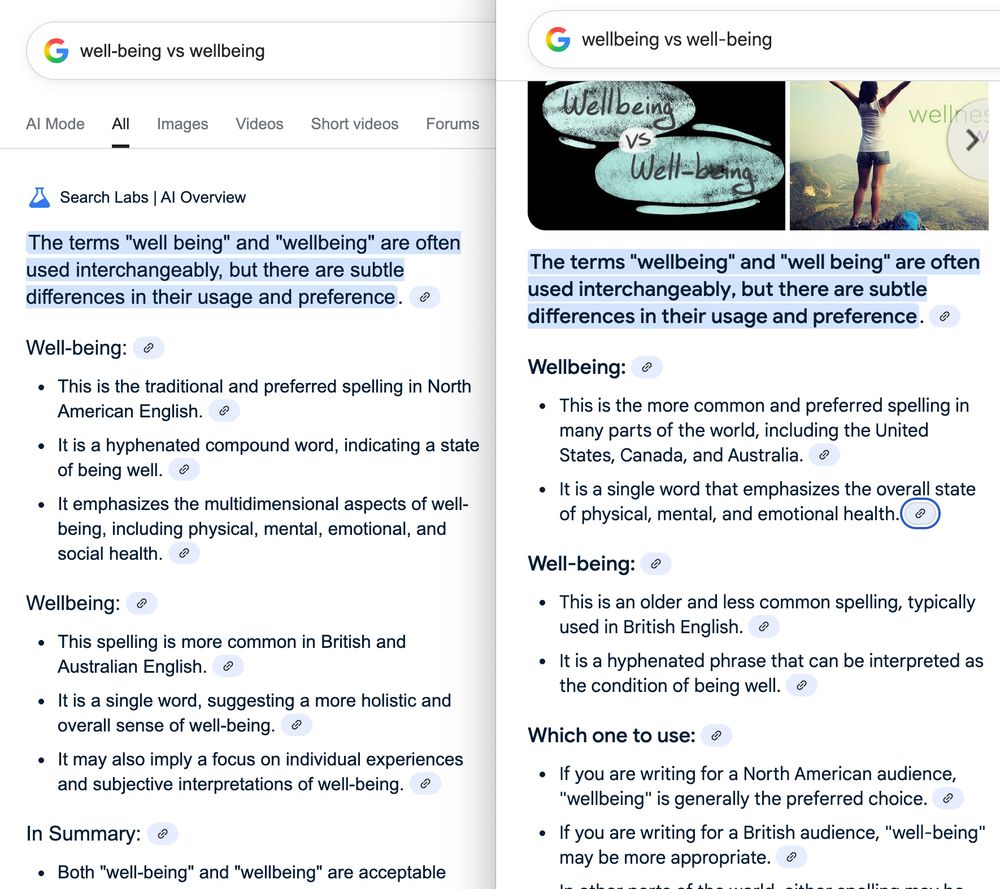
This wild AI example just happened to me + a colleague trying to decide on "wellbeing" or "well-being" for public material.
Depending on query framing, Google gives inverse recommendations for US audiences!
Almost as if its inferring my preference from order and trying to make me happy 🤔
Depending on query framing, Google gives inverse recommendations for US audiences!
Almost as if its inferring my preference from order and trying to make me happy 🤔
July 30, 2025 at 9:47 PM
This wild AI example just happened to me + a colleague trying to decide on "wellbeing" or "well-being" for public material.
Depending on query framing, Google gives inverse recommendations for US audiences!
Almost as if its inferring my preference from order and trying to make me happy 🤔
Depending on query framing, Google gives inverse recommendations for US audiences!
Almost as if its inferring my preference from order and trying to make me happy 🤔
Dug up the paper (left) the WPost vis (right) is based on to see how they presented the same data. It's fascinating to me how subtle color differences can shape the spatial patterns we see.
(I can't quite figure out why more of Houston seems to be rising in the paper than the WPost article 🤔)
(I can't quite figure out why more of Houston seems to be rising in the paper than the WPost article 🤔)


May 8, 2025 at 9:02 PM
Dug up the paper (left) the WPost vis (right) is based on to see how they presented the same data. It's fascinating to me how subtle color differences can shape the spatial patterns we see.
(I can't quite figure out why more of Houston seems to be rising in the paper than the WPost article 🤔)
(I can't quite figure out why more of Houston seems to be rising in the paper than the WPost article 🤔)
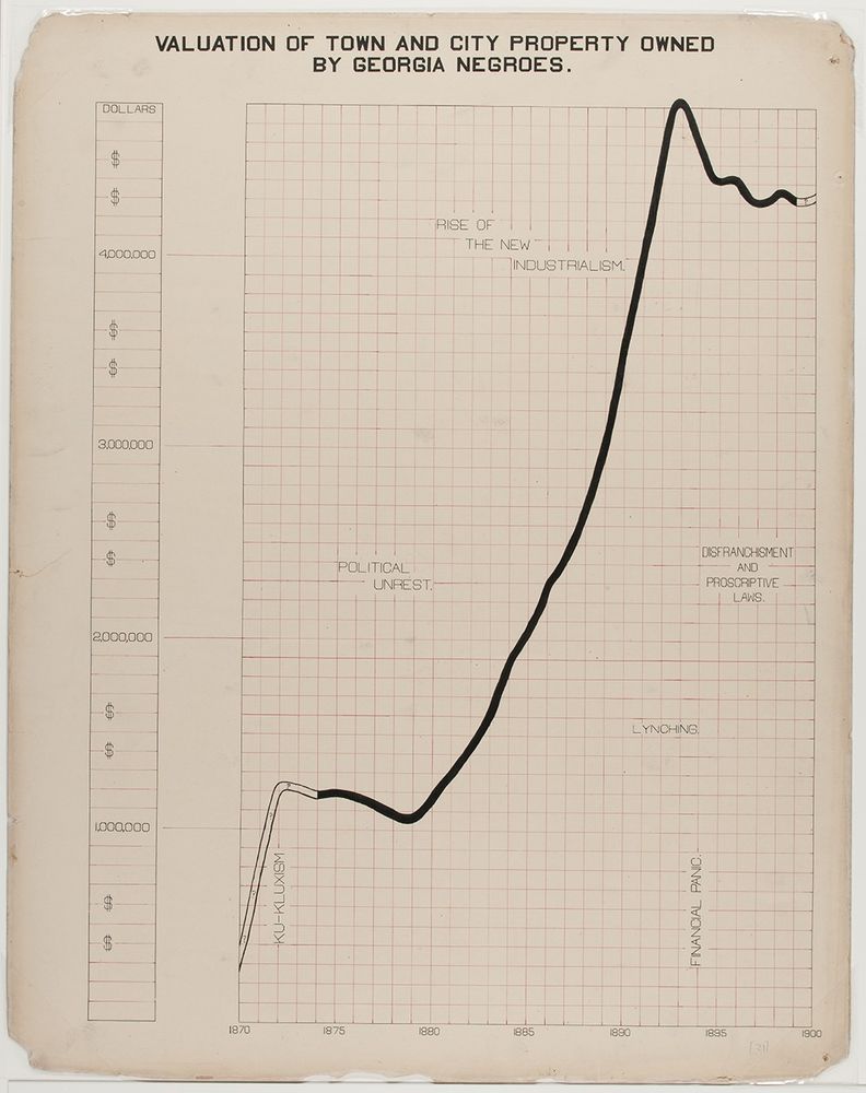
We often share W.E.B. Du Bois's more colorful work, but his annotations in charts like this ensured that positive-trending data did not mask America's social reality.
Give me more Du Bois designers right now.
Give me more Du Bois designers right now.
February 4, 2025 at 8:33 PM
We often share W.E.B. Du Bois's more colorful work, but his annotations in charts like this ensured that positive-trending data did not mask America's social reality.
Give me more Du Bois designers right now.
Give me more Du Bois designers right now.
Follow-up example that broke my brain for a second this morning: www.weather.gov/bou/winter
All that white? It actually represents a *low* probability of > 0.1" of snow.
Totally normal to use white as the low end of a scale.. but here, it just looks like the map is covered in snow
All that white? It actually represents a *low* probability of > 0.1" of snow.
Totally normal to use white as the low end of a scale.. but here, it just looks like the map is covered in snow

December 31, 2024 at 3:54 PM
Follow-up example that broke my brain for a second this morning: www.weather.gov/bou/winter
All that white? It actually represents a *low* probability of > 0.1" of snow.
Totally normal to use white as the low end of a scale.. but here, it just looks like the map is covered in snow
All that white? It actually represents a *low* probability of > 0.1" of snow.
Totally normal to use white as the low end of a scale.. but here, it just looks like the map is covered in snow
😀 Emojicon Creator 🔢
Icon arrays are a great way to see some kinds of data - often used in health, and broadly used to communicate probability.
But I get annoyed trying to prototype them, so I made a tiny tool to quickly make + share emoji-based icon arrays.
👉 emojicon-creator.netlify.app
Icon arrays are a great way to see some kinds of data - often used in health, and broadly used to communicate probability.
But I get annoyed trying to prototype them, so I made a tiny tool to quickly make + share emoji-based icon arrays.
👉 emojicon-creator.netlify.app
December 30, 2024 at 2:43 PM
😀 Emojicon Creator 🔢
Icon arrays are a great way to see some kinds of data - often used in health, and broadly used to communicate probability.
But I get annoyed trying to prototype them, so I made a tiny tool to quickly make + share emoji-based icon arrays.
👉 emojicon-creator.netlify.app
Icon arrays are a great way to see some kinds of data - often used in health, and broadly used to communicate probability.
But I get annoyed trying to prototype them, so I made a tiny tool to quickly make + share emoji-based icon arrays.
👉 emojicon-creator.netlify.app


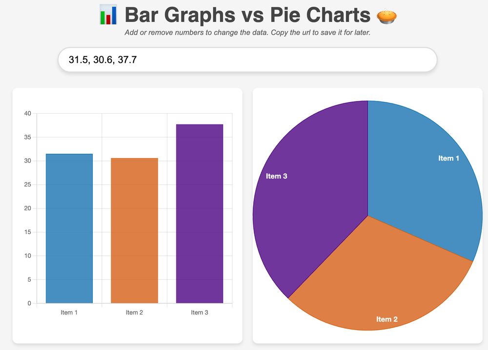
This is a good example where the "feel" of data can really vary by a simple chart change - from pie chart to bar graph.
While the 🥧 pie chart looks like 3 roughly-equal groups of people, the "didn't vote" group jumps out in a 📊 bar graph
Same data plotted below: barvpie.netlify.app?numbers=31.5...
While the 🥧 pie chart looks like 3 roughly-equal groups of people, the "didn't vote" group jumps out in a 📊 bar graph
Same data plotted below: barvpie.netlify.app?numbers=31.5...
December 22, 2024 at 1:39 AM
This is a good example where the "feel" of data can really vary by a simple chart change - from pie chart to bar graph.
While the 🥧 pie chart looks like 3 roughly-equal groups of people, the "didn't vote" group jumps out in a 📊 bar graph
Same data plotted below: barvpie.netlify.app?numbers=31.5...
While the 🥧 pie chart looks like 3 roughly-equal groups of people, the "didn't vote" group jumps out in a 📊 bar graph
Same data plotted below: barvpie.netlify.app?numbers=31.5...
📊 An old NOAA map of ❄️ probabilities is flying around socials that shows wonky color design
Old 🗺️ (left): It takes work to understand because the color lightness doesn't increase consistently with values (48% is light-blue, 52% dark-purple 😬)
New 🗺️ (right): lightness increases as values increase 👍
Old 🗺️ (left): It takes work to understand because the color lightness doesn't increase consistently with values (48% is light-blue, 52% dark-purple 😬)
New 🗺️ (right): lightness increases as values increase 👍


December 20, 2024 at 5:19 PM
📊 An old NOAA map of ❄️ probabilities is flying around socials that shows wonky color design
Old 🗺️ (left): It takes work to understand because the color lightness doesn't increase consistently with values (48% is light-blue, 52% dark-purple 😬)
New 🗺️ (right): lightness increases as values increase 👍
Old 🗺️ (left): It takes work to understand because the color lightness doesn't increase consistently with values (48% is light-blue, 52% dark-purple 😬)
New 🗺️ (right): lightness increases as values increase 👍
I suspect it depends what we mean by reliable. While those heuristics broadly hold, there is a lot of individual variability, even in basic graphs.
I like this example showing how graph rankings vary between people (@mjskay.com + @laneh.bsky.social research paper)
arxiv.org/pdf/2212.10533
I like this example showing how graph rankings vary between people (@mjskay.com + @laneh.bsky.social research paper)
arxiv.org/pdf/2212.10533

December 20, 2024 at 2:54 PM
I suspect it depends what we mean by reliable. While those heuristics broadly hold, there is a lot of individual variability, even in basic graphs.
I like this example showing how graph rankings vary between people (@mjskay.com + @laneh.bsky.social research paper)
arxiv.org/pdf/2212.10533
I like this example showing how graph rankings vary between people (@mjskay.com + @laneh.bsky.social research paper)
arxiv.org/pdf/2212.10533
In a July article from the @nytimes.com also on home insurances, that same dotted pattern is labelled as "Low or No Data" in the legend (vs. "State rate shown" today).
While I understand the shift in clarity, I really miss fronting that data integrity info vs. burying in a footnote.
While I understand the shift in clarity, I really miss fronting that data integrity info vs. burying in a footnote.

December 18, 2024 at 8:19 PM
In a July article from the @nytimes.com also on home insurances, that same dotted pattern is labelled as "Low or No Data" in the legend (vs. "State rate shown" today).
While I understand the shift in clarity, I really miss fronting that data integrity info vs. burying in a footnote.
While I understand the shift in clarity, I really miss fronting that data integrity info vs. burying in a footnote.
Interesting 📊 design choice by @nytimes.com:
Vis designers often use a color like gray for regions with little-to-no data. But "in counties with few policies reported", @nytimes.com used the state avg + a dotted texture
Imagine how different this would look + feel if those sections were gray! 🤔
Vis designers often use a color like gray for regions with little-to-no data. But "in counties with few policies reported", @nytimes.com used the state avg + a dotted texture
Imagine how different this would look + feel if those sections were gray! 🤔

December 18, 2024 at 8:11 PM
Interesting 📊 design choice by @nytimes.com:
Vis designers often use a color like gray for regions with little-to-no data. But "in counties with few policies reported", @nytimes.com used the state avg + a dotted texture
Imagine how different this would look + feel if those sections were gray! 🤔
Vis designers often use a color like gray for regions with little-to-no data. But "in counties with few policies reported", @nytimes.com used the state avg + a dotted texture
Imagine how different this would look + feel if those sections were gray! 🤔