


Eli Holder
@elibryan.bsky.social
Raleigh. How might we visualize people, fairly and equitably? Data / dataviz / design / psychology / research geek. He / him. Chaotic good. Follows Fizzlethorpe Bristlebane. Design / research / writing at https://3iap.com.
Pinned
Eli Holder
@elibryan.bsky.social
· Oct 17


Excited to share my new study with Lace Padilla, re: equity impacts of public health dataviz. #ieeevis 📊
The bad news: Conventional disparity charts may actively undermine health + health equity. They push misbeliefs about the people being visualized.
The good news: ...
osf.io/preprints/os...
The bad news: Conventional disparity charts may actively undermine health + health equity. They push misbeliefs about the people being visualized.
The good news: ...
osf.io/preprints/os...


Reposted by Eli Holder


Reposted by Eli Holder

My favorite sign at the Montclair NJ No Kings today:

October 18, 2025 at 7:29 PM
My favorite sign at the Montclair NJ No Kings today:
Reposted by Eli Holder

A trip to the doctor after an accident shouldn’t cost so much that you can’t pay your rent. We expanded Medicaid so working people can have peace of mind, knowing an illness or injury won’t put them in debt. DC Republicans including my opponent clearly disagree.
October 18, 2025 at 8:45 PM
A trip to the doctor after an accident shouldn’t cost so much that you can’t pay your rent. We expanded Medicaid so working people can have peace of mind, knowing an illness or injury won’t put them in debt. DC Republicans including my opponent clearly disagree.
Reposted by Eli Holder

eh, It wasn't that high up... and 4-year-olds can take it. 😜
But if you're looking for other good moments in the paper... I also recommend reading the acknowledgments closely.
But if you're looking for other good moments in the paper... I also recommend reading the acknowledgments closely.

October 15, 2025 at 11:49 AM
eh, It wasn't that high up... and 4-year-olds can take it. 😜
But if you're looking for other good moments in the paper... I also recommend reading the acknowledgments closely.
But if you're looking for other good moments in the paper... I also recommend reading the acknowledgments closely.
Reposted by Eli Holder

Turn off your phone’s “advertising ID” to make it harder for location data brokers to track you. (2/4)


October 2, 2025 at 11:13 PM
Turn off your phone’s “advertising ID” to make it harder for location data brokers to track you. (2/4)
Reposted by Eli Holder

1/ I’m Till Eckert, a ProPublica reporter. For the past 2 weeks, I’ve been going to the same NY immigration courthouse.
Nearly every time, I see ICE agents arresting immigrants. Today, a woman was slammed to the ground after begging officials not to take her husband away.
Thread 👇
Nearly every time, I see ICE agents arresting immigrants. Today, a woman was slammed to the ground after begging officials not to take her husband away.
Thread 👇
September 26, 2025 at 1:06 AM
1/ I’m Till Eckert, a ProPublica reporter. For the past 2 weeks, I’ve been going to the same NY immigration courthouse.
Nearly every time, I see ICE agents arresting immigrants. Today, a woman was slammed to the ground after begging officials not to take her husband away.
Thread 👇
Nearly every time, I see ICE agents arresting immigrants. Today, a woman was slammed to the ground after begging officials not to take her husband away.
Thread 👇
Reposted by Eli Holder

📊 The new book Dashboards That Deliver releases today. For authors Andy Cotgreave, Amanda Makulec, Jeffrey Shaffer, and Steve Wexler, this is the culmination of countless hard work.
@emiliaruzicka.bsky.social sat down with the authors to hear about their process.
nightingaledvs.com/behind-the-s...
@emiliaruzicka.bsky.social sat down with the authors to hear about their process.
nightingaledvs.com/behind-the-s...

Behind the Scenes: Dashboards That Deliver, Nightingale
Andy Cotgreave, Amanda Makulec, Jeffrey Shaffer, and Steve Wexler have a new book coming out on September 23, 2025—Dashboards That Deliver: How to...
nightingaledvs.com
September 23, 2025 at 2:36 PM
📊 The new book Dashboards That Deliver releases today. For authors Andy Cotgreave, Amanda Makulec, Jeffrey Shaffer, and Steve Wexler, this is the culmination of countless hard work.
@emiliaruzicka.bsky.social sat down with the authors to hear about their process.
nightingaledvs.com/behind-the-s...
@emiliaruzicka.bsky.social sat down with the authors to hear about their process.
nightingaledvs.com/behind-the-s...
Reposted by Eli Holder

Last year I wrote about the NCGOP leaderships multi-decade obsession with erasing LGBT people from UNC’s campus life for @triangleblogblog.bsky.social. Might need to update soon unfortunately. triangleblogblog.com/2024/05/05/t...

The long and eventful history of Tim Moore and Peter Hans’ animosity towards marginalized people - Triangle Blog Blog
A group civics blog covering town council, education, transportation, and recreation in Chapel Hill and Carrboro, NC.
triangleblogblog.com
September 18, 2025 at 1:45 PM
Last year I wrote about the NCGOP leaderships multi-decade obsession with erasing LGBT people from UNC’s campus life for @triangleblogblog.bsky.social. Might need to update soon unfortunately. triangleblogblog.com/2024/05/05/t...
Reposted by Eli Holder
Disney learned nothing from Andor.
September 18, 2025 at 5:05 AM
Disney learned nothing from Andor.
🤩📊 What a cool visual effect! Great composition from @nrennie.bsky.social

There was lots of data to play with for #TidyTuesday this week where we're looking at the power of different passports! ✈️
I decided to try out the idea of using small multiples and highlighting to untangle a spaghetti chart with lots of lines 📊
#RStats #DataViz #ggplot2
I decided to try out the idea of using small multiples and highlighting to untangle a spaghetti chart with lots of lines 📊
#RStats #DataViz #ggplot2

September 9, 2025 at 2:06 PM
🤩📊 What a cool visual effect! Great composition from @nrennie.bsky.social
The Times takes their horse race reporting about as seriously as you should... which is.... not at all. 🏇📊
I just had to check it for myself: the NYT truly only compressed Mamdani to fit into the mobile version, and none of the others. 📊 #dataviz
No matter the technical explanation, the could and should have been avoided.
No matter the technical explanation, the could and should have been avoided.
September 9, 2025 at 2:04 PM
The Times takes their horse race reporting about as seriously as you should... which is.... not at all. 🏇📊
Reposted by Eli Holder

Rosling’s insistance on looking beyond averages to see the world as it really is reminds me of the work of @elibryan.bsky.social and Cindy Xiong. 📊
nightingaledvs.com/unfair-compa...
nightingaledvs.com/unfair-compa...

September 1, 2025 at 11:40 AM
Rosling’s insistance on looking beyond averages to see the world as it really is reminds me of the work of @elibryan.bsky.social and Cindy Xiong. 📊
nightingaledvs.com/unfair-compa...
nightingaledvs.com/unfair-compa...
Fun sketches → Fun charts! 📊🎉


September 3, 2025 at 2:35 PM
Fun sketches → Fun charts! 📊🎉
Reposted by Eli Holder

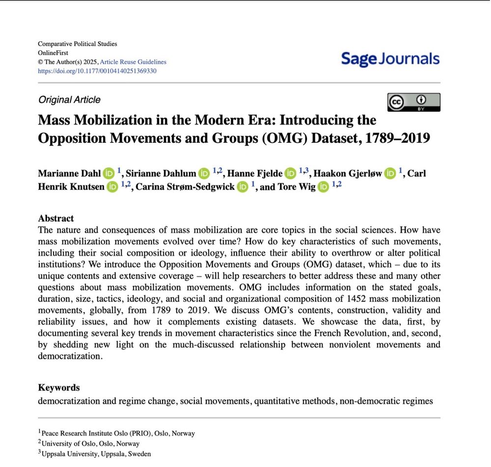
📊 New dataset and paper alert!
We’re proud to launch the Opposition Movements and Groups (OMG) Dataset, 1789–2019: a global dataset covering 1,452 mass mobilization movements. It was just published in Comparative Political Studies. journals.sagepub.com/doi/10.1177/...
Below follows a 🧵
We’re proud to launch the Opposition Movements and Groups (OMG) Dataset, 1789–2019: a global dataset covering 1,452 mass mobilization movements. It was just published in Comparative Political Studies. journals.sagepub.com/doi/10.1177/...
Below follows a 🧵
August 29, 2025 at 11:08 AM
📊 New dataset and paper alert!
We’re proud to launch the Opposition Movements and Groups (OMG) Dataset, 1789–2019: a global dataset covering 1,452 mass mobilization movements. It was just published in Comparative Political Studies. journals.sagepub.com/doi/10.1177/...
Below follows a 🧵
We’re proud to launch the Opposition Movements and Groups (OMG) Dataset, 1789–2019: a global dataset covering 1,452 mass mobilization movements. It was just published in Comparative Political Studies. journals.sagepub.com/doi/10.1177/...
Below follows a 🧵
Things to do at SIGGRAPH:
✅ Behind-the-scenes FX secrets for Superman!
✅ Never-before-seen Oscar-worthy animation shorts!!
🤔 90 minutes with me... on "woke dataviz," eugenics, public health charts, fighting data demagoguery?!?
A few new slides from my talk...
📊🧵...
✅ Behind-the-scenes FX secrets for Superman!
✅ Never-before-seen Oscar-worthy animation shorts!!
🤔 90 minutes with me... on "woke dataviz," eugenics, public health charts, fighting data demagoguery?!?
A few new slides from my talk...
📊🧵...


August 22, 2025 at 4:30 PM
Things to do at SIGGRAPH:
✅ Behind-the-scenes FX secrets for Superman!
✅ Never-before-seen Oscar-worthy animation shorts!!
🤔 90 minutes with me... on "woke dataviz," eugenics, public health charts, fighting data demagoguery?!?
A few new slides from my talk...
📊🧵...
✅ Behind-the-scenes FX secrets for Superman!
✅ Never-before-seen Oscar-worthy animation shorts!!
🤔 90 minutes with me... on "woke dataviz," eugenics, public health charts, fighting data demagoguery?!?
A few new slides from my talk...
📊🧵...
Reposted by Eli Holder

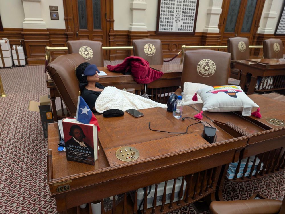
Texas State Rep. Nicole Collier spent the night on the House floor after refusing to agree ‘to round-the-clock monitoring by state troopers’ www.keranews.org/texas-news/2...
August 19, 2025 at 12:26 PM
Texas State Rep. Nicole Collier spent the night on the House floor after refusing to agree ‘to round-the-clock monitoring by state troopers’ www.keranews.org/texas-news/2...
Reposted by Eli Holder

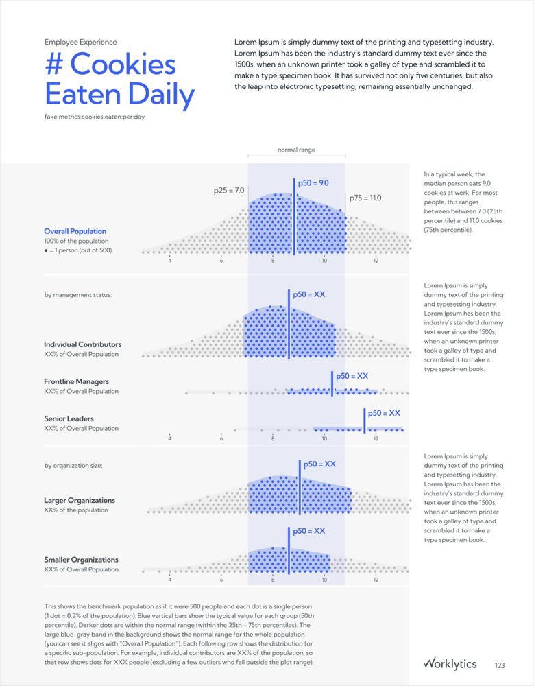
Excellent use of shown data in a business report.
How do people work at work?
Also: How do you get quantile dot plots to play nicely in a dataviz 📊 design system across an 89 page report, with hundreds of different plots, each with varying distributions?
New deep-dive case study on my recent project for Worklytics: 3iap.com/work/worklyt...
Also: How do you get quantile dot plots to play nicely in a dataviz 📊 design system across an 89 page report, with hundreds of different plots, each with varying distributions?
New deep-dive case study on my recent project for Worklytics: 3iap.com/work/worklyt...
Worklytics - Work Analytics Benchmark Report Design and Specialized Data Visualization
Design system, visualization, and automation for the Worklytics Annual Benchmarks Report.
3iap.com
July 31, 2025 at 4:25 AM
Excellent use of shown data in a business report.
Reposted by Eli Holder

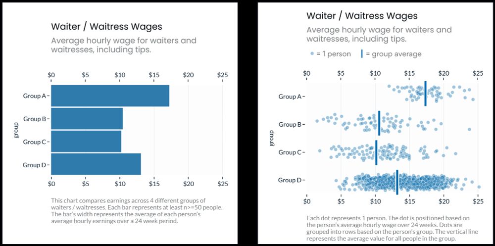
"In Experiment 1 we found that Jitter Plots reduced personal attribution (i.e. blame) by 7.0 points, relative to Bar Charts (p=0.0011)." @elibryan.bsky.social 3iap.com/dispersion-d...
July 30, 2025 at 7:00 PM
"In Experiment 1 we found that Jitter Plots reduced personal attribution (i.e. blame) by 7.0 points, relative to Bar Charts (p=0.0011)." @elibryan.bsky.social 3iap.com/dispersion-d...
How do people work at work?
Also: How do you get quantile dot plots to play nicely in a dataviz 📊 design system across an 89 page report, with hundreds of different plots, each with varying distributions?
New deep-dive case study on my recent project for Worklytics: 3iap.com/work/worklyt...
Also: How do you get quantile dot plots to play nicely in a dataviz 📊 design system across an 89 page report, with hundreds of different plots, each with varying distributions?
New deep-dive case study on my recent project for Worklytics: 3iap.com/work/worklyt...
Worklytics - Work Analytics Benchmark Report Design and Specialized Data Visualization
Design system, visualization, and automation for the Worklytics Annual Benchmarks Report.
3iap.com
July 30, 2025 at 6:22 PM
How do people work at work?
Also: How do you get quantile dot plots to play nicely in a dataviz 📊 design system across an 89 page report, with hundreds of different plots, each with varying distributions?
New deep-dive case study on my recent project for Worklytics: 3iap.com/work/worklyt...
Also: How do you get quantile dot plots to play nicely in a dataviz 📊 design system across an 89 page report, with hundreds of different plots, each with varying distributions?
New deep-dive case study on my recent project for Worklytics: 3iap.com/work/worklyt...
Recently gave a talk on boundary-making and dehumanization and the road to fascism. What took me 45 minutes to cover, Josh does in 3...

July 28, 2025 at 2:13 PM
Recently gave a talk on boundary-making and dehumanization and the road to fascism. What took me 45 minutes to cover, Josh does in 3...
Roy!
I have thought on it and prayed about it, and I have decided: I am running to be the next U.S. Senator from North Carolina.
July 28, 2025 at 1:29 PM
Roy!
Recommend for 📊 folks.
Our job isn't just plotting "true" data, we're also responsible for how people interpret and use our work.
Consequential thinking is something test designers take seriously and @claitusis.bsky.social and Meagan Karvonen's Principle #3 is a great starting point for others.
Our job isn't just plotting "true" data, we're also responsible for how people interpret and use our work.
Consequential thinking is something test designers take seriously and @claitusis.bsky.social and Meagan Karvonen's Principle #3 is a great starting point for others.

We recognize the impressive advances the universal design community has made to ensure that #universaldesign #UDL requirements permeate laws and design requirements that extend beyond educational assessment. Instead of abandoning these efforts, we reimagine -
onlinelibrary.wiley.com/doi/10.1111/...
onlinelibrary.wiley.com/doi/10.1111/...
July 23, 2025 at 4:23 PM
Recommend for 📊 folks.
Our job isn't just plotting "true" data, we're also responsible for how people interpret and use our work.
Consequential thinking is something test designers take seriously and @claitusis.bsky.social and Meagan Karvonen's Principle #3 is a great starting point for others.
Our job isn't just plotting "true" data, we're also responsible for how people interpret and use our work.
Consequential thinking is something test designers take seriously and @claitusis.bsky.social and Meagan Karvonen's Principle #3 is a great starting point for others.
Student growth charts from @damianbetebenner.bsky.social.
I like how seeing them as a pair (left is baseline, right is after intervention) gives an immediate gist sense of changed proportions.
dbetebenner.github.io/NCSA_2025_Co...
I like how seeing them as a pair (left is baseline, right is after intervention) gives an immediate gist sense of changed proportions.
dbetebenner.github.io/NCSA_2025_Co...


June 25, 2025 at 2:31 PM
Student growth charts from @damianbetebenner.bsky.social.
I like how seeing them as a pair (left is baseline, right is after intervention) gives an immediate gist sense of changed proportions.
dbetebenner.github.io/NCSA_2025_Co...
I like how seeing them as a pair (left is baseline, right is after intervention) gives an immediate gist sense of changed proportions.
dbetebenner.github.io/NCSA_2025_Co...
Reposted by Eli Holder

We were very happy to give this scoop to @marisakabas.bsky.social's The Handbasket because it is important to support independent journalists who are doing the hard work at this time. Giving this story to Marisa also guarantees it will be in The Washington Post verbatim exactly 48 hours later.

EXCLUSIVE — The Onion has a full-page ad in today’s NYT featuring part of an editorial calling out congressional fecklessness towards Trump. They also sent a copy of their latest issue to every lawmaker.
My report, with an excerpt from the full editorial: www.thehandbasket.co/p/exclusive-...
My report, with an excerpt from the full editorial: www.thehandbasket.co/p/exclusive-...

June 22, 2025 at 3:12 PM
We were very happy to give this scoop to @marisakabas.bsky.social's The Handbasket because it is important to support independent journalists who are doing the hard work at this time. Giving this story to Marisa also guarantees it will be in The Washington Post verbatim exactly 48 hours later.