


Jeremy Wilmer
@showmydata.org
2.1K followers
470 following
67 posts
Founder of http://ShowMyData.org. Co-leader of http://TestMyBrain.org. Graph interpretation research: https://www.sciencefriday.com/segments/bar-graph/. Faculty @Wellesley.
Posts
Media
Videos
Starter Packs


Reposted by Jeremy Wilmer


In my #Neuropsychology course, I use many patient videos to give examples of various consequences of brain injury. Some of these are really excellent and can be tricky to find, so I thought I'd share this doc with links to some of my favorites - a brief 🧵with some highlights. (more to come later!)

Neuropsychology_Psyc486_VideoLinks
docs.google.com
Jeremy Wilmer
@showmydata.org
· 12d

Reposted by Jeremy Wilmer


Reposted by Jeremy Wilmer


Jeremy Wilmer
@showmydata.org
· Sep 28

Psychologists are also definitely guilty of confusing change with treatment response, which is why I wrote about it here:
www.the100.ci/2025/01/22/r...
www.the100.ci/2025/01/22/r...

Reviewer notes: In a randomized experiment, the pre-post differences are not effect estimates
Reviewer notes are a new short format with brief explanations of basic ideas that might come in handy during (for example) the peer-review process. They are a great way to keep Julia from writing 10,0...
www.the100.ci
Reposted by Jeremy Wilmer


Running R code on your phone... that is definitely magic!!
webR also makes it super easy to create #rstats learning resources that students can work with using just a browser, no install drama needed.
jen-richmond.quarto.pub/barbarplots/
webR also makes it super easy to create #rstats learning resources that students can work with using just a browser, no install drama needed.
jen-richmond.quarto.pub/barbarplots/
Reposted by Jeremy Wilmer

Henry Grabar
@henrygrabar.bsky.social
· Aug 14

Countrywide natural experiment links built environment to physical activity - Nature
By analysing the smartphone data of 2,112,288 participants, in particular observing and comparing the activity of the same individual in two different environments, we find that increases in the walka...
www.nature.com


Reposted by Jeremy Wilmer

Jeremy Wilmer
@showmydata.org
· Aug 14

AIPedagogy.org from Harvard's metaLAB was already the best-designed introduction to AI for educators I knew of.
I return to it again and again for creative, critical assignment ideas.
Now it's even more user friendly and offers a space to compare chatbots and change their settings.
I return to it again and again for creative, critical assignment ideas.
Now it's even more user friendly and offers a space to compare chatbots and change their settings.
Home
Creative and critical engagement with AI in education AI Guide Looking for a step-by-step introduction to AI? Our guide is designed to help you understand what AI is, how it works, and what it can and...
AIPedagogy.org
Reposted by Jeremy Wilmer

Jeremy Wilmer
@showmydata.org
· Jul 31

How do people work at work?
Also: How do you get quantile dot plots to play nicely in a dataviz 📊 design system across an 89 page report, with hundreds of different plots, each with varying distributions?
New deep-dive case study on my recent project for Worklytics: 3iap.com/work/worklyt...
Also: How do you get quantile dot plots to play nicely in a dataviz 📊 design system across an 89 page report, with hundreds of different plots, each with varying distributions?
New deep-dive case study on my recent project for Worklytics: 3iap.com/work/worklyt...
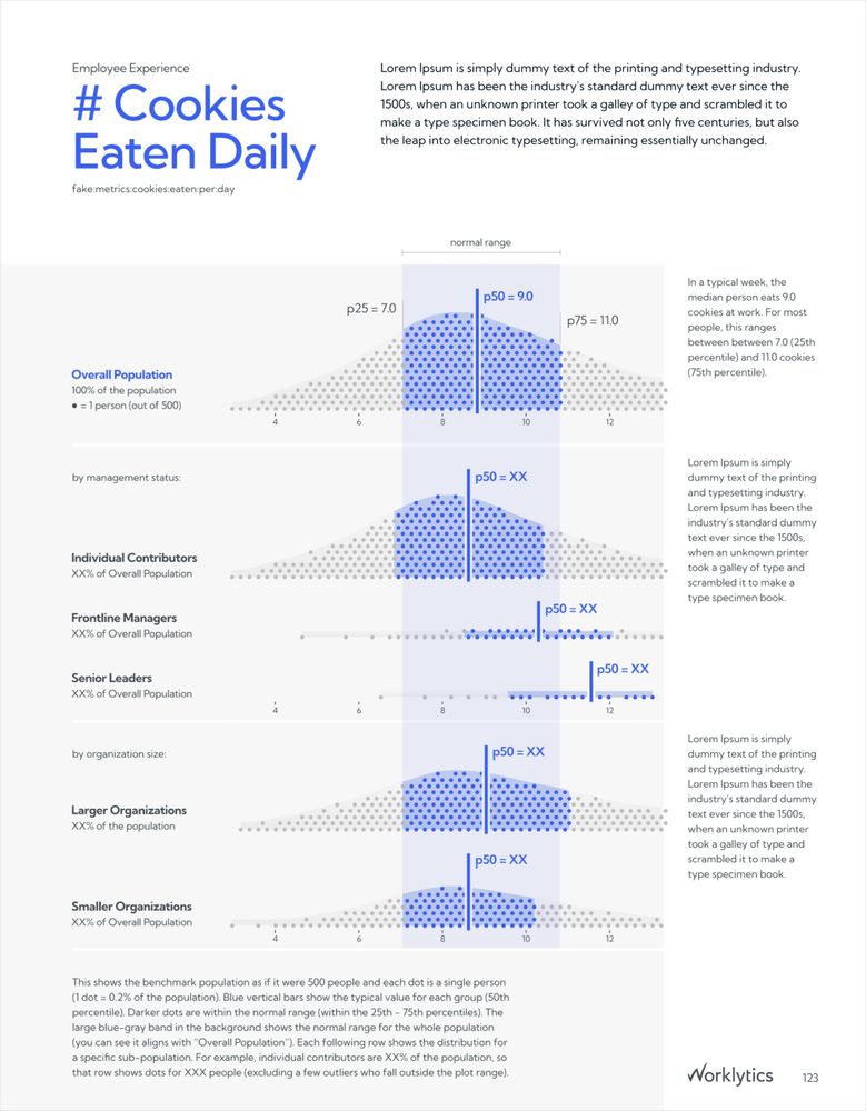
Worklytics - Work Analytics Benchmark Report Design and Specialized Data Visualization
Design system, visualization, and automation for the Worklytics Annual Benchmarks Report.
3iap.com
Reposted by Jeremy Wilmer


Reposted by Jeremy Wilmer

Reposted by Jeremy Wilmer


Jeremy Wilmer
@showmydata.org
· Jun 2

Joint w/@asinclair.bsky.social and the #SCIMaP team: brief correspondence in @nathumbehav.nature.com on the impact of NIH indirect cost cuts on the economy and employment, impacts that will only worsen given similar proposals for NSF/DOE + overall science proposal.
rdcu.be/eo3Hp
rdcu.be/eo3Hp
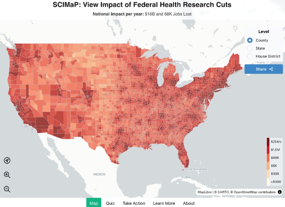
NIH indirect cost cuts will affect the economy and employment
Nature Human Behaviour - NIH indirect cost cuts will affect the economy and employment
rdcu.be

Reposted by Jeremy Wilmer


Reposted by Jeremy Wilmer

Ferric Fang, MD
@fangferric.bsky.social
· May 29

Cutting the NIH—The $8 Trillion Health Care Catastrophe
This JAMA Forum discusses the recent budget cuts to National Institutes of Health (NIH), the effects of these cuts on scientific research and health of individuals in the US, and the prospects for cha...
jamanetwork.com
Reposted by Jeremy Wilmer


Reposted by Jeremy Wilmer
