


Zack Labe
@zacklabe.com
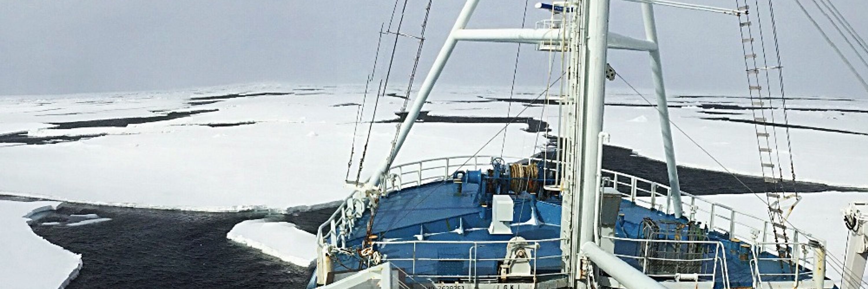
Climate Scientist at @climatecentral.org | PhD | Passionate about improving science communication through data-driven stories | Harrisburg, PA | https://zacklabe.com/
Views, thoughts, and opinions expressed here are only my own.
Views, thoughts, and opinions expressed here are only my own.
Pinned
Zack Labe
@zacklabe.com
· Nov 30
🧵 Looking for (polar) climate data visualizations? Start here! 📈📉🧪⚒️🌊
+ Polar climate change: zacklabe.com/arctic-sea-i...
+ Global climate change indicators: zacklabe.com/climate-chan...
+ #Arctic sea ice extent: zacklabe.com/arctic-sea-i...
+ #Antarctic sea ice: zacklabe.com/antarctic-se...
+ Polar climate change: zacklabe.com/arctic-sea-i...
+ Global climate change indicators: zacklabe.com/climate-chan...
+ #Arctic sea ice extent: zacklabe.com/arctic-sea-i...
+ #Antarctic sea ice: zacklabe.com/antarctic-se...
Last month observed unusually low sea ice around much of the outer edge of the #Arctic Ocean. The largest departures were across the Hudson Bay, Baffin Bay, and Barents Sea.
+ Concentration = fraction of sea ice
+ Graphic from zacklabe.com/arctic-sea-i...
+ Concentration = fraction of sea ice
+ Graphic from zacklabe.com/arctic-sea-i...

January 17, 2026 at 9:07 PM
Last month observed unusually low sea ice around much of the outer edge of the #Arctic Ocean. The largest departures were across the Hudson Bay, Baffin Bay, and Barents Sea.
+ Concentration = fraction of sea ice
+ Graphic from zacklabe.com/arctic-sea-i...
+ Concentration = fraction of sea ice
+ Graphic from zacklabe.com/arctic-sea-i...
Technical data update - I just went through and processed sea-ice concentration data from NOAA/NSIDC CDR *version 6*, which I will now use moving forward. This change is mostly due to AMSR2.
I previously used v5 for my visualizations. Differences are negligible. Learn more nsidc.org/data/user-re...
I previously used v5 for my visualizations. Differences are negligible. Learn more nsidc.org/data/user-re...
New version release: NOAA/NSIDC Sea Ice Concentration Data Records - CDR Version 6 and Near-Real-Time CDR Version 4 | National Snow and Ice Data Center
The National Snow and Ice Data Center (NSIDC) has released Version 6 of the NOAA/NSIDC Climate Data Record of Passive Microwave Sea Ice Concentration data set and Version 4 of the Near-Real-Time NO
nsidc.org
January 17, 2026 at 5:35 PM
Technical data update - I just went through and processed sea-ice concentration data from NOAA/NSIDC CDR *version 6*, which I will now use moving forward. This change is mostly due to AMSR2.
I previously used v5 for my visualizations. Differences are negligible. Learn more nsidc.org/data/user-re...
I previously used v5 for my visualizations. Differences are negligible. Learn more nsidc.org/data/user-re...
A look back at monthly temperature anomalies in the #Arctic during 2025...
Data from @copernicusecmwf.bsky.social ERA5 reanalysis.
Data from @copernicusecmwf.bsky.social ERA5 reanalysis.

January 17, 2026 at 3:11 PM
A look back at monthly temperature anomalies in the #Arctic during 2025...
Data from @copernicusecmwf.bsky.social ERA5 reanalysis.
Data from @copernicusecmwf.bsky.social ERA5 reanalysis.
My #Arctic sea-ice thickness and volume graphics are now updated for December 2025 (record low!) and for annual means through 2025 (record low!): zacklabe.com/arctic-sea-i... #SciComm #DataViz #OpenScience #OpenData

Arctic: Sea-Ice Thickness/Volume
Near real-time visualizations [Arctic Climate Seasonality and Variability] [Arctic Sea-Ice Extent and Concentration] [Arctic Sea-Ice Volume and Thickness] [Arctic Temperatures] [Antarctic Sea-Ice E…
zacklabe.com
January 17, 2026 at 12:41 PM
My #Arctic sea-ice thickness and volume graphics are now updated for December 2025 (record low!) and for annual means through 2025 (record low!): zacklabe.com/arctic-sea-i... #SciComm #DataViz #OpenScience #OpenData
The total volume of #Arctic sea ice has been at or near record low levels for every day since late October.
More graphics of thickness and volume: zacklabe.com/arctic-sea-i...
More graphics of thickness and volume: zacklabe.com/arctic-sea-i...

January 17, 2026 at 1:45 AM
The total volume of #Arctic sea ice has been at or near record low levels for every day since late October.
More graphics of thickness and volume: zacklabe.com/arctic-sea-i...
More graphics of thickness and volume: zacklabe.com/arctic-sea-i...
Friday ice update - #Arctic sea ice extent is currently the 2nd lowest on record (JAXA data)...
• about 420,000 km² below the 2010s mean
• about 960,000 km² below the 2000s mean
• about 1,530,000 km² below the 1990s mean
• about 1,950,000 km² below the 1980s mean
More: zacklabe.com/arctic-sea-i...
• about 420,000 km² below the 2010s mean
• about 960,000 km² below the 2000s mean
• about 1,530,000 km² below the 1990s mean
• about 1,950,000 km² below the 1980s mean
More: zacklabe.com/arctic-sea-i...

January 16, 2026 at 2:08 PM
Friday ice update - #Arctic sea ice extent is currently the 2nd lowest on record (JAXA data)...
• about 420,000 km² below the 2010s mean
• about 960,000 km² below the 2000s mean
• about 1,530,000 km² below the 1990s mean
• about 1,950,000 km² below the 1980s mean
More: zacklabe.com/arctic-sea-i...
• about 420,000 km² below the 2010s mean
• about 960,000 km² below the 2000s mean
• about 1,530,000 km² below the 1990s mean
• about 1,950,000 km² below the 1980s mean
More: zacklabe.com/arctic-sea-i...
Here's a closer look at the very sharp temperature anomaly contrast from northern Canada to Greenland in December 2025. Low sea ice in the Baffin Bay region is also contributing to this local relative warmth.
Data from doi.org/10.24381/cds...
Data from doi.org/10.24381/cds...

January 16, 2026 at 12:57 PM
Here's a closer look at the very sharp temperature anomaly contrast from northern Canada to Greenland in December 2025. Low sea ice in the Baffin Bay region is also contributing to this local relative warmth.
Data from doi.org/10.24381/cds...
Data from doi.org/10.24381/cds...
#Arctic climate rankings are now updated for December 2025: zacklabe.com/archive-2025/. Record low sea ice conditions!
#SciComm #DataViz #OpenScience #OpenData
#SciComm #DataViz #OpenScience #OpenData

Data Ranking Archive – 2025
December 2025 November 2025 October 2025 September 2025 August 2025 July 2025 June 2025 May 2025 April 2025 March 2025 February 2025 January 2025 Other climate year statistics: Data Archive –…
zacklabe.com
January 16, 2026 at 2:22 AM
#Arctic climate rankings are now updated for December 2025: zacklabe.com/archive-2025/. Record low sea ice conditions!
#SciComm #DataViz #OpenScience #OpenData
#SciComm #DataViz #OpenScience #OpenData
Trends in January #Arctic sea ice thickness over the 1979 to 2024 period. The greatest thinning (darkest red color) is found in the East Siberian Sea and around the Canadian Arctic Archipelago.
Simulated data from PIOMAS. For more information: doi.org/10.1175/JCLI....
Simulated data from PIOMAS. For more information: doi.org/10.1175/JCLI....

January 16, 2026 at 12:34 AM
Trends in January #Arctic sea ice thickness over the 1979 to 2024 period. The greatest thinning (darkest red color) is found in the East Siberian Sea and around the Canadian Arctic Archipelago.
Simulated data from PIOMAS. For more information: doi.org/10.1175/JCLI....
Simulated data from PIOMAS. For more information: doi.org/10.1175/JCLI....
An additional dataset in showing that global ocean heat content (0-2000 m depth) is surging off the charts after another new record in 2025... 🌊
Graphic/data (anomalies) from www.ncei.noaa.gov/access/globa...
Graphic/data (anomalies) from www.ncei.noaa.gov/access/globa...

January 15, 2026 at 1:29 PM
An additional dataset in showing that global ocean heat content (0-2000 m depth) is surging off the charts after another new record in 2025... 🌊
Graphic/data (anomalies) from www.ncei.noaa.gov/access/globa...
Graphic/data (anomalies) from www.ncei.noaa.gov/access/globa...
Temperature anomalies (departure from average) around our planet for the last month (left), 3 months (center), and 12 months (right)...
Data from doi.org/10.24381/cds...
Data from doi.org/10.24381/cds...

January 15, 2026 at 11:49 AM
Temperature anomalies (departure from average) around our planet for the last month (left), 3 months (center), and 12 months (right)...
Data from doi.org/10.24381/cds...
Data from doi.org/10.24381/cds...
December 2025 was the 5th warmest December on record globally. This month was about 1.42°C above the 1850-1900 pre-industrial average. Note the sharp temperature anomaly contrast across North America!
Summary of month from @copernicusecmwf.bsky.social: climate.copernicus.eu/surface-air-... 🌊🧪⚒️
Summary of month from @copernicusecmwf.bsky.social: climate.copernicus.eu/surface-air-... 🌊🧪⚒️


January 15, 2026 at 12:46 AM
December 2025 was the 5th warmest December on record globally. This month was about 1.42°C above the 1850-1900 pre-industrial average. Note the sharp temperature anomaly contrast across North America!
Summary of month from @copernicusecmwf.bsky.social: climate.copernicus.eu/surface-air-... 🌊🧪⚒️
Summary of month from @copernicusecmwf.bsky.social: climate.copernicus.eu/surface-air-... 🌊🧪⚒️
Reposted by Zack Labe

Looking forward to the 106th Annual Meeting of the @ametsoc.org.
If you're one of the thousands attending, we'd love to see you at any or all of these listed below. And honestly? Just come say "howdy" anytime! We're always up for a good conversation and connecting.
See you in Houston! #AMS2026
If you're one of the thousands attending, we'd love to see you at any or all of these listed below. And honestly? Just come say "howdy" anytime! We're always up for a good conversation and connecting.
See you in Houston! #AMS2026


January 13, 2026 at 11:36 PM
Looking forward to the 106th Annual Meeting of the @ametsoc.org.
If you're one of the thousands attending, we'd love to see you at any or all of these listed below. And honestly? Just come say "howdy" anytime! We're always up for a good conversation and connecting.
See you in Houston! #AMS2026
If you're one of the thousands attending, we'd love to see you at any or all of these listed below. And honestly? Just come say "howdy" anytime! We're always up for a good conversation and connecting.
See you in Houston! #AMS2026
We continue to receive warning signs for our future. The data is in, and last year was the 3rd hottest on record for our planet...
+ Full report by @copernicusecmwf.bsky.social at climate.copernicus.eu/sites/defaul...
+ Full report by @copernicusecmwf.bsky.social at climate.copernicus.eu/sites/defaul...

January 14, 2026 at 12:43 PM
We continue to receive warning signs for our future. The data is in, and last year was the 3rd hottest on record for our planet...
+ Full report by @copernicusecmwf.bsky.social at climate.copernicus.eu/sites/defaul...
+ Full report by @copernicusecmwf.bsky.social at climate.copernicus.eu/sites/defaul...
Last year observed the 3rd warmest global average sea surface temperature on record. 🌊
Data from psl.noaa.gov/data/gridded...
Data from psl.noaa.gov/data/gridded...

January 14, 2026 at 1:26 AM
Last year observed the 3rd warmest global average sea surface temperature on record. 🌊
Data from psl.noaa.gov/data/gridded...
Data from psl.noaa.gov/data/gridded...
Hope you will join us next week! I'll be leading our next public webinar that will review 2025's global climate stats and extreme events.
We'll also be discussing the recent tally of 2025's billion-dollar disasters in the U.S. 🧪⚒️
➡️ Register in advance at climatecentral-org.zoom.us/webinar/regi...
We'll also be discussing the recent tally of 2025's billion-dollar disasters in the U.S. 🧪⚒️
➡️ Register in advance at climatecentral-org.zoom.us/webinar/regi...


January 13, 2026 at 3:51 PM
Hope you will join us next week! I'll be leading our next public webinar that will review 2025's global climate stats and extreme events.
We'll also be discussing the recent tally of 2025's billion-dollar disasters in the U.S. 🧪⚒️
➡️ Register in advance at climatecentral-org.zoom.us/webinar/regi...
We'll also be discussing the recent tally of 2025's billion-dollar disasters in the U.S. 🧪⚒️
➡️ Register in advance at climatecentral-org.zoom.us/webinar/regi...
Northern Greenland, the marginal ice zone, and southern Barents Sea have observed an increase in precipitation over the last few decades in January, while the Bering Sea and subpolar North Atlantic have seen a drying.
+ Data: psl.noaa.gov/data/gridded...
+ Info: arctic.noaa.gov/report-card/...
+ Data: psl.noaa.gov/data/gridded...
+ Info: arctic.noaa.gov/report-card/...

January 13, 2026 at 12:52 PM
Northern Greenland, the marginal ice zone, and southern Barents Sea have observed an increase in precipitation over the last few decades in January, while the Bering Sea and subpolar North Atlantic have seen a drying.
+ Data: psl.noaa.gov/data/gridded...
+ Info: arctic.noaa.gov/report-card/...
+ Data: psl.noaa.gov/data/gridded...
+ Info: arctic.noaa.gov/report-card/...
"In a reversal, the agency plans to calculate only the cost to industry when setting pollution limits, and not the monetary value of saving human lives, documents show."

Scoop: The EPA will no longer estimate the lives saved by reducing air pollution when writing clean-air regulations, according to documents reviewed by @nytimes.com.
Gift link: www.nytimes.com/2026/01/12/c...
Gift link: www.nytimes.com/2026/01/12/c...

E.P.A. to Stop Considering Lives Saved When Setting Rules on Air Pollution
www.nytimes.com
January 12, 2026 at 5:50 PM
"In a reversal, the agency plans to calculate only the cost to industry when setting pollution limits, and not the monetary value of saving human lives, documents show."
Monday ice update - #Arctic sea ice extent is currently the 4th lowest on record (JAXA data)...
• about 200,000 km² below the 2010s mean
• about 750,000 km² below the 2000s mean
• about 1,330,000 km² below the 1990s mean
• about 1,720,000 km² below the 1980s mean
More: zacklabe.com/arctic-sea-i...
• about 200,000 km² below the 2010s mean
• about 750,000 km² below the 2000s mean
• about 1,330,000 km² below the 1990s mean
• about 1,720,000 km² below the 1980s mean
More: zacklabe.com/arctic-sea-i...

January 12, 2026 at 1:48 PM
Monday ice update - #Arctic sea ice extent is currently the 4th lowest on record (JAXA data)...
• about 200,000 km² below the 2010s mean
• about 750,000 km² below the 2000s mean
• about 1,330,000 km² below the 1990s mean
• about 1,720,000 km² below the 1980s mean
More: zacklabe.com/arctic-sea-i...
• about 200,000 km² below the 2010s mean
• about 750,000 km² below the 2000s mean
• about 1,330,000 km² below the 1990s mean
• about 1,720,000 km² below the 1980s mean
More: zacklabe.com/arctic-sea-i...
Here are the latest monthly-averaged observations of global methane (CH₄; a potent greenhouse gas)...
September 2025 - 1940.59 ppb
September 2024 - 1934.39 ppb
+ Data: gml.noaa.gov/ccgg/trends_...
+ Learn more: doi.org/10.5194/essd...
September 2025 - 1940.59 ppb
September 2024 - 1934.39 ppb
+ Data: gml.noaa.gov/ccgg/trends_...
+ Learn more: doi.org/10.5194/essd...

January 12, 2026 at 12:55 PM
Here are the latest monthly-averaged observations of global methane (CH₄; a potent greenhouse gas)...
September 2025 - 1940.59 ppb
September 2024 - 1934.39 ppb
+ Data: gml.noaa.gov/ccgg/trends_...
+ Learn more: doi.org/10.5194/essd...
September 2025 - 1940.59 ppb
September 2024 - 1934.39 ppb
+ Data: gml.noaa.gov/ccgg/trends_...
+ Learn more: doi.org/10.5194/essd...
Carbon dioxide (CO₂) averaged about 427 ppm in December 2025
10 years ago December averaged about 402 ppm
Data available at gml.noaa.gov/ccgg/trends/
10 years ago December averaged about 402 ppm
Data available at gml.noaa.gov/ccgg/trends/

January 11, 2026 at 8:57 PM
Carbon dioxide (CO₂) averaged about 427 ppm in December 2025
10 years ago December averaged about 402 ppm
Data available at gml.noaa.gov/ccgg/trends/
10 years ago December averaged about 402 ppm
Data available at gml.noaa.gov/ccgg/trends/
#Arctic sea ice concentration trends in January are only confined to the outer edges of the Arctic Ocean, such as the Barents-Kara Seas, Greenland Sea, Baffin Bay, and Sea of Okhotsk.
Sea ice concentration = fraction of ice-cover. For more info: doi.org/10.1175/BAMS...
Sea ice concentration = fraction of ice-cover. For more info: doi.org/10.1175/BAMS...

January 11, 2026 at 6:48 PM
#Arctic sea ice concentration trends in January are only confined to the outer edges of the Arctic Ocean, such as the Barents-Kara Seas, Greenland Sea, Baffin Bay, and Sea of Okhotsk.
Sea ice concentration = fraction of ice-cover. For more info: doi.org/10.1175/BAMS...
Sea ice concentration = fraction of ice-cover. For more info: doi.org/10.1175/BAMS...
A summary overview showing the standardized anomalies of annual #Arctic sea ice extent by region - now updated through 2025
[Data via @nsidc.bsky.social; Graphic available at zacklabe.com/arctic-sea-i.... Bright blue = max year, bright red = min year, vertical lines = 2007/2012/2016/2020/2025]
[Data via @nsidc.bsky.social; Graphic available at zacklabe.com/arctic-sea-i.... Bright blue = max year, bright red = min year, vertical lines = 2007/2012/2016/2020/2025]

January 11, 2026 at 2:01 PM
A summary overview showing the standardized anomalies of annual #Arctic sea ice extent by region - now updated through 2025
[Data via @nsidc.bsky.social; Graphic available at zacklabe.com/arctic-sea-i.... Bright blue = max year, bright red = min year, vertical lines = 2007/2012/2016/2020/2025]
[Data via @nsidc.bsky.social; Graphic available at zacklabe.com/arctic-sea-i.... Bright blue = max year, bright red = min year, vertical lines = 2007/2012/2016/2020/2025]
While most of the #Arctic Ocean is predominately ice covered in January, the edges reveal warming at the ocean surface. Warming trends are particularly large in the North Atlantic and Davis Strait/Labrador Sea. 🌊
Data from OISSTv2.1. For more info: arctic.noaa.gov/report-card/...
Data from OISSTv2.1. For more info: arctic.noaa.gov/report-card/...

January 10, 2026 at 10:08 PM
While most of the #Arctic Ocean is predominately ice covered in January, the edges reveal warming at the ocean surface. Warming trends are particularly large in the North Atlantic and Davis Strait/Labrador Sea. 🌊
Data from OISSTv2.1. For more info: arctic.noaa.gov/report-card/...
Data from OISSTv2.1. For more info: arctic.noaa.gov/report-card/...
2025 was the hottest year on record for ocean heat content. Unfortunately, we now say this every year. 🥹
"In addition to setting a new record in 2025, the global
ocean continues to show sustained and intensified warming."
+ #OpenAccess Study: doi.org/10.1007/s003...
+ Data: www.ocean.iap.ac.cn
"In addition to setting a new record in 2025, the global
ocean continues to show sustained and intensified warming."
+ #OpenAccess Study: doi.org/10.1007/s003...
+ Data: www.ocean.iap.ac.cn

January 10, 2026 at 4:32 PM
2025 was the hottest year on record for ocean heat content. Unfortunately, we now say this every year. 🥹
"In addition to setting a new record in 2025, the global
ocean continues to show sustained and intensified warming."
+ #OpenAccess Study: doi.org/10.1007/s003...
+ Data: www.ocean.iap.ac.cn
"In addition to setting a new record in 2025, the global
ocean continues to show sustained and intensified warming."
+ #OpenAccess Study: doi.org/10.1007/s003...
+ Data: www.ocean.iap.ac.cn