


Typographica
@typographica.org
A review of #lettering and #typography. Since 2002. Posts by editor @stewf.com.
Primarily on Mastodon with many from the type community: https://typo.social/@typographica
Primarily on Mastodon with many from the type community: https://typo.social/@typographica
Pinned
Typographica
@typographica.org
· Jul 11

typo.social
Welcome to Typo.social! This is a Mastodon instance open to any typo and type enthusiastic. We are offering this service out of sheer courtesy without being held responsible for any disadvantages.
typo.social
Bluesky is a good alternative to X for the general public and some specific topics, especially politics. But for many communities and fields, a critical mass remains exclusively on Mastodon. Type designers and fans, for instance, have their own server with 679 active users: typo.social/directory.
Reposted by Typographica
Also! The Bay had me on to talk about CCA's closure. This team does such audio magic: we hear from a current BFA student just starting his second semester, I talk about the ripple effects on the art community, and we give the school the respect our mayor did not.
www.kqed.org/news/1207045...
www.kqed.org/news/1207045...

‘Nowhere Left to Go’: As California College of the Arts Closes, So Does a Pathway for Bay Area Artists | KQED
The school's closure stands to have a devastating impact on the Bay Area’s arts ecosystem
www.kqed.org
January 21, 2026 at 6:58 PM
Also! The Bay had me on to talk about CCA's closure. This team does such audio magic: we hear from a current BFA student just starting his second semester, I talk about the ripple effects on the art community, and we give the school the respect our mayor did not.
www.kqed.org/news/1207045...
www.kqed.org/news/1207045...
Look at the consistency between these two signs that hang on either side of the room at Don’s Donuts in Arcata, CA. That’s just solid brush work.
#SignPainting #Signs #Lettering #ArcataCA
#SignPainting #Signs #Lettering #ArcataCA

January 20, 2026 at 9:18 AM
Look at the consistency between these two signs that hang on either side of the room at Don’s Donuts in Arcata, CA. That’s just solid brush work.
#SignPainting #Signs #Lettering #ArcataCA
#SignPainting #Signs #Lettering #ArcataCA

Reposted by Typographica

Check out original scholarship from Tânia Raposo (@ainat_) on French publication designer Jeanine Fricker on our blog! Pictured works are from 1950s and 60s.
#PeoplesGDArchive
#GDHistory
#PeoplesGDArchive
#GDHistory


January 16, 2026 at 10:00 PM
Check out original scholarship from Tânia Raposo (@ainat_) on French publication designer Jeanine Fricker on our blog! Pictured works are from 1950s and 60s.
#PeoplesGDArchive
#GDHistory
#PeoplesGDArchive
#GDHistory
Reposted by Typographica

The first early announcement!
I’m going to run a Calligraphy Marathon ahead of St Valentine’s Day.
14 days. Writing a #name on request!
🎥 Video of every calligraphy work included ✍️
Options:
1. an original sent by mail — £10 + postage
2. a scan of the calligraphy piece — £8
#CalligraphyMarathon
I’m going to run a Calligraphy Marathon ahead of St Valentine’s Day.
14 days. Writing a #name on request!
🎥 Video of every calligraphy work included ✍️
Options:
1. an original sent by mail — £10 + postage
2. a scan of the calligraphy piece — £8
#CalligraphyMarathon

January 16, 2026 at 4:49 PM
The first early announcement!
I’m going to run a Calligraphy Marathon ahead of St Valentine’s Day.
14 days. Writing a #name on request!
🎥 Video of every calligraphy work included ✍️
Options:
1. an original sent by mail — £10 + postage
2. a scan of the calligraphy piece — £8
#CalligraphyMarathon
I’m going to run a Calligraphy Marathon ahead of St Valentine’s Day.
14 days. Writing a #name on request!
🎥 Video of every calligraphy work included ✍️
Options:
1. an original sent by mail — £10 + postage
2. a scan of the calligraphy piece — £8
#CalligraphyMarathon
CCA sells to Vanderbilt. The century-old school will close after the 2026–27 academic year.
Vanderbilt announcement: news.vanderbilt.edu/2026/01/13/v...
CCA president’s message: cca.edu/about/vander...
FAQ: portal.cca.edu/transition/c...
Vanderbilt announcement: news.vanderbilt.edu/2026/01/13/v...
CCA president’s message: cca.edu/about/vander...
FAQ: portal.cca.edu/transition/c...

Vanderbilt University to establish full-time academic campus in San Francisco
Vanderbilt University today announced plans to establish an academic campus in San Francisco beginning in 2027, subject to necessary regulatory approvals. This is a significant expansion of the univer...
news.vanderbilt.edu
January 13, 2026 at 7:31 PM
CCA sells to Vanderbilt. The century-old school will close after the 2026–27 academic year.
Vanderbilt announcement: news.vanderbilt.edu/2026/01/13/v...
CCA president’s message: cca.edu/about/vander...
FAQ: portal.cca.edu/transition/c...
Vanderbilt announcement: news.vanderbilt.edu/2026/01/13/v...
CCA president’s message: cca.edu/about/vander...
FAQ: portal.cca.edu/transition/c...
Reposted by Typographica

My very insightful friend Doug Wilson has started a new business that might help you out. It’s a rare thing to have an independent resource with such deep knowledge of typography and the type industry available to help you make sense of things. typeadvisor.com

Type Advisor: Your Font Consultant
Helping designers and users of fonts make the best decisions about type
typeadvisor.com
January 13, 2026 at 4:14 PM
My very insightful friend Doug Wilson has started a new business that might help you out. It’s a rare thing to have an independent resource with such deep knowledge of typography and the type industry available to help you make sense of things. typeadvisor.com
Reposted by Typographica

Remembering James Mosley
hyphenpress.co.uk/2026/01/07/r...
hyphenpress.co.uk/2026/01/07/r...

January 7, 2026 at 12:54 PM
Remembering James Mosley
hyphenpress.co.uk/2026/01/07/r...
hyphenpress.co.uk/2026/01/07/r...
A reminder that Apple’s (not Hoefler’s) Hoefler Text: is buggy. Hyphens and dashes are in the cap position (too high). It’s been reported many times on Apple’s feedback site and mentioned to various employees. Perhaps Apple has simply decided that this is not a bug.
#HoeflerText #Apple #Fonts
#HoeflerText #Apple #Fonts

January 9, 2026 at 6:26 AM
A reminder that Apple’s (not Hoefler’s) Hoefler Text: is buggy. Hyphens and dashes are in the cap position (too high). It’s been reported many times on Apple’s feedback site and mentioned to various employees. Perhaps Apple has simply decided that this is not a bug.
#HoeflerText #Apple #Fonts
#HoeflerText #Apple #Fonts
Reposted by Typographica

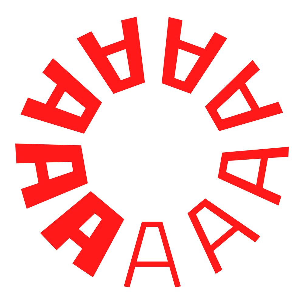
As requested, the tumbling alphabet needed to be hung in any orientation, so here we are:


January 7, 2026 at 2:30 PM
As requested, the tumbling alphabet needed to be hung in any orientation, so here we are:
Reposted by Typographica
This Just In: Chinese Lettering Manuals, 1930–1971
In our ongoing effort to expand the story of graphic design beyond the Western canon, we’re consulting experts and collecting objects in other scripts. Read Synoptic Office’s article on the latest collection: letterformarchive.org/news/this-ju...
In our ongoing effort to expand the story of graphic design beyond the Western canon, we’re consulting experts and collecting objects in other scripts. Read Synoptic Office’s article on the latest collection: letterformarchive.org/news/this-ju...

This Just In: Chinese Lettering Manuals, 1930–1971
Our new meishuzi collection reflects a period of significant cultural change in China, and provides an uncommon source of inspiration for contemporary lettering artists and type designers.
letterformarchive.org
January 6, 2026 at 5:26 AM
This Just In: Chinese Lettering Manuals, 1930–1971
In our ongoing effort to expand the story of graphic design beyond the Western canon, we’re consulting experts and collecting objects in other scripts. Read Synoptic Office’s article on the latest collection: letterformarchive.org/news/this-ju...
In our ongoing effort to expand the story of graphic design beyond the Western canon, we’re consulting experts and collecting objects in other scripts. Read Synoptic Office’s article on the latest collection: letterformarchive.org/news/this-ju...
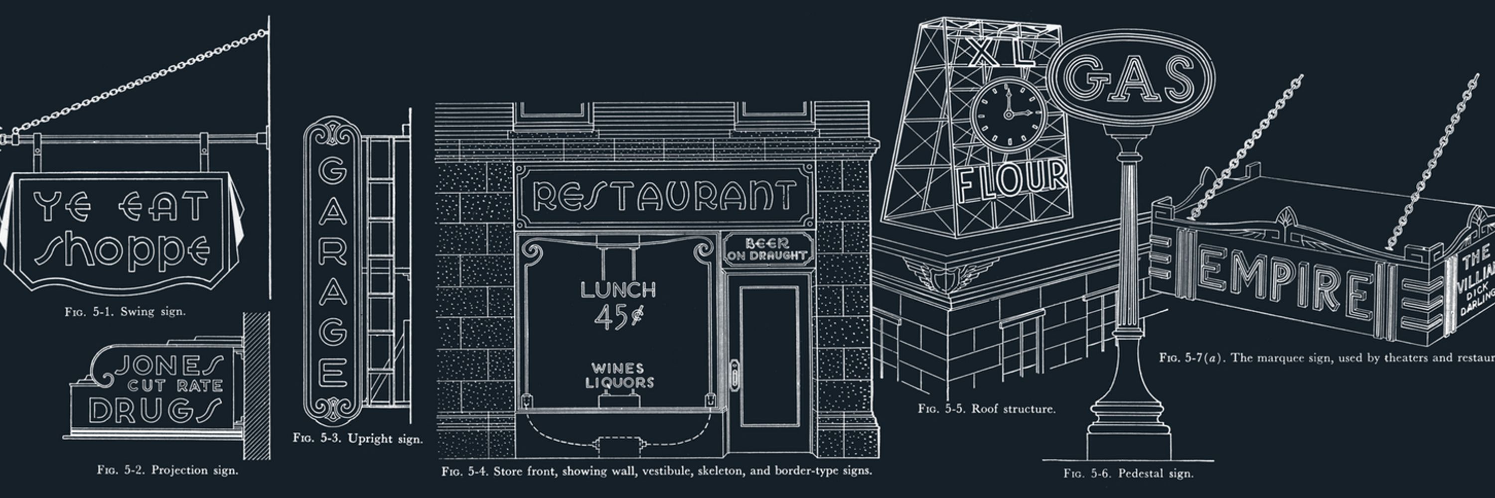
The Flickr album of my favorite signs just passed 100: www.flickr.com/photos/stewf...
Here’s the map view: www.flickr.com/photos/stewf...
As always, Flickr remains the best place to store, organize, and share photos.
#Signs #Lettering #Photography #Flickr
Here’s the map view: www.flickr.com/photos/stewf...
As always, Flickr remains the best place to store, organize, and share photos.
#Signs #Lettering #Photography #Flickr

Best of Signs
Explore this photo album by Stephen Coles on Flickr!
www.flickr.com
January 6, 2026 at 5:44 PM
The Flickr album of my favorite signs just passed 100: www.flickr.com/photos/stewf...
Here’s the map view: www.flickr.com/photos/stewf...
As always, Flickr remains the best place to store, organize, and share photos.
#Signs #Lettering #Photography #Flickr
Here’s the map view: www.flickr.com/photos/stewf...
As always, Flickr remains the best place to store, organize, and share photos.
#Signs #Lettering #Photography #Flickr
Highly professional adaptive reuse.
Pee Wee’s Pizza, San Leandro, CA.
2009 www.flickr.com/photos/tspau...
2025 maps.app.goo.gl/8sXiQKst6bVL...
#Signs #Neon #NeonSigns #Oakland #SanLeandro
Pee Wee’s Pizza, San Leandro, CA.
2009 www.flickr.com/photos/tspau...
2025 maps.app.goo.gl/8sXiQKst6bVL...
#Signs #Neon #NeonSigns #Oakland #SanLeandro


December 22, 2025 at 7:33 AM
Highly professional adaptive reuse.
Pee Wee’s Pizza, San Leandro, CA.
2009 www.flickr.com/photos/tspau...
2025 maps.app.goo.gl/8sXiQKst6bVL...
#Signs #Neon #NeonSigns #Oakland #SanLeandro
Pee Wee’s Pizza, San Leandro, CA.
2009 www.flickr.com/photos/tspau...
2025 maps.app.goo.gl/8sXiQKst6bVL...
#Signs #Neon #NeonSigns #Oakland #SanLeandro
Reposted by Typographica
From the Collection: Sylvie Vodáková’s Book Covers for Květy Poezie. Meet the Czech designer who shaped how generations of readers encountered poetry. A new blog post by Tanya George. letterformarchive.org/news/sylvie-...
#Lettering #BookCovers #Poetry #GraphicDesign #Illustration #CzechDesign
#Lettering #BookCovers #Poetry #GraphicDesign #Illustration #CzechDesign

From the Collection: Sylvie Vodáková’s Book Covers for Květy Poezie
Meet the Czech designer who shaped how generations of readers encountered poetry.
letterformarchive.org
December 21, 2025 at 2:22 AM
From the Collection: Sylvie Vodáková’s Book Covers for Květy Poezie. Meet the Czech designer who shaped how generations of readers encountered poetry. A new blog post by Tanya George. letterformarchive.org/news/sylvie-...
#Lettering #BookCovers #Poetry #GraphicDesign #Illustration #CzechDesign
#Lettering #BookCovers #Poetry #GraphicDesign #Illustration #CzechDesign
Want to use the Adobe Fonts service but don’t want to pay $70/month for Creative Cloud? You can subscribe to InCopy for $5/month (which includes Adobe Fonts): www.adobe.com/plans/creati...
Just learned this from Tom Phinney: typedrawers.com/discussion/c...
Just learned this from Tom Phinney: typedrawers.com/discussion/c...

Adobe plans and pricing for creative professionals
www.adobe.com
December 15, 2025 at 7:34 AM
Want to use the Adobe Fonts service but don’t want to pay $70/month for Creative Cloud? You can subscribe to InCopy for $5/month (which includes Adobe Fonts): www.adobe.com/plans/creati...
Just learned this from Tom Phinney: typedrawers.com/discussion/c...
Just learned this from Tom Phinney: typedrawers.com/discussion/c...
“For a division that promised better services, the NDS’s first releases are remarkably devoid of services altogether. Of the four (soon to be five) public-facing projects associated with NDS, none meaningfully connect users to a government system where any real task can be completed.”
I wrote a piece for @archpaper.com about 18F, the National Design Studio, and the insidiousness of “rebranding” government services instead of improving them. Thanks to my editors for letting me use the phrase “tread on me daddy” in an architecture publication 🫡
www.archpaper.com/2025/12/nati...
www.archpaper.com/2025/12/nati...
www.archpaper.com
December 15, 2025 at 6:48 AM
“For a division that promised better services, the NDS’s first releases are remarkably devoid of services altogether. Of the four (soon to be five) public-facing projects associated with NDS, none meaningfully connect users to a government system where any real task can be completed.”
Reposted by Typographica

If the State Dept doesn’t want to use Calibri or Times New Roman, they could always opt for Satanick, an 1890s knockoff of William Morris’s Troy by ATF


December 12, 2025 at 12:32 AM
If the State Dept doesn’t want to use Calibri or Times New Roman, they could always opt for Satanick, an 1890s knockoff of William Morris’s Troy by ATF
Reposted by Typographica

Ditching Calibri as a “wasteful diversity” font is both hilarious and sad.
Here's a quick reminder of what Calibri actually is and why it matters. (1/2)
Here's a quick reminder of what Calibri actually is and why it matters. (1/2)


December 11, 2025 at 5:22 PM
Ditching Calibri as a “wasteful diversity” font is both hilarious and sad.
Here's a quick reminder of what Calibri actually is and why it matters. (1/2)
Here's a quick reminder of what Calibri actually is and why it matters. (1/2)
The State Dept. font story is pretty silly, but I like that it gives the public a chance to learn more about a craft they encounter every day. Here’s the designer of Calibri, Luc(as) de Groot, on CNN talking parameters and spindly serifs. video.snapstream.net/Play/2UPcOhf...

What We Know With Max Foster - Luc de Groot
Powered by SnapStream Cloud Sharing
video.snapstream.net
December 11, 2025 at 3:56 PM
The State Dept. font story is pretty silly, but I like that it gives the public a chance to learn more about a craft they encounter every day. Here’s the designer of Calibri, Luc(as) de Groot, on CNN talking parameters and spindly serifs. video.snapstream.net/Play/2UPcOhf...
Reposted by Typographica

Flip-through book review of Stephen Cole's modern classic, The Anatomy of Type 👀 @stewf.com #typography
www.youtube.com
December 10, 2025 at 12:27 PM
Flip-through book review of Stephen Cole's modern classic, The Anatomy of Type 👀 @stewf.com #typography
Reposted by Typographica
Tezzo Suzuki calendars are on their way to the Archive! This year features 228 new numeral designs. reorder now to get yours by the end of the year. letterformarchive.org/shop/tezzo-s...

Tezzo Suzuki Calendar 26 (2026)
A nonprofit center for inspiration, education, and community in the graphic arts.
letterformarchive.org
December 10, 2025 at 8:31 AM
Tezzo Suzuki calendars are on their way to the Archive! This year features 228 new numeral designs. reorder now to get yours by the end of the year. letterformarchive.org/shop/tezzo-s...
Reposted by Typographica

We re-publish this article initially written in 2000 by Evert Bloemsma (1958-2005), and never published to our knowledge. Evert discusses the challenges and considerations involved in typeface design:
➽ typofonderie.com/gazette/look...
➽ typofonderie.com/gazette/look...

December 9, 2025 at 6:04 PM
We re-publish this article initially written in 2000 by Evert Bloemsma (1958-2005), and never published to our knowledge. Evert discusses the challenges and considerations involved in typeface design:
➽ typofonderie.com/gazette/look...
➽ typofonderie.com/gazette/look...
Reposted by Typographica

I collaborated with CMYK and Angela Kirkwood on the redesign of cult classic game Magical Athlete! I worked on the brand identity, art direction, and all the graphic design for components like cards & tokens. Now ask me how much math I had to do to make an evenly spaced game board with 31 spaces...


December 8, 2025 at 8:37 PM
I collaborated with CMYK and Angela Kirkwood on the redesign of cult classic game Magical Athlete! I worked on the brand identity, art direction, and all the graphic design for components like cards & tokens. Now ask me how much math I had to do to make an evenly spaced game board with 31 spaces...
A deep bow to @kellianderson.bsky.social for the astonishing ambition of Alphabet in Motion. My favorite pop-up mechanisms are those that clearly explain principles of type design that are difficult to show in static images: #KelliAnderson #PopupBooks #TypeDesign #Lettering

November 23, 2025 at 8:46 PM
A deep bow to @kellianderson.bsky.social for the astonishing ambition of Alphabet in Motion. My favorite pop-up mechanisms are those that clearly explain principles of type design that are difficult to show in static images: #KelliAnderson #PopupBooks #TypeDesign #Lettering
Reposted by Typographica

Last night’s opening reception of “Piet Zwart: Brand Architect” was a great beginning for a great exhibition at @letterformarchive.org. Well worth a visit!


November 23, 2025 at 5:32 PM
Last night’s opening reception of “Piet Zwart: Brand Architect” was a great beginning for a great exhibition at @letterformarchive.org. Well worth a visit!