


Typofonderie: fonts & typography
@typofonderie.com
https://typofonderie.com/links
Join any graphic designer, art director, web designer who use our fonts! Buy the best quality typefaces you need. Est. 1994.
👋 Annual graphic & typography design conference + learn type design @typeparis.com
Join any graphic designer, art director, web designer who use our fonts! Buy the best quality typefaces you need. Est. 1994.
👋 Annual graphic & typography design conference + learn type design @typeparis.com
Reposted by Typofonderie: fonts & typography
André Jammes 1928-2026. Collector-Historian of photographs and typography. His book on Romain du Roi in the 1960s is great. Imagine that André was at the first meeting of the ATypI and that he frequented Morison and Warde when they were in Paris.
He wrote about psfournier.typofonderie.com for us.
He wrote about psfournier.typofonderie.com for us.

January 18, 2026 at 6:38 PM
André Jammes 1928-2026. Collector-Historian of photographs and typography. His book on Romain du Roi in the 1960s is great. Imagine that André was at the first meeting of the ATypI and that he frequented Morison and Warde when they were in Paris.
He wrote about psfournier.typofonderie.com for us.
He wrote about psfournier.typofonderie.com for us.
Reposted by Typofonderie: fonts & typography

Note from Hans Baron stapled onto 1954 Jammes catalogue

January 18, 2026 at 7:07 PM
Note from Hans Baron stapled onto 1954 Jammes catalogue
André Jammes 1928-2026. Collector-Historian of photographs and typography. His book on Romain du Roi in the 1960s is great. Imagine that André was at the first meeting of the ATypI and that he frequented Morison and Warde when they were in Paris.
He wrote about psfournier.typofonderie.com for us.
He wrote about psfournier.typofonderie.com for us.
January 18, 2026 at 6:38 PM
André Jammes 1928-2026. Collector-Historian of photographs and typography. His book on Romain du Roi in the 1960s is great. Imagine that André was at the first meeting of the ATypI and that he frequented Morison and Warde when they were in Paris.
He wrote about psfournier.typofonderie.com for us.
He wrote about psfournier.typofonderie.com for us.
Reposted by Typofonderie: fonts & typography
The magic of conceptual diagrams always operates when it comes to a simple o. But when it comes to the s, or other letterforms, there is only experience and a good eye that make the difference, with theory.
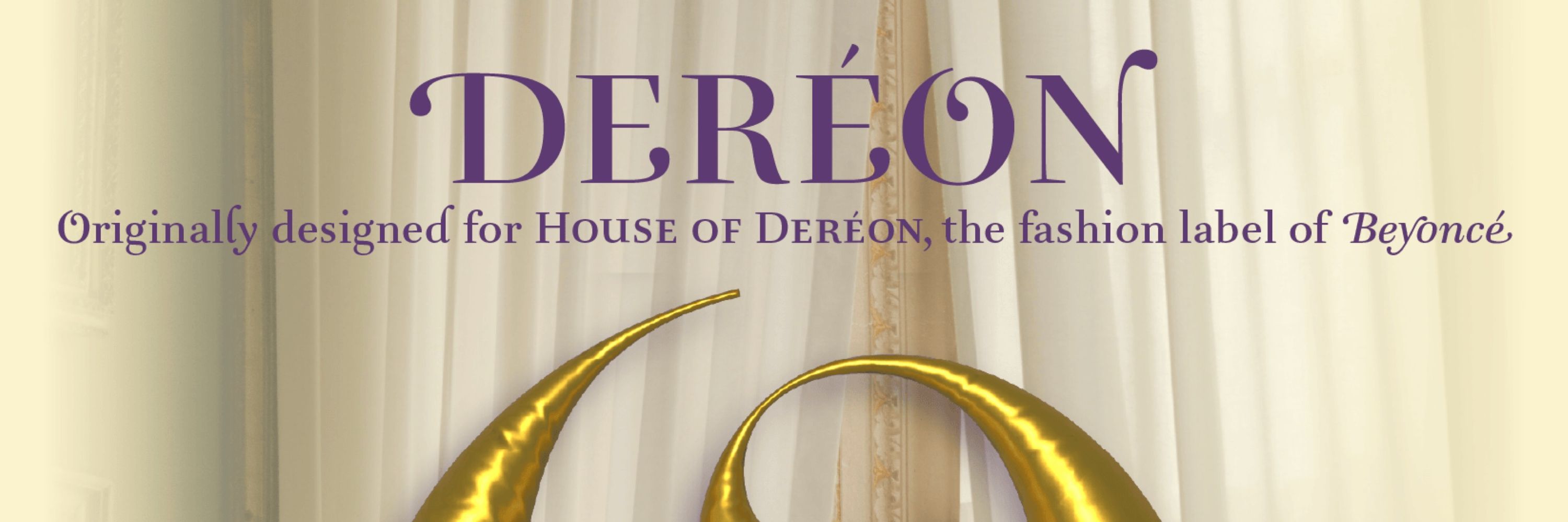
Aiglon, Arbale, Former: Regular and Italic.
1-2
Aiglon, Arbale, Former: Regular and Italic.
1-2

January 17, 2026 at 4:15 PM
The magic of conceptual diagrams always operates when it comes to a simple o. But when it comes to the s, or other letterforms, there is only experience and a good eye that make the difference, with theory.
Aiglon, Arbale, Former: Regular and Italic.
1-2
Aiglon, Arbale, Former: Regular and Italic.
1-2
Reposted by Typofonderie: fonts & typography

🚀 55 days left! Apply before the 14 March 2026 to submit your portfolio for #typeparis26 and have the chance to be selected typeparis.com/summer26
January 18, 2026 at 7:01 AM
🚀 55 days left! Apply before the 14 March 2026 to submit your portfolio for #typeparis26 and have the chance to be selected typeparis.com/summer26
Reposted by Typofonderie: fonts & typography

Because it seems so obvious once you see it: the counters more open and the letterforms feel more comfortable and natural. They breathe. The algorithmic ones look like they’ve been flattened. The latter makes sense since shifting the nodes like this is likely a type of projective geometry.
January 17, 2026 at 6:35 PM
Because it seems so obvious once you see it: the counters more open and the letterforms feel more comfortable and natural. They breathe. The algorithmic ones look like they’ve been flattened. The latter makes sense since shifting the nodes like this is likely a type of projective geometry.
The magic of conceptual diagrams always operates when it comes to a simple o. But when it comes to the s, or other letterforms, there is only experience and a good eye that make the difference, with theory.
Aiglon, Arbale, Former: Regular and Italic.
1-2
Aiglon, Arbale, Former: Regular and Italic.
1-2
January 17, 2026 at 4:15 PM
The magic of conceptual diagrams always operates when it comes to a simple o. But when it comes to the s, or other letterforms, there is only experience and a good eye that make the difference, with theory.
Aiglon, Arbale, Former: Regular and Italic.
1-2
Aiglon, Arbale, Former: Regular and Italic.
1-2
Reposted by Typofonderie: fonts & typography
🔥NEW🔥Former, Germano-Swiss humano-rationalism!
A néo-grotesque in 18 styles, designed by Raphaël Ronot, exclusively available at typofonderie.com
📡 Former is not just good-looking, it’s a fully-featured typographic tool: 787 glyphs by font! Whether you need small caps, alternates, ligatures…
A néo-grotesque in 18 styles, designed by Raphaël Ronot, exclusively available at typofonderie.com
📡 Former is not just good-looking, it’s a fully-featured typographic tool: 787 glyphs by font! Whether you need small caps, alternates, ligatures…
January 13, 2026 at 6:55 AM
🔥NEW🔥Former, Germano-Swiss humano-rationalism!
A néo-grotesque in 18 styles, designed by Raphaël Ronot, exclusively available at typofonderie.com
📡 Former is not just good-looking, it’s a fully-featured typographic tool: 787 glyphs by font! Whether you need small caps, alternates, ligatures…
A néo-grotesque in 18 styles, designed by Raphaël Ronot, exclusively available at typofonderie.com
📡 Former is not just good-looking, it’s a fully-featured typographic tool: 787 glyphs by font! Whether you need small caps, alternates, ligatures…
Reposted by Typofonderie: fonts & typography
Épreuve de caractères du Prosaic, @typofonderie.com, toner noir sur conqueror vergé blanc 100g/m², livret in-12, Paris, 2022. #typespecimen #typography #graphicdesign
www.instagram.com/p/DTiyeDiACR...
www.instagram.com/p/DTiyeDiACR...

January 15, 2026 at 7:47 PM
Épreuve de caractères du Prosaic, @typofonderie.com, toner noir sur conqueror vergé blanc 100g/m², livret in-12, Paris, 2022. #typespecimen #typography #graphicdesign
www.instagram.com/p/DTiyeDiACR...
www.instagram.com/p/DTiyeDiACR...
Reposted by Typofonderie: fonts & typography
Thanks to the Tokyo TDC, to feature the Prize nominee Arsen in your TDC36 annual.
typofonderie.com/fonts/arsen-...
typofonderie.com/fonts/arsen-...

January 15, 2026 at 1:29 PM
Thanks to the Tokyo TDC, to feature the Prize nominee Arsen in your TDC36 annual.
typofonderie.com/fonts/arsen-...
typofonderie.com/fonts/arsen-...
Reposted by Typofonderie: fonts & typography
Welcome to Laura Meseguer #typeparis26 guest critic typeparis.com/summer26 😍Learn type design in 6 weeks, from 2 June and ends 10 July 2026.🍾🇫🇷 Apply before the 14 March 2026 to be selected.
January 15, 2026 at 12:01 PM
Welcome to Laura Meseguer #typeparis26 guest critic typeparis.com/summer26 😍Learn type design in 6 weeks, from 2 June and ends 10 July 2026.🍾🇫🇷 Apply before the 14 March 2026 to be selected.
Thanks to the Tokyo TDC, to feature the Prize nominee Arsen in your TDC36 annual.
typofonderie.com/fonts/arsen-...
typofonderie.com/fonts/arsen-...
January 15, 2026 at 1:29 PM
Thanks to the Tokyo TDC, to feature the Prize nominee Arsen in your TDC36 annual.
typofonderie.com/fonts/arsen-...
typofonderie.com/fonts/arsen-...
Reposted by Typofonderie: fonts & typography
Welcome to Astrid Stavro. Speaker at #typeparisnow26 30 May 2026, Paris. 🛎 Earlybird tickets at €140. Limited quantity available (link on profile). Include access to all talks, snack, beverage, tote bag full of graphic & type goodies.
January 13, 2026 at 7:01 AM
Welcome to Astrid Stavro. Speaker at #typeparisnow26 30 May 2026, Paris. 🛎 Earlybird tickets at €140. Limited quantity available (link on profile). Include access to all talks, snack, beverage, tote bag full of graphic & type goodies.
Reposted by Typofonderie: fonts & typography
🤩 We’ve just published an interview of Martine. (link on profile) Speaker at #typeparisnow26 30 May 2026, Paris. 🛎 Earlybird tickets at €140. Limited quantity available!
January 14, 2026 at 7:00 AM
🤩 We’ve just published an interview of Martine. (link on profile) Speaker at #typeparisnow26 30 May 2026, Paris. 🛎 Earlybird tickets at €140. Limited quantity available!
🔥NEW🔥Former, Germano-Swiss humano-rationalism!
A néo-grotesque in 18 styles, designed by Raphaël Ronot, exclusively available at typofonderie.com
📡 Former is not just good-looking, it’s a fully-featured typographic tool: 787 glyphs by font! Whether you need small caps, alternates, ligatures…
A néo-grotesque in 18 styles, designed by Raphaël Ronot, exclusively available at typofonderie.com
📡 Former is not just good-looking, it’s a fully-featured typographic tool: 787 glyphs by font! Whether you need small caps, alternates, ligatures…
January 13, 2026 at 6:55 AM
🔥NEW🔥Former, Germano-Swiss humano-rationalism!
A néo-grotesque in 18 styles, designed by Raphaël Ronot, exclusively available at typofonderie.com
📡 Former is not just good-looking, it’s a fully-featured typographic tool: 787 glyphs by font! Whether you need small caps, alternates, ligatures…
A néo-grotesque in 18 styles, designed by Raphaël Ronot, exclusively available at typofonderie.com
📡 Former is not just good-looking, it’s a fully-featured typographic tool: 787 glyphs by font! Whether you need small caps, alternates, ligatures…
Yes, 1967.

Vintage TV Station identification WDR-SWF
The fixed stationary patterns WDR-SWF mark the beginning and end of a film whose length can be adapted to time requirements. Scanned from Gebrauchsgraphik, 8, 1967. designreviewed.com/artefacts/ge... #gebrauchsgraphik #vintagedesign #digitaldesign
The fixed stationary patterns WDR-SWF mark the beginning and end of a film whose length can be adapted to time requirements. Scanned from Gebrauchsgraphik, 8, 1967. designreviewed.com/artefacts/ge... #gebrauchsgraphik #vintagedesign #digitaldesign


January 11, 2026 at 10:29 AM
Yes, 1967.
Reposted by Typofonderie: fonts & typography
Welcome to Rainer Erich Scheichelbauert #typeparis26 instructor typeparis.com/summer26 😍Learn type design in 6 weeks, from 2 June and ends 10 July 2026.🍾🇫🇷 Apply before the 14 March 2026 to be selected.


January 11, 2026 at 7:05 AM
Welcome to Rainer Erich Scheichelbauert #typeparis26 instructor typeparis.com/summer26 😍Learn type design in 6 weeks, from 2 June and ends 10 July 2026.🍾🇫🇷 Apply before the 14 March 2026 to be selected.
Reposted by Typofonderie: fonts & typography
Many thanks to Robin Kinross for his post about James Mosley. 👀

January 8, 2026 at 11:27 PM
Many thanks to Robin Kinross for his post about James Mosley. 👀
Reposted by Typofonderie: fonts & typography
Searching for the right interpretation.

January 9, 2026 at 7:30 PM
Searching for the right interpretation.
Searching for the right interpretation.
January 9, 2026 at 7:30 PM
Searching for the right interpretation.
Many thanks to Robin Kinross for his post about James Mosley. 👀
January 8, 2026 at 11:27 PM
Many thanks to Robin Kinross for his post about James Mosley. 👀
Reposted by Typofonderie: fonts & typography
‼️The year starts well with the results of the Tokyo TDC Annual Awards 2026. We have Alembert and Caslonian who are Nominee Works in 2026.
🏆 Caslonian and Alembert have received awards at the Club des directeurs artistiques, 56e palmarès. And Caslonian at D&AD competition, a Graphite Pencil.
🏆 Caslonian and Alembert have received awards at the Club des directeurs artistiques, 56e palmarès. And Caslonian at D&AD competition, a Graphite Pencil.
January 7, 2026 at 6:01 PM
‼️The year starts well with the results of the Tokyo TDC Annual Awards 2026. We have Alembert and Caslonian who are Nominee Works in 2026.
🏆 Caslonian and Alembert have received awards at the Club des directeurs artistiques, 56e palmarès. And Caslonian at D&AD competition, a Graphite Pencil.
🏆 Caslonian and Alembert have received awards at the Club des directeurs artistiques, 56e palmarès. And Caslonian at D&AD competition, a Graphite Pencil.
January 7, 2026 at 6:01 PM
‼️The year starts well with the results of the Tokyo TDC Annual Awards 2026. We have Alembert and Caslonian who are Nominee Works in 2026.
🏆 Caslonian and Alembert have received awards at the Club des directeurs artistiques, 56e palmarès. And Caslonian at D&AD competition, a Graphite Pencil.
🏆 Caslonian and Alembert have received awards at the Club des directeurs artistiques, 56e palmarès. And Caslonian at D&AD competition, a Graphite Pencil.
Reposted by Typofonderie: fonts & typography
Beautiful Didot, Panthéon, Paris.

January 4, 2026 at 9:23 PM
Beautiful Didot, Panthéon, Paris.