


Typofonderie: fonts & typography
@typofonderie.com
https://typofonderie.com/links
Join any graphic designer, art director, web designer who use our fonts! Buy the best quality typefaces you need. Est. 1994.
👋 Annual graphic & typography design conference + learn type design @typeparis.com
Join any graphic designer, art director, web designer who use our fonts! Buy the best quality typefaces you need. Est. 1994.
👋 Annual graphic & typography design conference + learn type design @typeparis.com
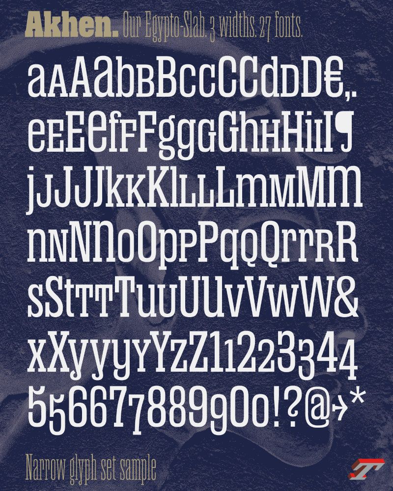
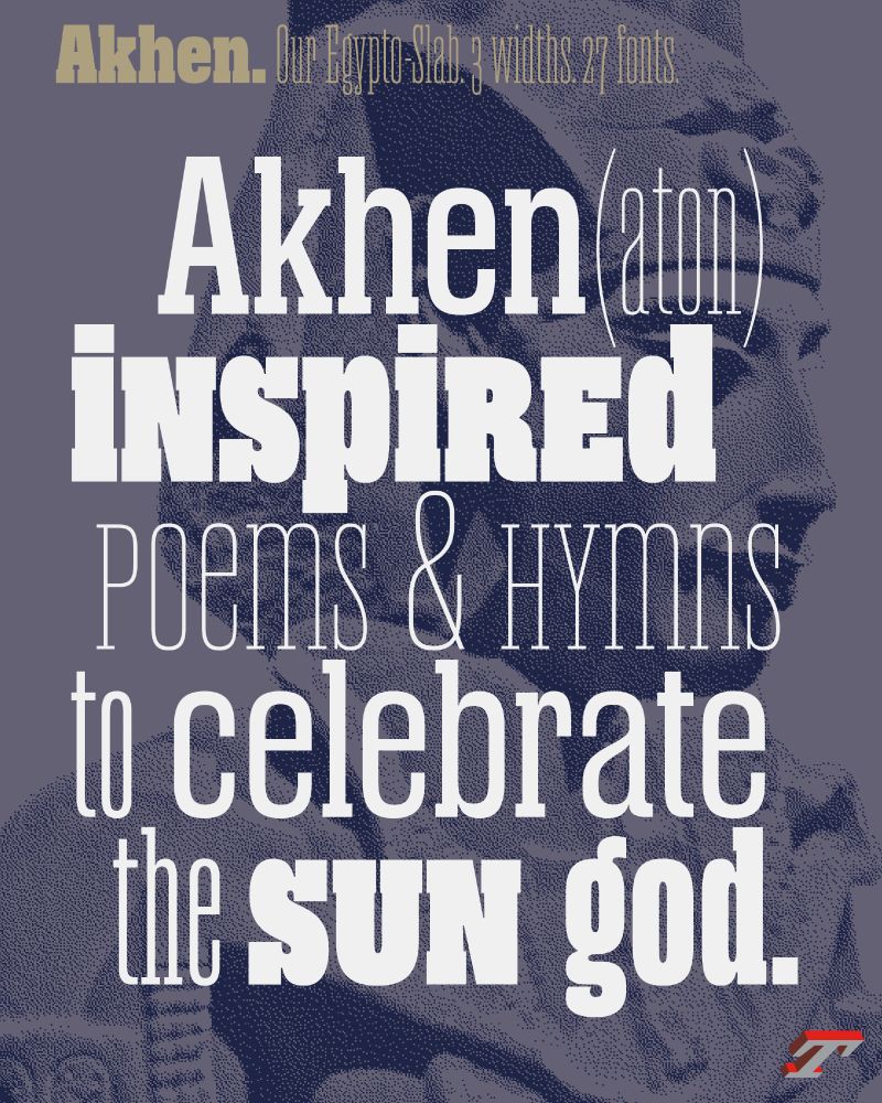
🐪Akhen, our Egypto-Slab🐪
➽ typofonderie.com/fonts/akhen-...
It offers versatility with OpenType features for stylistic combinations and a comprehensive glyph set. Its rigorous design and short serifs make it ideal for creating unique and visually appealing designs.
➽ typofonderie.com/fonts/akhen-...
It offers versatility with OpenType features for stylistic combinations and a comprehensive glyph set. Its rigorous design and short serifs make it ideal for creating unique and visually appealing designs.
November 30, 2025 at 9:18 PM
🐪Akhen, our Egypto-Slab🐪
➽ typofonderie.com/fonts/akhen-...
It offers versatility with OpenType features for stylistic combinations and a comprehensive glyph set. Its rigorous design and short serifs make it ideal for creating unique and visually appealing designs.
➽ typofonderie.com/fonts/akhen-...
It offers versatility with OpenType features for stylistic combinations and a comprehensive glyph set. Its rigorous design and short serifs make it ideal for creating unique and visually appealing designs.
Roman numerals instead?
Question: what about fractions in roman numerals?
Question: what about fractions in roman numerals?

November 27, 2025 at 9:48 AM
Roman numerals instead?
Question: what about fractions in roman numerals?
Question: what about fractions in roman numerals?
FF Balance, Evert Bloemsma. Specimen designed by himself (two printed version!), 1993. German-French-English.

November 24, 2025 at 4:32 PM
FF Balance, Evert Bloemsma. Specimen designed by himself (two printed version!), 1993. German-French-English.
Trying Apple Pencil Pro on iPad using Freeform app. Rather impressed by the quality of the tool and how it is comparable to a real calligraphic pen on paper.
Have a nice weekend! — @jf.porchez.com
Have a nice weekend! — @jf.porchez.com

November 21, 2025 at 6:47 PM
Trying Apple Pencil Pro on iPad using Freeform app. Rather impressed by the quality of the tool and how it is comparable to a real calligraphic pen on paper.
Have a nice weekend! — @jf.porchez.com
Have a nice weekend! — @jf.porchez.com
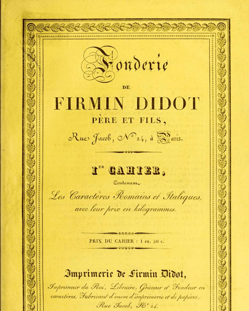
…but it was at the beginning of the following century, due to the typefaces of Firmin Didot and the editions of his brother, Pierre, that it began the saga that would dominate typography worldwide for decades.
➽ typofonderie.com/gazette/dido...
3-3
➽ typofonderie.com/gazette/dido...
3-3


November 19, 2025 at 2:06 PM
…but it was at the beginning of the following century, due to the typefaces of Firmin Didot and the editions of his brother, Pierre, that it began the saga that would dominate typography worldwide for decades.
➽ typofonderie.com/gazette/dido...
3-3
➽ typofonderie.com/gazette/dido...
3-3
Gazette: The didots or the typographic ideal of the 19th century
The Didot family established itself in the printing trade in the 18th century…
2-3
The Didot family established itself in the printing trade in the 18th century…
2-3


November 19, 2025 at 2:06 PM
Gazette: The didots or the typographic ideal of the 19th century
The Didot family established itself in the printing trade in the 18th century…
2-3
The Didot family established itself in the printing trade in the 18th century…
2-3
Read about Didot, the typeface and the family, François-Ambroise, Pierre, Jules…, as well punchcutters such Vafflard, Vibert.
➽ typofonderie.com/gazette/dido...
By Michel Wlassikoff, the eminent French historian of graphic and type history.
1-3
➽ typofonderie.com/gazette/dido...
By Michel Wlassikoff, the eminent French historian of graphic and type history.
1-3

November 19, 2025 at 2:06 PM
Read about Didot, the typeface and the family, François-Ambroise, Pierre, Jules…, as well punchcutters such Vafflard, Vibert.
➽ typofonderie.com/gazette/dido...
By Michel Wlassikoff, the eminent French historian of graphic and type history.
1-3
➽ typofonderie.com/gazette/dido...
By Michel Wlassikoff, the eminent French historian of graphic and type history.
1-3
We switched to Xerox color printers years ago, few models along the years. Genuine Adobe PostScript. Quite happy.

November 18, 2025 at 12:00 PM
We switched to Xerox color printers years ago, few models along the years. Genuine Adobe PostScript. Quite happy.
Contrasts!

November 16, 2025 at 10:20 AM
Contrasts!
Avant Garde, Alphatype, featuring its ligatures, Herb Lubalin.

November 14, 2025 at 9:22 AM
Avant Garde, Alphatype, featuring its ligatures, Herb Lubalin.
🐪Akhen, the Egypto-typographic remix
➽ typofonderie.com/gazette/Akhe...
Akhen pays homage to French égyptienne typefaces, offering versatility with OpenType features for stylistic combinations and a comprehensive glyph set. Discover the history of the first slab serifs and the references of Akhen.
➽ typofonderie.com/gazette/Akhe...
Akhen pays homage to French égyptienne typefaces, offering versatility with OpenType features for stylistic combinations and a comprehensive glyph set. Discover the history of the first slab serifs and the references of Akhen.

November 13, 2025 at 6:21 PM
🐪Akhen, the Egypto-typographic remix
➽ typofonderie.com/gazette/Akhe...
Akhen pays homage to French égyptienne typefaces, offering versatility with OpenType features for stylistic combinations and a comprehensive glyph set. Discover the history of the first slab serifs and the references of Akhen.
➽ typofonderie.com/gazette/Akhe...
Akhen pays homage to French égyptienne typefaces, offering versatility with OpenType features for stylistic combinations and a comprehensive glyph set. Discover the history of the first slab serifs and the references of Akhen.
@mjskay.com
As typeface designer of Altesse used by Palais de l’Élysée, I can tell you that a good copperplate should be programmed to have letters to connect contextuallly: 👀 Line 2.
In Altesse Pro, I have created 1500 glyphs to make this happen. @jf.porchez.com
typofonderie.com/fonts/altesse
As typeface designer of Altesse used by Palais de l’Élysée, I can tell you that a good copperplate should be programmed to have letters to connect contextuallly: 👀 Line 2.
In Altesse Pro, I have created 1500 glyphs to make this happen. @jf.porchez.com
typofonderie.com/fonts/altesse

November 12, 2025 at 7:48 AM
@mjskay.com
As typeface designer of Altesse used by Palais de l’Élysée, I can tell you that a good copperplate should be programmed to have letters to connect contextuallly: 👀 Line 2.
In Altesse Pro, I have created 1500 glyphs to make this happen. @jf.porchez.com
typofonderie.com/fonts/altesse
As typeface designer of Altesse used by Palais de l’Élysée, I can tell you that a good copperplate should be programmed to have letters to connect contextuallly: 👀 Line 2.
In Altesse Pro, I have created 1500 glyphs to make this happen. @jf.porchez.com
typofonderie.com/fonts/altesse

Collection of very typographic travel labels seen at the 1925-2025 Art Deco exhibition at the MAD, Paris.
madparis.fr/1925-2025-Ce...
madparis.fr/1925-2025-Ce...


November 9, 2025 at 4:50 PM
Collection of very typographic travel labels seen at the 1925-2025 Art Deco exhibition at the MAD, Paris.
madparis.fr/1925-2025-Ce...
madparis.fr/1925-2025-Ce...
You are a student (FR or EN) in a graphic design school, or type design specialized school, apply for a paid internship at Typofonderie.
➽ typofonderie.com/help/interns
From January 2026 for 2 months or more.
➽ typofonderie.com/help/interns
From January 2026 for 2 months or more.

November 7, 2025 at 2:27 PM
You are a student (FR or EN) in a graphic design school, or type design specialized school, apply for a paid internship at Typofonderie.
➽ typofonderie.com/help/interns
From January 2026 for 2 months or more.
➽ typofonderie.com/help/interns
From January 2026 for 2 months or more.
Original ATypI membership card of José Mendoza. Note he was member #23. ATypI logotype set in Meridien.


November 6, 2025 at 2:45 PM
Original ATypI membership card of José Mendoza. Note he was member #23. ATypI logotype set in Meridien.

🐪Let’s show you how Akhen g was designed!
Akhen, is our NEW Egypto-Slab remixed
➽ typofonderie.com/fonts/akhen-...
Akhen designed by Jean François Porchez, is new typeface family inspired by French 19th-century metal and wood types, featuring three narrow widths and a large range of weights.
Akhen, is our NEW Egypto-Slab remixed
➽ typofonderie.com/fonts/akhen-...
Akhen designed by Jean François Porchez, is new typeface family inspired by French 19th-century metal and wood types, featuring three narrow widths and a large range of weights.
November 4, 2025 at 4:11 PM
🐪Let’s show you how Akhen g was designed!
Akhen, is our NEW Egypto-Slab remixed
➽ typofonderie.com/fonts/akhen-...
Akhen designed by Jean François Porchez, is new typeface family inspired by French 19th-century metal and wood types, featuring three narrow widths and a large range of weights.
Akhen, is our NEW Egypto-Slab remixed
➽ typofonderie.com/fonts/akhen-...
Akhen designed by Jean François Porchez, is new typeface family inspired by French 19th-century metal and wood types, featuring three narrow widths and a large range of weights.
The original Wikipedia article about Sabon and the copy by Musk on Grokipedia.
The later copy should be renamed Copypedia?!
The later copy should be renamed Copypedia?!

October 28, 2025 at 8:25 AM
The original Wikipedia article about Sabon and the copy by Musk on Grokipedia.
The later copy should be renamed Copypedia?!
The later copy should be renamed Copypedia?!
Brasilia, started in 1958 by Albert Hollenstein & Albert Boton. One of the major influence of Astronef typeface.
Read about it: typofonderie.com/gazette/the-...
Read about it: typofonderie.com/gazette/the-...

October 26, 2025 at 4:17 PM
Brasilia, started in 1958 by Albert Hollenstein & Albert Boton. One of the major influence of Astronef typeface.
Read about it: typofonderie.com/gazette/the-...
Read about it: typofonderie.com/gazette/the-...
Discover a selection of projects set in PS Fournier, excellent text and titling typeface, which reflects the perfect French elegance.
➽ typofonderie.com/fonts-in-use...
— — —
#fontsinuse #typefaces #fonts #branding
➽ typofonderie.com/fonts-in-use...
— — —
#fontsinuse #typefaces #fonts #branding


October 20, 2025 at 4:45 PM
Discover a selection of projects set in PS Fournier, excellent text and titling typeface, which reflects the perfect French elegance.
➽ typofonderie.com/fonts-in-use...
— — —
#fontsinuse #typefaces #fonts #branding
➽ typofonderie.com/fonts-in-use...
— — —
#fontsinuse #typefaces #fonts #branding
Details x8 from bibliothèque Elzevirienne. Probably “Pierre Jannet typeface” 1856, who followed the earlier type revival by Louis Perrin (from 1846).
Few references about earliest revivals typofonderie.com/gazette/arse...
Few references about earliest revivals typofonderie.com/gazette/arse...
October 19, 2025 at 10:19 AM
Details x8 from bibliothèque Elzevirienne. Probably “Pierre Jannet typeface” 1856, who followed the earlier type revival by Louis Perrin (from 1846).
Few references about earliest revivals typofonderie.com/gazette/arse...
Few references about earliest revivals typofonderie.com/gazette/arse...
If you are looking for imposing, ultra-compressed, if not fat headlines, try our Akhen! 1/2
bsky.app/profile/typo...
bsky.app/profile/typo...


October 14, 2025 at 2:36 PM
If you are looking for imposing, ultra-compressed, if not fat headlines, try our Akhen! 1/2
bsky.app/profile/typo...
bsky.app/profile/typo...
Launched in 2025, Ahken was started in 2021. For the production of the typeface, Jean François Porchez has been accompanied by Jean-Baptiste Pernette, Svetlana Postikova, Burke Smithers, Malo Haffreingue. For the launch of Akhen: Benjamin Rouzand, Emma Rouguet where deeply involved.
4/4
4/4


October 14, 2025 at 12:41 PM
Launched in 2025, Ahken was started in 2021. For the production of the typeface, Jean François Porchez has been accompanied by Jean-Baptiste Pernette, Svetlana Postikova, Burke Smithers, Malo Haffreingue. For the launch of Akhen: Benjamin Rouzand, Emma Rouguet where deeply involved.
4/4
4/4
The name Akhen is a nod to this typographic history, paying tribute to this period and the fascination with Egyptian civilisation. Akhen is a shortened version of the name of Pharaoh Akhenaten. During the French Directory, antiquity was highly fashionable in French art.
3/4
3/4
October 14, 2025 at 12:41 PM
The name Akhen is a nod to this typographic history, paying tribute to this period and the fascination with Egyptian civilisation. Akhen is a shortened version of the name of Pharaoh Akhenaten. During the French Directory, antiquity was highly fashionable in French art.
3/4
3/4