


Transit Maps
@transitmap.net
A celebration of transit maps and diagrams from around the world. Visit the blog at transitmap.net. 🔁 Reposts appreciated!
Transit map prints sold at: transitmap.net/store
Transit mappers starter pack: https://go.bsky.app/32jXV41
Transit map prints sold at: transitmap.net/store
Transit mappers starter pack: https://go.bsky.app/32jXV41
New on the blog! A lovely little fantasy map for Honolulu's Skyline by Justin Kunimune.

Submission – Fantasy Map: Honolulu Skyline by Justin Kunimune
Submitted by Justin, who says: Hi, I'm a big fan of this blog! I've been working on a fantasy diagram for the Honolulu rapid transit system, Skyline, and wanted to submit it for you to review. As of this year, the system has one line that runs from East Kapolei (Kualakaʻi Station) to Kalihi (Kahauiki Station), with plans to extend it into downtown Honolulu.
transitmap.net
December 8, 2025 at 4:00 PM
New on the blog! A lovely little fantasy map for Honolulu's Skyline by Justin Kunimune.
Only a few hours left to grab a great deal on a great transit map print!
It's Cyber Monday – the last day to get 15% off all prints in the Transit Maps store before Christmas (no more sales this year)!
My original maps: transitmap.net/store/produc...
Vintage reproductions: transitmap.net/store/produc...
My original maps: transitmap.net/store/produc...
Vintage reproductions: transitmap.net/store/produc...


December 2, 2025 at 12:46 AM
Only a few hours left to grab a great deal on a great transit map print!
It's Cyber Monday – the last day to get 15% off all prints in the Transit Maps store before Christmas (no more sales this year)!
My original maps: transitmap.net/store/produc...
Vintage reproductions: transitmap.net/store/produc...
My original maps: transitmap.net/store/produc...
Vintage reproductions: transitmap.net/store/produc...
December 1, 2025 at 4:21 PM
It's Cyber Monday – the last day to get 15% off all prints in the Transit Maps store before Christmas (no more sales this year)!
My original maps: transitmap.net/store/produc...
Vintage reproductions: transitmap.net/store/produc...
My original maps: transitmap.net/store/produc...
Vintage reproductions: transitmap.net/store/produc...
It's Small Business Saturday, and Transit Maps is the very definition of "small," with just one employee (me!). Support independent creators this holiday season.
Time for a print sale! Get your Christmas shopping done early with one of the great maps in the Transit Maps store – 15% off everything through Monday, December 1!
transitmap.net/store/prints...
transitmap.net/store/prints...

November 29, 2025 at 5:37 PM
It's Small Business Saturday, and Transit Maps is the very definition of "small," with just one employee (me!). Support independent creators this holiday season.
Time for a print sale! Get your Christmas shopping done early with one of the great maps in the Transit Maps store – 15% off everything through Monday, December 1!
transitmap.net/store/prints...
transitmap.net/store/prints...
November 28, 2025 at 6:55 PM
Time for a print sale! Get your Christmas shopping done early with one of the great maps in the Transit Maps store – 15% off everything through Monday, December 1!
transitmap.net/store/prints...
transitmap.net/store/prints...
Well, that's a new change to my Amtrak as Subway Map that I didn't have on my bingo card...

Amtrak's San Joaquins service in California has been renamed as Gold Runner
media.amtrak.com/2025/11/amtr...
media.amtrak.com/2025/11/amtr...

Amtrak San Joaquins Becomes Gold Runner, Marking a New Era for California Passenger Rail - Amtrak Media
Stockton, Calif. – The San Joaquin Joint Powers Authority (SJJPA) is proud to introduce a new chapter in the history of California’s intercity passenger
media.amtrak.com
November 4, 2025 at 10:33 PM
Well, that's a new change to my Amtrak as Subway Map that I didn't have on my bingo card...
Leaving aside whether or not you actually need to show branches/alternate termini like this (I would say you don't), this is a pretty ugly way to apply hatching to the Silver Line. The DC Metro map has done this much better before.

November 4, 2025 at 4:12 AM
Leaving aside whether or not you actually need to show branches/alternate termini like this (I would say you don't), this is a pretty ugly way to apply hatching to the Silver Line. The DC Metro map has done this much better before.
This superb isochrone of travel time by rail in 1882 France has always been one of the most popular prints on the site – and with good reason!
transitmap.net/store/produc...
transitmap.net/store/produc...

November 4, 2025 at 3:29 AM
This superb isochrone of travel time by rail in 1882 France has always been one of the most popular prints on the site – and with good reason!
transitmap.net/store/produc...
transitmap.net/store/produc...
I'm printing up some maps tonight – add yours to my queue by placing an order now! I'll get out in the mail tomorrow.
transitmap.net/store/prints...
transitmap.net/store/prints...

November 4, 2025 at 2:59 AM
I'm printing up some maps tonight – add yours to my queue by placing an order now! I'll get out in the mail tomorrow.
transitmap.net/store/prints...
transitmap.net/store/prints...
Hey everyone! Time for a print giveaway – this awesome 1912 map of San Francisco was printed right at the end of a roll, and got skewed so the print isn't square on the sheet; otherwise it's perfect. You just pay shipping costs via PayPal or Venmo. First to DM me gets it! (US residents only, please)


October 31, 2025 at 4:04 AM
Hey everyone! Time for a print giveaway – this awesome 1912 map of San Francisco was printed right at the end of a roll, and got skewed so the print isn't square on the sheet; otherwise it's perfect. You just pay shipping costs via PayPal or Venmo. First to DM me gets it! (US residents only, please)
@trimet.org is on to a winner with this scarf that has all their old sector icons on it.
trimetgear.myshopify.com/products/tri...
trimetgear.myshopify.com/products/tri...

TriMet Winter Scarf - PREORDER
TriMet Winter Scarf The scarf is long and patterned on both sides with a sequence of our former sector symbols: the fish, raindrops, snowflake, beaver, leaf, rose and deer set against alternating burg...
trimetgear.myshopify.com
October 27, 2025 at 11:15 PM
@trimet.org is on to a winner with this scarf that has all their old sector icons on it.
trimetgear.myshopify.com/products/tri...
trimetgear.myshopify.com/products/tri...
Reposted by Transit Maps
🗺️ This circa 1925 #NYTMCollection map was the first to show #NYC's full rapid transit network after the system’s expansion in the 1920s.

October 25, 2025 at 6:35 PM
🗺️ This circa 1925 #NYTMCollection map was the first to show #NYC's full rapid transit network after the system’s expansion in the 1920s.
Reposted by Transit Maps
New on the blog! A really nice unofficial diagram of the tram network of The Hague, The Netherlands.

Submission – Unofficial Map: Trams of The Hague, The Netherlands by Hugo von der Thüsen
Submitted by the designer, Hugo, who says: I have always been ashamed of the official transit diagram for the tram system of The Hague [PDF link – Cam]. It’s a weird A4-shaped portrait diagram oriented so that the beach is at the top which is a strange choice as most residents of The Hague would tell you they think the beach is to the West/left.
transitmap.net
October 27, 2025 at 3:00 PM
New on the blog! A really nice unofficial diagram of the tram network of The Hague, The Netherlands.
New on the blog! A really nice unofficial diagram of the tram network of The Hague, The Netherlands.
Submission – Unofficial Map: Trams of The Hague, The Netherlands by Hugo von der Thüsen
Submitted by the designer, Hugo, who says: I have always been ashamed of the official transit diagram for the tram system of The Hague [PDF link – Cam]. It’s a weird A4-shaped portrait diagram oriented so that the beach is at the top which is a strange choice as most residents of The Hague would tell you they think the beach is to the West/left.
transitmap.net
October 27, 2025 at 3:00 PM
New on the blog! A really nice unofficial diagram of the tram network of The Hague, The Netherlands.
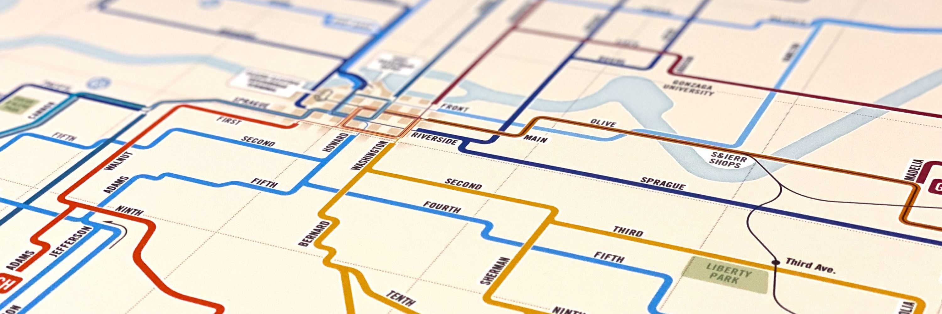
The KC Streetcar's Main Street extension opens today, and there's a new map for the occasion – is it up to the task?

Submission – Official Map: Kansas City Streetcar Extension, 2025
Submitted by Jon in KC, who says: This is the new KC Streetcar pylon map, updated to reflect the Main Street Extension that opens this Friday, October 24th. It also shows the Riverfront Extension, which will open sometime early next year. I'm curious to get your thoughts. I have some concerns about the limited amount of contrast between the dark blue station lettering getting lost on the darker backgrounds, Art Museums and UMKC in particular, but maybe I'm overthinking it.
transitmap.net
October 24, 2025 at 3:00 PM
The KC Streetcar's Main Street extension opens today, and there's a new map for the occasion – is it up to the task?
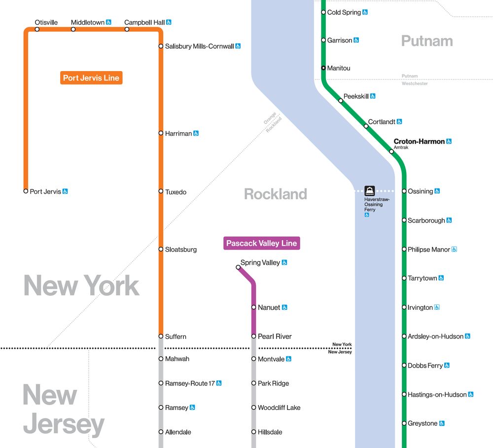
When showing that Port Jervis sits on the the NY/PA border messes with your aesthetics...
October 17, 2025 at 2:54 PM
When showing that Port Jervis sits on the the NY/PA border messes with your aesthetics...
Okay, the giant red "Go THIS way to get to the Cubs game, you dummy!" arrows are sending me.

From the Transportation Library's Instagram - go Cubs! www.instagram.com/p/DPT4IapEYe...


October 2, 2025 at 3:06 PM
Okay, the giant red "Go THIS way to get to the Cubs game, you dummy!" arrows are sending me.
Reposted by Transit Maps
New on the blog! A new future-proofed unofficial diagram of integrated transit in Kuala Lumpur, Malaysia that just really, really good.

Submission – Unofficial Map: Klang Valley Integrated Transit by Eco
Submitted by Eco, who says: I made this redesign of Greater Kuala Lumpur's rail and BRT map this summer for an competition, given their official map feels unusually sloppy . I'd love to hear your thoughts. Transit Maps says: Oh, I do like this! A sleek, modern diagram that's future-proofed up to 2032 with the inclusion of the planned MRT Circle Line (line 13).
transitmap.net
September 29, 2025 at 3:00 PM
New on the blog! A new future-proofed unofficial diagram of integrated transit in Kuala Lumpur, Malaysia that just really, really good.
New on the blog! A new future-proofed unofficial diagram of integrated transit in Kuala Lumpur, Malaysia that just really, really good.
Submission – Unofficial Map: Klang Valley Integrated Transit by Eco
Submitted by Eco, who says: I made this redesign of Greater Kuala Lumpur's rail and BRT map this summer for an competition, given their official map feels unusually sloppy . I'd love to hear your thoughts. Transit Maps says: Oh, I do like this! A sleek, modern diagram that's future-proofed up to 2032 with the inclusion of the planned MRT Circle Line (line 13).
transitmap.net
September 29, 2025 at 3:00 PM
New on the blog! A new future-proofed unofficial diagram of integrated transit in Kuala Lumpur, Malaysia that just really, really good.
Reposted by Transit Maps


Reposted by Transit Maps

#SundayPixRailway
Completely useless London Underground map. Especially useless because it is on the riverbus pier and nowhere near an underground station. I love it
Completely useless London Underground map. Especially useless because it is on the riverbus pier and nowhere near an underground station. I love it


September 21, 2025 at 9:11 AM
#SundayPixRailway
Completely useless London Underground map. Especially useless because it is on the riverbus pier and nowhere near an underground station. I love it
Completely useless London Underground map. Especially useless because it is on the riverbus pier and nowhere near an underground station. I love it
Sale still on for TODAY only!
FLASH SALE – 15% off all prints in the Transit Maps store today and tomorrow only. A great selection of my original designs and digitally restored vintage maps to choose from.
Visit: transitmap.net/store/prints...
Visit: transitmap.net/store/prints...

September 21, 2025 at 4:06 PM
Sale still on for TODAY only!
Reposted by Transit Maps

A map in my style showing the late 2040s Sydney network, based on the recent leaked TfNSW diagram!

September 21, 2025 at 3:35 AM
A map in my style showing the late 2040s Sydney network, based on the recent leaked TfNSW diagram!
FLASH SALE – 15% off all prints in the Transit Maps store today and tomorrow only. A great selection of my original designs and digitally restored vintage maps to choose from.
Visit: transitmap.net/store/prints...
Visit: transitmap.net/store/prints...
September 20, 2025 at 7:04 PM
FLASH SALE – 15% off all prints in the Transit Maps store today and tomorrow only. A great selection of my original designs and digitally restored vintage maps to choose from.
Visit: transitmap.net/store/prints...
Visit: transitmap.net/store/prints...
Reposted by Transit Maps
Now THAT'S more like it!

Last week, DART announced that the new Silver Line will be opening on October 25th. To celebrate, here's my take on a map of the DART rail network once it opens.

September 20, 2025 at 2:56 AM
Now THAT'S more like it!