


Caroline Jarrett
@cjforms.bsky.social
Forms and survey specialist.
Always keen to try to answer your questions about making better forms (and if you must, maybe even those about surveys).
Effortmark.co.uk
Always keen to try to answer your questions about making better forms (and if you must, maybe even those about surveys).
Effortmark.co.uk
Reposted by Caroline Jarrett
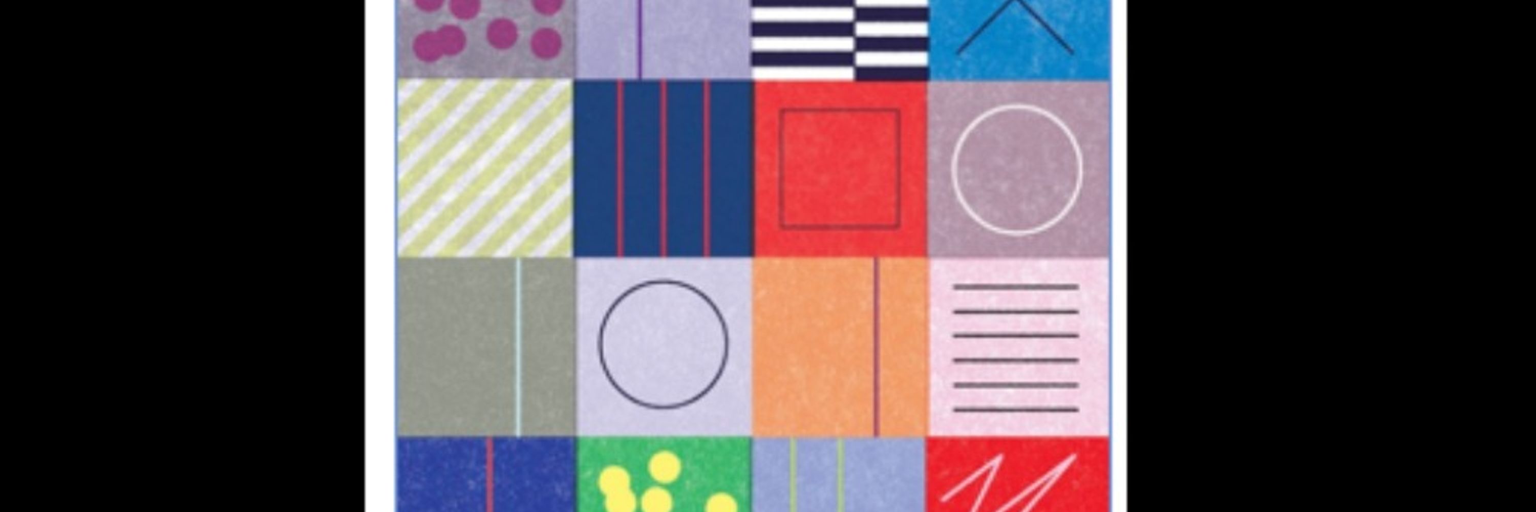
My book, Accessibility For Everyone, is now free and online as a website.
accessibilityforeveryone.site
The book was first published by A Book Apart in 2017 but it holds up! It covers web accessibility for designers, developers, content folks, and really everyone who works in tech.
accessibilityforeveryone.site
The book was first published by A Book Apart in 2017 but it holds up! It covers web accessibility for designers, developers, content folks, and really everyone who works in tech.

Accessibility For Everyone by Laura Kalbag
Read the book online for free.
accessibilityforeveryone.site
January 27, 2026 at 1:14 PM
My book, Accessibility For Everyone, is now free and online as a website.
accessibilityforeveryone.site
The book was first published by A Book Apart in 2017 but it holds up! It covers web accessibility for designers, developers, content folks, and really everyone who works in tech.
accessibilityforeveryone.site
The book was first published by A Book Apart in 2017 but it holds up! It covers web accessibility for designers, developers, content folks, and really everyone who works in tech.
In today’s episode of #FixTheForms, @adamsilverhq.bsky.social points out the problems of toast messages.
Pro tip 1: toast messages - just say no.
Pro tip 2: the existence of a design pattern is not enough to justify using it.
Pro tip 1: toast messages - just say no.
Pro tip 2: the existence of a design pattern is not enough to justify using it.

Some design patterns are just bad UX.
No amount of improving will turn them into good UX.
Take toast messages as an example:
Toast messages are little notifications that pop up after an action such as “Saved”, “Sent” and “Updated”.
GitHub’s design team recently banned them.
No amount of improving will turn them into good UX.
Take toast messages as an example:
Toast messages are little notifications that pop up after an action such as “Saved”, “Sent” and “Updated”.
GitHub’s design team recently banned them.

January 27, 2026 at 1:39 PM
In today’s episode of #FixTheForms, @adamsilverhq.bsky.social points out the problems of toast messages.
Pro tip 1: toast messages - just say no.
Pro tip 2: the existence of a design pattern is not enough to justify using it.
Pro tip 1: toast messages - just say no.
Pro tip 2: the existence of a design pattern is not enough to justify using it.
Reposted by Caroline Jarrett

When I visit England, in the rural North, the conversation can turn quickly to 'stopping the boats', largely thanks to the BBC upping a 'migrant crisis'. This is utter bollocks. The huge English crises are, as ever, poverty & illiteracy.
About 6.8 million people – half of all those in poverty – were in very deep poverty, the highest number and proportion since records began three decades ago - @jrf-uk.bsky.social analysis
www.theguardian.com/society/2026...
www.theguardian.com/society/2026...

Record number of people in UK live in ‘very deep poverty’, analysis shows
Joseph Rowntree Foundation finds problem is ‘deeper and more damaging than at any point in the last 30 years’
www.theguardian.com
January 27, 2026 at 7:45 AM
When I visit England, in the rural North, the conversation can turn quickly to 'stopping the boats', largely thanks to the BBC upping a 'migrant crisis'. This is utter bollocks. The huge English crises are, as ever, poverty & illiteracy.
Reposted by Caroline Jarrett

January 22, 2026 at 6:53 PM
For a few years, I wrote a monthly column for @wearebcs.bsky.social HCI group Usability News. They changed to the Interaction group and took everything down, no warning. Then brought them back for a while. Then took them all down again.
Have republished them on my website, but.
Have republished them on my website, but

It's incredibly disheartening to go to a former employer's site to find stories you've written from 10-15 years ago and they're just ... not there.
Years of journalism, of records, of knowledge, gone.
This is the modern equivalent to the collapse and destruction of the Library of Alexandria.
Years of journalism, of records, of knowledge, gone.
This is the modern equivalent to the collapse and destruction of the Library of Alexandria.
January 22, 2026 at 7:12 PM
For a few years, I wrote a monthly column for @wearebcs.bsky.social HCI group Usability News. They changed to the Interaction group and took everything down, no warning. Then brought them back for a while. Then took them all down again.
Have republished them on my website, but.
Have republished them on my website, but
In today’s episode of #FixTheForms, @priyanca.bsky.social battles with a perennial problem: badly-designed and badly-implemented “validation” on names
Pro tip: names can include punctuation or spaces.
Pro tip: names can include punctuation or spaces.

Filling in a form and being told my last name is 'invalid'. There is punctuation in my surname on my ID so when I do the checks the names will not be the same. Adds an extra layer of anxiety

January 22, 2026 at 10:55 AM
In today’s episode of #FixTheForms, @priyanca.bsky.social battles with a perennial problem: badly-designed and badly-implemented “validation” on names
Pro tip: names can include punctuation or spaces.
Pro tip: names can include punctuation or spaces.
Reposted by Caroline Jarrett

'Linguists argue that language death is a tragedy. “Languages represent thousands of natural experiments: ways of seeing, understanding and living that should form part of any meaningful account of what it is to be human”.' (Ross Perlin)
Linguistics, coproduction, botany, culture & inspiration.
Linguistics, coproduction, botany, culture & inspiration.

‘I thought it was going to perish’: the remarkable revival of an endangered language in Lesotho
Concentrated among 1,000 people in the remote Daliwe valley, siPhuthi has gained a dictionary, a Bible translation and official recognition thanks to intrepid linguists and activists
www.theguardian.com
January 21, 2026 at 10:48 AM
'Linguists argue that language death is a tragedy. “Languages represent thousands of natural experiments: ways of seeing, understanding and living that should form part of any meaningful account of what it is to be human”.' (Ross Perlin)
Linguistics, coproduction, botany, culture & inspiration.
Linguistics, coproduction, botany, culture & inspiration.
Reposted by Caroline Jarrett

Reposted by Caroline Jarrett
Another shout out for @gailmyerscough.co.uk who very kindly sent some customers my way, so I'd like to send her some in return.
If you love the retro vintage vibe, do go and have a look at her website. If you get in quick you might be able to grab a bargain in her sale :)
www.gailmyerscough.co.uk
If you love the retro vintage vibe, do go and have a look at her website. If you get in quick you might be able to grab a bargain in her sale :)
www.gailmyerscough.co.uk

There’s 20% off all my unframed prints with code GAILSALE
www.gailmyerscough.co.uk/prints
Ends 18 January
www.gailmyerscough.co.uk/prints
Ends 18 January

January 18, 2026 at 1:19 PM
Another shout out for @gailmyerscough.co.uk who very kindly sent some customers my way, so I'd like to send her some in return.
If you love the retro vintage vibe, do go and have a look at her website. If you get in quick you might be able to grab a bargain in her sale :)
www.gailmyerscough.co.uk
If you love the retro vintage vibe, do go and have a look at her website. If you get in quick you might be able to grab a bargain in her sale :)
www.gailmyerscough.co.uk
On my train heading home from #ukgc26
Thanks everyone for great conversations and the opportunity to make some new friends
Extra thanks to the camp makers, especially the lovely Surita from Birmingham City Council and her help with access
Thanks everyone for great conversations and the opportunity to make some new friends
Extra thanks to the camp makers, especially the lovely Surita from Birmingham City Council and her help with access
January 18, 2026 at 9:59 AM
On my train heading home from #ukgc26
Thanks everyone for great conversations and the opportunity to make some new friends
Extra thanks to the camp makers, especially the lovely Surita from Birmingham City Council and her help with access
Thanks everyone for great conversations and the opportunity to make some new friends
Extra thanks to the camp makers, especially the lovely Surita from Birmingham City Council and her help with access
Reposted by Caroline Jarrett

Solid Eurovision bop, douze points

I know it's not the Hunger Games but BOY are Greenland winning the social media war..
youtu.be/hS0wFiWpU4U?...
youtu.be/hS0wFiWpU4U?...

Greenland Defense Front - The Hungry Giant (Official Music Video)
YouTube video by demonflyingfox
youtu.be
January 18, 2026 at 7:33 AM
Solid Eurovision bop, douze points
Reposted by Caroline Jarrett
New post from me. Here is my personal touchstone for evaluating proposed legislation regarding young people and smartphones, social media, age verification, and potential bans. It's called the Darnella test. Who's Darnella? You already know.
heatherburns.tech/2026/01/16/t...
heatherburns.tech/2026/01/16/t...
The Darnella test of social media and smartphone regulation – Hi, I'm Heather Burns
heatherburns.tech
January 16, 2026 at 8:11 AM
New post from me. Here is my personal touchstone for evaluating proposed legislation regarding young people and smartphones, social media, age verification, and potential bans. It's called the Darnella test. Who's Darnella? You already know.
heatherburns.tech/2026/01/16/t...
heatherburns.tech/2026/01/16/t...
Survey panel membership is the gift that keeps on giving.
One of my favourites from today: when I phone an organisation, do I want to talk to a person, to a chat bot / intelligent robot, or do I have no preference?
Let's see how YOU answer this one. Replies please :)
One of my favourites from today: when I phone an organisation, do I want to talk to a person, to a chat bot / intelligent robot, or do I have no preference?
Let's see how YOU answer this one. Replies please :)
January 14, 2026 at 3:10 PM
Survey panel membership is the gift that keeps on giving.
One of my favourites from today: when I phone an organisation, do I want to talk to a person, to a chat bot / intelligent robot, or do I have no preference?
Let's see how YOU answer this one. Replies please :)
One of my favourites from today: when I phone an organisation, do I want to talk to a person, to a chat bot / intelligent robot, or do I have no preference?
Let's see how YOU answer this one. Replies please :)
In today’s episode of #FixTheForms, @adamsilverhq.bsky.social points out some easy-to-avoid forms design fails in Fizzy by 37signals
If I could burn all instances of JIRA and replace them with Fizzy, I would.
Fizzy is a new project management tool designed and built by the legends at 37signals.
They’ve got a lot right here. Everything is chunky, clear, and on brand.
Fizzy is a new project management tool designed and built by the legends at 37signals.
They’ve got a lot right here. Everything is chunky, clear, and on brand.

January 13, 2026 at 2:26 PM
In today’s episode of #FixTheForms, @adamsilverhq.bsky.social points out some easy-to-avoid forms design fails in Fizzy by 37signals
I keep meaning to write a blog post about the Content Fairy and the Content Gnome, neither of which are real.
Now I’m thinking about the very real threat of the Content Zombie.
Now I’m thinking about the very real threat of the Content Zombie.
'living document' implies the existence of 'dead documents ' or, more promisingly, 'zombie' and 'undead' documents 🧟
January 12, 2026 at 11:35 AM
I keep meaning to write a blog post about the Content Fairy and the Content Gnome, neither of which are real.
Now I’m thinking about the very real threat of the Content Zombie.
Now I’m thinking about the very real threat of the Content Zombie.
Reposted by Caroline Jarrett

'living document' implies the existence of 'dead documents ' or, more promisingly, 'zombie' and 'undead' documents 🧟
January 12, 2026 at 10:20 AM
'living document' implies the existence of 'dead documents ' or, more promisingly, 'zombie' and 'undead' documents 🧟
Further update on the Companies House episode of #FixTheForms
The statement that I didn’t know I had filed has been rejected as a duplicate.
I don’t know what this means and there is no further information or any link to any help.
I suspect that it means I tried to do the task too early.
The statement that I didn’t know I had filed has been rejected as a duplicate.
I don’t know what this means and there is no further information or any link to any help.
I suspect that it means I tried to do the task too early.
Update on today's episode of #FixTheForms, I was baffled to receive an email from Companies House saying that I had filed a statement when I thought I'd bailed out at the start page.
Sigh.
Sigh.
In today's episode of #FixTheForms, I bravely attempted to file my company statement ahead of the deadline.
Companies House had truly provided one of the most baffling, confusing, and repetitive sets of pages that I've ever encountered on any website ever.
Special prize for useless 4min video.
Companies House had truly provided one of the most baffling, confusing, and repetitive sets of pages that I've ever encountered on any website ever.
Special prize for useless 4min video.
January 12, 2026 at 9:04 AM
Further update on the Companies House episode of #FixTheForms
The statement that I didn’t know I had filed has been rejected as a duplicate.
I don’t know what this means and there is no further information or any link to any help.
I suspect that it means I tried to do the task too early.
The statement that I didn’t know I had filed has been rejected as a duplicate.
I don’t know what this means and there is no further information or any link to any help.
I suspect that it means I tried to do the task too early.
Reposted by Caroline Jarrett
And for my first blog post of the year, a good old fashioned rant.
"I'm sorry"
amyhupe.co.uk/articles/sor...
"I'm sorry"
amyhupe.co.uk/articles/sor...
Sorry seems to be the most overused word
Content design and design systems consultant
amyhupe.co.uk
January 10, 2026 at 1:33 PM
And for my first blog post of the year, a good old fashioned rant.
"I'm sorry"
amyhupe.co.uk/articles/sor...
"I'm sorry"
amyhupe.co.uk/articles/sor...
Another update on today's episode of #FixTheForms
It's hard to show how baffling the Companies House experience was without dozens of screenshots, but here's a specific example of lack of user-centred design.
My company number has seven digits.
Pro tip: try adding those leading zero for me OR ...
It's hard to show how baffling the Companies House experience was without dozens of screenshots, but here's a specific example of lack of user-centred design.
My company number has seven digits.
Pro tip: try adding those leading zero for me OR ...
January 9, 2026 at 4:48 PM
Another update on today's episode of #FixTheForms
It's hard to show how baffling the Companies House experience was without dozens of screenshots, but here's a specific example of lack of user-centred design.
My company number has seven digits.
Pro tip: try adding those leading zero for me OR ...
It's hard to show how baffling the Companies House experience was without dozens of screenshots, but here's a specific example of lack of user-centred design.
My company number has seven digits.
Pro tip: try adding those leading zero for me OR ...
Update on today's episode of #FixTheForms, I was baffled to receive an email from Companies House saying that I had filed a statement when I thought I'd bailed out at the start page.
Sigh.
Sigh.
In today's episode of #FixTheForms, I bravely attempted to file my company statement ahead of the deadline.
Companies House had truly provided one of the most baffling, confusing, and repetitive sets of pages that I've ever encountered on any website ever.
Special prize for useless 4min video.
Companies House had truly provided one of the most baffling, confusing, and repetitive sets of pages that I've ever encountered on any website ever.
Special prize for useless 4min video.
January 9, 2026 at 4:36 PM
Update on today's episode of #FixTheForms, I was baffled to receive an email from Companies House saying that I had filed a statement when I thought I'd bailed out at the start page.
Sigh.
Sigh.
In today's episode of #FixTheForms, I bravely attempted to file my company statement ahead of the deadline.
Companies House had truly provided one of the most baffling, confusing, and repetitive sets of pages that I've ever encountered on any website ever.
Special prize for useless 4min video.
Companies House had truly provided one of the most baffling, confusing, and repetitive sets of pages that I've ever encountered on any website ever.
Special prize for useless 4min video.
January 9, 2026 at 4:26 PM
In today's episode of #FixTheForms, I bravely attempted to file my company statement ahead of the deadline.
Companies House had truly provided one of the most baffling, confusing, and repetitive sets of pages that I've ever encountered on any website ever.
Special prize for useless 4min video.
Companies House had truly provided one of the most baffling, confusing, and repetitive sets of pages that I've ever encountered on any website ever.
Special prize for useless 4min video.
Hooray, @contenthelen.bsky.social is here now
@contenthelen.bsky.social welcome friend to this other micro blogging platform 🤗
January 8, 2026 at 8:09 AM
Hooray, @contenthelen.bsky.social is here now
If you’re coming to @ukgovcamp.com by train and haven’t already booked, it’s worth trying for train tickets right now. There’s a sale on and I snagged my outward ticket for a tasty £3.40. A welcome reduction on the standard anytime fare (£23.20 including senior discount).
January 7, 2026 at 7:27 PM
If you’re coming to @ukgovcamp.com by train and haven’t already booked, it’s worth trying for train tickets right now. There’s a sale on and I snagged my outward ticket for a tasty £3.40. A welcome reduction on the standard anytime fare (£23.20 including senior discount).
In today’s episode of #FixTheForms, @adamsilverhq.bsky.social battles with a button that isn’t sufficiently buttony
Pro tip: make your buttons look like buttons, on-screen or off
Related: we bought a new microwave last year and were delighted to find one that has actual buttons, not a flat screen
Pro tip: make your buttons look like buttons, on-screen or off
Related: we bought a new microwave last year and were delighted to find one that has actual buttons, not a flat screen
It’s 2026, we’re all worried about AI taking over design but check this UX out...
Let me explain:
We stayed over at Blackwood Forest over xmas.
When we arrived, I plugged the car into the electric charging point.
After it was charged I tried to release the charging cable.
Let me explain:
We stayed over at Blackwood Forest over xmas.
When we arrived, I plugged the car into the electric charging point.
After it was charged I tried to release the charging cable.

January 6, 2026 at 2:07 PM
In today’s episode of #FixTheForms, @adamsilverhq.bsky.social battles with a button that isn’t sufficiently buttony
Pro tip: make your buttons look like buttons, on-screen or off
Related: we bought a new microwave last year and were delighted to find one that has actual buttons, not a flat screen
Pro tip: make your buttons look like buttons, on-screen or off
Related: we bought a new microwave last year and were delighted to find one that has actual buttons, not a flat screen
Reposted by Caroline Jarrett
Looking up how to make user journey maps accessible and there’s a load of articles about how important accessibility is and how to capture those needs on your map, but nothing about making the *actual artefact* accessible. Sums up the industry imo, likes to talk about us and to us but not with us.
January 5, 2026 at 10:13 AM
Looking up how to make user journey maps accessible and there’s a load of articles about how important accessibility is and how to capture those needs on your map, but nothing about making the *actual artefact* accessible. Sums up the industry imo, likes to talk about us and to us but not with us.