


#30DayMapChallenge Day 13, a 10 Minute map.
AED units with a 10 minute gentle stroll round trip of my office*
*not expecting to be gently strolling if I need one.
(I already had the base map, so just looked up AED locations, as I had been meaning to)
AED units with a 10 minute gentle stroll round trip of my office*
*not expecting to be gently strolling if I need one.
(I already had the base map, so just looked up AED locations, as I had been meaning to)

November 13, 2025 at 12:44 AM
#30DayMapChallenge Day 13, a 10 Minute map.
AED units with a 10 minute gentle stroll round trip of my office*
*not expecting to be gently strolling if I need one.
(I already had the base map, so just looked up AED locations, as I had been meaning to)
AED units with a 10 minute gentle stroll round trip of my office*
*not expecting to be gently strolling if I need one.
(I already had the base map, so just looked up AED locations, as I had been meaning to)

#30DayMapChallenge Day 10: AIR - THE LISBON NOISE MAP DURING NIGHTTIME - Based on data from April 2021, the blue–green tones indicate quieter zones, typically open, forested, or residential areas.
Tools: #QGIS, #Photoshop, #Illustrator
Files: github.com/LX-Files/30D...
Tools: #QGIS, #Photoshop, #Illustrator
Files: github.com/LX-Files/30D...

November 13, 2025 at 12:14 AM
#30DayMapChallenge Day 10: AIR - THE LISBON NOISE MAP DURING NIGHTTIME - Based on data from April 2021, the blue–green tones indicate quieter zones, typically open, forested, or residential areas.
Tools: #QGIS, #Photoshop, #Illustrator
Files: github.com/LX-Files/30D...
Tools: #QGIS, #Photoshop, #Illustrator
Files: github.com/LX-Files/30D...

🌍 #30DayMapChallenge Day 12 | Map from 2125
Projected world population to 2125 using UN data + ARIMA forecasts, shown with the Equal Earth projection — an equal-area view that keeps countries’ true proportions.
Growth in Africa & South Asia, decline in Europe.
#RStats #DataViz
Projected world population to 2125 using UN data + ARIMA forecasts, shown with the Equal Earth projection — an equal-area view that keeps countries’ true proportions.
Growth in Africa & South Asia, decline in Europe.
#RStats #DataViz

November 12, 2025 at 11:28 PM
🌍 #30DayMapChallenge Day 12 | Map from 2125
Projected world population to 2125 using UN data + ARIMA forecasts, shown with the Equal Earth projection — an equal-area view that keeps countries’ true proportions.
Growth in Africa & South Asia, decline in Europe.
#RStats #DataViz
Projected world population to 2125 using UN data + ARIMA forecasts, shown with the Equal Earth projection — an equal-area view that keeps countries’ true proportions.
Growth in Africa & South Asia, decline in Europe.
#RStats #DataViz


November 12, 2025 at 11:15 PM

🔊Using #GIS to visualise data in a webmap
Stepped explanation > #CreateBuffers analysis tool in @esriuk.bsky.social ArcGIS OnLine > visualise exclusion zones around #Merapi volcano
@oaknational.bsky.social #GIS integration KS4 GCSE Geog
tinyurl.com/yh56fjw3
#30DayMapChallenge Day 13: 10 minute map
Stepped explanation > #CreateBuffers analysis tool in @esriuk.bsky.social ArcGIS OnLine > visualise exclusion zones around #Merapi volcano
@oaknational.bsky.social #GIS integration KS4 GCSE Geog
tinyurl.com/yh56fjw3
#30DayMapChallenge Day 13: 10 minute map
November 12, 2025 at 11:03 PM
🔊Using #GIS to visualise data in a webmap
Stepped explanation > #CreateBuffers analysis tool in @esriuk.bsky.social ArcGIS OnLine > visualise exclusion zones around #Merapi volcano
@oaknational.bsky.social #GIS integration KS4 GCSE Geog
tinyurl.com/yh56fjw3
#30DayMapChallenge Day 13: 10 minute map
Stepped explanation > #CreateBuffers analysis tool in @esriuk.bsky.social ArcGIS OnLine > visualise exclusion zones around #Merapi volcano
@oaknational.bsky.social #GIS integration KS4 GCSE Geog
tinyurl.com/yh56fjw3
#30DayMapChallenge Day 13: 10 minute map

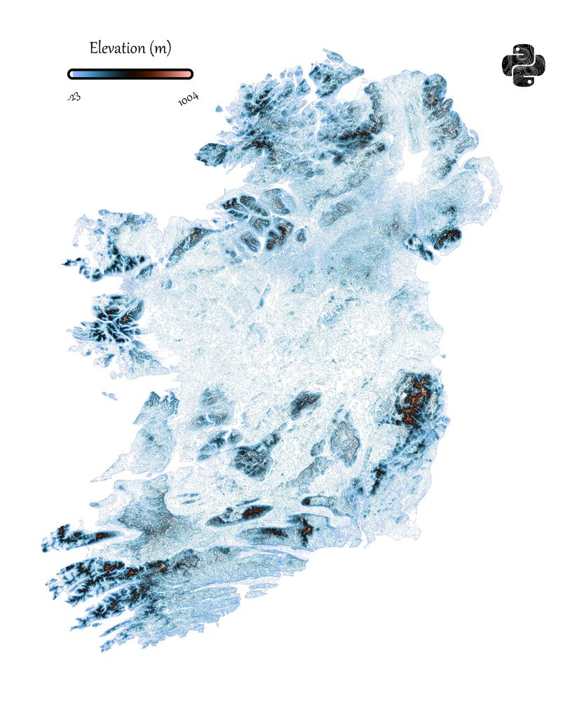
Day 12 of the #30DayMapChallenge - Map from 2125 - I think Northern Ireland and the Republic of Ireland could merge into a new country. So here is a topography map.
November 12, 2025 at 10:19 PM
Day 12 of the #30DayMapChallenge - Map from 2125 - I think Northern Ireland and the Republic of Ireland could merge into a new country. So here is a topography map.


Day 12 - Map from 2125
SLR in Rhode Island
Part of my MS research, I studied the impact of SLR on bldgs in coastal LA. SLR is rising faster in the Gulf than anywhere else in the US. While the RI SLR extent is not as bad as LAs, the population density is higher.
#30DayMapChallenge
SLR in Rhode Island
Part of my MS research, I studied the impact of SLR on bldgs in coastal LA. SLR is rising faster in the Gulf than anywhere else in the US. While the RI SLR extent is not as bad as LAs, the population density is higher.
#30DayMapChallenge

November 12, 2025 at 8:11 PM
Day 12 - Map from 2125
SLR in Rhode Island
Part of my MS research, I studied the impact of SLR on bldgs in coastal LA. SLR is rising faster in the Gulf than anywhere else in the US. While the RI SLR extent is not as bad as LAs, the population density is higher.
#30DayMapChallenge
SLR in Rhode Island
Part of my MS research, I studied the impact of SLR on bldgs in coastal LA. SLR is rising faster in the Gulf than anywhere else in the US. While the RI SLR extent is not as bad as LAs, the population density is higher.
#30DayMapChallenge


November 12, 2025 at 7:42 PM

November 12, 2025 at 7:40 PM

#30DayMapChallenge | Day 12: Map From (Miniature Globes Edition)
The "Chart Of The World On Mercators Projection" by Hermann Berghaus is a masterful representation of 19th-century cartography, encapsulating the period's technological, cultural, and geographical advancements.
#handcrafted #gischat
The "Chart Of The World On Mercators Projection" by Hermann Berghaus is a masterful representation of 19th-century cartography, encapsulating the period's technological, cultural, and geographical advancements.
#handcrafted #gischat


November 12, 2025 at 7:17 PM
#30DayMapChallenge | Day 12: Map From (Miniature Globes Edition)
The "Chart Of The World On Mercators Projection" by Hermann Berghaus is a masterful representation of 19th-century cartography, encapsulating the period's technological, cultural, and geographical advancements.
#handcrafted #gischat
The "Chart Of The World On Mercators Projection" by Hermann Berghaus is a masterful representation of 19th-century cartography, encapsulating the period's technological, cultural, and geographical advancements.
#handcrafted #gischat
#30DayMapChallenge | Day 11: Minimal (Miniature Globes Edition)
Today's miniature globe is a 🌎Wanmei Liang x Perrin Remonté collab showing global tidal range.
Perrin's map 🔗https://lnkd.in/gtJuk9rS
#handcrafted #cartography
Today's miniature globe is a 🌎Wanmei Liang x Perrin Remonté collab showing global tidal range.
Perrin's map 🔗https://lnkd.in/gtJuk9rS
#handcrafted #cartography


November 12, 2025 at 7:15 PM
#30DayMapChallenge | Day 11: Minimal (Miniature Globes Edition)
Today's miniature globe is a 🌎Wanmei Liang x Perrin Remonté collab showing global tidal range.
Perrin's map 🔗https://lnkd.in/gtJuk9rS
#handcrafted #cartography
Today's miniature globe is a 🌎Wanmei Liang x Perrin Remonté collab showing global tidal range.
Perrin's map 🔗https://lnkd.in/gtJuk9rS
#handcrafted #cartography

#30DayMapChallenge Day 12 — Map from 2125
This ‘Tron Style’ reimagines the map of the future: minimalist yet deeply informative, rendered from LiDAR-driven precision where each line, road, and structure pulses with purpose.
This ‘Tron Style’ reimagines the map of the future: minimalist yet deeply informative, rendered from LiDAR-driven precision where each line, road, and structure pulses with purpose.
November 12, 2025 at 7:00 PM
#30DayMapChallenge Day 12 — Map from 2125
This ‘Tron Style’ reimagines the map of the future: minimalist yet deeply informative, rendered from LiDAR-driven precision where each line, road, and structure pulses with purpose.
This ‘Tron Style’ reimagines the map of the future: minimalist yet deeply informative, rendered from LiDAR-driven precision where each line, road, and structure pulses with purpose.

#30DayMapChallenge
Day 12 - Future Model Toronto Stephen Velasco
Visualizing the future of
Toronto’s urban centres
h/t @chanface.bsky.social
www.stephenvelasco.com
Day 12 - Future Model Toronto Stephen Velasco
Visualizing the future of
Toronto’s urban centres
h/t @chanface.bsky.social
www.stephenvelasco.com

November 12, 2025 at 6:41 PM
#30DayMapChallenge
Day 12 - Future Model Toronto Stephen Velasco
Visualizing the future of
Toronto’s urban centres
h/t @chanface.bsky.social
www.stephenvelasco.com
Day 12 - Future Model Toronto Stephen Velasco
Visualizing the future of
Toronto’s urban centres
h/t @chanface.bsky.social
www.stephenvelasco.com

#30DayMapChallenge day 6: dimensions
Atmika Pai dove into the ArcGIS Unity SDK to see how architects & designers plan in 3D. She explored 15 features from geocoding to viewshed analysis, all in an immersive game engine! Here's a video teaser of her map.
Atmika Pai dove into the ArcGIS Unity SDK to see how architects & designers plan in 3D. She explored 15 features from geocoding to viewshed analysis, all in an immersive game engine! Here's a video teaser of her map.
November 12, 2025 at 6:40 PM
#30DayMapChallenge day 6: dimensions
Atmika Pai dove into the ArcGIS Unity SDK to see how architects & designers plan in 3D. She explored 15 features from geocoding to viewshed analysis, all in an immersive game engine! Here's a video teaser of her map.
Atmika Pai dove into the ArcGIS Unity SDK to see how architects & designers plan in 3D. She explored 15 features from geocoding to viewshed analysis, all in an immersive game engine! Here's a video teaser of her map.
#30DayMapChallenge | Day 8 Urban | This is an HDF laser-cut 3D #Madison city flag, which also reads as a city map, including the two lakes and an isthmus land, with a four-wing capitol building at center. I gave it a watercolor coat and made it as a magnet. What a little Madison souvenir!


November 12, 2025 at 5:48 PM
#30DayMapChallenge | Day 8 Urban | This is an HDF laser-cut 3D #Madison city flag, which also reads as a city map, including the two lakes and an isthmus land, with a four-wing capitol building at center. I gave it a watercolor coat and made it as a magnet. What a little Madison souvenir!

30 Day Map Challenge
Day 12: 2125
#30daymapchallenge #30daymapchallenge2025
so much more could be done with this
Day 12: 2125
#30daymapchallenge #30daymapchallenge2025
so much more could be done with this

November 12, 2025 at 5:29 PM
30 Day Map Challenge
Day 12: 2125
#30daymapchallenge #30daymapchallenge2025
so much more could be done with this
Day 12: 2125
#30daymapchallenge #30daymapchallenge2025
so much more could be done with this

#30DayMapChallenge Day 12: Map from 2125
What if we just intentionally misread it as "Map from 21º, 25º" and then make all four variants?
What if we just intentionally misread it as "Map from 21º, 25º" and then make all four variants?

November 12, 2025 at 5:03 PM
#30DayMapChallenge Day 12: Map from 2125
What if we just intentionally misread it as "Map from 21º, 25º" and then make all four variants?
What if we just intentionally misread it as "Map from 21º, 25º" and then make all four variants?

#30DayMapChallenge Day 12 - Map from 2125
This map illustrates the projected range suitability of a raptor species in Nigeria by 2060.
If pressure from human activities remains unchecked, its range is expected to shrink drastically.
#R
#ArcGISPro
This map illustrates the projected range suitability of a raptor species in Nigeria by 2060.
If pressure from human activities remains unchecked, its range is expected to shrink drastically.
#R
#ArcGISPro

November 12, 2025 at 5:03 PM
#30DayMapChallenge Day 12 - Map from 2125
This map illustrates the projected range suitability of a raptor species in Nigeria by 2060.
If pressure from human activities remains unchecked, its range is expected to shrink drastically.
#R
#ArcGISPro
This map illustrates the projected range suitability of a raptor species in Nigeria by 2060.
If pressure from human activities remains unchecked, its range is expected to shrink drastically.
#R
#ArcGISPro

#30DayMapChallenge Day 11: Minimal Map
Showing river network from HydroRIVERS clipped to EU countries and Switzerland.
Showing river network from HydroRIVERS clipped to EU countries and Switzerland.

November 12, 2025 at 4:50 PM
#30DayMapChallenge Day 11: Minimal Map
Showing river network from HydroRIVERS clipped to EU countries and Switzerland.
Showing river network from HydroRIVERS clipped to EU countries and Switzerland.

#30DayMapChallenge | Day 12 - 2125
For today's challenge, I imagined what some countries might look like in 2125
Can't you see anything beyond the sea? This scenario could become a reality for some low-lying countries as climate change poses a significant threat to their existence
Tools: Figma
For today's challenge, I imagined what some countries might look like in 2125
Can't you see anything beyond the sea? This scenario could become a reality for some low-lying countries as climate change poses a significant threat to their existence
Tools: Figma


November 12, 2025 at 4:47 PM
#30DayMapChallenge | Day 12 - 2125
For today's challenge, I imagined what some countries might look like in 2125
Can't you see anything beyond the sea? This scenario could become a reality for some low-lying countries as climate change poses a significant threat to their existence
Tools: Figma
For today's challenge, I imagined what some countries might look like in 2125
Can't you see anything beyond the sea? This scenario could become a reality for some low-lying countries as climate change poses a significant threat to their existence
Tools: Figma

#30DayMapChallenge Day 12 #Map2125
After the "the burning of the transom lockers" or the purge of archives 2038-40. Only wrack lined linen backed spatial fragments survived. Along with some...
After the "the burning of the transom lockers" or the purge of archives 2038-40. Only wrack lined linen backed spatial fragments survived. Along with some...
![[section] Plan showing the region explored by S. J. Dawson and his party between Fort William, Lake Superior and the Great Saskatchewan River from 1st of August 1857, to 1st November 1858. [linen backed)
Printed in Toronto by John Lovell.
To accompany Report on the Exploration of the country between Lake Superior and the Red River Settlement and between the latter place and the Assiniboine and Saskatchewan, by S. J. Dawson.
https://archive.org/details/reportonexplorat00unse/page/24/mode/2up](https://cdn.bsky.app/img/feed_thumbnail/plain/did:plc:q66r3vy7xepmx62ti4vt7uzb/bafkreihuqduewdfoqazquekjes33oihamodrcweqrg4wl2vgonmloi5bva@jpeg)
November 12, 2025 at 4:34 PM
#30DayMapChallenge Day 12 #Map2125
After the "the burning of the transom lockers" or the purge of archives 2038-40. Only wrack lined linen backed spatial fragments survived. Along with some...
After the "the burning of the transom lockers" or the purge of archives 2038-40. Only wrack lined linen backed spatial fragments survived. Along with some...

#30DayMapChallenge Day 12 – Map from 2125
With the rising ocean levels and after the fast-food wars of the early 2100s, coastal communities reorganized around being island nations.
With the rising ocean levels and after the fast-food wars of the early 2100s, coastal communities reorganized around being island nations.

November 12, 2025 at 4:19 PM
#30DayMapChallenge Day 12 – Map from 2125
With the rising ocean levels and after the fast-food wars of the early 2100s, coastal communities reorganized around being island nations.
With the rising ocean levels and after the fast-food wars of the early 2100s, coastal communities reorganized around being island nations.

#30DayMapChallenge Day 6: Dimensions
Taiwan's population distribution is highly concentrated in the northern part of the island. This dense distribution is clearly mapped across latitude and longitude lines.
Taiwan's population distribution is highly concentrated in the northern part of the island. This dense distribution is clearly mapped across latitude and longitude lines.

November 12, 2025 at 3:42 PM
#30DayMapChallenge Day 6: Dimensions
Taiwan's population distribution is highly concentrated in the northern part of the island. This dense distribution is clearly mapped across latitude and longitude lines.
Taiwan's population distribution is highly concentrated in the northern part of the island. This dense distribution is clearly mapped across latitude and longitude lines.

A 2125 cyberpunk theme for Tokyo, visualized in 3D with
@mapbox.com.
#30DayMapChallenge Day 12: Map from 2125
The brand-new `palette_to_lut()` function in #rstats mapgl helps you create a custom LUT from any colors.
@mapbox.com.
#30DayMapChallenge Day 12: Map from 2125
The brand-new `palette_to_lut()` function in #rstats mapgl helps you create a custom LUT from any colors.
November 12, 2025 at 3:20 PM
A 2125 cyberpunk theme for Tokyo, visualized in 3D with
@mapbox.com.
#30DayMapChallenge Day 12: Map from 2125
The brand-new `palette_to_lut()` function in #rstats mapgl helps you create a custom LUT from any colors.
@mapbox.com.
#30DayMapChallenge Day 12: Map from 2125
The brand-new `palette_to_lut()` function in #rstats mapgl helps you create a custom LUT from any colors.