


robin
@squarehead333.bsky.social
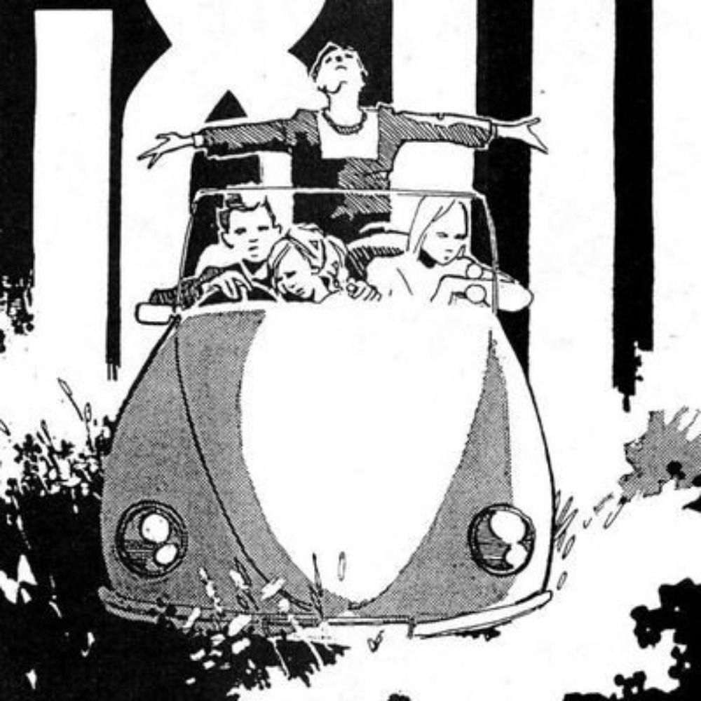
! New Helge Reumann klaxon !
CHÖD, coming from Atrabile in 2026
CHÖD, coming from Atrabile in 2026


December 12, 2025 at 3:09 PM
! New Helge Reumann klaxon !
CHÖD, coming from Atrabile in 2026
CHÖD, coming from Atrabile in 2026

I should read more of his interviews, but my interpretation was that he was very passionate about the form but disappointed in the direction it was going. More than a bit curmudgeonly. Sort of the Alan Moore of his time (I'm aware there's some overlap there)

December 8, 2025 at 11:11 PM
I should read more of his interviews, but my interpretation was that he was very passionate about the form but disappointed in the direction it was going. More than a bit curmudgeonly. Sort of the Alan Moore of his time (I'm aware there's some overlap there)
WRT comics, I like what Barthélémy Schwartz had to say about the matter (trns. Derik Badman:
www.du9.org/en/dossier/d...
www.du9.org/en/dossier/d...

December 8, 2025 at 9:32 PM
WRT comics, I like what Barthélémy Schwartz had to say about the matter (trns. Derik Badman:
www.du9.org/en/dossier/d...
www.du9.org/en/dossier/d...
Also! Highly debatable that they've been better and, if so, whether that has anything to do with Salah's omission. Does Salah not contributing defensively (a tactical decision Slot made!) have anything to do with their numerous issues? Why then is Konaté still playing? Macallister? Gakpo?

December 7, 2025 at 9:58 PM
Also! Highly debatable that they've been better and, if so, whether that has anything to do with Salah's omission. Does Salah not contributing defensively (a tactical decision Slot made!) have anything to do with their numerous issues? Why then is Konaté still playing? Macallister? Gakpo?
Unfortunately, we live in a world where what pundits say matters. Where have you been? Less than two years ago at the Euros Southgate's team selections in huge games were clearly heavily influenced by punditry. It's not Salah being bigger than the club it's about Salah being bigger than Slot, he is

December 7, 2025 at 9:58 PM
Unfortunately, we live in a world where what pundits say matters. Where have you been? Less than two years ago at the Euros Southgate's team selections in huge games were clearly heavily influenced by punditry. It's not Salah being bigger than the club it's about Salah being bigger than Slot, he is
Gabriel Hibert, erasure comic from his blog Slow Forward, 2025

November 24, 2025 at 9:33 PM
Gabriel Hibert, erasure comic from his blog Slow Forward, 2025

As soon as he says "When I'm buying steak, you know I'm ordering the largest" you know he's run out of good lines

November 22, 2025 at 8:33 PM
As soon as he says "When I'm buying steak, you know I'm ordering the largest" you know he's run out of good lines
Holy fuckkkkk (a translation of Andrea Pazienza's autobio about his drug addiction, Pompeo, being teased by NYRC)

November 20, 2025 at 12:03 AM
Holy fuckkkkk (a translation of Andrea Pazienza's autobio about his drug addiction, Pompeo, being teased by NYRC)
Also, I think bold text gives a completely different flavour of emphasis compared to italics. Italics are less legible at comic book scale which is probably why they haven't traditionally been used. In Face, Milligan uses italics & bold but the italicised text is also bold.


November 18, 2025 at 6:48 PM
Also, I think bold text gives a completely different flavour of emphasis compared to italics. Italics are less legible at comic book scale which is probably why they haven't traditionally been used. In Face, Milligan uses italics & bold but the italicised text is also bold.
Of course, unlike Kael, you make work in the medium you write criticism of, but still:

November 7, 2025 at 10:31 PM
Of course, unlike Kael, you make work in the medium you write criticism of, but still:
This page always annoyed me why is the brush so big

November 1, 2025 at 1:11 AM
This page always annoyed me why is the brush so big
According to Craig Brown there are seven conflicting versions of this story. Then there's also this one from Guy Davenport


October 24, 2025 at 7:53 AM
According to Craig Brown there are seven conflicting versions of this story. Then there's also this one from Guy Davenport

It was in Manga Classroom, which might've been translated? I first encountered it in this great Ryan Holmberg essay on Yūichi Yokoyama.
www.tcj.com/eye-buds-yok...
www.tcj.com/eye-buds-yok...


October 22, 2025 at 2:40 PM
It was in Manga Classroom, which might've been translated? I first encountered it in this great Ryan Holmberg essay on Yūichi Yokoyama.
www.tcj.com/eye-buds-yok...
www.tcj.com/eye-buds-yok...
Olaf Gulbransson for Simplicissimus, 1908

October 21, 2025 at 9:59 AM
Olaf Gulbransson for Simplicissimus, 1908

Comment on the music video for Cameron Winter's "$0"

October 13, 2025 at 10:15 PM
Comment on the music video for Cameron Winter's "$0"
Found a better pic of that Columbia hat, brim is definitely too big. Also found another Columbia hat im denim this time: if the sizes of the brim and neck protector were swapped it's be perfect.


October 13, 2025 at 7:43 PM
Found a better pic of that Columbia hat, brim is definitely too big. Also found another Columbia hat im denim this time: if the sizes of the brim and neck protector were swapped it's be perfect.
Found a similar hat for sale on ebay. Made by Columbia. Think the front brim is bigger than the drawing but it's pretty close

October 13, 2025 at 7:35 PM
Found a similar hat for sale on ebay. Made by Columbia. Think the front brim is bigger than the drawing but it's pretty close
In a way that manga did exist! López is a huge influence on Hirohiko Araki's work and he directly homaged him multiple times for JJBA

October 13, 2025 at 7:15 PM
In a way that manga did exist! López is a huge influence on Hirohiko Araki's work and he directly homaged him multiple times for JJBA
This whole series of illos is career-best work by López, btw. Cycling gloves and caps and oversized knit sweaters have never seemed cooler


October 13, 2025 at 6:46 PM
This whole series of illos is career-best work by López, btw. Cycling gloves and caps and oversized knit sweaters have never seemed cooler
I want a hat like the guy in this 1984 Antonio López illustration has but I have no clue what it's called. Some weird kind of flap cap

October 13, 2025 at 6:43 PM
I want a hat like the guy in this 1984 Antonio López illustration has but I have no clue what it's called. Some weird kind of flap cap
Most of Imiri Sakabashira's work fits in this category. Feel like Landry's Shit and Piss would qualify if it weren't so wordy. There must be some others I'm not thinking of

October 8, 2025 at 11:13 PM
Most of Imiri Sakabashira's work fits in this category. Feel like Landry's Shit and Piss would qualify if it weren't so wordy. There must be some others I'm not thinking of