


Peltier Tech
@peltiertech.bsky.social
Microsoft MVP for Excel, expert in Excel charting and VBA, creator of the best Excel Charting Add-In.
Better Pie Chart Data Labels
I've just posted a tutorial showing how to improve pie chart data labels. First, format text with a glow effect to improve contrast. Second, use VBA to position labels between Center and Inside End. Also, you'll read how to fix VBA timing issues.
I've just posted a tutorial showing how to improve pie chart data labels. First, format text with a glow effect to improve contrast. Second, use VBA to position labels between Center and Inside End. Also, you'll read how to fix VBA timing issues.

February 10, 2025 at 4:04 PM
Better Pie Chart Data Labels
I've just posted a tutorial showing how to improve pie chart data labels. First, format text with a glow effect to improve contrast. Second, use VBA to position labels between Center and Inside End. Also, you'll read how to fix VBA timing issues.
I've just posted a tutorial showing how to improve pie chart data labels. First, format text with a glow effect to improve contrast. Second, use VBA to position labels between Center and Inside End. Also, you'll read how to fix VBA timing issues.
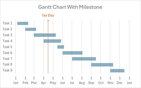
A few years ago I wrote a tutorial showing how to make a Gantt chart with a "nice" horizontal date axis. This axis has proportionally spaced dates, e.g., the first of each month, which is not possible with a standard stacked bar chart construction.
January 23, 2025 at 8:02 PM
A few years ago I wrote a tutorial showing how to make a Gantt chart with a "nice" horizontal date axis. This axis has proportionally spaced dates, e.g., the first of each month, which is not possible with a standard stacked bar chart construction.