


Peltier Tech
@peltiertech.bsky.social
Microsoft MVP for Excel, expert in Excel charting and VBA, creator of the best Excel Charting Add-In.
Reposted by Peltier Tech

I finally have the chance to make a bunch of Boston maps again, and no collection would be complete without a map of Storrowing. (Truck vs low overpass)
The “winner” of the last decade is not on Storrow, but rather adjacent to the smartest humans on the planet over at Mem Drive/Mass Ave.
The “winner” of the last decade is not on Storrow, but rather adjacent to the smartest humans on the planet over at Mem Drive/Mass Ave.
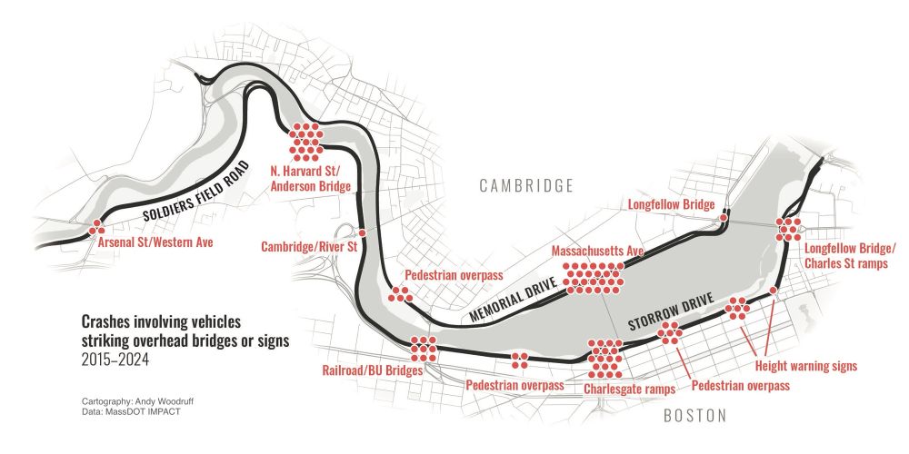
February 27, 2025 at 11:30 PM
I finally have the chance to make a bunch of Boston maps again, and no collection would be complete without a map of Storrowing. (Truck vs low overpass)
The “winner” of the last decade is not on Storrow, but rather adjacent to the smartest humans on the planet over at Mem Drive/Mass Ave.
The “winner” of the last decade is not on Storrow, but rather adjacent to the smartest humans on the planet over at Mem Drive/Mass Ave.
Better Pie Chart Data Labels
I've just posted a tutorial showing how to improve pie chart data labels. First, format text with a glow effect to improve contrast. Second, use VBA to position labels between Center and Inside End. Also, you'll read how to fix VBA timing issues.
I've just posted a tutorial showing how to improve pie chart data labels. First, format text with a glow effect to improve contrast. Second, use VBA to position labels between Center and Inside End. Also, you'll read how to fix VBA timing issues.

February 10, 2025 at 4:04 PM
Better Pie Chart Data Labels
I've just posted a tutorial showing how to improve pie chart data labels. First, format text with a glow effect to improve contrast. Second, use VBA to position labels between Center and Inside End. Also, you'll read how to fix VBA timing issues.
I've just posted a tutorial showing how to improve pie chart data labels. First, format text with a glow effect to improve contrast. Second, use VBA to position labels between Center and Inside End. Also, you'll read how to fix VBA timing issues.
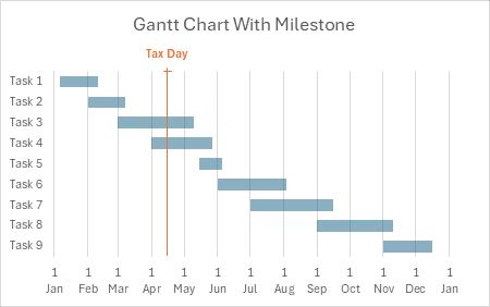
A few years ago I wrote a tutorial showing how to make a Gantt chart with a "nice" horizontal date axis. This axis has proportionally spaced dates, e.g., the first of each month, which is not possible with a standard stacked bar chart construction.
January 23, 2025 at 8:02 PM
A few years ago I wrote a tutorial showing how to make a Gantt chart with a "nice" horizontal date axis. This axis has proportionally spaced dates, e.g., the first of each month, which is not possible with a standard stacked bar chart construction.
Nice Bar Chart Data Labels
This quick tutorial shows how to create data labels for your bar chart which are attractive, informative, and legible.
#excelcharts #peltiertech
peltiertech.com/nice-bar-cha...
This quick tutorial shows how to create data labels for your bar chart which are attractive, informative, and legible.
#excelcharts #peltiertech
peltiertech.com/nice-bar-cha...
Nice Bar Chart Data Labels - Peltier Tech
This quick tutorial shows how to create data labels for your bar chart which are attractive, informative, and legible.
peltiertech.com
January 20, 2025 at 10:16 PM
Nice Bar Chart Data Labels
This quick tutorial shows how to create data labels for your bar chart which are attractive, informative, and legible.
#excelcharts #peltiertech
peltiertech.com/nice-bar-cha...
This quick tutorial shows how to create data labels for your bar chart which are attractive, informative, and legible.
#excelcharts #peltiertech
peltiertech.com/nice-bar-cha...