


Lisa Charlotte Muth
@lisacmuth.bsky.social
Creating & writing about data vis for @datawrapper.de
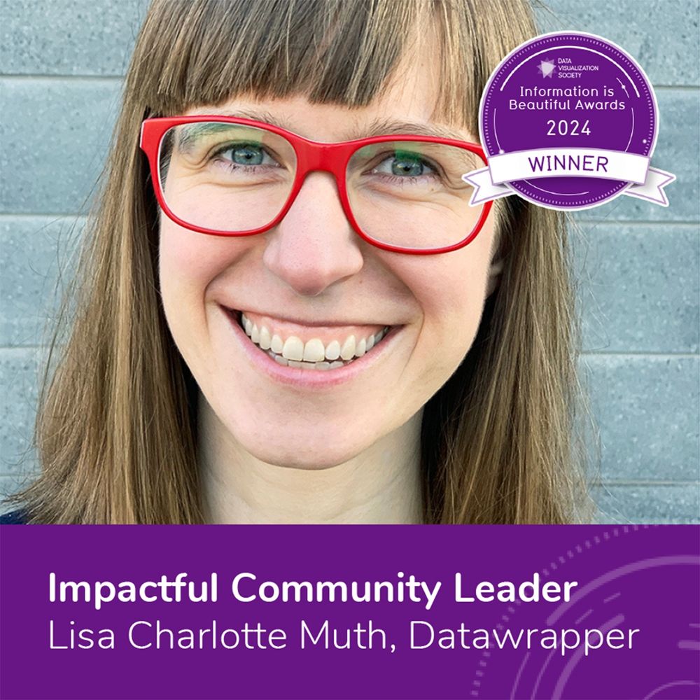
Wow! It's a great honor to receive this Information is Beautiful Award.
Thanks to @datawrapper.de for letting me inspire people. And thanks to everyone else who's contributing to the lovely #dataviz community!
Find all #IIBAwards winners here: www.informationisbeautifulawards.com/news/680-ann...
Thanks to @datawrapper.de for letting me inspire people. And thanks to everyone else who's contributing to the lovely #dataviz community!
Find all #IIBAwards winners here: www.informationisbeautifulawards.com/news/680-ann...
June 18, 2025 at 1:08 PM
Wow! It's a great honor to receive this Information is Beautiful Award.
Thanks to @datawrapper.de for letting me inspire people. And thanks to everyone else who's contributing to the lovely #dataviz community!
Find all #IIBAwards winners here: www.informationisbeautifulawards.com/news/680-ann...
Thanks to @datawrapper.de for letting me inspire people. And thanks to everyone else who's contributing to the lovely #dataviz community!
Find all #IIBAwards winners here: www.informationisbeautifulawards.com/news/680-ann...
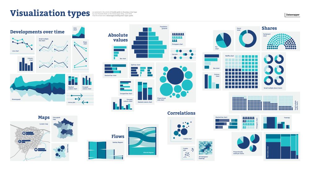
📊 There are *so* many chart types out there. Which one should you use for what kind of data and goal?
I tried to answer the question in a new blog post (and poster!): www.datawrapper.de/blog/chart-t...
I tried to answer the question in a new blog post (and poster!): www.datawrapper.de/blog/chart-t...
June 16, 2025 at 7:14 PM
📊 There are *so* many chart types out there. Which one should you use for what kind of data and goal?
I tried to answer the question in a new blog post (and poster!): www.datawrapper.de/blog/chart-t...
I tried to answer the question in a new blog post (and poster!): www.datawrapper.de/blog/chart-t...
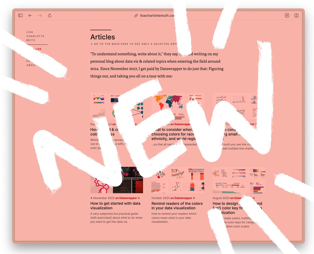
I just added lots of new content to my website! lisacharlottemuth.com
→ #dataviz projects & articles I've worked on at @datawrapper.de in the past years
→ a new "Events" page with information about the Data Vis Meetup, the Data Vis Book Club, and the Unwrapped conference
→ an updated About me page
→ #dataviz projects & articles I've worked on at @datawrapper.de in the past years
→ a new "Events" page with information about the Data Vis Meetup, the Data Vis Book Club, and the Unwrapped conference
→ an updated About me page
May 29, 2025 at 9:35 AM
I just added lots of new content to my website! lisacharlottemuth.com
→ #dataviz projects & articles I've worked on at @datawrapper.de in the past years
→ a new "Events" page with information about the Data Vis Meetup, the Data Vis Book Club, and the Unwrapped conference
→ an updated About me page
→ #dataviz projects & articles I've worked on at @datawrapper.de in the past years
→ a new "Events" page with information about the Data Vis Meetup, the Data Vis Book Club, and the Unwrapped conference
→ an updated About me page
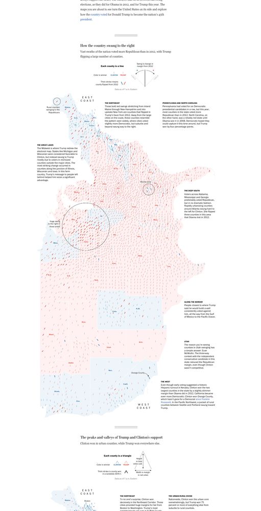
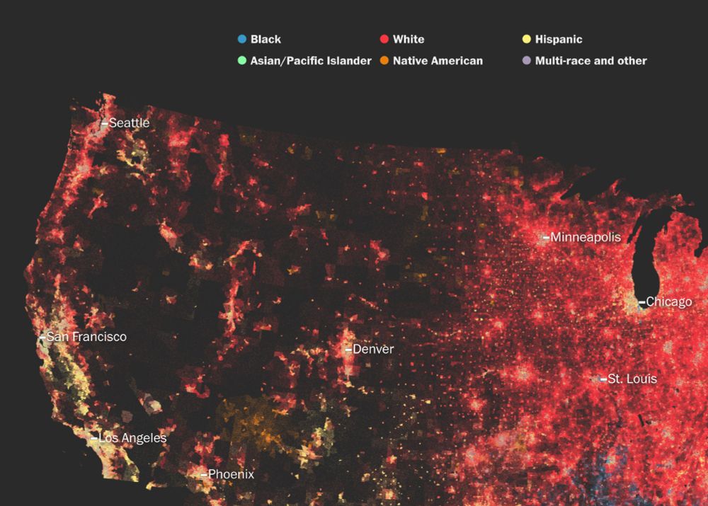
Thanks for doing and sharing your research – fascinating! I really like the split continents map; haven't see this before.
Other mobile-friendly map approaches I know are
→ splitting a map in the middle (www.nytimes.com/interactive/...)
→ rotating the map (www.washingtonpost.com/graphics/pol...)
Other mobile-friendly map approaches I know are
→ splitting a map in the middle (www.nytimes.com/interactive/...)
→ rotating the map (www.washingtonpost.com/graphics/pol...)
May 15, 2025 at 8:28 AM
Thanks for doing and sharing your research – fascinating! I really like the split continents map; haven't see this before.
Other mobile-friendly map approaches I know are
→ splitting a map in the middle (www.nytimes.com/interactive/...)
→ rotating the map (www.washingtonpost.com/graphics/pol...)
Other mobile-friendly map approaches I know are
→ splitting a map in the middle (www.nytimes.com/interactive/...)
→ rotating the map (www.washingtonpost.com/graphics/pol...)
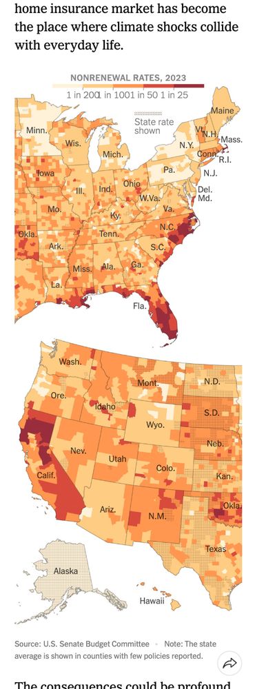
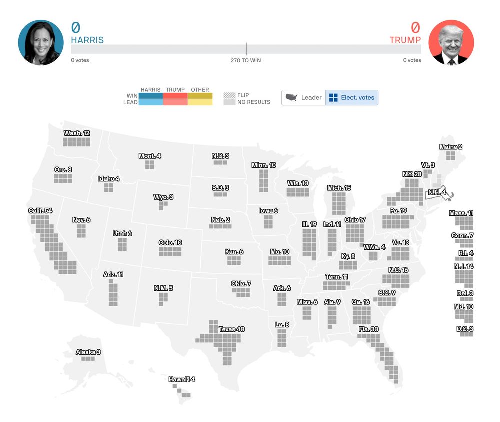
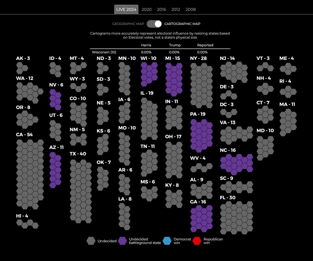
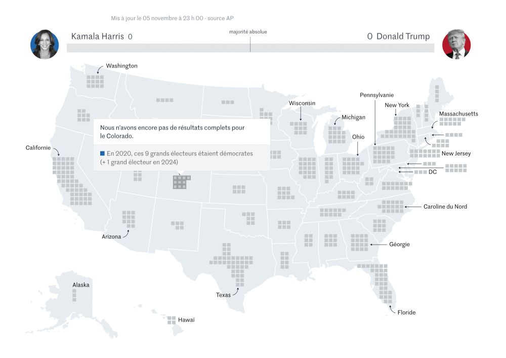
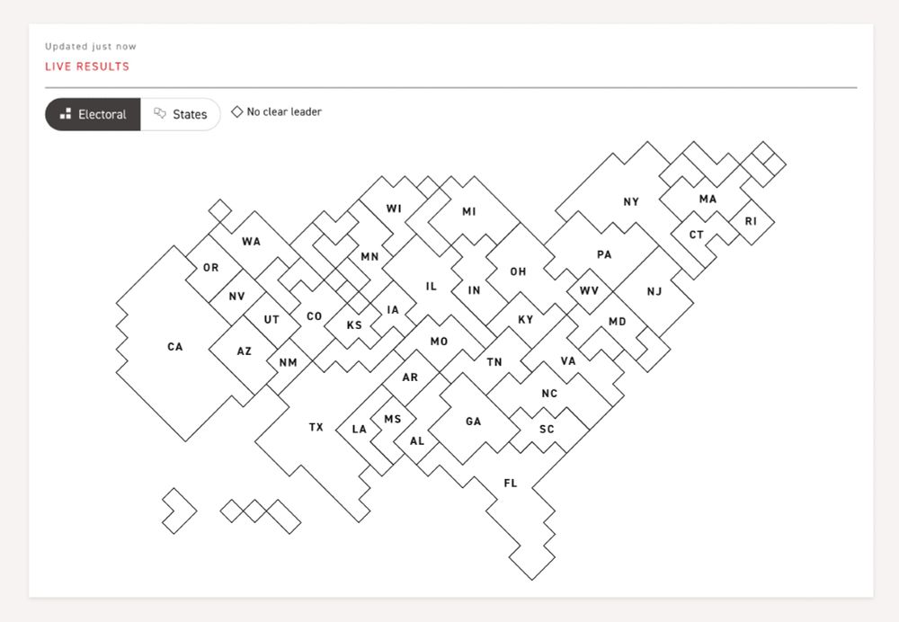
Curious how different news sites visualize U.S. election results? Here are 25+ links — let me know in the comments which ones I missed!
U.S. news sites
===============
→ The New York Times: www.nytimes.com/interactive/...
→ The Washington Post: www.washingtonpost.com/elections/re...
U.S. news sites
===============
→ The New York Times: www.nytimes.com/interactive/...
→ The Washington Post: www.washingtonpost.com/elections/re...
November 5, 2024 at 10:30 PM
Curious how different news sites visualize U.S. election results? Here are 25+ links — let me know in the comments which ones I missed!
U.S. news sites
===============
→ The New York Times: www.nytimes.com/interactive/...
→ The Washington Post: www.washingtonpost.com/elections/re...
U.S. news sites
===============
→ The New York Times: www.nytimes.com/interactive/...
→ The Washington Post: www.washingtonpost.com/elections/re...
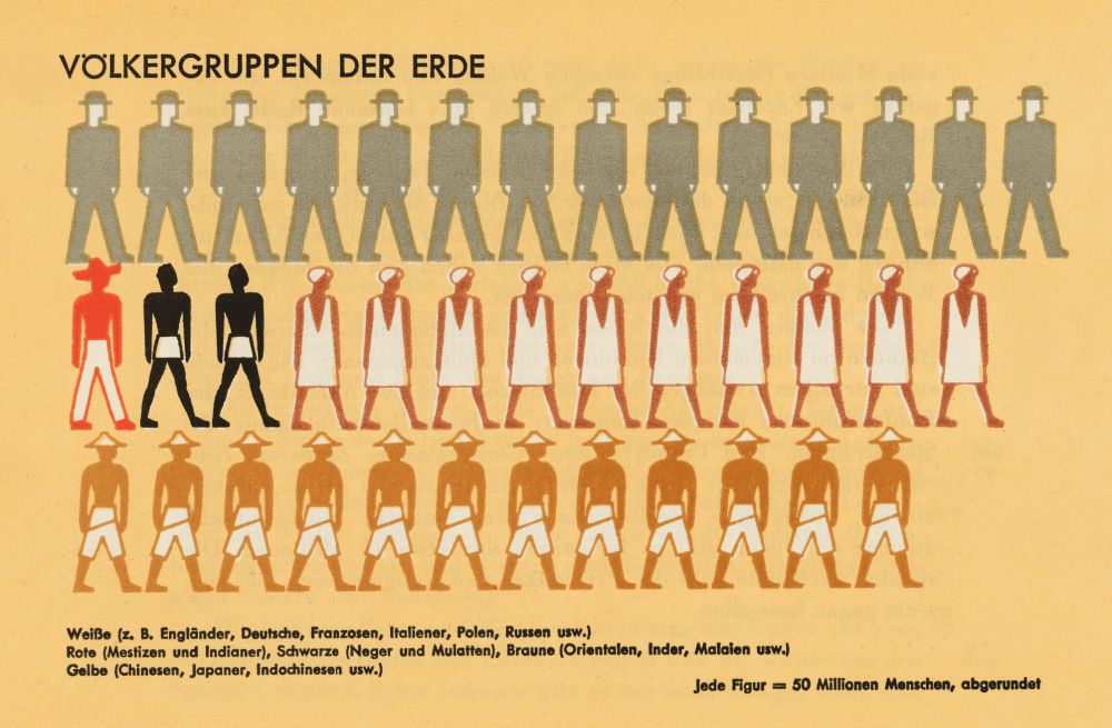
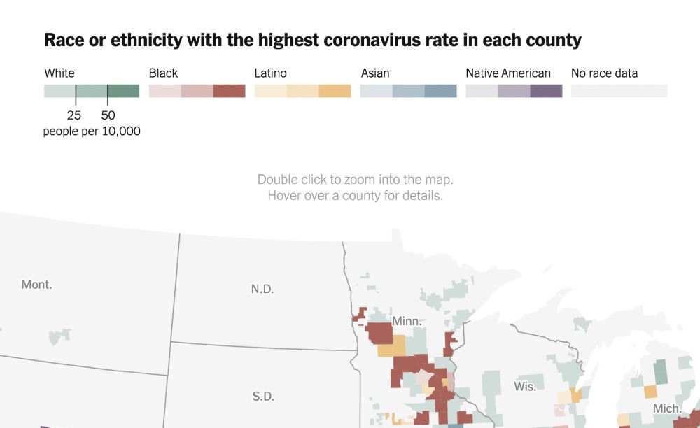
🎉 New blog post! Choosing colors for a #dataviz on race, ethnicity or continents can be tricky. I collected lots of examples and wrote down 6 guidelines to help ensure all your readers feel respected by your color choices: blog.datawrapper.de/colors-for-r...
October 10, 2024 at 10:30 AM
🎉 New blog post! Choosing colors for a #dataviz on race, ethnicity or continents can be tricky. I collected lots of examples and wrote down 6 guidelines to help ensure all your readers feel respected by your color choices: blog.datawrapper.de/colors-for-r...
That looks beautiful! Haven't tried the colors, but the presentation is amazing. I really like the little charts on the side giving the L, C, and H "profiles". Great find!

January 17, 2024 at 2:23 PM
That looks beautiful! Haven't tried the colors, but the presentation is amazing. I really like the little charts on the side giving the L, C, and H "profiles". Great find!
I guess so, too! I quickly drafted a survey (forms.gle/UhExR8jzxe28... – the options shuffle randomly) with the questions I'd include, but I'm sure a stats person like @steveharoz.com could improve it.


December 22, 2023 at 8:08 PM
I guess so, too! I quickly drafted a survey (forms.gle/UhExR8jzxe28... – the options shuffle randomly) with the questions I'd include, but I'm sure a stats person like @steveharoz.com could improve it.
Nathan is here!
Do follow Nathan!
And have a look at his latest graphics here: flowingdata.com/category/pro...
Do follow Nathan!
And have a look at his latest graphics here: flowingdata.com/category/pro...


December 22, 2023 at 7:43 PM
Nathan is here!
Do follow Nathan!
And have a look at his latest graphics here: flowingdata.com/category/pro...
Do follow Nathan!
And have a look at his latest graphics here: flowingdata.com/category/pro...
I'm annoyed by the number of social networks these days, so I've decided to only read the feed of one of them for a month and then switch. (I'll still post & check notifications on each of them.)
I start here, with Bluesky. I'm looking forward to all your data visualizations, links, and opinions!
I start here, with Bluesky. I'm looking forward to all your data visualizations, links, and opinions!

December 22, 2023 at 10:01 AM
I'm annoyed by the number of social networks these days, so I've decided to only read the feed of one of them for a month and then switch. (I'll still post & check notifications on each of them.)
I start here, with Bluesky. I'm looking forward to all your data visualizations, links, and opinions!
I start here, with Bluesky. I'm looking forward to all your data visualizations, links, and opinions!
Hi! I'm trying to post more here.
Like this: Today I published a blog post that will hopefully help all of you who love data vis, but have no idea how to go from there to "actually creating great data vis".
It's full of my learnings from many years.
Find it here: blog.datawrapper.de/how-to-get-s...
Like this: Today I published a blog post that will hopefully help all of you who love data vis, but have no idea how to go from there to "actually creating great data vis".
It's full of my learnings from many years.
Find it here: blog.datawrapper.de/how-to-get-s...

November 15, 2023 at 7:48 PM
Hi! I'm trying to post more here.
Like this: Today I published a blog post that will hopefully help all of you who love data vis, but have no idea how to go from there to "actually creating great data vis".
It's full of my learnings from many years.
Find it here: blog.datawrapper.de/how-to-get-s...
Like this: Today I published a blog post that will hopefully help all of you who love data vis, but have no idea how to go from there to "actually creating great data vis".
It's full of my learnings from many years.
Find it here: blog.datawrapper.de/how-to-get-s...