


krákawørld
@krakaworld.bsky.social
That's completely true. Sometimes I feel like it's just us, the devs, overthinking things.
May 12, 2025 at 4:07 PM
That's completely true. Sometimes I feel like it's just us, the devs, overthinking things.
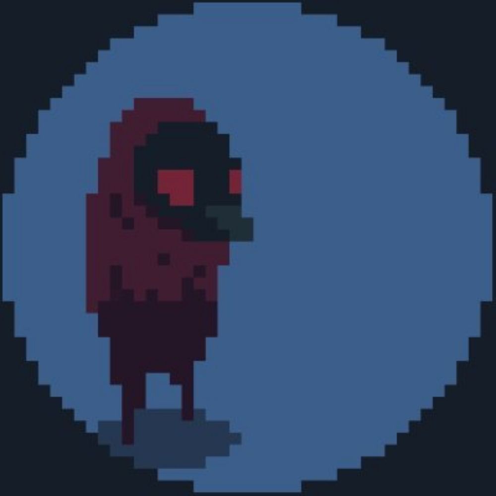
The mouse icon needs some more love for sure, thanks! 🙏
May 12, 2025 at 4:05 PM
The mouse icon needs some more love for sure, thanks! 🙏
Hmmm 🤔 I see. I love how one can spend gazillions of hours on such details instead of developing meaningful mechanics crucial for the gameplay. haha
Thank you, tho, valuable. Looks like I have to think about it again (and maybe even deeper) and test more variants 😆
Thank you, tho, valuable. Looks like I have to think about it again (and maybe even deeper) and test more variants 😆
May 11, 2025 at 1:35 PM
Hmmm 🤔 I see. I love how one can spend gazillions of hours on such details instead of developing meaningful mechanics crucial for the gameplay. haha
Thank you, tho, valuable. Looks like I have to think about it again (and maybe even deeper) and test more variants 😆
Thank you, tho, valuable. Looks like I have to think about it again (and maybe even deeper) and test more variants 😆
I just did this 👇
I will try playing with the thickness, though. You might be right!
bsky.app/profile/krak...
I will try playing with the thickness, though. You might be right!
bsky.app/profile/krak...
I was thinking about something like this 👇 for the outline animation.
Looks quite good when zoomed out. Brings more attention to the selected object.
Looks quite good when zoomed out. Brings more attention to the selected object.
May 11, 2025 at 1:08 PM
I just did this 👇
I will try playing with the thickness, though. You might be right!
bsky.app/profile/krak...
I will try playing with the thickness, though. You might be right!
bsky.app/profile/krak...
Circles are great. Maybe I will try applying them to Krákas (villagers) since they move all the time and are smaller than buildings.
Not sure such different visuals would be good, tho. Could be confusing, maybe?
Not sure such different visuals would be good, tho. Could be confusing, maybe?
May 11, 2025 at 1:05 PM
Circles are great. Maybe I will try applying them to Krákas (villagers) since they move all the time and are smaller than buildings.
Not sure such different visuals would be good, tho. Could be confusing, maybe?
Not sure such different visuals would be good, tho. Could be confusing, maybe?
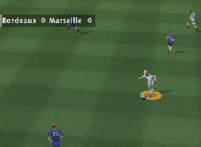
😅 good old FIFA vibes
I've tried something like that before. Felt weird. But it was only my poor implementation 😀
I've tried something like that before. Felt weird. But it was only my poor implementation 😀
May 11, 2025 at 12:58 PM
😅 good old FIFA vibes
I've tried something like that before. Felt weird. But it was only my poor implementation 😀
I've tried something like that before. Felt weird. But it was only my poor implementation 😀
Right? That was exactly my first impression. It's there, but somehow quiet.
May 11, 2025 at 12:08 PM
Right? That was exactly my first impression. It's there, but somehow quiet.
I was thinking about something like this 👇 for the outline animation.
Looks quite good when zoomed out. Brings more attention to the selected object.
Looks quite good when zoomed out. Brings more attention to the selected object.
May 11, 2025 at 12:06 PM
Seems like a consensus here, I like that idea, tbh 🙏
May 11, 2025 at 12:05 PM
Seems like a consensus here, I like that idea, tbh 🙏
So you say I need even moooore outline? 🤔 OK, I will test🫡
May 11, 2025 at 12:04 PM
So you say I need even moooore outline? 🤔 OK, I will test🫡
That could be possible, not sure if many people would use it. Also, if I spend my time on creating the outline, you gotta use my outline! 😀😀
However, there will be settings for its color change.
I will test the combined variant, as was suggested multiple times here.
However, there will be settings for its color change.
I will test the combined variant, as was suggested multiple times here.
May 11, 2025 at 12:02 PM
That could be possible, not sure if many people would use it. Also, if I spend my time on creating the outline, you gotta use my outline! 😀😀
However, there will be settings for its color change.
I will test the combined variant, as was suggested multiple times here.
However, there will be settings for its color change.
I will test the combined variant, as was suggested multiple times here.
I was thinking about something like this 👇 for the outline animation.
Looks quite good when zoomed out. Brings more attention to the selected object.
Looks quite good when zoomed out. Brings more attention to the selected object.
May 11, 2025 at 11:57 AM
I was thinking about something like this 👇 for the outline animation.
Looks quite good when zoomed out. Brings more attention to the selected object.
Looks quite good when zoomed out. Brings more attention to the selected object.
What a great tip with the grayscale! Thank you 😊
Someone recommended the outline on hover and the arrow (or both) on selection. Which I'll test too. But yeah, seems like using both is the way to go.
Someone recommended the outline on hover and the arrow (or both) on selection. Which I'll test too. But yeah, seems like using both is the way to go.
May 11, 2025 at 7:29 AM
What a great tip with the grayscale! Thank you 😊
Someone recommended the outline on hover and the arrow (or both) on selection. Which I'll test too. But yeah, seems like using both is the way to go.
Someone recommended the outline on hover and the arrow (or both) on selection. Which I'll test too. But yeah, seems like using both is the way to go.