


How To Read This Chart
@howtoreadthisch.art
A weekly newsletter about data, data visualizations and the aggregated weirdness of the world around us. A pbump.com project.
https://howtoreadthisch.art
https://howtoreadthisch.art
The newsletter includes a number of other comparisons — and several other topics and visualizations. Check it out!
8/8
www.howtoreadthisch.art/putting-the-...
8/8
www.howtoreadthisch.art/putting-the-...

Putting the real world down on paper
This week's newsletter looks at how we use maps. I review a new book on the subject, interview a mapmaker and show how maps can reshape our assumptions about borders. It's all topped off with what I t...
www.howtoreadthisch.art
November 15, 2025 at 4:55 PM
The newsletter includes a number of other comparisons — and several other topics and visualizations. Check it out!
8/8
www.howtoreadthisch.art/putting-the-...
8/8
www.howtoreadthisch.art/putting-the-...
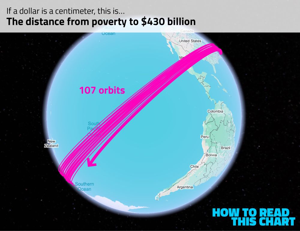
The richest person on that list is Elon Musk. Convert his net worth to centimeters and it’s enough to circle the globe more than 100 times.
It’s not even really comparable.
7/8
It’s not even really comparable.
7/8
November 15, 2025 at 4:55 PM
The richest person on that list is Elon Musk. Convert his net worth to centimeters and it’s enough to circle the globe more than 100 times.
It’s not even really comparable.
7/8
It’s not even really comparable.
7/8
So what happens when you get to the billionaires? Well, Bloomberg has a running list of the wealthiest people in the world.
The poorest of that 500-person list is almost two complete orbits of the globe away from poverty.
6/8
The poorest of that 500-person list is almost two complete orbits of the globe away from poverty.
6/8

November 15, 2025 at 4:55 PM
So what happens when you get to the billionaires? Well, Bloomberg has a running list of the wealthiest people in the world.
The poorest of that 500-person list is almost two complete orbits of the globe away from poverty.
6/8
The poorest of that 500-person list is almost two complete orbits of the globe away from poverty.
6/8
But only relatively. If you make a million dollars, we’re not even talking about blocks anymore. You’re way out in the harbor.
5/8
5/8

November 15, 2025 at 4:55 PM
But only relatively. If you make a million dollars, we’re not even talking about blocks anymore. You’re way out in the harbor.
5/8
5/8
If you make $200,000 a year, quite a bit more than poverty level, you end up more than 20 blocks away. Quite a distance!
4/8
4/8

November 15, 2025 at 4:55 PM
If you make $200,000 a year, quite a bit more than poverty level, you end up more than 20 blocks away. Quite a distance!
4/8
4/8
The distance between poverty and the median income, meanwhile, is slightly further: about seven blocks.
3/8
3/8

November 15, 2025 at 4:55 PM
The distance between poverty and the median income, meanwhile, is slightly further: about seven blocks.
3/8
3/8
I decided to convert dollars to centimeters. That allows us to visualize, for example, the distance between having no money and being at poverty level — about four city blocks.
2/8
2/8

November 15, 2025 at 4:55 PM
I decided to convert dollars to centimeters. That allows us to visualize, for example, the distance between having no money and being at poverty level — about four city blocks.
2/8
2/8
All for free (thanks to the people who support it financially)! Check it out!
www.howtoreadthisch.art/r/682c3344?m...
www.howtoreadthisch.art/r/682c3344?m...

Red versus blue. Versus yellow. Versus gray.
Chapter 1
It's (almost) all about TV
There was an election this week, I assume you heard, one in which the people who were unhappy last year became happy and vice versa. If you're one of the current ...
www.howtoreadthisch.art
November 8, 2025 at 4:01 PM
All for free (thanks to the people who support it financially)! Check it out!
www.howtoreadthisch.art/r/682c3344?m...
www.howtoreadthisch.art/r/682c3344?m...
4. Other good charts, like this look at where and when certain behaviors are acceptable.

November 8, 2025 at 4:01 PM
4. Other good charts, like this look at where and when certain behaviors are acceptable.
3. Prediction markets — or, as they probably should be called, “markets.”

November 8, 2025 at 4:01 PM
3. Prediction markets — or, as they probably should be called, “markets.”
2. Trump and the art of the government shutdown.

November 8, 2025 at 4:01 PM
2. Trump and the art of the government shutdown.
All free to read. Sign up to get the newsletter every weekend!
www.howtoreadthisch.art/r/46bb4a69?m...
www.howtoreadthisch.art/r/46bb4a69?m...

The web that tried to steal the presidency
Chapter 1
What is it that happens when first we practice to deceive? I forget.
If you are anything like me, you tuned into cable news coverage of the Capitol riot on Jan. 6, 2021 and thought to yours...
www.howtoreadthisch.art
November 1, 2025 at 4:12 PM
All free to read. Sign up to get the newsletter every weekend!
www.howtoreadthisch.art/r/46bb4a69?m...
www.howtoreadthisch.art/r/46bb4a69?m...
4.
Chart attack, including this survey of croissants.
Chart attack, including this survey of croissants.

November 1, 2025 at 4:12 PM
4.
Chart attack, including this survey of croissants.
Chart attack, including this survey of croissants.
3.
The overlap of Tesla and politics.
The overlap of Tesla and politics.

November 1, 2025 at 4:12 PM
3.
The overlap of Tesla and politics.
The overlap of Tesla and politics.
2.
How a senator’s chart became Trump’s disinformation.
How a senator’s chart became Trump’s disinformation.

November 1, 2025 at 4:12 PM
2.
How a senator’s chart became Trump’s disinformation.
How a senator’s chart became Trump’s disinformation.