


Steve Wexler
@datarevelations.com
Professional chart looker-atter. Author of "The Big Picture" and co-author of "The Big Book of Dashboards." James Jamerson disciple.
Hey dashboard designers:
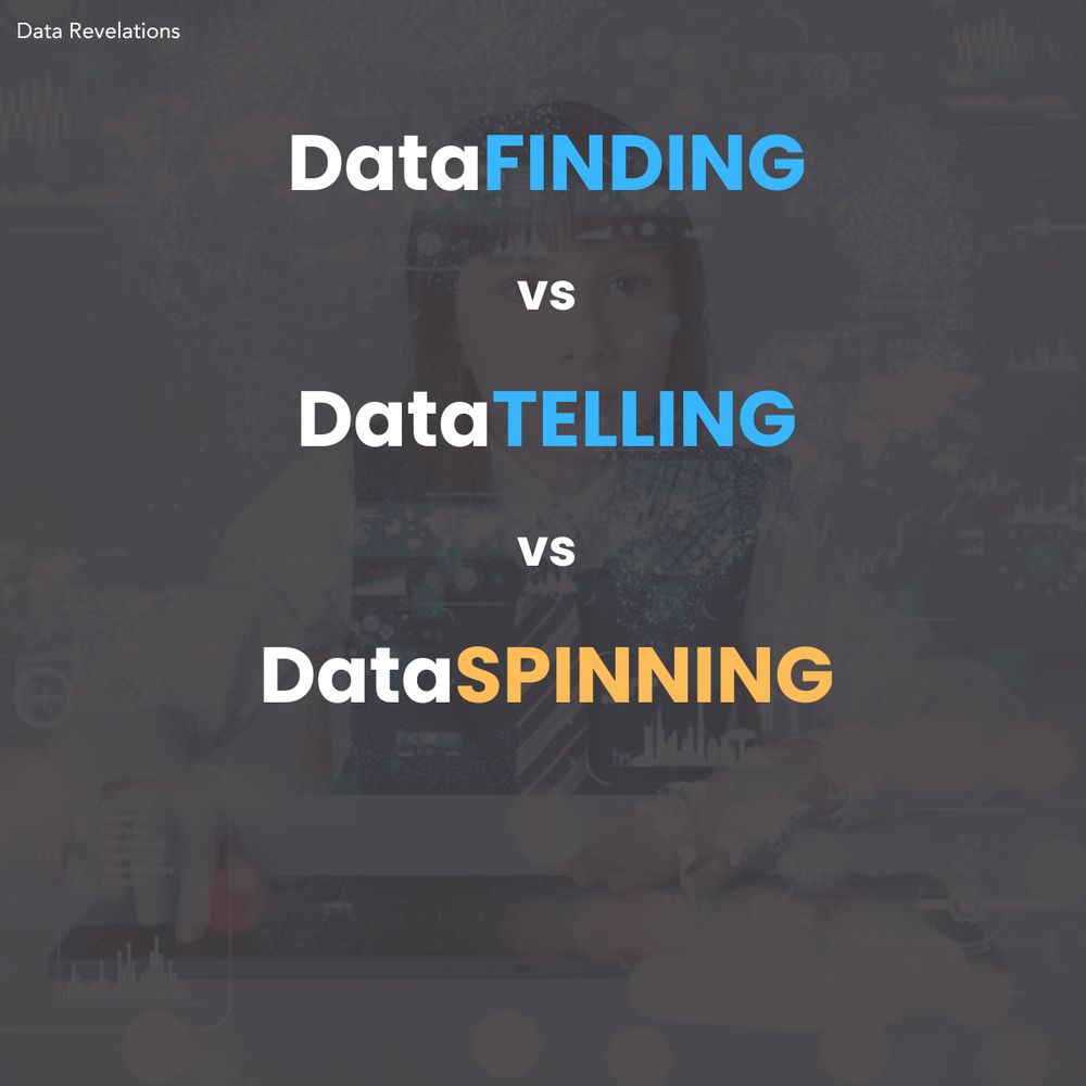
This may be controversial, but I think a dashboard is a terrible place to *tell* a data story.
But a good dashboard can be an indispensable tool for helping you and your organization *find* data stories worth telling.
Learn more at buytickets.at/datarevelati...
This may be controversial, but I think a dashboard is a terrible place to *tell* a data story.
But a good dashboard can be an indispensable tool for helping you and your organization *find* data stories worth telling.
Learn more at buytickets.at/datarevelati...
April 23, 2025 at 8:01 AM
Hey dashboard designers:
This may be controversial, but I think a dashboard is a terrible place to *tell* a data story.
But a good dashboard can be an indispensable tool for helping you and your organization *find* data stories worth telling.
Learn more at buytickets.at/datarevelati...
This may be controversial, but I think a dashboard is a terrible place to *tell* a data story.
But a good dashboard can be an indispensable tool for helping you and your organization *find* data stories worth telling.
Learn more at buytickets.at/datarevelati...
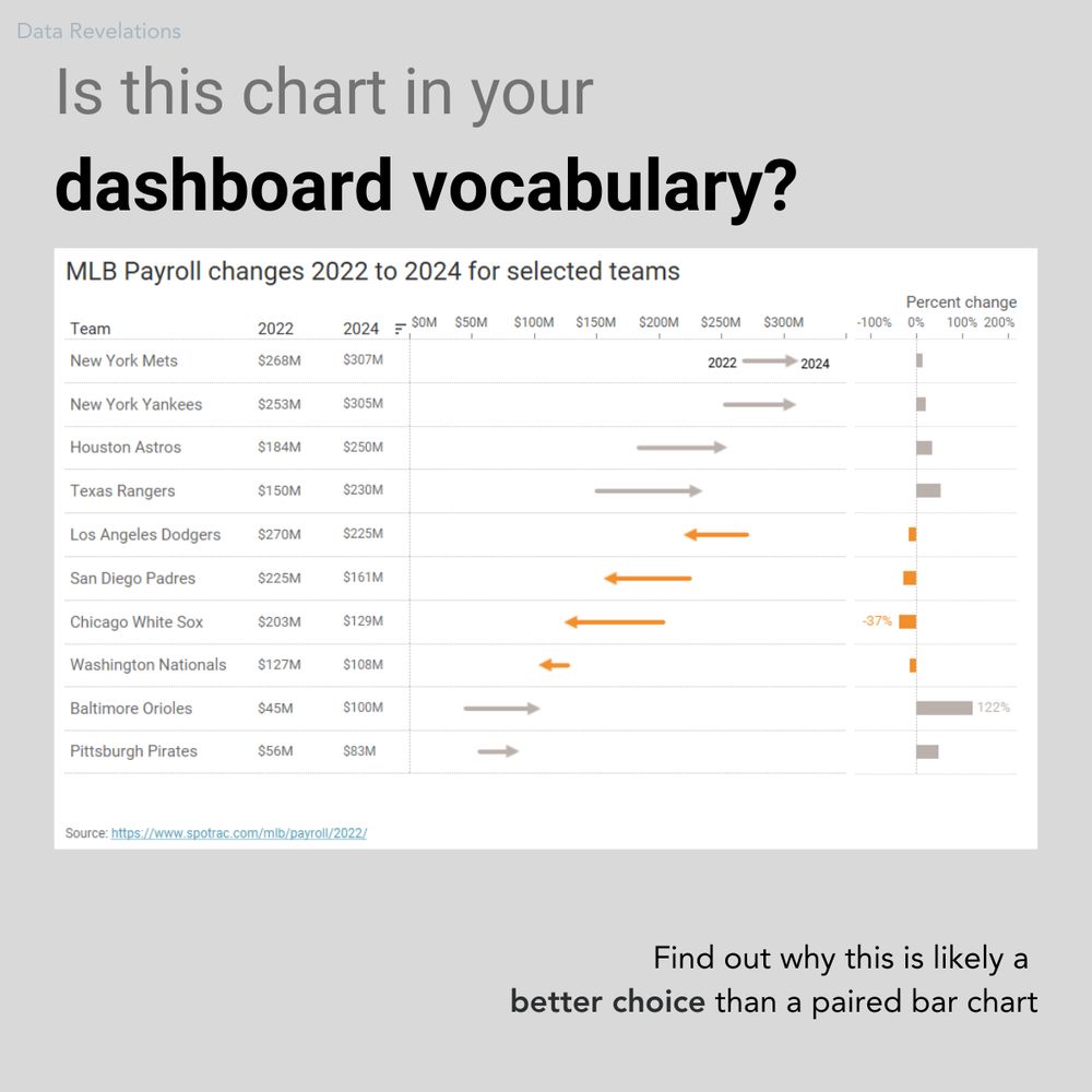
Hey, dashboard designers:
Is this chart in your chart vocabulary?
It's one of my favorite ways to show "now vs. then" along with percent change.
We'll examine this chart--and dozens--more in my upcoming dashboard design workshop May 27 and 29.
Learn more at buytickets.at/datarevelati...
Is this chart in your chart vocabulary?
It's one of my favorite ways to show "now vs. then" along with percent change.
We'll examine this chart--and dozens--more in my upcoming dashboard design workshop May 27 and 29.
Learn more at buytickets.at/datarevelati...
April 22, 2025 at 6:16 PM
Hey, dashboard designers:
Is this chart in your chart vocabulary?
It's one of my favorite ways to show "now vs. then" along with percent change.
We'll examine this chart--and dozens--more in my upcoming dashboard design workshop May 27 and 29.
Learn more at buytickets.at/datarevelati...
Is this chart in your chart vocabulary?
It's one of my favorite ways to show "now vs. then" along with percent change.
We'll examine this chart--and dozens--more in my upcoming dashboard design workshop May 27 and 29.
Learn more at buytickets.at/datarevelati...
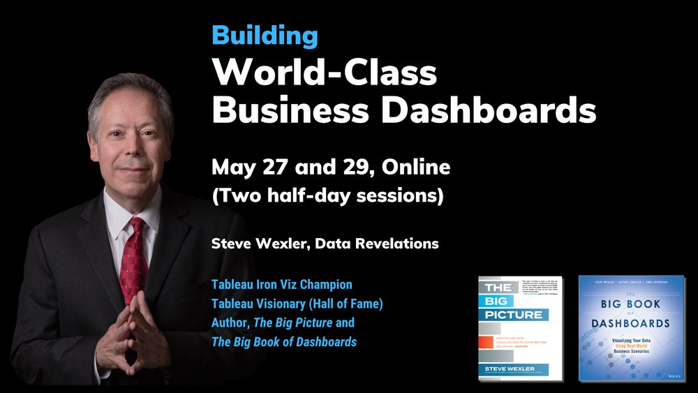
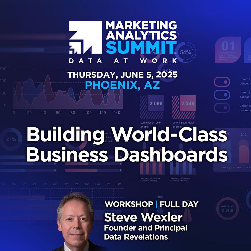
Not one but TWO dashboard design workshops coming up soon!
May 27 and 29 -- Online (two half-days).
June 5 -- In person as part of the Marketing Analytics Summit on Phoenix.
May: buytickets.at/datarevelati...
June: marketinganalyticssummit.com/workshop/bui...
May 27 and 29 -- Online (two half-days).
June 5 -- In person as part of the Marketing Analytics Summit on Phoenix.
May: buytickets.at/datarevelati...
June: marketinganalyticssummit.com/workshop/bui...
March 25, 2025 at 4:22 PM
Not one but TWO dashboard design workshops coming up soon!
May 27 and 29 -- Online (two half-days).
June 5 -- In person as part of the Marketing Analytics Summit on Phoenix.
May: buytickets.at/datarevelati...
June: marketinganalyticssummit.com/workshop/bui...
May 27 and 29 -- Online (two half-days).
June 5 -- In person as part of the Marketing Analytics Summit on Phoenix.
May: buytickets.at/datarevelati...
June: marketinganalyticssummit.com/workshop/bui...
2) **Chart Chat (In Person!)** A top-rated session three years in a row, I look forward to sparring with my fellow book authors Jeffrey Shaffer, @acotgreave.bsky.social , and @abmakulec.bsky.social. Lots of great sessions. See
reg.salesforce.com/flow/plus/tc...
reg.salesforce.com/flow/plus/tc...
March 17, 2025 at 4:02 PM
2) **Chart Chat (In Person!)** A top-rated session three years in a row, I look forward to sparring with my fellow book authors Jeffrey Shaffer, @acotgreave.bsky.social , and @abmakulec.bsky.social. Lots of great sessions. See
reg.salesforce.com/flow/plus/tc...
reg.salesforce.com/flow/plus/tc...
Better link:
reg.salesforce.com/flow/plus/tc...
reg.salesforce.com/flow/plus/tc...
March 17, 2025 at 3:59 PM
Better link:
reg.salesforce.com/flow/plus/tc...
reg.salesforce.com/flow/plus/tc...
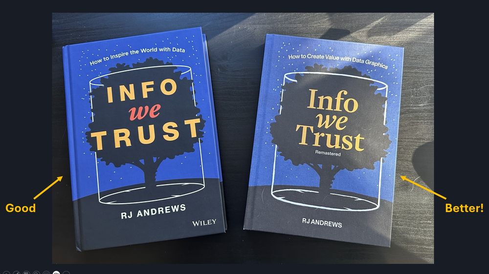
@infowetrust.com I'm grateful for the good you bring into the world.
And now with the updated and remastered version, you've brought some "better" into the world.
I encourage people to visit infowetrust.com
And now with the updated and remastered version, you've brought some "better" into the world.
I encourage people to visit infowetrust.com
January 22, 2025 at 10:26 PM
@infowetrust.com I'm grateful for the good you bring into the world.
And now with the updated and remastered version, you've brought some "better" into the world.
I encourage people to visit infowetrust.com
And now with the updated and remastered version, you've brought some "better" into the world.
I encourage people to visit infowetrust.com
How often does a CHART play a pivotal role in a TV show?
This one from the Hulu mini-series "Dopesick" sure did.
We'll explore this and nine other charts from TV shows in our upcoming Chart Chat on December 12.
https://buff.ly/4irpEtP
This one from the Hulu mini-series "Dopesick" sure did.
We'll explore this and nine other charts from TV shows in our upcoming Chart Chat on December 12.
https://buff.ly/4irpEtP

December 10, 2024 at 2:15 PM
How often does a CHART play a pivotal role in a TV show?
This one from the Hulu mini-series "Dopesick" sure did.
We'll explore this and nine other charts from TV shows in our upcoming Chart Chat on December 12.
https://buff.ly/4irpEtP
This one from the Hulu mini-series "Dopesick" sure did.
We'll explore this and nine other charts from TV shows in our upcoming Chart Chat on December 12.
https://buff.ly/4irpEtP
Is this one of the best charts EVER shown on TV?
It's the infamous "pie chart of my favorite bars" from "How I Met Your Mother."
We'll look at this, and nine other delights in our upcoming Chart Chat Livestream on December 12. Join us!
https://buff.ly/4irpEtP
It's the infamous "pie chart of my favorite bars" from "How I Met Your Mother."
We'll look at this, and nine other delights in our upcoming Chart Chat Livestream on December 12. Join us!
https://buff.ly/4irpEtP

December 9, 2024 at 11:38 AM
Is this one of the best charts EVER shown on TV?
It's the infamous "pie chart of my favorite bars" from "How I Met Your Mother."
We'll look at this, and nine other delights in our upcoming Chart Chat Livestream on December 12. Join us!
https://buff.ly/4irpEtP
It's the infamous "pie chart of my favorite bars" from "How I Met Your Mother."
We'll look at this, and nine other delights in our upcoming Chart Chat Livestream on December 12. Join us!
https://buff.ly/4irpEtP
Only two spots left for my upcoming dashboard design workshop on December 3 and 5.
Learn more at https://buff.ly/3Bm0wnA
Learn more at https://buff.ly/3Bm0wnA

December 2, 2024 at 8:18 PM
Only two spots left for my upcoming dashboard design workshop on December 3 and 5.
Learn more at https://buff.ly/3Bm0wnA
Learn more at https://buff.ly/3Bm0wnA
Do most dashboards fail?
I'd love to know what YOU think.
Please take this two-question survey: www.surveymonkey.com/r/K6YGR6Z
#dashboards
#success
#failure
I'd love to know what YOU think.
Please take this two-question survey: www.surveymonkey.com/r/K6YGR6Z
#dashboards
#success
#failure

November 6, 2024 at 10:14 PM
Do most dashboards fail?
I'd love to know what YOU think.
Please take this two-question survey: www.surveymonkey.com/r/K6YGR6Z
#dashboards
#success
#failure
I'd love to know what YOU think.
Please take this two-question survey: www.surveymonkey.com/r/K6YGR6Z
#dashboards
#success
#failure
BANs (Big-Ass Numbers)
I used to look at BANs--large, occasionally overstuffed Key Performance Indicators (KPIs)— as ornamental rather than informational.
I’ve changed my mind.
At least BANs with *context*.
We'll explore this in my upcoming dashboard design workshop. https://buff.ly/3YaZUtM
I used to look at BANs--large, occasionally overstuffed Key Performance Indicators (KPIs)— as ornamental rather than informational.
I’ve changed my mind.
At least BANs with *context*.
We'll explore this in my upcoming dashboard design workshop. https://buff.ly/3YaZUtM

October 10, 2024 at 9:00 AM
BANs (Big-Ass Numbers)
I used to look at BANs--large, occasionally overstuffed Key Performance Indicators (KPIs)— as ornamental rather than informational.
I’ve changed my mind.
At least BANs with *context*.
We'll explore this in my upcoming dashboard design workshop. https://buff.ly/3YaZUtM
I used to look at BANs--large, occasionally overstuffed Key Performance Indicators (KPIs)— as ornamental rather than informational.
I’ve changed my mind.
At least BANs with *context*.
We'll explore this in my upcoming dashboard design workshop. https://buff.ly/3YaZUtM
Hey dashboard designers:
This may be controversial, but I think a dashboard is a terrible place to *tell* a data story.
But a good dashboard can be an indispensable tool for helping you and your organization *find* data stories worth telling.
Learn more at https://buff.ly/3YaZUtM
This may be controversial, but I think a dashboard is a terrible place to *tell* a data story.
But a good dashboard can be an indispensable tool for helping you and your organization *find* data stories worth telling.
Learn more at https://buff.ly/3YaZUtM
October 8, 2024 at 9:00 AM
Hey dashboard designers:
This may be controversial, but I think a dashboard is a terrible place to *tell* a data story.
But a good dashboard can be an indispensable tool for helping you and your organization *find* data stories worth telling.
Learn more at https://buff.ly/3YaZUtM
This may be controversial, but I think a dashboard is a terrible place to *tell* a data story.
But a good dashboard can be an indispensable tool for helping you and your organization *find* data stories worth telling.
Learn more at https://buff.ly/3YaZUtM
Hey, dashboard designers:
Is this chart in your chart vocabulary?
It's one of my favorite ways to show "now vs. then" along with percent change.
We'll examine this chart--and dozens--more in my upcoming dashboard design workshop December 3 and 5.
Learn more at https://buff.ly/3BqDagl
Is this chart in your chart vocabulary?
It's one of my favorite ways to show "now vs. then" along with percent change.
We'll examine this chart--and dozens--more in my upcoming dashboard design workshop December 3 and 5.
Learn more at https://buff.ly/3BqDagl
October 7, 2024 at 3:50 PM
Hey, dashboard designers:
Is this chart in your chart vocabulary?
It's one of my favorite ways to show "now vs. then" along with percent change.
We'll examine this chart--and dozens--more in my upcoming dashboard design workshop December 3 and 5.
Learn more at https://buff.ly/3BqDagl
Is this chart in your chart vocabulary?
It's one of my favorite ways to show "now vs. then" along with percent change.
We'll examine this chart--and dozens--more in my upcoming dashboard design workshop December 3 and 5.
Learn more at https://buff.ly/3BqDagl
Very excited. THE Giorgia Lupi will be our guest on Chart Chat on October 23 at 11 AM EDT. Register for free at
buytickets.at/datarevelati...
buytickets.at/datarevelati...

October 1, 2024 at 5:52 PM
Very excited. THE Giorgia Lupi will be our guest on Chart Chat on October 23 at 11 AM EDT. Register for free at
buytickets.at/datarevelati...
buytickets.at/datarevelati...
I’m Steve Wexler, chief chart looker-atter at Data Revelations.
I am one of three authors of The Big Book of Dashboards and the author of The Big Picture.
I'll be presenting a dashboard design workshop online on Dec 3 and 5.
Learn more at buff.ly/3BqDagl
EARLY-BIRD pricing ends October 31.
I am one of three authors of The Big Book of Dashboards and the author of The Big Picture.
I'll be presenting a dashboard design workshop online on Dec 3 and 5.
Learn more at buff.ly/3BqDagl
EARLY-BIRD pricing ends October 31.

October 1, 2024 at 5:00 PM
I’m Steve Wexler, chief chart looker-atter at Data Revelations.
I am one of three authors of The Big Book of Dashboards and the author of The Big Picture.
I'll be presenting a dashboard design workshop online on Dec 3 and 5.
Learn more at buff.ly/3BqDagl
EARLY-BIRD pricing ends October 31.
I am one of three authors of The Big Book of Dashboards and the author of The Big Picture.
I'll be presenting a dashboard design workshop online on Dec 3 and 5.
Learn more at buff.ly/3BqDagl
EARLY-BIRD pricing ends October 31.
Ten years ago.
I had the good sense to listen and not talk.
Jock Mackinlay said "I sat next to him at the last conference. You take the seat."
Thank you, Jock.
I had the good sense to listen and not talk.
Jock Mackinlay said "I sat next to him at the last conference. You take the seat."
Thank you, Jock.

September 12, 2024 at 1:26 PM
Ten years ago.
I had the good sense to listen and not talk.
Jock Mackinlay said "I sat next to him at the last conference. You take the seat."
Thank you, Jock.
I had the good sense to listen and not talk.
Jock Mackinlay said "I sat next to him at the last conference. You take the seat."
Thank you, Jock.
September's show is a deep dive into the latest goings on we've seen in data graphics this summer. We'll also share some highlights of our upcoming book.
And... we're going REALLY DEEP into population pyramids Look out for Andy's rant!
buytickets.at/datarevelati... with
@abmakulec.bsky.social
And... we're going REALLY DEEP into population pyramids Look out for Andy's rant!
buytickets.at/datarevelati... with
@abmakulec.bsky.social

September 11, 2024 at 3:06 PM
September's show is a deep dive into the latest goings on we've seen in data graphics this summer. We'll also share some highlights of our upcoming book.
And... we're going REALLY DEEP into population pyramids Look out for Andy's rant!
buytickets.at/datarevelati... with
@abmakulec.bsky.social
And... we're going REALLY DEEP into population pyramids Look out for Andy's rant!
buytickets.at/datarevelati... with
@abmakulec.bsky.social
A nod to @infowetrust.com from our latest Chart Chat episode. www.youtube.com/live/HFZGYJt...

March 8, 2024 at 10:02 PM
A nod to @infowetrust.com from our latest Chart Chat episode. www.youtube.com/live/HFZGYJt...
Please join me, Amanda Makulec, Jeffrey Shaffer, and Andy Cotgreave on March 7 for Chart Chat Dynamic Duos:
We'll look at chart pairings where the whole that is greater than the sum of the two parts.
Register for free at buytickets.at/datarevelati...
We'll look at chart pairings where the whole that is greater than the sum of the two parts.
Register for free at buytickets.at/datarevelati...


March 4, 2024 at 7:14 PM
Please join me, Amanda Makulec, Jeffrey Shaffer, and Andy Cotgreave on March 7 for Chart Chat Dynamic Duos:
We'll look at chart pairings where the whole that is greater than the sum of the two parts.
Register for free at buytickets.at/datarevelati...
We'll look at chart pairings where the whole that is greater than the sum of the two parts.
Register for free at buytickets.at/datarevelati...
Hey, data viz practitioners.
We've got a new book in the works, and we could use your help!
I'm working with Jeffrey Shaffer, @acotgreave.bsky.social, and @abmakulec.bsky.social on a follow up to The Big Book of Dashboards.
Learn more at bigbookofdashboards.com/newbook.html.
We've got a new book in the works, and we could use your help!
I'm working with Jeffrey Shaffer, @acotgreave.bsky.social, and @abmakulec.bsky.social on a follow up to The Big Book of Dashboards.
Learn more at bigbookofdashboards.com/newbook.html.

January 9, 2024 at 7:29 PM
Hey, data viz practitioners.
We've got a new book in the works, and we could use your help!
I'm working with Jeffrey Shaffer, @acotgreave.bsky.social, and @abmakulec.bsky.social on a follow up to The Big Book of Dashboards.
Learn more at bigbookofdashboards.com/newbook.html.
We've got a new book in the works, and we could use your help!
I'm working with Jeffrey Shaffer, @acotgreave.bsky.social, and @abmakulec.bsky.social on a follow up to The Big Book of Dashboards.
Learn more at bigbookofdashboards.com/newbook.html.
While an interesting and well-researched article, I think the stacked column polar charts that make up the bulk of the article (aka "Nightingale rose" chart) were a poor choice.
But I bet the sanitary conditions at the student infirmary are exemplary.
www.wsj.com/us-news/educ...
But I bet the sanitary conditions at the student infirmary are exemplary.
www.wsj.com/us-news/educ...

December 28, 2023 at 3:07 PM
While an interesting and well-researched article, I think the stacked column polar charts that make up the bulk of the article (aka "Nightingale rose" chart) were a poor choice.
But I bet the sanitary conditions at the student infirmary are exemplary.
www.wsj.com/us-news/educ...
But I bet the sanitary conditions at the student infirmary are exemplary.
www.wsj.com/us-news/educ...