


Steve Wexler
@datarevelations.com
Professional chart looker-atter. Author of "The Big Picture" and co-author of "The Big Book of Dashboards." James Jamerson disciple.
That would be great.
bigpic.me/broadway
Please spread the word! The more people who participate, the more who will know about these trailblazers.
bigpic.me/broadway
Please spread the word! The more people who participate, the more who will know about these trailblazers.

Women+ Conduct on Broadway Data Visualization Contest
Broadway has a rich history of music and artistry, but until recently, little attention has been given to the representation of female and nonbinary conductors, music directors, and music supervisors ...
bigpic.me
January 6, 2026 at 9:11 PM
That would be great.
bigpic.me/broadway
Please spread the word! The more people who participate, the more who will know about these trailblazers.
bigpic.me/broadway
Please spread the word! The more people who participate, the more who will know about these trailblazers.
If you are into data and music (and especially Broadway musicals) THIS IS FOR YOU!
Join me and the stellar team I've been working with for a 20-minute Livestream on January 6 at 11 AM EST.
Women+ Conduct on Broadway Data Visualization Contest.
www.eventbrite.com/e/women-cond...
Join me and the stellar team I've been working with for a 20-minute Livestream on January 6 at 11 AM EST.
Women+ Conduct on Broadway Data Visualization Contest.
www.eventbrite.com/e/women-cond...

January 5, 2026 at 4:39 PM
If you are into data and music (and especially Broadway musicals) THIS IS FOR YOU!
Join me and the stellar team I've been working with for a 20-minute Livestream on January 6 at 11 AM EST.
Women+ Conduct on Broadway Data Visualization Contest.
www.eventbrite.com/e/women-cond...
Join me and the stellar team I've been working with for a 20-minute Livestream on January 6 at 11 AM EST.
Women+ Conduct on Broadway Data Visualization Contest.
www.eventbrite.com/e/women-cond...
HOW COOL IS THIS TABLE?!
The table on the left shows my results for the first three tournaments I've played in Learned League. The green highlights are lightly-rendered bars.
I drew the bars in the table on the right in case you don't see them on the left.
Great way to augment a table.
The table on the left shows my results for the first three tournaments I've played in Learned League. The green highlights are lightly-rendered bars.
I drew the bars in the table on the right in case you don't see them on the left.
Great way to augment a table.

December 19, 2025 at 4:39 PM
HOW COOL IS THIS TABLE?!
The table on the left shows my results for the first three tournaments I've played in Learned League. The green highlights are lightly-rendered bars.
I drew the bars in the table on the right in case you don't see them on the left.
Great way to augment a table.
The table on the left shows my results for the first three tournaments I've played in Learned League. The green highlights are lightly-rendered bars.
I drew the bars in the table on the right in case you don't see them on the left.
Great way to augment a table.
Not being able to paste images in a reply on LinkedIn drives me nuts.
Finding the names of people I want to tag over here is difficult.
Sigh. LinkedIn was working well for a little while at least.
I'm willing to give it a try here.
Finding the names of people I want to tag over here is difficult.
Sigh. LinkedIn was working well for a little while at least.
I'm willing to give it a try here.
December 17, 2025 at 9:59 PM
Not being able to paste images in a reply on LinkedIn drives me nuts.
Finding the names of people I want to tag over here is difficult.
Sigh. LinkedIn was working well for a little while at least.
I'm willing to give it a try here.
Finding the names of people I want to tag over here is difficult.
Sigh. LinkedIn was working well for a little while at least.
I'm willing to give it a try here.
For me, three things:
1) I hope to learn things and be challenged.
2) I need to contribute things others find valuable, either original content or comments.
3) If and when I have something to promote (a course, a book, etc.) my hope is that people will have seen number 2 above.
1) I hope to learn things and be challenged.
2) I need to contribute things others find valuable, either original content or comments.
3) If and when I have something to promote (a course, a book, etc.) my hope is that people will have seen number 2 above.
December 17, 2025 at 6:17 PM
For me, three things:
1) I hope to learn things and be challenged.
2) I need to contribute things others find valuable, either original content or comments.
3) If and when I have something to promote (a course, a book, etc.) my hope is that people will have seen number 2 above.
1) I hope to learn things and be challenged.
2) I need to contribute things others find valuable, either original content or comments.
3) If and when I have something to promote (a course, a book, etc.) my hope is that people will have seen number 2 above.
Great clue.
And the movie starred Cary Grant at his Cary Grant-iest.
And the movie starred Cary Grant at his Cary Grant-iest.
December 17, 2025 at 6:13 PM
Great clue.
And the movie starred Cary Grant at his Cary Grant-iest.
And the movie starred Cary Grant at his Cary Grant-iest.
Hitchcock, yes?
If so, then it's my favorite Hitchcock movie.
If so, then it's my favorite Hitchcock movie.
December 17, 2025 at 5:55 PM
Hitchcock, yes?
If so, then it's my favorite Hitchcock movie.
If so, then it's my favorite Hitchcock movie.
Ben, you are giving me to fuel to see if I can get enough people to give it a serious try.
I tried this three years ago and had some success.
It will need more than one week and I don't know if I will be able to convince some "gotta have" folks.
See www.datarevelations.com/laying-off-t...
I tried this three years ago and had some success.
It will need more than one week and I don't know if I will be able to convince some "gotta have" folks.
See www.datarevelations.com/laying-off-t...

Laying off Twitter for a Week - Data Revelations
Where and how to have discussions around data visualization From December 5 through 9, I took a break from Twitter to spark conversation on The Data Visualization Society’s Slack workspace. I want to ...
www.datarevelations.com
December 17, 2025 at 5:53 PM
Ben, you are giving me to fuel to see if I can get enough people to give it a serious try.
I tried this three years ago and had some success.
It will need more than one week and I don't know if I will be able to convince some "gotta have" folks.
See www.datarevelations.com/laying-off-t...
I tried this three years ago and had some success.
It will need more than one week and I don't know if I will be able to convince some "gotta have" folks.
See www.datarevelations.com/laying-off-t...
@chezvoila.com oooh, that's a good one to lead with! Francis posts such good stuff!
December 17, 2025 at 5:45 PM
@chezvoila.com oooh, that's a good one to lead with! Francis posts such good stuff!
Folks, here's a link to my newsletter where I express my exasperation with LinkedIn.
Maybe we can get a critical mass of data viz people to agree to put in real effort to make BlueSky social work.
mailchi.mp/b0a153ba5843...
Maybe we can get a critical mass of data viz people to agree to put in real effort to make BlueSky social work.
mailchi.mp/b0a153ba5843...
I'm exasperated with LinkedIn. How about you?
mailchi.mp
December 17, 2025 at 5:18 PM
Folks, here's a link to my newsletter where I express my exasperation with LinkedIn.
Maybe we can get a critical mass of data viz people to agree to put in real effort to make BlueSky social work.
mailchi.mp/b0a153ba5843...
Maybe we can get a critical mass of data viz people to agree to put in real effort to make BlueSky social work.
mailchi.mp/b0a153ba5843...
Women+ Conduct on Broadway Data Visualization Contest
I've been working for the past few months with some great collaborators to bring this contest into fruition.
Learn more: forms.gle/xwPYxFehjfmT...
I've been working for the past few months with some great collaborators to bring this contest into fruition.
Learn more: forms.gle/xwPYxFehjfmT...
Women+ Conduct on Broadway Data Visualization Contest
Broadway has a rich history of music and artistry, but until recently, little attention has been given to the representation of female and nonbinary conductors, music directors, and music supervisors ...
forms.gle
December 10, 2025 at 6:19 PM
Women+ Conduct on Broadway Data Visualization Contest
I've been working for the past few months with some great collaborators to bring this contest into fruition.
Learn more: forms.gle/xwPYxFehjfmT...
I've been working for the past few months with some great collaborators to bring this contest into fruition.
Learn more: forms.gle/xwPYxFehjfmT...
You can now get LIFETIME access to my *updated* Visualizing Survey Data Using Tableau On-Demand course.
Learn more at bigpic.me/course
#surveydata
Learn more at bigpic.me/course
#surveydata
December 4, 2025 at 6:31 PM
You can now get LIFETIME access to my *updated* Visualizing Survey Data Using Tableau On-Demand course.
Learn more at bigpic.me/course
#surveydata
Learn more at bigpic.me/course
#surveydata
Come join me, @abmakulec.bsky.social, @acotgreave.bsky.social, and Jeffrey Shaffer as we explore some of the highlights (and lowlights) of data visualization in 2025.
Like the BBC News, our goal is to inform, educate, and entertain.
(But without any scandals).
buytickets.at/datarevelati...
Like the BBC News, our goal is to inform, educate, and entertain.
(But without any scandals).
buytickets.at/datarevelati...

December 4, 2025 at 6:25 PM
Come join me, @abmakulec.bsky.social, @acotgreave.bsky.social, and Jeffrey Shaffer as we explore some of the highlights (and lowlights) of data visualization in 2025.
Like the BBC News, our goal is to inform, educate, and entertain.
(But without any scandals).
buytickets.at/datarevelati...
Like the BBC News, our goal is to inform, educate, and entertain.
(But without any scandals).
buytickets.at/datarevelati...
If you are into music and data (or music and history, or music and anthropology, or music and politics) this edition of Chart Chat is for you!
We'll be talking with musician, author, and fellow data nerd Chris Dalla Riva about his new book, "Uncharted Territory."
buytickets.at/datarevelati...
We'll be talking with musician, author, and fellow data nerd Chris Dalla Riva about his new book, "Uncharted Territory."
buytickets.at/datarevelati...

November 12, 2025 at 5:35 PM
If you are into music and data (or music and history, or music and anthropology, or music and politics) this edition of Chart Chat is for you!
We'll be talking with musician, author, and fellow data nerd Chris Dalla Riva about his new book, "Uncharted Territory."
buytickets.at/datarevelati...
We'll be talking with musician, author, and fellow data nerd Chris Dalla Riva about his new book, "Uncharted Territory."
buytickets.at/datarevelati...
Monday bass delights.
Live recording of Stevie Wonder performing "For Once In My Life." KILLER bass playing from then 18-year-old Michael Henderson. Apparently, Miles Davis caught one of the shows and told Wonder "I'm stealing your bass player."
stevewexlertopshelf.wordpress.com/2014/09/01/f...
Live recording of Stevie Wonder performing "For Once In My Life." KILLER bass playing from then 18-year-old Michael Henderson. Apparently, Miles Davis caught one of the shows and told Wonder "I'm stealing your bass player."
stevewexlertopshelf.wordpress.com/2014/09/01/f...

For Once in My Life — An Appreciation of Michael Henderson
I think I own everything that Stevie Wonder has recorded and released, going back to the early 1960s. On a recent plane ride to Omaha with my iPhone in shuffle mode I stumbled across a live record…
stevewexlertopshelf.wordpress.com
September 29, 2025 at 6:02 PM
Monday bass delights.
Live recording of Stevie Wonder performing "For Once In My Life." KILLER bass playing from then 18-year-old Michael Henderson. Apparently, Miles Davis caught one of the shows and told Wonder "I'm stealing your bass player."
stevewexlertopshelf.wordpress.com/2014/09/01/f...
Live recording of Stevie Wonder performing "For Once In My Life." KILLER bass playing from then 18-year-old Michael Henderson. Apparently, Miles Davis caught one of the shows and told Wonder "I'm stealing your bass player."
stevewexlertopshelf.wordpress.com/2014/09/01/f...
Monday Bass Delight.
"What's The Buzz" from Jesus Christ Superstar. Alan Spenner (Joe Cocker) on bass. A veritable clinic on I to IV.
So inventive and so in-the-pocket. Great tone, too.
youtu.be/0X4h9TEwPRY?...
"What's The Buzz" from Jesus Christ Superstar. Alan Spenner (Joe Cocker) on bass. A veritable clinic on I to IV.
So inventive and so in-the-pocket. Great tone, too.
youtu.be/0X4h9TEwPRY?...

What's The Buzz / Strange Thing Mystifying
YouTube video by Yvonne Elliman - Topic
youtu.be
September 8, 2025 at 2:21 PM
Monday Bass Delight.
"What's The Buzz" from Jesus Christ Superstar. Alan Spenner (Joe Cocker) on bass. A veritable clinic on I to IV.
So inventive and so in-the-pocket. Great tone, too.
youtu.be/0X4h9TEwPRY?...
"What's The Buzz" from Jesus Christ Superstar. Alan Spenner (Joe Cocker) on bass. A veritable clinic on I to IV.
So inventive and so in-the-pocket. Great tone, too.
youtu.be/0X4h9TEwPRY?...
Sadly, I'm not an expert on creating the survey instrument itself. I can certainly provide ideas on what NOT to do, but my expertise is around visualizing and understanding the result.
August 6, 2025 at 7:53 PM
Sadly, I'm not an expert on creating the survey instrument itself. I can certainly provide ideas on what NOT to do, but my expertise is around visualizing and understanding the result.
How does Andy Borowitz come up with this stuff, day after day?
Brilliant.
www.borowitzreport.com/p/trump-taps...
Brilliant.
www.borowitzreport.com/p/trump-taps...

Trump Taps George Santos to Head Dept. Of Labor Statistics
Beltway insiders are calling it one of the most stunning political comebacks in American history.
www.borowitzreport.com
August 4, 2025 at 6:05 PM
How does Andy Borowitz come up with this stuff, day after day?
Brilliant.
www.borowitzreport.com/p/trump-taps...
Brilliant.
www.borowitzreport.com/p/trump-taps...
I had forgotten about this.
You continue to have what may be a perfect track record of nothing-but-really-useful posts (either your own or amplifying others).
You continue to have what may be a perfect track record of nothing-but-really-useful posts (either your own or amplifying others).
June 29, 2025 at 3:49 PM
I had forgotten about this.
You continue to have what may be a perfect track record of nothing-but-really-useful posts (either your own or amplifying others).
You continue to have what may be a perfect track record of nothing-but-really-useful posts (either your own or amplifying others).
Thank you for the kind words.
June 12, 2025 at 1:08 AM
Thank you for the kind words.
Hey dashboard designers:
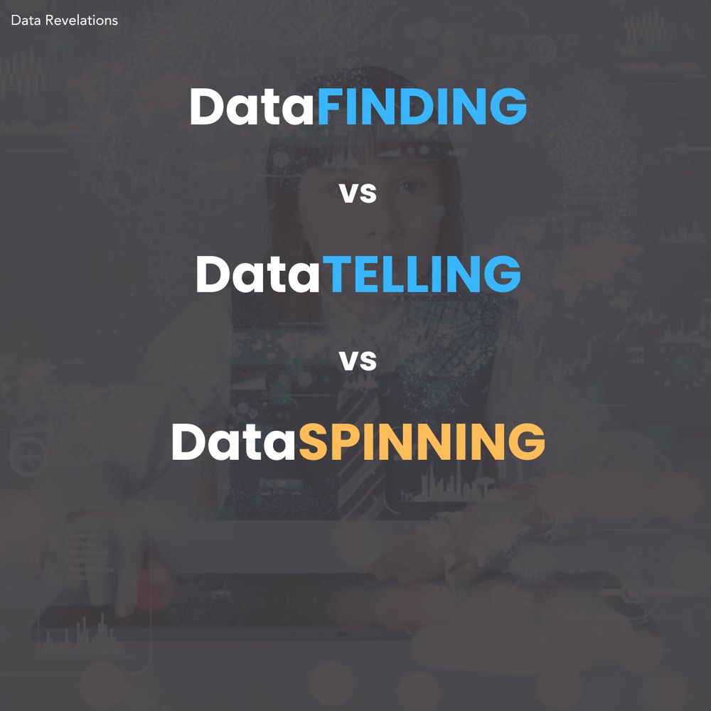
This may be controversial, but I think a dashboard is a terrible place to *tell* a data story.
But a good dashboard can be an indispensable tool for helping you and your organization *find* data stories worth telling.
Learn more at buytickets.at/datarevelati...
This may be controversial, but I think a dashboard is a terrible place to *tell* a data story.
But a good dashboard can be an indispensable tool for helping you and your organization *find* data stories worth telling.
Learn more at buytickets.at/datarevelati...
April 23, 2025 at 8:01 AM
Hey dashboard designers:
This may be controversial, but I think a dashboard is a terrible place to *tell* a data story.
But a good dashboard can be an indispensable tool for helping you and your organization *find* data stories worth telling.
Learn more at buytickets.at/datarevelati...
This may be controversial, but I think a dashboard is a terrible place to *tell* a data story.
But a good dashboard can be an indispensable tool for helping you and your organization *find* data stories worth telling.
Learn more at buytickets.at/datarevelati...
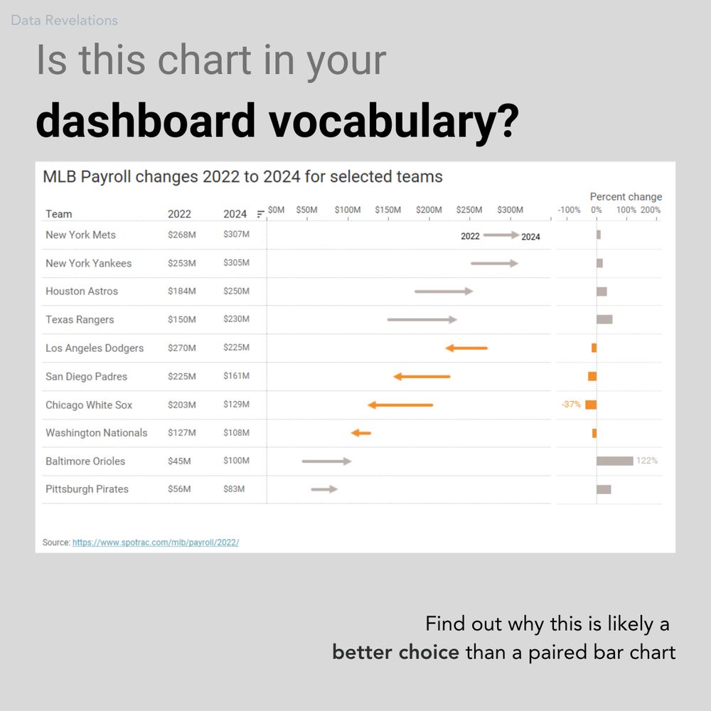
Hey, dashboard designers:
Is this chart in your chart vocabulary?
It's one of my favorite ways to show "now vs. then" along with percent change.
We'll examine this chart--and dozens--more in my upcoming dashboard design workshop May 27 and 29.
Learn more at buytickets.at/datarevelati...
Is this chart in your chart vocabulary?
It's one of my favorite ways to show "now vs. then" along with percent change.
We'll examine this chart--and dozens--more in my upcoming dashboard design workshop May 27 and 29.
Learn more at buytickets.at/datarevelati...
April 22, 2025 at 6:16 PM
Hey, dashboard designers:
Is this chart in your chart vocabulary?
It's one of my favorite ways to show "now vs. then" along with percent change.
We'll examine this chart--and dozens--more in my upcoming dashboard design workshop May 27 and 29.
Learn more at buytickets.at/datarevelati...
Is this chart in your chart vocabulary?
It's one of my favorite ways to show "now vs. then" along with percent change.
We'll examine this chart--and dozens--more in my upcoming dashboard design workshop May 27 and 29.
Learn more at buytickets.at/datarevelati...
These are all so good.
"Good" may not be the right word. I'd much prefer fewer choices here.
"Good" may not be the right word. I'd much prefer fewer choices here.
April 19, 2025 at 5:45 PM
These are all so good.
"Good" may not be the right word. I'd much prefer fewer choices here.
"Good" may not be the right word. I'd much prefer fewer choices here.
And please forward the link.
I'd like to get a few hundred responses by Friday.
I'd like to get a few hundred responses by Friday.
April 9, 2025 at 3:18 PM
And please forward the link.
I'd like to get a few hundred responses by Friday.
I'd like to get a few hundred responses by Friday.
FAVOR:
Please take this one-question survey. If my theory is correct, we'll have some interesting data to visualize.
www.surveymonkey.com/r/8BLVDW9
Please take this one-question survey. If my theory is correct, we'll have some interesting data to visualize.
www.surveymonkey.com/r/8BLVDW9
What do you think of anchovies?
Take this survey powered by surveymonkey.com. Create your own surveys for free.
www.surveymonkey.com
April 9, 2025 at 3:17 PM
FAVOR:
Please take this one-question survey. If my theory is correct, we'll have some interesting data to visualize.
www.surveymonkey.com/r/8BLVDW9
Please take this one-question survey. If my theory is correct, we'll have some interesting data to visualize.
www.surveymonkey.com/r/8BLVDW9