


Nate Piekos of Blambot
@blambot.bsky.social
20+ years lettering for Marvel, DC, Dark Horse, and Image. Eisner nominee. Award-winning design & typography. Author of The Essential Guide to Comic Book Lettering.
My idea for this was to have the regular and bold in two very different pens but from the same "hand" -- the regular is more of a calligraphic pen. The bold is a wedge marker.
November 20, 2025 at 4:39 PM
My idea for this was to have the regular and bold in two very different pens but from the same "hand" -- the regular is more of a calligraphic pen. The bold is a wedge marker.
Many Men is an older indie font. Only the newer Indie fonts have some accented characters.
November 18, 2025 at 4:16 PM
Many Men is an older indie font. Only the newer Indie fonts have some accented characters.
Reposted by Nate Piekos of Blambot

That reminds me a lot how asterix and obelix handles that

November 14, 2025 at 9:28 PM
That reminds me a lot how asterix and obelix handles that
Oof. I don't know. That would be super convenient.
November 14, 2025 at 4:55 PM
Oof. I don't know. That would be super convenient.
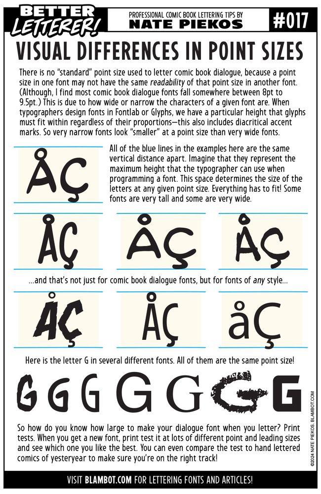
BETTER LETTERER batch 6 for you. And before the inevitable "that's not how I do it" replies, keep in mind that, by and large, this is how it's done in pro American comics (Marvel, DC, etc.) I've worked for all of them. More tips: blambot.com/pages/letter...


November 14, 2025 at 2:43 PM
BETTER LETTERER batch 6 for you. And before the inevitable "that's not how I do it" replies, keep in mind that, by and large, this is how it's done in pro American comics (Marvel, DC, etc.) I've worked for all of them. More tips: blambot.com/pages/letter...
Better Letterer batch 5! And before the inevitable "that's not how I do it" replies, keep in mind that, by and large, this is how it's done in pro American comics (Marvel, DC, etc.) I've worked for all of them. More tips: blambot.com/pages/letter...


November 13, 2025 at 2:36 PM
Better Letterer batch 5! And before the inevitable "that's not how I do it" replies, keep in mind that, by and large, this is how it's done in pro American comics (Marvel, DC, etc.) I've worked for all of them. More tips: blambot.com/pages/letter...
Reposted by Nate Piekos of Blambot
BETTER LETTERER batch 4 for you. And before the inevitable "that's not how I do it" replies, keep in mind that, by and large, this is how it's done in pro American comics (Marvel, DC, etc.) I've worked for all of them. More tips: blambot.com/pages/letter...


November 12, 2025 at 6:22 PM
BETTER LETTERER batch 4 for you. And before the inevitable "that's not how I do it" replies, keep in mind that, by and large, this is how it's done in pro American comics (Marvel, DC, etc.) I've worked for all of them. More tips: blambot.com/pages/letter...
BETTER LETTERER batch 4 for you. And before the inevitable "that's not how I do it" replies, keep in mind that, by and large, this is how it's done in pro American comics (Marvel, DC, etc.) I've worked for all of them. More tips: blambot.com/pages/letter...
November 12, 2025 at 6:22 PM
BETTER LETTERER batch 4 for you. And before the inevitable "that's not how I do it" replies, keep in mind that, by and large, this is how it's done in pro American comics (Marvel, DC, etc.) I've worked for all of them. More tips: blambot.com/pages/letter...