


Laura Meseguer Studio
@laurameseguer.bsky.social
Custom type design. Typographer. Partner and co-founder of Type-Ø-Tones, directing and teaching Type design at Tipo-g, and typography at Elisava.
www.laurameseguer.com
www.laurameseguer.com
Do you have a branding project in mind? Then, consider designing a custom type typeface with me ;)
I can do that for you!
Send me a DM
❤️👌
I can do that for you!
Send me a DM
❤️👌

Elizabeth Goodspeed on why design studios are making fonts
Custom type has become branding’s newest obsession, promising control, originality, and ownership – but its rapid rise is reshaping the culture and economy of type design itself.
www.itsnicethat.com
October 23, 2025 at 2:39 PM
Do you have a branding project in mind? Then, consider designing a custom type typeface with me ;)
I can do that for you!
Send me a DM
❤️👌
I can do that for you!
Send me a DM
❤️👌
Reposted by Laura Meseguer Studio
Our 10th birthday party continues with a subset of the “100 Tens”. This clip includes a wide range of fabulous 1s contributed by:
Antic-Ham and Francis Van Maele of Redfoxpress
Laura Serra @laureola.bsky.social
Laura Meseguer @laurameseguer.bsky.social
Martin Venezky @martinvenezky.bsky.social
Antic-Ham and Francis Van Maele of Redfoxpress
Laura Serra @laureola.bsky.social
Laura Meseguer @laurameseguer.bsky.social
Martin Venezky @martinvenezky.bsky.social
October 16, 2025 at 6:54 AM
Our 10th birthday party continues with a subset of the “100 Tens”. This clip includes a wide range of fabulous 1s contributed by:
Antic-Ham and Francis Van Maele of Redfoxpress
Laura Serra @laureola.bsky.social
Laura Meseguer @laurameseguer.bsky.social
Martin Venezky @martinvenezky.bsky.social
Antic-Ham and Francis Van Maele of Redfoxpress
Laura Serra @laureola.bsky.social
Laura Meseguer @laurameseguer.bsky.social
Martin Venezky @martinvenezky.bsky.social
✨ Placa in Typography News No.17 ✨
It’s always great to see Placa in spaces that celebrate type design. This time, it has been featured in Typography News No.17, an online bulletin highlighting type news, published by Jectives
😊 You can catch it at minute 0:47:27 👉 www.youtube.com/live/rEoP4w4...
It’s always great to see Placa in spaces that celebrate type design. This time, it has been featured in Typography News No.17, an online bulletin highlighting type news, published by Jectives
😊 You can catch it at minute 0:47:27 👉 www.youtube.com/live/rEoP4w4...

October 2, 2025 at 12:14 PM
✨ Placa in Typography News No.17 ✨
It’s always great to see Placa in spaces that celebrate type design. This time, it has been featured in Typography News No.17, an online bulletin highlighting type news, published by Jectives
😊 You can catch it at minute 0:47:27 👉 www.youtube.com/live/rEoP4w4...
It’s always great to see Placa in spaces that celebrate type design. This time, it has been featured in Typography News No.17, an online bulletin highlighting type news, published by Jectives
😊 You can catch it at minute 0:47:27 👉 www.youtube.com/live/rEoP4w4...
Reposted by Laura Meseguer Studio
Karel Martens Unbound at the Stedelijk Museum, Amsterdam
One of the most intelligent and beautiful design/art exhibitions I've ever seen.
Until 26 October: inderdaad, onmisbaar!
One of the most intelligent and beautiful design/art exhibitions I've ever seen.
Until 26 October: inderdaad, onmisbaar!

August 7, 2025 at 7:00 AM
Karel Martens Unbound at the Stedelijk Museum, Amsterdam
One of the most intelligent and beautiful design/art exhibitions I've ever seen.
Until 26 October: inderdaad, onmisbaar!
One of the most intelligent and beautiful design/art exhibitions I've ever seen.
Until 26 October: inderdaad, onmisbaar!
KAREL MARTENS — UNBOUND 💥
A powerful reminder of the beauty that comes from decades of making and remaking. Martens’ work flows across time, media, and intention—always with a sense of play and precision. It’s not about reaching a final form, but staying in motion.
Unmissable!
www.stedelijk.nl
A powerful reminder of the beauty that comes from decades of making and remaking. Martens’ work flows across time, media, and intention—always with a sense of play and precision. It’s not about reaching a final form, but staying in motion.
Unmissable!
www.stedelijk.nl
August 6, 2025 at 1:37 PM
KAREL MARTENS — UNBOUND 💥
A powerful reminder of the beauty that comes from decades of making and remaking. Martens’ work flows across time, media, and intention—always with a sense of play and precision. It’s not about reaching a final form, but staying in motion.
Unmissable!
www.stedelijk.nl
A powerful reminder of the beauty that comes from decades of making and remaking. Martens’ work flows across time, media, and intention—always with a sense of play and precision. It’s not about reaching a final form, but staying in motion.
Unmissable!
www.stedelijk.nl
Reposted by Laura Meseguer Studio

Hace muchos años sorprendí a un tipo que estaba cortando la cadena de mi bici con un trozo de hoja sierra, cuando le llamé la atención me dijo lo siguiente "un segundito, que ya casi lo tengo...".
Con lo de Gaza está pasando lo mismo.
Mi viñeta de hoy en El País.
elpais.com/opinion/2025...
Con lo de Gaza está pasando lo mismo.
Mi viñeta de hoy en El País.
elpais.com/opinion/2025...

July 20, 2025 at 8:22 AM
Hace muchos años sorprendí a un tipo que estaba cortando la cadena de mi bici con un trozo de hoja sierra, cuando le llamé la atención me dijo lo siguiente "un segundito, que ya casi lo tengo...".
Con lo de Gaza está pasando lo mismo.
Mi viñeta de hoy en El País.
elpais.com/opinion/2025...
Con lo de Gaza está pasando lo mismo.
Mi viñeta de hoy en El País.
elpais.com/opinion/2025...
Reposted by Laura Meseguer Studio

Bluesky is a good alternative to X for the general public and some specific topics, especially politics. But for many communities and fields, a critical mass remains exclusively on Mastodon. Type designers and fans, for instance, have their own server with 679 active users: typo.social/directory.
typo.social
Welcome to Typo.social! This is a Mastodon instance open to any typo and type enthusiastic. We are offering this service out of sheer courtesy without being held responsible for any disadvantages.
typo.social
July 11, 2025 at 6:24 PM
Bluesky is a good alternative to X for the general public and some specific topics, especially politics. But for many communities and fields, a critical mass remains exclusively on Mastodon. Type designers and fans, for instance, have their own server with 679 active users: typo.social/directory.
Reposted by Laura Meseguer Studio
En la cocina con @laurameseguer.bsky.social:
Durante más de 20 años, Laura ha realizado lettering y tipografía a medida para marcas, instituciones culturales y editoriales a través de su estudio www.laurameseguer.com
albertoromero.com/la-cocina/s0...
Durante más de 20 años, Laura ha realizado lettering y tipografía a medida para marcas, instituciones culturales y editoriales a través de su estudio www.laurameseguer.com
albertoromero.com/la-cocina/s0...

Laura Meseguer
Laura Meseguer diseña tipografías y marcas a través de Laura Meseguer Studio.Durante más de 20 años, ha realizado lettering y tipografía a medida para marcas...
albertoromero.com
July 7, 2025 at 12:57 PM
En la cocina con @laurameseguer.bsky.social:
Durante más de 20 años, Laura ha realizado lettering y tipografía a medida para marcas, instituciones culturales y editoriales a través de su estudio www.laurameseguer.com
albertoromero.com/la-cocina/s0...
Durante más de 20 años, Laura ha realizado lettering y tipografía a medida para marcas, instituciones culturales y editoriales a través de su estudio www.laurameseguer.com
albertoromero.com/la-cocina/s0...
Placa is my display typeface, born from the question: What typeface could represent Barcelona? Inspired by street signs, it now has 5 styles + a Variable Font. I'm adding an expressive lowercase & Latin Plus.
#PlacaTypeface is #wip — more soon!
🔗 laurameseguer.com/case/placa
#typedesign #typography
#PlacaTypeface is #wip — more soon!
🔗 laurameseguer.com/case/placa
#typedesign #typography


May 9, 2025 at 10:29 AM
Placa is my display typeface, born from the question: What typeface could represent Barcelona? Inspired by street signs, it now has 5 styles + a Variable Font. I'm adding an expressive lowercase & Latin Plus.
#PlacaTypeface is #wip — more soon!
🔗 laurameseguer.com/case/placa
#typedesign #typography
#PlacaTypeface is #wip — more soon!
🔗 laurameseguer.com/case/placa
#typedesign #typography
Types and Letters #2 is out, if you want to receive my newsletter, join us here
shorturl.at/rGOlC
Mentioning my new typeface family Brise, samples of my typefaces in use, some design delights, a typographic tour and a song :)
#typedesign #typography #laurameseguer
shorturl.at/rGOlC
Mentioning my new typeface family Brise, samples of my typefaces in use, some design delights, a typographic tour and a song :)
#typedesign #typography #laurameseguer
May 5, 2025 at 11:05 AM
Types and Letters #2 is out, if you want to receive my newsletter, join us here
shorturl.at/rGOlC
Mentioning my new typeface family Brise, samples of my typefaces in use, some design delights, a typographic tour and a song :)
#typedesign #typography #laurameseguer
shorturl.at/rGOlC
Mentioning my new typeface family Brise, samples of my typefaces in use, some design delights, a typographic tour and a song :)
#typedesign #typography #laurameseguer
Welcome Brise! My new typeface family :=)
type-o-tones.com/fonts/brise
#laurameseguer #typeotones #typography #StencilType #typedesign
type-o-tones.com/fonts/brise
#laurameseguer #typeotones #typography #StencilType #typedesign

April 21, 2025 at 8:30 PM
Welcome Brise! My new typeface family :=)
type-o-tones.com/fonts/brise
#laurameseguer #typeotones #typography #StencilType #typedesign
type-o-tones.com/fonts/brise
#laurameseguer #typeotones #typography #StencilType #typedesign
Brise is a stencil type family inspired by the interplay between air and structure. Like a breeze drifting through space, its forms are shaped by both presence and absence. The family goes from Text Light to Display Extreme. Available also as a Variable Font (on demand).
type-o-tones.com/fonts/brise
type-o-tones.com/fonts/brise
April 21, 2025 at 7:40 PM
Brise is a stencil type family inspired by the interplay between air and structure. Like a breeze drifting through space, its forms are shaped by both presence and absence. The family goes from Text Light to Display Extreme. Available also as a Variable Font (on demand).
type-o-tones.com/fonts/brise
type-o-tones.com/fonts/brise
Questrial, designed by Joe Prince and Laura Meseguer
Many African languages lack proper typographic support. To address the lack of open source fonts for African languages, Google Fonts gave me the task of expanding Questrial typeface for that purpose.
fonts.google.com/specimen/Que...
#typography
Many African languages lack proper typographic support. To address the lack of open source fonts for African languages, Google Fonts gave me the task of expanding Questrial typeface for that purpose.
fonts.google.com/specimen/Que...
#typography


March 25, 2025 at 1:00 PM
Questrial, designed by Joe Prince and Laura Meseguer
Many African languages lack proper typographic support. To address the lack of open source fonts for African languages, Google Fonts gave me the task of expanding Questrial typeface for that purpose.
fonts.google.com/specimen/Que...
#typography
Many African languages lack proper typographic support. To address the lack of open source fonts for African languages, Google Fonts gave me the task of expanding Questrial typeface for that purpose.
fonts.google.com/specimen/Que...
#typography
Reposted by Laura Meseguer Studio

Fontstand is becoming a co-op! At the Fontstand Conference in The Hague, we announced that we’re becoming a cooperatively owned and managed font distributor — with expanded licensing and services. Stay tuned as we create a more equitable, transparent and democratic model for font designers.

March 17, 2025 at 11:41 AM
Fontstand is becoming a co-op! At the Fontstand Conference in The Hague, we announced that we’re becoming a cooperatively owned and managed font distributor — with expanded licensing and services. Stay tuned as we create a more equitable, transparent and democratic model for font designers.
We are ready for our Experimental type & typography workshop at ISIA Urbino. 17-20 April

March 16, 2025 at 9:06 PM
We are ready for our Experimental type & typography workshop at ISIA Urbino. 17-20 April
Reposted by Laura Meseguer Studio
This might be a good time to mention that I’m currently looking for interesting projects or companies to collaborate with. I’m an experienced Product Designer who can code, illustrate, and build the silliest side projects.
March 11, 2025 at 7:06 PM
This might be a good time to mention that I’m currently looking for interesting projects or companies to collaborate with. I’m an experienced Product Designer who can code, illustrate, and build the silliest side projects.
Almost a year ago, at Type-Ø-Tones we teamed up with Luis Mendo to craft a typeface family from his handwriting. Clear, readable, and natural, Mendo Sans includes Mendo Titles Light, Mendo Titles Bold, Mendo Sans Uppercase, and Mendo Sans Lowercase. Follow Luis at @luismendo.com
#typography
#typography


March 13, 2025 at 5:11 PM
Almost a year ago, at Type-Ø-Tones we teamed up with Luis Mendo to craft a typeface family from his handwriting. Clear, readable, and natural, Mendo Sans includes Mendo Titles Light, Mendo Titles Bold, Mendo Sans Uppercase, and Mendo Sans Lowercase. Follow Luis at @luismendo.com
#typography
#typography
Reposted by Laura Meseguer Studio
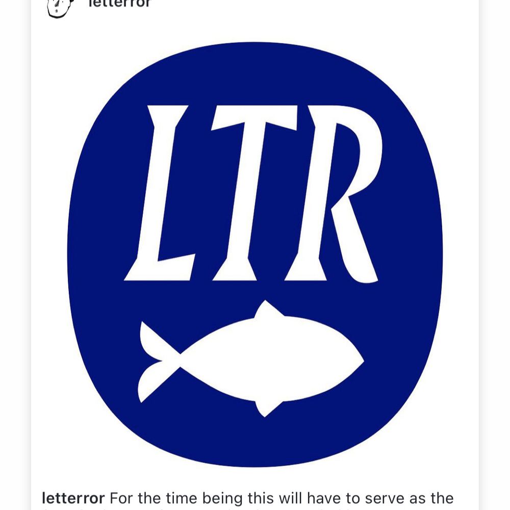
An update for LTR Very Bauble! The OG characterset was a bit sparse, so I added about 2500 more! All animated with lines, thorns and pips. One axis, five masters. These were already having a party and now they are having a ball. #ad #update #tuscan #variablefont letterror.com/verybauble/index…
March 11, 2025 at 8:39 AM
An update for LTR Very Bauble! The OG characterset was a bit sparse, so I added about 2500 more! All animated with lines, thorns and pips. One axis, five masters. These were already having a party and now they are having a ball. #ad #update #tuscan #variablefont letterror.com/verybauble/index…
I’m starting to get more active here and I created a starter pack with some of my favorites here.
Who do you think I’m missing from this list?
I’d love to connect with other type designers, typographers, instititutions and creatives on this platform.🤩
go.bsky.app/2tZdTWW
Who do you think I’m missing from this list?
I’d love to connect with other type designers, typographers, instititutions and creatives on this platform.🤩
go.bsky.app/2tZdTWW

Laura Meseguer Studio favs :)
Join the conversation
go.bsky.app
March 11, 2025 at 10:41 AM
I’m starting to get more active here and I created a starter pack with some of my favorites here.
Who do you think I’m missing from this list?
I’d love to connect with other type designers, typographers, instititutions and creatives on this platform.🤩
go.bsky.app/2tZdTWW
Who do you think I’m missing from this list?
I’d love to connect with other type designers, typographers, instititutions and creatives on this platform.🤩
go.bsky.app/2tZdTWW
My typefaces are available at Type-Ø-Tones, and here you have the ones available at Adobe. With the Adobe Suite license, the use is unrestricted for desktop and web use, but if you want to use it in apps, broadcasting, products or servers… contact me ([email protected])
#typedesign #typography
#typedesign #typography


March 10, 2025 at 5:20 PM
My typefaces are available at Type-Ø-Tones, and here you have the ones available at Adobe. With the Adobe Suite license, the use is unrestricted for desktop and web use, but if you want to use it in apps, broadcasting, products or servers… contact me ([email protected])
#typedesign #typography
#typedesign #typography
Reposted by Laura Meseguer Studio
Filip Blažek and Linda Kudrnovská’s seven-part documentary series on Czech design is now online with English subtitles: identitaproject.com#content_plan...
#CzechDesign #CzechRepublic #Czechia #Typography
#CzechDesign #CzechRepublic #Czechia #Typography
identita – příběh českého grafického designu
identitaproject.com
March 8, 2025 at 8:49 AM
Filip Blažek and Linda Kudrnovská’s seven-part documentary series on Czech design is now online with English subtitles: identitaproject.com#content_plan...
#CzechDesign #CzechRepublic #Czechia #Typography
#CzechDesign #CzechRepublic #Czechia #Typography
After a long pause, my latest newsletter is out, featuring: Toormix, LLOS&, Khatt Books, Worlds of Type, Stedelijk Museum, Karel Martens; and introducing my website and latest typeface.
If you’d like to see it and receive the new ones via email, just click to subscribe!
mailchi.mp/152150bcf052...
If you’d like to see it and receive the new ones via email, just click to subscribe!
mailchi.mp/152150bcf052...
March 5, 2025 at 12:55 PM
After a long pause, my latest newsletter is out, featuring: Toormix, LLOS&, Khatt Books, Worlds of Type, Stedelijk Museum, Karel Martens; and introducing my website and latest typeface.
If you’d like to see it and receive the new ones via email, just click to subscribe!
mailchi.mp/152150bcf052...
If you’d like to see it and receive the new ones via email, just click to subscribe!
mailchi.mp/152150bcf052...
The Toormix studio designed the identity of Restaurant Volta. Inspired by the Porxos d’en Xifré vaults. The visual identity features my PLACA typeface, inspired by Barcelona’s street name plaques.
www.laurameseguer.com/case/placa/
toormix.com/proyecto/vol...
#Branding #Typedesign #Placatypeface
www.laurameseguer.com/case/placa/
toormix.com/proyecto/vol...
#Branding #Typedesign #Placatypeface


March 5, 2025 at 11:29 AM
The Toormix studio designed the identity of Restaurant Volta. Inspired by the Porxos d’en Xifré vaults. The visual identity features my PLACA typeface, inspired by Barcelona’s street name plaques.
www.laurameseguer.com/case/placa/
toormix.com/proyecto/vol...
#Branding #Typedesign #Placatypeface
www.laurameseguer.com/case/placa/
toormix.com/proyecto/vol...
#Branding #Typedesign #Placatypeface
So incredible and georgeous ❤️
Soeprapto Soekonto, theater programs, Semarang, Indonesia, ca. 1931–34. We’d love to know more about this artist, who was perhaps influenced by Hendrik Wijdeveld (posting tomorrow), but with a style all their own.
#IndonesianDesign #1930s #Lettering #GraphicDesign
#IndonesianDesign #1930s #Lettering #GraphicDesign


March 5, 2025 at 8:10 AM
So incredible and georgeous ❤️
Last week, the exhibition Matter Matters opened at the Museu del Disseny—DHUB in Barcelona. Within the "Digital Matter" section, you’ll find the capsule "The Dematerialization of Typography", where my type family ELLA is on display alongside some typographic treasures.
#MatterMatters #TypeDesign
#MatterMatters #TypeDesign


February 28, 2025 at 2:07 PM
Last week, the exhibition Matter Matters opened at the Museu del Disseny—DHUB in Barcelona. Within the "Digital Matter" section, you’ll find the capsule "The Dematerialization of Typography", where my type family ELLA is on display alongside some typographic treasures.
#MatterMatters #TypeDesign
#MatterMatters #TypeDesign