


The Other Formats Laugh Club (COMMS OK!)
@cdscissor.bsky.social
Two formats laugh it out in the day, but they're pretty tired at night. They still keep it fun, though. Open for comms. Appreciate tips too, though.
https://ko-fi.com/cdscissor
https://ko-fi.com/cdscissor
Pinned

Made a commission sheet! Figured I needed one.
Didn't know the kid could aura farm
December 10, 2025 at 3:24 PM
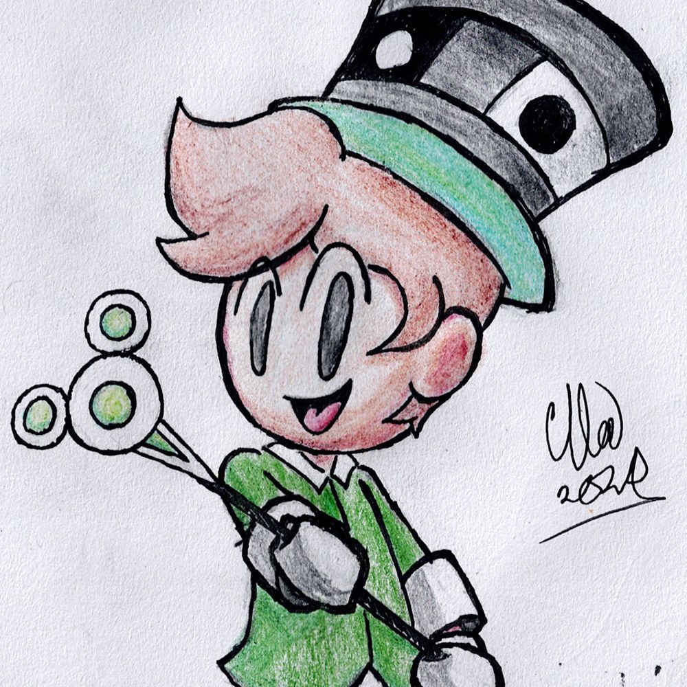
Didn't know the kid could aura farm

November 28, 2025 at 3:00 AM
Made a commission sheet! Figured I needed one.
November 26, 2025 at 5:55 PM
Made a commission sheet! Figured I needed one.
Yeah... on a tissue paper too. Yeah... #skullgirlsfanart #Squigly

November 5, 2025 at 4:50 AM
Yeah... on a tissue paper too. Yeah... #skullgirlsfanart #Squigly
It's still unfinished but whateves, just so I'm not void of Cirno Day this year. (Even if a day late.)
#9月9日はチルノの日
#チルノの日
#9月9日はチルノの日
#チルノの日

September 10, 2025 at 2:47 AM
It's still unfinished but whateves, just so I'm not void of Cirno Day this year. (Even if a day late.)
#9月9日はチルノの日
#チルノの日
#9月9日はチルノの日
#チルノの日
Cleaned her up.

August 28, 2025 at 3:33 PM
Cleaned her up.
Haven't touched Ibis Paint like forever so how I do?

August 26, 2025 at 2:47 PM
Haven't touched Ibis Paint like forever so how I do?
Never before fully uploaded on Bluesky! Originally finished September 2024, the first image is a new scan while the second is fresh from when it had just dried back in September.
Lady Squigly, gouache on watercolor paper. September 2024.
#skullgirlsfanart #Squigly
Lady Squigly, gouache on watercolor paper. September 2024.
#skullgirlsfanart #Squigly


August 16, 2025 at 2:35 PM
Never before fully uploaded on Bluesky! Originally finished September 2024, the first image is a new scan while the second is fresh from when it had just dried back in September.
Lady Squigly, gouache on watercolor paper. September 2024.
#skullgirlsfanart #Squigly
Lady Squigly, gouache on watercolor paper. September 2024.
#skullgirlsfanart #Squigly
low stakes sketch

August 9, 2025 at 7:33 PM
low stakes sketch
There's something deeply upsetting about the struggle of not knowing who you are, with a feeling of lacking meaning or identity. In thinking of that, my long-time struggle is so nothing by comparison. I know who I am and what I want to be, I just can't get others to care.
August 3, 2025 at 3:04 AM
There's something deeply upsetting about the struggle of not knowing who you are, with a feeling of lacking meaning or identity. In thinking of that, my long-time struggle is so nothing by comparison. I know who I am and what I want to be, I just can't get others to care.
I experienced the latest FLAVOR FOLEY drop and thought I had to make #flavorfoley_fa but also promised myself to keep it quick cuz I'm busy. This is what I managed in one hour.

August 2, 2025 at 3:02 AM
I experienced the latest FLAVOR FOLEY drop and thought I had to make #flavorfoley_fa but also promised myself to keep it quick cuz I'm busy. This is what I managed in one hour.
We are so Pac-ing back.
July 31, 2025 at 2:24 PM
We are so Pac-ing back.
Reposted by The Other Formats Laugh Club (COMMS OK!)
Snippet #9: Annie Of The Stars receives a heart felt postcard!
Annie & Sagan: @cdscissor.bsky.social
#SWWC #Skullgirls #Skullgirlsfanart
Annie & Sagan: @cdscissor.bsky.social
#SWWC #Skullgirls #Skullgirlsfanart

July 30, 2025 at 7:15 PM
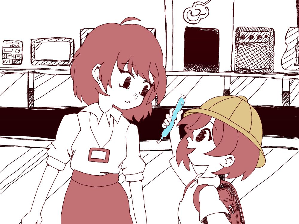
Snippet #9: Annie Of The Stars receives a heart felt postcard!
Annie & Sagan: @cdscissor.bsky.social
#SWWC #Skullgirls #Skullgirlsfanart
Annie & Sagan: @cdscissor.bsky.social
#SWWC #Skullgirls #Skullgirlsfanart
MS Paint is like, the most "technically you can?" but like, WHY.

July 29, 2025 at 5:46 PM
MS Paint is like, the most "technically you can?" but like, WHY.
Genuinely... what did I make?

July 27, 2025 at 6:08 PM
Genuinely... what did I make?
Oh give me a break, Windows. I install one update and it hasn't even been a week since I got you! How bloated can an OS get smh

July 26, 2025 at 2:24 PM
Oh give me a break, Windows. I install one update and it hasn't even been a week since I got you! How bloated can an OS get smh
In any case, I should work on copy-pasting that little nerd out I did over on the other platform over here. Threads are a pain to sync-post.
July 26, 2025 at 2:19 PM
In any case, I should work on copy-pasting that little nerd out I did over on the other platform over here. Threads are a pain to sync-post.
You're not gonna find out what I wrote for Undertale 10th anni-memory, but it is pretty funny.
July 26, 2025 at 2:17 PM
You're not gonna find out what I wrote for Undertale 10th anni-memory, but it is pretty funny.
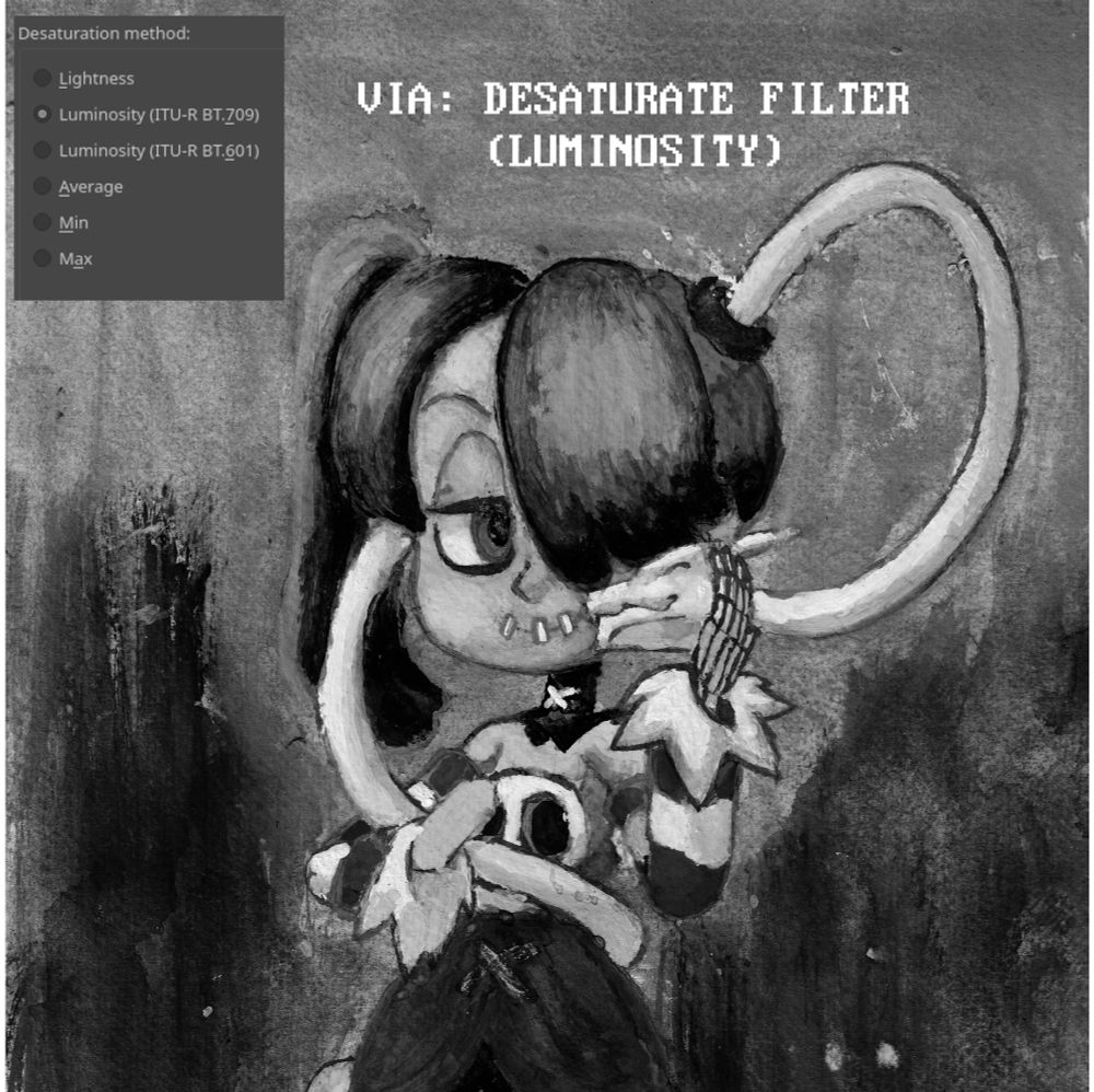
It's often said that the values are far more important than the colours in a piece. But there are various ways those greyscale values can be rendered for checking so... which one is right? Here's a few examples of possible ways to do it in Krita:


July 25, 2025 at 8:48 AM
It's often said that the values are far more important than the colours in a piece. But there are various ways those greyscale values can be rendered for checking so... which one is right? Here's a few examples of possible ways to do it in Krita:
I tried out CSP

July 22, 2025 at 6:48 AM
I tried out CSP
Lately there's been a shift in my approach.

July 21, 2025 at 5:07 AM
Lately there's been a shift in my approach.
Studying the Static doesn't stop at one little doodle, y'know. Let's get really real.

July 17, 2025 at 3:58 PM
Studying the Static doesn't stop at one little doodle, y'know. Let's get really real.
I study the Static. Apparently just in time for her 10 million. Huh. Anyways, it's surprisingly easy to get a good likeness of her. Happy 10 million to Static Miku!

July 16, 2025 at 7:48 AM
I study the Static. Apparently just in time for her 10 million. Huh. Anyways, it's surprisingly easy to get a good likeness of her. Happy 10 million to Static Miku!
Man, I wish there was an easy way not just to cross-post but also cross-post threads.
July 14, 2025 at 2:16 PM
Man, I wish there was an easy way not just to cross-post but also cross-post threads.