


Urban Data
@urban-data.bsky.social
Official social media for the Urban Data working group. Researchers at the intersection of data, cities, people, and space. Read more and join us at https://urban-data-science-eaamo.github.io
Pinned
30DayMapChallenge
Daily mapping challenge happening every November!
30daymapchallenge.com
To get this feed started, our group will be participating in the #30daymapchallenge! On (most) days of November we will be posting a new map, by a new author, on a new theme. First batch of maps incoming... 🗺️
30daymapchallenge.com#maps-stats
30daymapchallenge.com#maps-stats
#30DayMapChallenge day 22: Natural Earth
@lgreenstreet.bsky.social worked on a visualization of invasive species in New York State. Invasive species presence correlates with the presence of road, rail, and urban areas due to a combination of human activity introducing them and observation density.
@lgreenstreet.bsky.social worked on a visualization of invasive species in New York State. Invasive species presence correlates with the presence of road, rail, and urban areas due to a combination of human activity introducing them and observation density.

November 25, 2025 at 6:09 PM
#30DayMapChallenge day 22: Natural Earth
@lgreenstreet.bsky.social worked on a visualization of invasive species in New York State. Invasive species presence correlates with the presence of road, rail, and urban areas due to a combination of human activity introducing them and observation density.
@lgreenstreet.bsky.social worked on a visualization of invasive species in New York State. Invasive species presence correlates with the presence of road, rail, and urban areas due to a combination of human activity introducing them and observation density.
#30DayMapChallenge day 20: water
This map of Arsenic and Cadmium levels in Mexico's water show non-trace concentrations of Total and Soluble Arsenic and Cadium. Points are colored by the presence of high amounts of contaminants, and sized by their relative concentration.
tinyurl.com/map20wtr
This map of Arsenic and Cadmium levels in Mexico's water show non-trace concentrations of Total and Soluble Arsenic and Cadium. Points are colored by the presence of high amounts of contaminants, and sized by their relative concentration.
tinyurl.com/map20wtr

November 24, 2025 at 6:53 PM
#30DayMapChallenge day 20: water
This map of Arsenic and Cadmium levels in Mexico's water show non-trace concentrations of Total and Soluble Arsenic and Cadium. Points are colored by the presence of high amounts of contaminants, and sized by their relative concentration.
tinyurl.com/map20wtr
This map of Arsenic and Cadmium levels in Mexico's water show non-trace concentrations of Total and Soluble Arsenic and Cadium. Points are colored by the presence of high amounts of contaminants, and sized by their relative concentration.
tinyurl.com/map20wtr
#30DayMapChallenge day 19: projections
@jennahgosciak.bsky.social created a gif that visualizes NYC neighborhoods under different map projections. While most atrocities are clear only at national or global levels, her maps show interesting local deformities!
@jennahgosciak.bsky.social created a gif that visualizes NYC neighborhoods under different map projections. While most atrocities are clear only at national or global levels, her maps show interesting local deformities!
November 24, 2025 at 2:42 PM
#30DayMapChallenge day 19: projections
@jennahgosciak.bsky.social created a gif that visualizes NYC neighborhoods under different map projections. While most atrocities are clear only at national or global levels, her maps show interesting local deformities!
@jennahgosciak.bsky.social created a gif that visualizes NYC neighborhoods under different map projections. While most atrocities are clear only at national or global levels, her maps show interesting local deformities!
Out of this world!
@eappelson.bsky.social explored fantasy map-making using rice digital to form tactile terrains for #30DayMapChallenge day 18. He was inspired by handmade maps created by outlining real piles of rice and simulated rice scattering. Grain density becomes elevation.
@eappelson.bsky.social explored fantasy map-making using rice digital to form tactile terrains for #30DayMapChallenge day 18. He was inspired by handmade maps created by outlining real piles of rice and simulated rice scattering. Grain density becomes elevation.

November 22, 2025 at 4:27 PM
Out of this world!
@eappelson.bsky.social explored fantasy map-making using rice digital to form tactile terrains for #30DayMapChallenge day 18. He was inspired by handmade maps created by outlining real piles of rice and simulated rice scattering. Grain density becomes elevation.
@eappelson.bsky.social explored fantasy map-making using rice digital to form tactile terrains for #30DayMapChallenge day 18. He was inspired by handmade maps created by outlining real piles of rice and simulated rice scattering. Grain density becomes elevation.
#30DayMapChallenge 15: Fire
@sylviaimani.bsky.social visualized how Uganda’s transition toward electric cooking aligns with the reach of the national grid. Regions with denser grid networks show a strong correlation with higher household adoption of electric cooking technologies.
@sylviaimani.bsky.social visualized how Uganda’s transition toward electric cooking aligns with the reach of the national grid. Regions with denser grid networks show a strong correlation with higher household adoption of electric cooking technologies.

November 21, 2025 at 6:35 PM
#30DayMapChallenge 15: Fire
@sylviaimani.bsky.social visualized how Uganda’s transition toward electric cooking aligns with the reach of the national grid. Regions with denser grid networks show a strong correlation with higher household adoption of electric cooking technologies.
@sylviaimani.bsky.social visualized how Uganda’s transition toward electric cooking aligns with the reach of the national grid. Regions with denser grid networks show a strong correlation with higher household adoption of electric cooking technologies.
Are you running from your responsibilities? On our #30DayMapChallenge day 14 entry, we tell you where!
Atmika Pai maps running clubs with OpenStreetMap, which includes amenities such as water and restrooms. Running club data comes from @shaylaruns (Instagram).
atmikapai13.github.io/iconic-runcl...
Atmika Pai maps running clubs with OpenStreetMap, which includes amenities such as water and restrooms. Running club data comes from @shaylaruns (Instagram).
atmikapai13.github.io/iconic-runcl...

November 21, 2025 at 2:33 PM
Are you running from your responsibilities? On our #30DayMapChallenge day 14 entry, we tell you where!
Atmika Pai maps running clubs with OpenStreetMap, which includes amenities such as water and restrooms. Running club data comes from @shaylaruns (Instagram).
atmikapai13.github.io/iconic-runcl...
Atmika Pai maps running clubs with OpenStreetMap, which includes amenities such as water and restrooms. Running club data comes from @shaylaruns (Instagram).
atmikapai13.github.io/iconic-runcl...
#30DayMapChallenge day 13: 10-min map
Atmika Pai set the clock. "I used Marauders, an AI-powered spatial intelligence tool, to create a heatmap of 311 indoor air quality complaints in NYC" she says. "All it took was downloading the dataset from Open Data and uploading!"
tinyurl.com/13-map-311
Atmika Pai set the clock. "I used Marauders, an AI-powered spatial intelligence tool, to create a heatmap of 311 indoor air quality complaints in NYC" she says. "All it took was downloading the dataset from Open Data and uploading!"
tinyurl.com/13-map-311

November 21, 2025 at 12:16 AM
#30DayMapChallenge day 13: 10-min map
Atmika Pai set the clock. "I used Marauders, an AI-powered spatial intelligence tool, to create a heatmap of 311 indoor air quality complaints in NYC" she says. "All it took was downloading the dataset from Open Data and uploading!"
tinyurl.com/13-map-311
Atmika Pai set the clock. "I used Marauders, an AI-powered spatial intelligence tool, to create a heatmap of 311 indoor air quality complaints in NYC" she says. "All it took was downloading the dataset from Open Data and uploading!"
tinyurl.com/13-map-311
For #30DayMapChallenge day 11, a minimal map from @kennypeng.bsky.social.
Kenny extracts minimal elements from a not-as-minimal-as-it-seems object: the Manhattan street grid. "I show how Manhattan’s numbered grid of streets and avenues is more complicated than you might realize," he says.
Kenny extracts minimal elements from a not-as-minimal-as-it-seems object: the Manhattan street grid. "I show how Manhattan’s numbered grid of streets and avenues is more complicated than you might realize," he says.
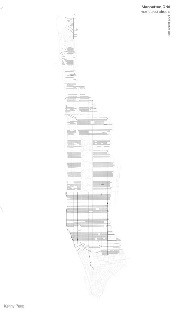
November 17, 2025 at 2:43 PM
For #30DayMapChallenge day 11, a minimal map from @kennypeng.bsky.social.
Kenny extracts minimal elements from a not-as-minimal-as-it-seems object: the Manhattan street grid. "I show how Manhattan’s numbered grid of streets and avenues is more complicated than you might realize," he says.
Kenny extracts minimal elements from a not-as-minimal-as-it-seems object: the Manhattan street grid. "I show how Manhattan’s numbered grid of streets and avenues is more complicated than you might realize," he says.
#30DayMapChallenge day 10: Air
@jessiefin.bsky.social + Francisco Marmolejo-Cossío visualize the presence of ladrilleras, or brick kilns, which emit pollution across the state. Data cleaned by Jacqueline Calderón and Lizet Jarquin at UASLP.
Full interactive map: tinyurl.com/map10-air
@jessiefin.bsky.social + Francisco Marmolejo-Cossío visualize the presence of ladrilleras, or brick kilns, which emit pollution across the state. Data cleaned by Jacqueline Calderón and Lizet Jarquin at UASLP.
Full interactive map: tinyurl.com/map10-air

November 15, 2025 at 5:19 PM
#30DayMapChallenge day 10: Air
@jessiefin.bsky.social + Francisco Marmolejo-Cossío visualize the presence of ladrilleras, or brick kilns, which emit pollution across the state. Data cleaned by Jacqueline Calderón and Lizet Jarquin at UASLP.
Full interactive map: tinyurl.com/map10-air
@jessiefin.bsky.social + Francisco Marmolejo-Cossío visualize the presence of ladrilleras, or brick kilns, which emit pollution across the state. Data cleaned by Jacqueline Calderón and Lizet Jarquin at UASLP.
Full interactive map: tinyurl.com/map10-air
#30DayMapChallenge day 9 asked us to get off our screens. @annaloganmc.bsky.social's "analog" map is a hand-painted postcard! 📫
"I chose to paint a postcard of a map of Ann Arbor where I currently live showing the Huron River!" she says
"I chose to paint a postcard of a map of Ann Arbor where I currently live showing the Huron River!" she says

November 14, 2025 at 8:42 PM
#30DayMapChallenge day 9 asked us to get off our screens. @annaloganmc.bsky.social's "analog" map is a hand-painted postcard! 📫
"I chose to paint a postcard of a map of Ann Arbor where I currently live showing the Huron River!" she says
"I chose to paint a postcard of a map of Ann Arbor where I currently live showing the Huron River!" she says
#30DayMapChallenge day 8: Urban
Chae Won Lee uses the Overpass API to visualize current coffee shop density in New York with an interactive map. Here's a snippet.
Chae Won Lee uses the Overpass API to visualize current coffee shop density in New York with an interactive map. Here's a snippet.

November 14, 2025 at 5:09 PM
#30DayMapChallenge day 8: Urban
Chae Won Lee uses the Overpass API to visualize current coffee shop density in New York with an interactive map. Here's a snippet.
Chae Won Lee uses the Overpass API to visualize current coffee shop density in New York with an interactive map. Here's a snippet.
Day 7 of #30DayMapChallenge asked us to think about accessibility. @gsagostini.bsky.social considers two metrics of access simultaneously: distance to a Subway and distance to the subway.

November 13, 2025 at 2:27 PM
Day 7 of #30DayMapChallenge asked us to think about accessibility. @gsagostini.bsky.social considers two metrics of access simultaneously: distance to a Subway and distance to the subway.
#30DayMapChallenge day 6: dimensions
Atmika Pai dove into the ArcGIS Unity SDK to see how architects & designers plan in 3D. She explored 15 features from geocoding to viewshed analysis, all in an immersive game engine! Here's a video teaser of her map.
Atmika Pai dove into the ArcGIS Unity SDK to see how architects & designers plan in 3D. She explored 15 features from geocoding to viewshed analysis, all in an immersive game engine! Here's a video teaser of her map.
November 12, 2025 at 6:40 PM
#30DayMapChallenge day 6: dimensions
Atmika Pai dove into the ArcGIS Unity SDK to see how architects & designers plan in 3D. She explored 15 features from geocoding to viewshed analysis, all in an immersive game engine! Here's a video teaser of her map.
Atmika Pai dove into the ArcGIS Unity SDK to see how architects & designers plan in 3D. She explored 15 features from geocoding to viewshed analysis, all in an immersive game engine! Here's a video teaser of her map.
We might be a few days delayed on the #30DayMapChallenge, but our day 5 submission spans almost 250 years of history! Our "Earth" map comes from @jennahgosciak.bsky.social, who compared the original ecology of New York City to present day variables.

November 11, 2025 at 5:01 PM
We might be a few days delayed on the #30DayMapChallenge, but our day 5 submission spans almost 250 years of history! Our "Earth" map comes from @jennahgosciak.bsky.social, who compared the original ecology of New York City to present day variables.
Last week, we presented the work of our group at the EAAMO conference. So, for our delayed #30DayMapChallenge day 4 (my data) we created a map showing flows from some EAAMO contributors and attendees!

November 11, 2025 at 4:05 PM
Last week, we presented the work of our group at the EAAMO conference. So, for our delayed #30DayMapChallenge day 4 (my data) we created a map showing flows from some EAAMO contributors and attendees!
We are slowly catching up to the #30DayMapChallenge!
In our day 3: polygons submission, @zhixuanqi.bsky.social questioned the boundaries and fuzziness of polygons with an animated map that invites us to think about the (not-so-well-defined) idea of neighborhoods.
In our day 3: polygons submission, @zhixuanqi.bsky.social questioned the boundaries and fuzziness of polygons with an animated map that invites us to think about the (not-so-well-defined) idea of neighborhoods.
November 7, 2025 at 5:20 PM
We are slowly catching up to the #30DayMapChallenge!
In our day 3: polygons submission, @zhixuanqi.bsky.social questioned the boundaries and fuzziness of polygons with an animated map that invites us to think about the (not-so-well-defined) idea of neighborhoods.
In our day 3: polygons submission, @zhixuanqi.bsky.social questioned the boundaries and fuzziness of polygons with an animated map that invites us to think about the (not-so-well-defined) idea of neighborhoods.
#30DayMapChallenge day 2: Lines
Atmika Pai interpreted lines in multiple ways. Her map shows how the lines we stand in to wait for the tramway (line) generate flows lines!
Atmika Pai interpreted lines in multiple ways. Her map shows how the lines we stand in to wait for the tramway (line) generate flows lines!

November 6, 2025 at 5:33 PM
#30DayMapChallenge day 2: Lines
Atmika Pai interpreted lines in multiple ways. Her map shows how the lines we stand in to wait for the tramway (line) generate flows lines!
Atmika Pai interpreted lines in multiple ways. Her map shows how the lines we stand in to wait for the tramway (line) generate flows lines!
#30daymapchallenge day 1: Points
For our first map, we had to visualize spatial data as dots. @gsagostini.bsky.social worked on a dot density map showing dog density in New York City.
1 dot = 1 dog 🐕🐩
For our first map, we had to visualize spatial data as dots. @gsagostini.bsky.social worked on a dot density map showing dog density in New York City.
1 dot = 1 dog 🐕🐩
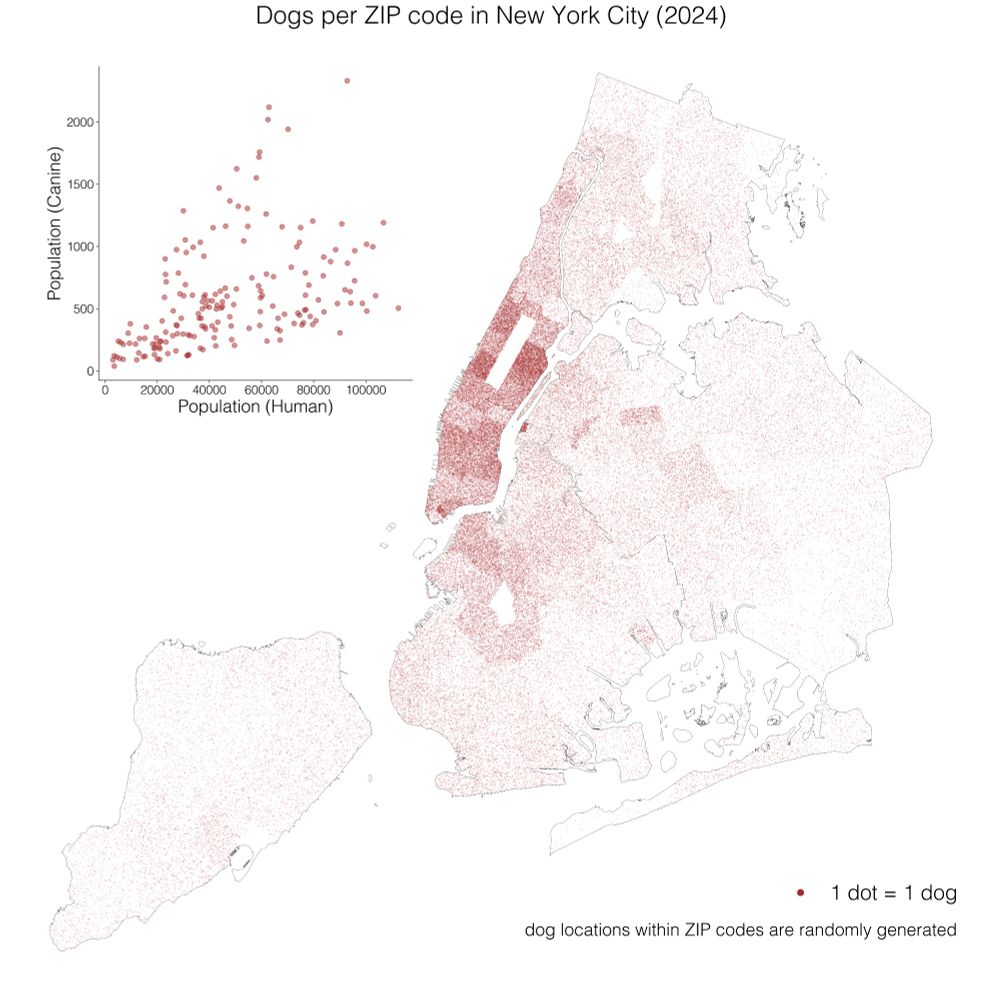
November 6, 2025 at 5:18 PM
#30daymapchallenge day 1: Points
For our first map, we had to visualize spatial data as dots. @gsagostini.bsky.social worked on a dot density map showing dog density in New York City.
1 dot = 1 dog 🐕🐩
For our first map, we had to visualize spatial data as dots. @gsagostini.bsky.social worked on a dot density map showing dog density in New York City.
1 dot = 1 dog 🐕🐩
To get this feed started, our group will be participating in the #30daymapchallenge! On (most) days of November we will be posting a new map, by a new author, on a new theme. First batch of maps incoming... 🗺️
30daymapchallenge.com#maps-stats
30daymapchallenge.com#maps-stats
30DayMapChallenge
Daily mapping challenge happening every November!
30daymapchallenge.com
November 6, 2025 at 4:47 PM
To get this feed started, our group will be participating in the #30daymapchallenge! On (most) days of November we will be posting a new map, by a new author, on a new theme. First batch of maps incoming... 🗺️
30daymapchallenge.com#maps-stats
30daymapchallenge.com#maps-stats