


Ralph Spandl
@spandl.ca
data visualization designer and founder of r42.ca
#dataviz · #LookerStudio · #PowerBI · #d3js · #measure – 🇨🇦 🇩🇪
#dataviz · #LookerStudio · #PowerBI · #d3js · #measure – 🇨🇦 🇩🇪

Strong signal - take a break.

August 13, 2025 at 11:40 PM
Strong signal - take a break.
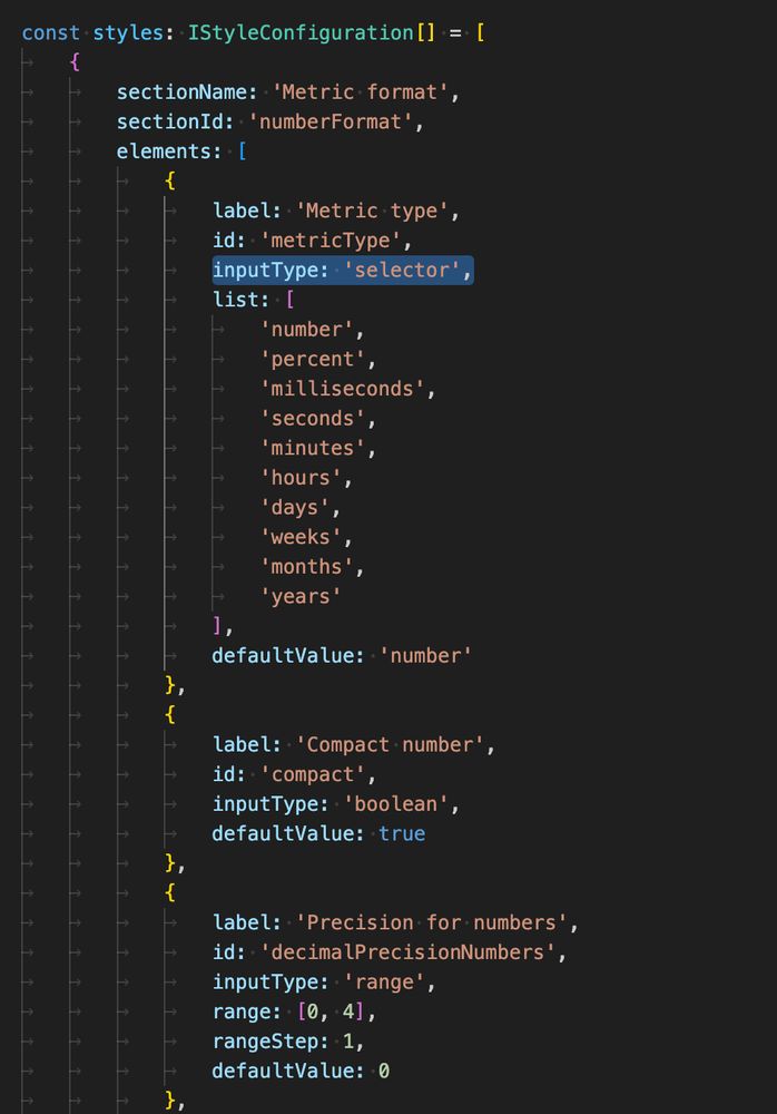
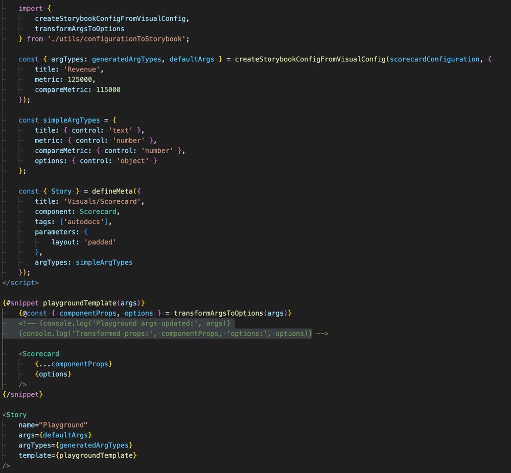
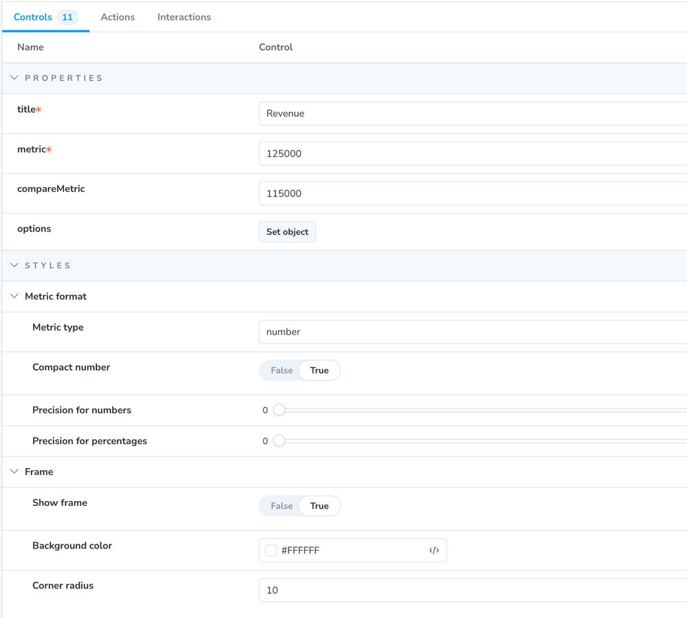
In a nutshell:
- I create (or wrap) data visuals
- Each visual has a JSON definition, that determines what style elements can be changed, including a strict definition of the controls.
- Each visual is a Svelte component (or JS/d3 only)
- The Story is dynamically created from the JSON
- I create (or wrap) data visuals
- Each visual has a JSON definition, that determines what style elements can be changed, including a strict definition of the controls.
- Each visual is a Svelte component (or JS/d3 only)
- The Story is dynamically created from the JSON
June 12, 2025 at 9:55 PM
In a nutshell:
- I create (or wrap) data visuals
- Each visual has a JSON definition, that determines what style elements can be changed, including a strict definition of the controls.
- Each visual is a Svelte component (or JS/d3 only)
- The Story is dynamically created from the JSON
- I create (or wrap) data visuals
- Each visual has a JSON definition, that determines what style elements can be changed, including a strict definition of the controls.
- Each visual is a Svelte component (or JS/d3 only)
- The Story is dynamically created from the JSON
Wow, there is even a smoke forecast website now:
firesmoke.ca/forecasts/cu...
firesmoke.ca/forecasts/cu...

June 4, 2025 at 12:44 AM
Wow, there is even a smoke forecast website now:
firesmoke.ca/forecasts/cu...
firesmoke.ca/forecasts/cu...
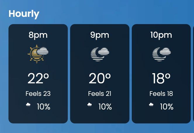
Looks like the Weather Network has now a new icon when the air is foggy from forest fires... #climatechange
June 3, 2025 at 10:54 PM
Looks like the Weather Network has now a new icon when the air is foggy from forest fires... #climatechange
Last week, #Observable announced the deprecation of its Cloud service. This means developers of Observable Framework data apps loose their option to quickly deploy and protect their data apps. Here is a quick overview about alternatives.
www.linkedin.com/pulse/protec...
www.linkedin.com/pulse/protec...

April 21, 2025 at 9:55 AM
Last week, #Observable announced the deprecation of its Cloud service. This means developers of Observable Framework data apps loose their option to quickly deploy and protect their data apps. Here is a quick overview about alternatives.
www.linkedin.com/pulse/protec...
www.linkedin.com/pulse/protec...
OK, ce n'était pas plus compliqué que ça. Je dirais que c'est un mandat clair! Je suis certain rien se passera les prochaines 5 années...

March 8, 2025 at 8:25 PM
OK, ce n'était pas plus compliqué que ça. Je dirais que c'est un mandat clair! Je suis certain rien se passera les prochaines 5 années...
That's some nice advertising...
They kept the agency name in the document title 😀
They kept the agency name in the document title 😀

February 6, 2025 at 11:39 PM
That's some nice advertising...
They kept the agency name in the document title 😀
They kept the agency name in the document title 😀
Side projects are always fun—especially when they bring together art and music.
12 lignes is a tiny web project featuring a new recording by Nouvel Ensemble Moderne, in honor of artist and friend Claude Chaussard.
Take a moment to explore the music and a tiny viz at 🎵✨ 12lignes.claudechaussard.com
12 lignes is a tiny web project featuring a new recording by Nouvel Ensemble Moderne, in honor of artist and friend Claude Chaussard.
Take a moment to explore the music and a tiny viz at 🎵✨ 12lignes.claudechaussard.com

February 4, 2025 at 4:03 PM
Side projects are always fun—especially when they bring together art and music.
12 lignes is a tiny web project featuring a new recording by Nouvel Ensemble Moderne, in honor of artist and friend Claude Chaussard.
Take a moment to explore the music and a tiny viz at 🎵✨ 12lignes.claudechaussard.com
12 lignes is a tiny web project featuring a new recording by Nouvel Ensemble Moderne, in honor of artist and friend Claude Chaussard.
Take a moment to explore the music and a tiny viz at 🎵✨ 12lignes.claudechaussard.com
Having a lot of fun to visualize sound data for an artist friend.
Didn't even know how much data you get extract from standard mp3 files using JavaScript.
Didn't even know how much data you get extract from standard mp3 files using JavaScript.

January 22, 2025 at 4:49 PM
Having a lot of fun to visualize sound data for an artist friend.
Didn't even know how much data you get extract from standard mp3 files using JavaScript.
Didn't even know how much data you get extract from standard mp3 files using JavaScript.
You need to ask often enough and "it" will change its mind.

January 17, 2025 at 11:10 PM
You need to ask often enough and "it" will change its mind.
I've always wondered how BI tools manage without offering a solid mobile reporting experience. #LookerStudio is now taking steps to change that with responsive layouts. The feature is still in private preview, but I had a chance to test it out. Here are my first impressions:
bit.ly/preview-ls-r...
bit.ly/preview-ls-r...

December 17, 2024 at 3:00 PM
I've always wondered how BI tools manage without offering a solid mobile reporting experience. #LookerStudio is now taking steps to change that with responsive layouts. The feature is still in private preview, but I had a chance to test it out. Here are my first impressions:
bit.ly/preview-ls-r...
bit.ly/preview-ls-r...
For the voronoi treemap, the labels need to be centered, can go over multiple lines and change the size depending on the metric.
There should also be a setting to keep a nice margin around the label keep the graphic clean.
There should also be a setting to keep a nice margin around the label keep the graphic clean.

December 3, 2024 at 12:56 AM
For the voronoi treemap, the labels need to be centered, can go over multiple lines and change the size depending on the metric.
There should also be a setting to keep a nice margin around the label keep the graphic clean.
There should also be a setting to keep a nice margin around the label keep the graphic clean.
And how cool is this "discovery" search button 😀

November 20, 2024 at 2:49 PM
And how cool is this "discovery" search button 😀
Finally, stacked bar charts:
- place labels inside or outside?
- For regular bars, I have the tendency to place them outside (more room), and place them only inside... unless they don't fit.
- place labels inside or outside?
- For regular bars, I have the tendency to place them outside (more room), and place them only inside... unless they don't fit.

November 18, 2024 at 11:50 PM
Finally, stacked bar charts:
- place labels inside or outside?
- For regular bars, I have the tendency to place them outside (more room), and place them only inside... unless they don't fit.
- place labels inside or outside?
- For regular bars, I have the tendency to place them outside (more room), and place them only inside... unless they don't fit.
A line graph is another great example: Data labels are great, but too many will create a mess.
In this chart, I try to place the highest value first, then the lowest value, etc., as long as the label fits inside the chart area and doesn't overlap a placed label.
🧵🧵🧵...
In this chart, I try to place the highest value first, then the lowest value, etc., as long as the label fits inside the chart area and doesn't overlap a placed label.
🧵🧵🧵...

November 18, 2024 at 11:50 PM
A line graph is another great example: Data labels are great, but too many will create a mess.
In this chart, I try to place the highest value first, then the lowest value, etc., as long as the label fits inside the chart area and doesn't overlap a placed label.
🧵🧵🧵...
In this chart, I try to place the highest value first, then the lowest value, etc., as long as the label fits inside the chart area and doesn't overlap a placed label.
🧵🧵🧵...
Removing potentially overlapping labels in data visualizations is as hard as coding all the rest.
I virtually draw all text blocks in a hidden container to get the bounding box and be able to detect an overlap.
How is everybody else handling data label overlapping?
I virtually draw all text blocks in a hidden container to get the bounding box and be able to detect an overlap.
How is everybody else handling data label overlapping?

November 18, 2024 at 9:44 PM
Removing potentially overlapping labels in data visualizations is as hard as coding all the rest.
I virtually draw all text blocks in a hidden container to get the bounding box and be able to detect an overlap.
How is everybody else handling data label overlapping?
I virtually draw all text blocks in a hidden container to get the bounding box and be able to detect an overlap.
How is everybody else handling data label overlapping?

Amazing how much NYC transformed over the past 10-15 years in terms of bike path and mobility.
It is now safe to discover large parts of Manhattan and Brooklyn on a city bike.
What a day.
It is now safe to discover large parts of Manhattan and Brooklyn on a city bike.
What a day.

October 27, 2024 at 10:59 PM
Amazing how much NYC transformed over the past 10-15 years in terms of bike path and mobility.
It is now safe to discover large parts of Manhattan and Brooklyn on a city bike.
What a day.
It is now safe to discover large parts of Manhattan and Brooklyn on a city bike.
What a day.
Hier braut sich etwas zusammen. Gekocht werden einheitliche Looker Studio Dashboards, und die magischen Zutaten finden sich in meinem neuen Artikel des Analytics Pioneers Magazins.
Und wer noch kein kostenloses Abo hat, kann sich gerne hier anmelden: analytics-pioneers.de/magazin/
Und wer noch kein kostenloses Abo hat, kann sich gerne hier anmelden: analytics-pioneers.de/magazin/

October 23, 2024 at 1:06 PM
Hier braut sich etwas zusammen. Gekocht werden einheitliche Looker Studio Dashboards, und die magischen Zutaten finden sich in meinem neuen Artikel des Analytics Pioneers Magazins.
Und wer noch kein kostenloses Abo hat, kann sich gerne hier anmelden: analytics-pioneers.de/magazin/
Und wer noch kein kostenloses Abo hat, kann sich gerne hier anmelden: analytics-pioneers.de/magazin/
I'm not sure how many #LookerStudio users are on BlueSky.
Please join this Looker Studio Toolkit webinar if you're one of them.
I'll present our solution and how we set up a starter kit to ensure better consistency of dashboards across an organization.
community.supermetrics.com/events/the-l...
Please join this Looker Studio Toolkit webinar if you're one of them.
I'll present our solution and how we set up a starter kit to ensure better consistency of dashboards across an organization.
community.supermetrics.com/events/the-l...

September 20, 2024 at 7:45 AM
I'm not sure how many #LookerStudio users are on BlueSky.
Please join this Looker Studio Toolkit webinar if you're one of them.
I'll present our solution and how we set up a starter kit to ensure better consistency of dashboards across an organization.
community.supermetrics.com/events/the-l...
Please join this Looker Studio Toolkit webinar if you're one of them.
I'll present our solution and how we set up a starter kit to ensure better consistency of dashboards across an organization.
community.supermetrics.com/events/the-l...
I really like bump charts.
This Looker Studio report shows the standings of all 175 riders throughout the 21 stages of the 2024 TdF.
Fascinating to see how fast the top 10 were sorted and how Mark Cavendish was moving up because of all the dropouts.
Report:
lookerstudio.google.com/u/0/reportin...
This Looker Studio report shows the standings of all 175 riders throughout the 21 stages of the 2024 TdF.
Fascinating to see how fast the top 10 were sorted and how Mark Cavendish was moving up because of all the dropouts.
Report:
lookerstudio.google.com/u/0/reportin...

July 25, 2024 at 8:55 PM
I really like bump charts.
This Looker Studio report shows the standings of all 175 riders throughout the 21 stages of the 2024 TdF.
Fascinating to see how fast the top 10 were sorted and how Mark Cavendish was moving up because of all the dropouts.
Report:
lookerstudio.google.com/u/0/reportin...
This Looker Studio report shows the standings of all 175 riders throughout the 21 stages of the 2024 TdF.
Fascinating to see how fast the top 10 were sorted and how Mark Cavendish was moving up because of all the dropouts.
Report:
lookerstudio.google.com/u/0/reportin...
Sometimes, dashboards profit from simple insights. For example, you may want to compare a metric value of a single dimension to an aggregated value of the complete dataset.
We must use data blends and custom vizzes to achieve this in Looker Studio.
community.supermetrics.com/tips-and-tri...
We must use data blends and custom vizzes to achieve this in Looker Studio.
community.supermetrics.com/tips-and-tri...

July 11, 2024 at 7:30 PM
Sometimes, dashboards profit from simple insights. For example, you may want to compare a metric value of a single dimension to an aggregated value of the complete dataset.
We must use data blends and custom vizzes to achieve this in Looker Studio.
community.supermetrics.com/tips-and-tri...
We must use data blends and custom vizzes to achieve this in Looker Studio.
community.supermetrics.com/tips-and-tri...
Sports stats are trending.
So, I thought it might be interesting to track the overall standings of the Tour de France in Looker Studio.
Find the link and the short story of the report in this community post:
lookerstudio.google.com/u/0/reportin...
Who will be on top after 21 stages?
So, I thought it might be interesting to track the overall standings of the Tour de France in Looker Studio.
Find the link and the short story of the report in this community post:
lookerstudio.google.com/u/0/reportin...
Who will be on top after 21 stages?

July 3, 2024 at 6:13 PM
Sports stats are trending.
So, I thought it might be interesting to track the overall standings of the Tour de France in Looker Studio.
Find the link and the short story of the report in this community post:
lookerstudio.google.com/u/0/reportin...
Who will be on top after 21 stages?
So, I thought it might be interesting to track the overall standings of the Tour de France in Looker Studio.
Find the link and the short story of the report in this community post:
lookerstudio.google.com/u/0/reportin...
Who will be on top after 21 stages?
