


PythonMaps
@pythonmaps.bsky.social
Mapping the world with Python. Geospatial data scientist who likes maps.
Contact [email protected]
Contact [email protected]
Day 21 of the #30DayMapChallenge - Icons - Use icons to highlight points of interest. Here are lighthouses of the Caribbean and Gulf of America. I used a few tricks to make the points look like they are shining out to sea.

November 21, 2025 at 11:38 PM
Day 21 of the #30DayMapChallenge - Icons - Use icons to highlight points of interest. Here are lighthouses of the Caribbean and Gulf of America. I used a few tricks to make the points look like they are shining out to sea.
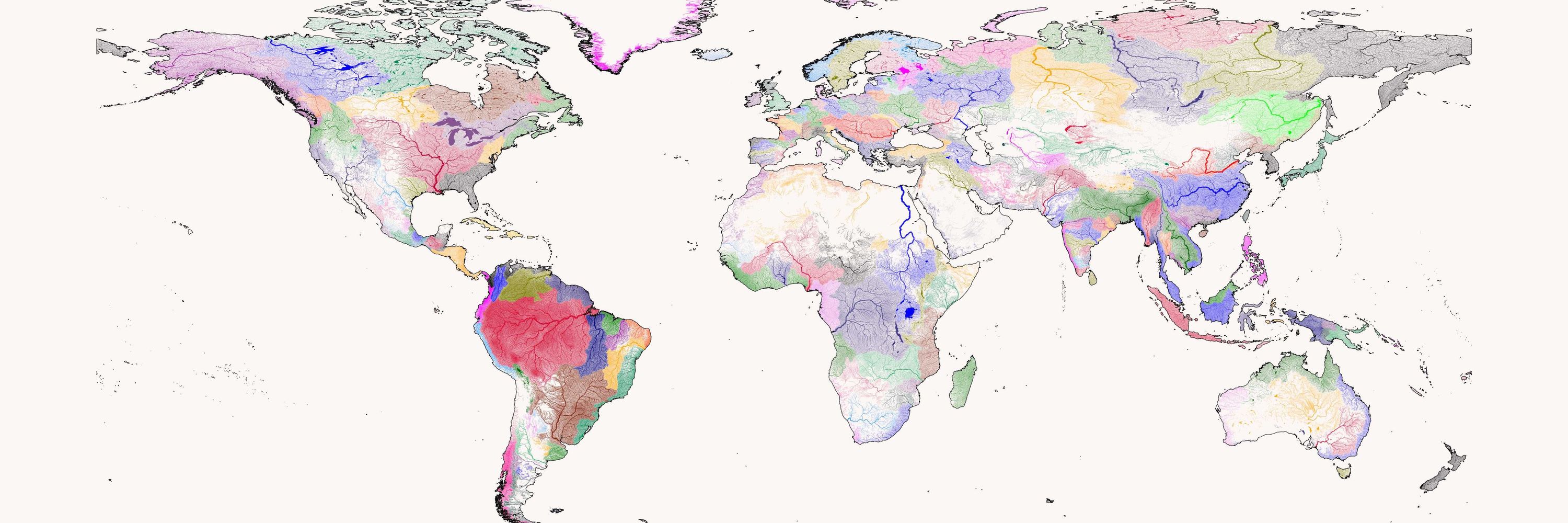
Day 20 of the #30DayMapChallenge - Water - Rivers of South America

November 20, 2025 at 9:04 PM
Day 20 of the #30DayMapChallenge - Water - Rivers of South America
Day 19 of the #30DayMapChallenge - Projections. Here are maps showing tropical storms using a number of different projections. We have the South Polar Stereo, the Robinson, the Lambert Conformal and finally I have included a shipping lanes map using the infamous Spilhaus projection.


November 19, 2025 at 10:18 PM
Day 19 of the #30DayMapChallenge - Projections. Here are maps showing tropical storms using a number of different projections. We have the South Polar Stereo, the Robinson, the Lambert Conformal and finally I have included a shipping lanes map using the infamous Spilhaus projection.
Day 18 of the #30DayMapChallenge - Out of this World. Here is a topographical map of Mars. I have added some hill shading and used a colourmap that simulates an ocean, proportionally equal in size to Earths.

November 19, 2025 at 11:48 AM
Day 18 of the #30DayMapChallenge - Out of this World. Here is a topographical map of Mars. I have added some hill shading and used a colourmap that simulates an ocean, proportionally equal in size to Earths.
Day 17 of the #30DayMapChallenge - New tool. It has been on my radar for a while so I tried out datashader to visualise population density. These maps usually take minutes to render but with datashader it takes seconds.

November 17, 2025 at 11:15 PM
Day 17 of the #30DayMapChallenge - New tool. It has been on my radar for a while so I tried out datashader to visualise population density. These maps usually take minutes to render but with datashader it takes seconds.
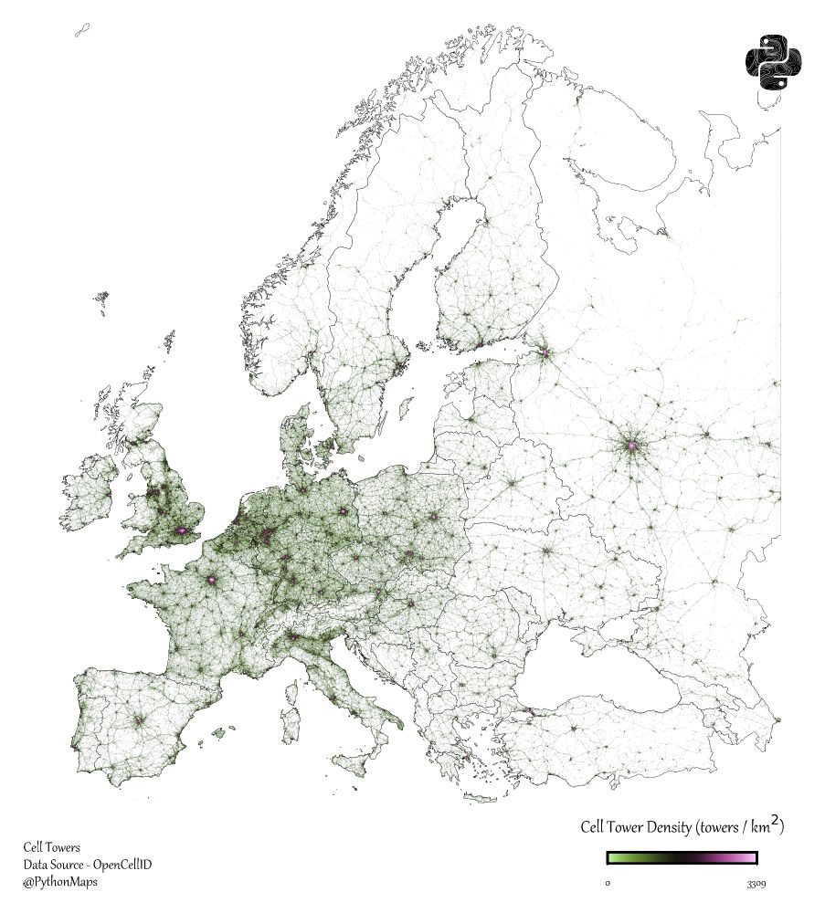
Day 16 of the #30DayMapChallenge - Cell - Here is a map of Cell tower density in Europe. Clearly this is just a population density map but gotta follow the theme.
November 16, 2025 at 9:49 PM
Day 16 of the #30DayMapChallenge - Cell - Here is a map of Cell tower density in Europe. Clearly this is just a population density map but gotta follow the theme.
Day 15 of the #30DayMapChallenge - Fire. Wildfire map. Data aggregated for all of 2024.

November 16, 2025 at 9:48 PM
Day 15 of the #30DayMapChallenge - Fire. Wildfire map. Data aggregated for all of 2024.
Day 14 of the #30DayMapChallenge Open Street Map - Railways.

November 14, 2025 at 11:10 PM
Day 14 of the #30DayMapChallenge Open Street Map - Railways.
Day 13 of the #30DayMapChallenge — 10-minute map.
Once I’ve made a particular type of map once, I can usually recreate it in about 10 minutes. This one’s a bivariate map — the style that probably took me the longest to learn the first time around. Rainfall vs Temperature in South America
Once I’ve made a particular type of map once, I can usually recreate it in about 10 minutes. This one’s a bivariate map — the style that probably took me the longest to learn the first time around. Rainfall vs Temperature in South America

November 13, 2025 at 9:45 PM
Day 13 of the #30DayMapChallenge — 10-minute map.
Once I’ve made a particular type of map once, I can usually recreate it in about 10 minutes. This one’s a bivariate map — the style that probably took me the longest to learn the first time around. Rainfall vs Temperature in South America
Once I’ve made a particular type of map once, I can usually recreate it in about 10 minutes. This one’s a bivariate map — the style that probably took me the longest to learn the first time around. Rainfall vs Temperature in South America
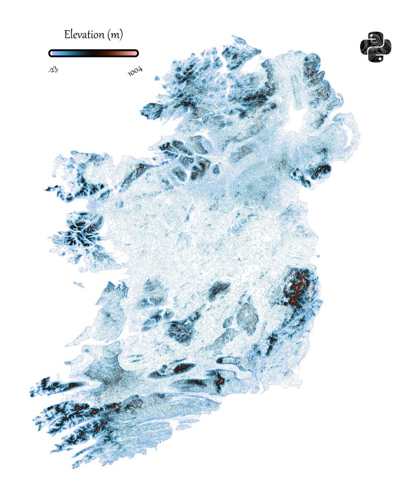
Day 12 of the #30DayMapChallenge - Map from 2125 - I think Northern Ireland and the Republic of Ireland could merge into a new country. So here is a topography map.
November 12, 2025 at 10:19 PM
Day 12 of the #30DayMapChallenge - Map from 2125 - I think Northern Ireland and the Republic of Ireland could merge into a new country. So here is a topography map.
Day 11 of the #30DayMapChallenge - Minimal - Population density of Egypt. This was always my preferred style but recently I caved to academics who wanted labels and keys 🤮. Glad to get back to basics.

November 11, 2025 at 9:11 PM
Day 11 of the #30DayMapChallenge - Minimal - Population density of Egypt. This was always my preferred style but recently I caved to academics who wanted labels and keys 🤮. Glad to get back to basics.
Day 10 of the #30DayMapChallenge - Air - Map of the world's airports and airways.

November 10, 2025 at 9:35 PM
Day 10 of the #30DayMapChallenge - Air - Map of the world's airports and airways.
Day 9 of the #30DayMapChallenge - Analog. Create your map using traditional methods. Obviously I am not going to stick to this. Frankly nothing is more traditional that Python so here is another map made with Python. Roads of the Roman Empire.

November 9, 2025 at 6:05 PM
Day 9 of the #30DayMapChallenge - Analog. Create your map using traditional methods. Obviously I am not going to stick to this. Frankly nothing is more traditional that Python so here is another map made with Python. Roads of the Roman Empire.
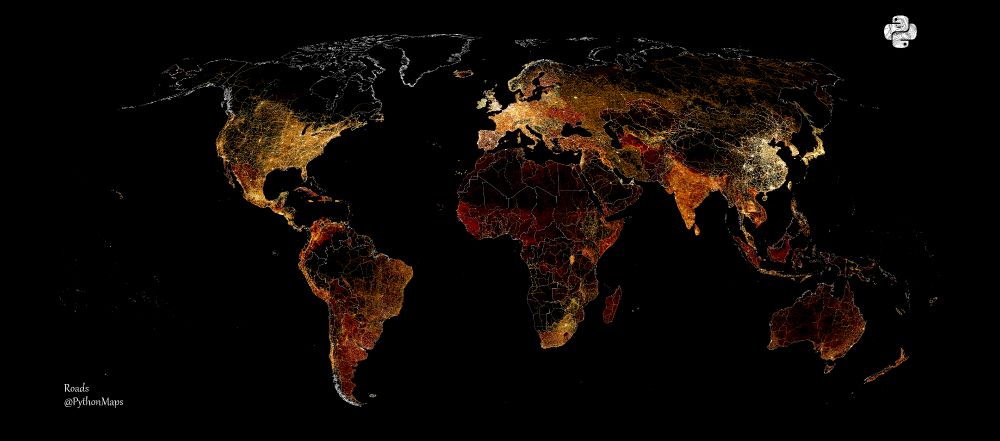
Day 8 of the #30DayMapChallenge Urban - Roads of the world. Couldn't think of anything more urban than roads.
November 8, 2025 at 11:12 PM
Day 8 of the #30DayMapChallenge Urban - Roads of the world. Couldn't think of anything more urban than roads.
Day 7 of the #30DayMapChallenge - Accessibility - "Visualize travel time, barriers....." - Here is a map showing nighttime lights in the Korean Peninsula. The border between North and South is visible from space.

November 7, 2025 at 11:32 PM
Day 7 of the #30DayMapChallenge - Accessibility - "Visualize travel time, barriers....." - Here is a map showing nighttime lights in the Korean Peninsula. The border between North and South is visible from space.
Day 6 of the #30DayMapChallenge - Dimensions. A thread of a few maps that cross into the three dimensional world. Here is a 3D representation of the topography and bathymetry around Gibralta.

November 7, 2025 at 11:32 PM
Day 6 of the #30DayMapChallenge - Dimensions. A thread of a few maps that cross into the three dimensional world. Here is a 3D representation of the topography and bathymetry around Gibralta.
Day five of the #30DayMapChallenge - Earth. Soil moisture. Data comes from the TerraClimate project. I love this colourmap.

November 7, 2025 at 11:31 PM
Day five of the #30DayMapChallenge - Earth. Soil moisture. Data comes from the TerraClimate project. I love this colourmap.
Day four of the #30DayMapChallenge - Data challenge: My Data. I made some historical geojsons of the Roman and Mongol empires. Accuracy is vaguely correct but the Mongol Empire does look a bit like a bear.

November 7, 2025 at 11:11 PM
Day four of the #30DayMapChallenge - Data challenge: My Data. I made some historical geojsons of the Roman and Mongol empires. Accuracy is vaguely correct but the Mongol Empire does look a bit like a bear.
Day 7 of the #30DayMapChallenge - Accessibility - "Visualize travel time, barriers....." - Here is a map showing nighttime lights in the Korean Peninsula. The border between North and South is visible from space.
November 7, 2025 at 11:04 PM
Day 7 of the #30DayMapChallenge - Accessibility - "Visualize travel time, barriers....." - Here is a map showing nighttime lights in the Korean Peninsula. The border between North and South is visible from space.
Day three of the #30DayMapChallenge - Polygons. This map shows the earths tectonic plates. I have overlayed all of the earthquakes with a magnitude greater than 4.0 over the last 20 years, coloured according to their magnitude (blue (smallest) - red (largest).

November 3, 2025 at 9:47 PM
Day three of the #30DayMapChallenge - Polygons. This map shows the earths tectonic plates. I have overlayed all of the earthquakes with a magnitude greater than 4.0 over the last 20 years, coloured according to their magnitude (blue (smallest) - red (largest).
Day 2 of the #30DayMapChallenge - Lines. This map shows the rivers of Africa, coloured according to the minimum river temperature.

November 2, 2025 at 7:14 PM
Day 2 of the #30DayMapChallenge - Lines. This map shows the rivers of Africa, coloured according to the minimum river temperature.
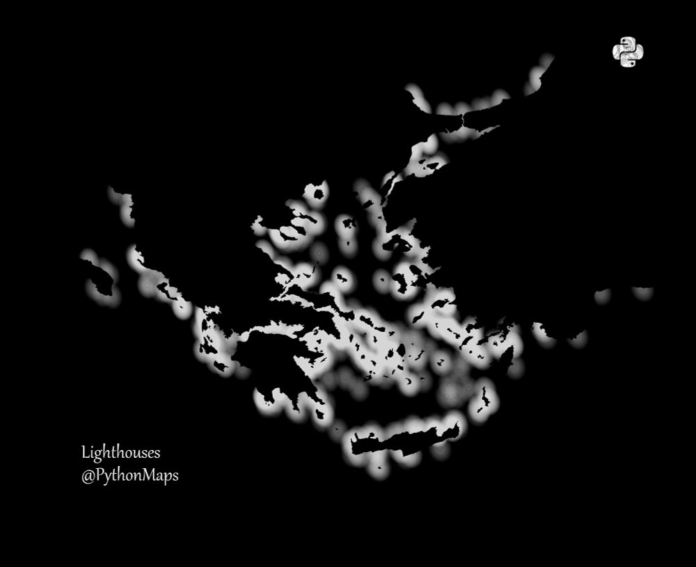
Day one of the #30DayMapChallenge - Points. These maps show lighthouses of the British Isles, the Aegean Sea and Italy. I have tried to simulate how they would shine and cast light out to sea.


November 1, 2025 at 9:41 AM
Day one of the #30DayMapChallenge - Points. These maps show lighthouses of the British Isles, the Aegean Sea and Italy. I have tried to simulate how they would shine and cast light out to sea.
Croplands. This map shows the croplands of East Asia. Using my new favourite colourmap.
Data - www.nature.com/articles/s43...
Data - www.nature.com/articles/s43...

October 2, 2025 at 8:54 PM
Croplands. This map shows the croplands of East Asia. Using my new favourite colourmap.
Data - www.nature.com/articles/s43...
Data - www.nature.com/articles/s43...
Soil moisture. Data comes from the TerraClimate project.
Is my choice of colourmap appropriate? No.
Do I care? No.
Do I just like making pretty pictures? Yes
Is my choice of colourmap appropriate? No.
Do I care? No.
Do I just like making pretty pictures? Yes
October 1, 2025 at 9:13 PM
Soil moisture. Data comes from the TerraClimate project.
Is my choice of colourmap appropriate? No.
Do I care? No.
Do I just like making pretty pictures? Yes
Is my choice of colourmap appropriate? No.
Do I care? No.
Do I just like making pretty pictures? Yes
Evapaotranspiration. Data comes from the TerraClimate project.

September 27, 2025 at 8:59 AM
Evapaotranspiration. Data comes from the TerraClimate project.