


Olivia Vane
@oliviafvane.bsky.social
Data visualisation design + code
Interactive data journalist at The Economist
oliviavane.co.uk
Interactive data journalist at The Economist
oliviavane.co.uk
Some #design notes:
This map uses a more unusual projection, the Nicolosi globular projection, and a stipple effect around the coastline—both demonstrated in code by @torbenjansen.bsky.social Thanks Torben!
Try them yourself:
🌐 observablehq.com/@toja/nicolo...
✨ observablehq.com/@toja/pen-an...
This map uses a more unusual projection, the Nicolosi globular projection, and a stipple effect around the coastline—both demonstrated in code by @torbenjansen.bsky.social Thanks Torben!
Try them yourself:
🌐 observablehq.com/@toja/nicolo...
✨ observablehq.com/@toja/pen-an...
May 12, 2025 at 1:40 PM
Some #design notes:
This map uses a more unusual projection, the Nicolosi globular projection, and a stipple effect around the coastline—both demonstrated in code by @torbenjansen.bsky.social Thanks Torben!
Try them yourself:
🌐 observablehq.com/@toja/nicolo...
✨ observablehq.com/@toja/pen-an...
This map uses a more unusual projection, the Nicolosi globular projection, and a stipple effect around the coastline—both demonstrated in code by @torbenjansen.bsky.social Thanks Torben!
Try them yourself:
🌐 observablehq.com/@toja/nicolo...
✨ observablehq.com/@toja/pen-an...
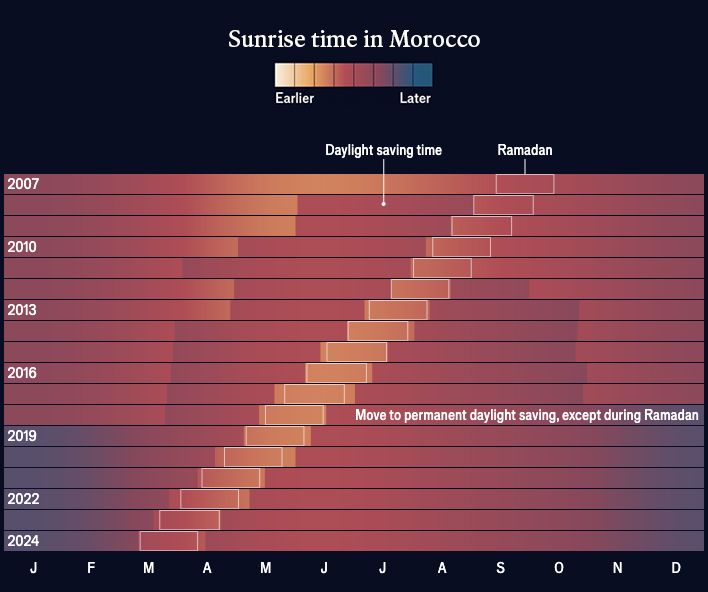
In Morocco the interplay between Ramadan, which moves with the lunar calendar, and daylight saving left the government changing clocks up to 4 times a year. Shifting daylight saving to avoid Ramadan helps Muslims observing the holy month, so they don’t have to delay breaking their fast.
May 12, 2025 at 1:35 PM
In Morocco the interplay between Ramadan, which moves with the lunar calendar, and daylight saving left the government changing clocks up to 4 times a year. Shifting daylight saving to avoid Ramadan helps Muslims observing the holy month, so they don’t have to delay breaking their fast.
This map shows the hour of sunrise globally through the year. It reveals time zones following national and, sometimes, regional boundaries, and slicing through the oceans.
May 12, 2025 at 1:25 PM
This map shows the hour of sunrise globally through the year. It reveals time zones following national and, sometimes, regional boundaries, and slicing through the oceans.