Jhey ʕ·ᴥ· ʔ
@jhey.dev
⚡️ makin' ideas click
👨🍳 staff design engineer @shopify (ex @google, @vercel 🫡)
📚 making ui/ux course craftofui.dev
👰♀️ @seaotta.dev
👨🍳 staff design engineer @shopify (ex @google, @vercel 🫡)
📚 making ui/ux course craftofui.dev
👰♀️ @seaotta.dev
it’s true, steph still talks about these potatoes

November 11, 2025 at 1:43 PM
it’s true, steph still talks about these potatoes

November 11, 2025 at 1:41 PM
super easy CSS sticky scroll hide/reveal 🧑🍳
.sticky-atc {
position: fixed;
inset: auto 0 0 0;
transition: translate 0.26s cubic-bezier(.55,0,.67,1.25);
/* hide when scrolling down */
@container scroll-state(scrolled: bottom) {
translate: 0 100%;
transition-delay: 0.5s;
}
}
.sticky-atc {
position: fixed;
inset: auto 0 0 0;
transition: translate 0.26s cubic-bezier(.55,0,.67,1.25);
/* hide when scrolling down */
@container scroll-state(scrolled: bottom) {
translate: 0 100%;
transition-delay: 0.5s;
}
}
October 22, 2025 at 11:22 PM
super easy CSS sticky scroll hide/reveal 🧑🍳
.sticky-atc {
position: fixed;
inset: auto 0 0 0;
transition: translate 0.26s cubic-bezier(.55,0,.67,1.25);
/* hide when scrolling down */
@container scroll-state(scrolled: bottom) {
translate: 0 100%;
transition-delay: 0.5s;
}
}
.sticky-atc {
position: fixed;
inset: auto 0 0 0;
transition: translate 0.26s cubic-bezier(.55,0,.67,1.25);
/* hide when scrolling down */
@container scroll-state(scrolled: bottom) {
translate: 0 100%;
transition-delay: 0.5s;
}
}
small details that matter 🧑🍳
use CSS pseudoelements to bridge the :hover gap w/ :has() + inset
a:has(+ .dots) a::after,
.dots + a::after {
position: absolute;
content: '';
}
a:has(+ .dots) a::after { inset: 0 -50% 0 100%; }
.dots + a::after { inset: 0 100% 0 -50%; }
use CSS pseudoelements to bridge the :hover gap w/ :has() + inset
a:has(+ .dots) a::after,
.dots + a::after {
position: absolute;
content: '';
}
a:has(+ .dots) a::after { inset: 0 -50% 0 100%; }
.dots + a::after { inset: 0 100% 0 -50%; }
October 22, 2025 at 4:54 PM
small details that matter 🧑🍳
use CSS pseudoelements to bridge the :hover gap w/ :has() + inset
a:has(+ .dots) a::after,
.dots + a::after {
position: absolute;
content: '';
}
a:has(+ .dots) a::after { inset: 0 -50% 0 100%; }
.dots + a::after { inset: 0 100% 0 -50%; }
use CSS pseudoelements to bridge the :hover gap w/ :has() + inset
a:has(+ .dots) a::after,
.dots + a::after {
position: absolute;
content: '';
}
a:has(+ .dots) a::after { inset: 0 -50% 0 100%; }
.dots + a::after { inset: 0 100% 0 -50%; }
jus' see a cat with the biggest lips sliding to a halt

October 22, 2025 at 4:39 PM
jus' see a cat with the biggest lips sliding to a halt
this demo continues to be my baseline gauge/one of the final bosses for where we're at with this API 😅
October 22, 2025 at 1:07 PM
this demo continues to be my baseline gauge/one of the final bosses for where we're at with this API 😅
the only atlas you should be invested in. touch grass.

October 22, 2025 at 12:55 PM
the only atlas you should be invested in. touch grass.
apple-style disclosure w/ CSS details + summary 👨🍳
::details-content {
interpolate-size: allow-keywords;
transition: content-visibility, height;
transition-behavior: allow-discrete;
}
[open]::details-content { height: fit-content; }
CSS :has() handling the image swaps 🤙
::details-content {
interpolate-size: allow-keywords;
transition: content-visibility, height;
transition-behavior: allow-discrete;
}
[open]::details-content { height: fit-content; }
CSS :has() handling the image swaps 🤙
October 22, 2025 at 9:45 AM
apple-style disclosure w/ CSS details + summary 👨🍳
::details-content {
interpolate-size: allow-keywords;
transition: content-visibility, height;
transition-behavior: allow-discrete;
}
[open]::details-content { height: fit-content; }
CSS :has() handling the image swaps 🤙
::details-content {
interpolate-size: allow-keywords;
transition: content-visibility, height;
transition-behavior: allow-discrete;
}
[open]::details-content { height: fit-content; }
CSS :has() handling the image swaps 🤙
easing is everything
use different CSS timing functions per axis for motion paths 👨🍳
.p {
animation: x .8s var(--x-time), y .8s var(--y-time);
animation-composition: accumulate; 👈
}
@keyframes x { to { translate: var(--x) 0 }
@keyframes y { to { translate: 0 var(--y) }
use different CSS timing functions per axis for motion paths 👨🍳
.p {
animation: x .8s var(--x-time), y .8s var(--y-time);
animation-composition: accumulate; 👈
}
@keyframes x { to { translate: var(--x) 0 }
@keyframes y { to { translate: 0 var(--y) }
October 19, 2025 at 4:49 PM
easing is everything
use different CSS timing functions per axis for motion paths 👨🍳
.p {
animation: x .8s var(--x-time), y .8s var(--y-time);
animation-composition: accumulate; 👈
}
@keyframes x { to { translate: var(--x) 0 }
@keyframes y { to { translate: 0 var(--y) }
use different CSS timing functions per axis for motion paths 👨🍳
.p {
animation: x .8s var(--x-time), y .8s var(--y-time);
animation-composition: accumulate; 👈
}
@keyframes x { to { translate: var(--x) 0 }
@keyframes y { to { translate: 0 var(--y) }
progressive css-only pagination indicators w/ anchor positioning 👨🍳
nav::before { position-anchor: --h; }
nav::before { left: anchor(left); }
a:hover { anchor-name: --h; }
use the nav pseudoelements, ::before for intent, ::after for current 🤙
nav::before { position-anchor: --h; }
nav::before { left: anchor(left); }
a:hover { anchor-name: --h; }
use the nav pseudoelements, ::before for intent, ::after for current 🤙
October 16, 2025 at 11:05 AM
progressive css-only pagination indicators w/ anchor positioning 👨🍳
nav::before { position-anchor: --h; }
nav::before { left: anchor(left); }
a:hover { anchor-name: --h; }
use the nav pseudoelements, ::before for intent, ::after for current 🤙
nav::before { position-anchor: --h; }
nav::before { left: anchor(left); }
a:hover { anchor-name: --h; }
use the nav pseudoelements, ::before for intent, ::after for current 🤙
you ever take an enneagram test? we did them for an onsite last week. honestly answered a lot of things for me 💯 high recommend
type 3
type 3

October 16, 2025 at 10:47 AM
you ever take an enneagram test? we did them for an onsite last week. honestly answered a lot of things for me 💯 high recommend
type 3
type 3
cross-browser liquid toggle 👨🔬
CSS + SVG filter + drag mechanics 🧑🍳
(exploding view 👇)
CSS + SVG filter + drag mechanics 🧑🍳
(exploding view 👇)
October 15, 2025 at 3:05 PM
cross-browser liquid toggle 👨🔬
CSS + SVG filter + drag mechanics 🧑🍳
(exploding view 👇)
CSS + SVG filter + drag mechanics 🧑🍳
(exploding view 👇)
responsive CSS pinned sidebar transition 📌
.layout:has(:popover-open) {
grid-template-columns: var(--sidebar-width) 1fr;
}
aside:popover-open {
translate: 0 var(--ctrl);
height: var(--extend);
}
actual zero JS for the layout transition here
so many details to play with! 🧑🍳
.layout:has(:popover-open) {
grid-template-columns: var(--sidebar-width) 1fr;
}
aside:popover-open {
translate: 0 var(--ctrl);
height: var(--extend);
}
actual zero JS for the layout transition here
so many details to play with! 🧑🍳
October 14, 2025 at 2:01 PM
responsive CSS pinned sidebar transition 📌
.layout:has(:popover-open) {
grid-template-columns: var(--sidebar-width) 1fr;
}
aside:popover-open {
translate: 0 var(--ctrl);
height: var(--extend);
}
actual zero JS for the layout transition here
so many details to play with! 🧑🍳
.layout:has(:popover-open) {
grid-template-columns: var(--sidebar-width) 1fr;
}
aside:popover-open {
translate: 0 var(--ctrl);
height: var(--extend);
}
actual zero JS for the layout transition here
so many details to play with! 🧑🍳
add to cart 🛒
configurable css + svg 👇
configurable css + svg 👇
October 9, 2025 at 10:16 AM
add to cart 🛒
configurable css + svg 👇
configurable css + svg 👇
cursor tracking on 3D CSS surfaces 👨🍳
inverse projection mappin' to calculate proximity in 3D space and apply an eased 0-1 value 🤙
the key: measuring the 4 corners, check the reveal 👇
(ideal for 2D canvas w/ 3D transforms)
inverse projection mappin' to calculate proximity in 3D space and apply an eased 0-1 value 🤙
the key: measuring the 4 corners, check the reveal 👇
(ideal for 2D canvas w/ 3D transforms)
October 9, 2025 at 10:13 AM
cursor tracking on 3D CSS surfaces 👨🍳
inverse projection mappin' to calculate proximity in 3D space and apply an eased 0-1 value 🤙
the key: measuring the 4 corners, check the reveal 👇
(ideal for 2D canvas w/ 3D transforms)
inverse projection mappin' to calculate proximity in 3D space and apply an eased 0-1 value 🤙
the key: measuring the 4 corners, check the reveal 👇
(ideal for 2D canvas w/ 3D transforms)
🚨💚🤙 BREAKING: Jhey Tompkins to Shopify, here we go! Agreement in place between all parties involved
July 25, 2025 at 11:56 PM
🚨💚🤙 BREAKING: Jhey Tompkins to Shopify, here we go! Agreement in place between all parties involved
little details: hold to confirm signature ✍️
signature playback mirrors the timing of your strokes
not just what you drew, but how you drew it, retaining the feel and personality
signature playback mirrors the timing of your strokes
not just what you drew, but how you drew it, retaining the feel and personality
July 11, 2025 at 7:54 PM
little details: hold to confirm signature ✍️
signature playback mirrors the timing of your strokes
not just what you drew, but how you drew it, retaining the feel and personality
signature playback mirrors the timing of your strokes
not just what you drew, but how you drew it, retaining the feel and personality
SVG filters provide a basic lighting system you can sync with a little JavaScript and use in your web apps 💡
... not as powerful as MacOS implementation but pretty cool
... not as powerful as MacOS implementation but pretty cool
July 8, 2025 at 8:46 PM
SVG filters provide a basic lighting system you can sync with a little JavaScript and use in your web apps 💡
... not as powerful as MacOS implementation but pretty cool
... not as powerful as MacOS implementation but pretty cool
you can just <select> things 🧑🍳
custom select with CSS (progressively enhanced)
select {
&,
&::picker(select) { appearance: base-select; }
}
custom select with CSS (progressively enhanced)
select {
&,
&::picker(select) { appearance: base-select; }
}
July 8, 2025 at 6:12 PM
you can just <select> things 🧑🍳
custom select with CSS (progressively enhanced)
select {
&,
&::picker(select) { appearance: base-select; }
}
custom select with CSS (progressively enhanced)
select {
&,
&::picker(select) { appearance: base-select; }
}
obligatory "new role, new macbook" post
wHAt dO i inSTaLl fiRsT?
i jus' run a node script and it does it all for me 🧑🍳
wHAt dO i inSTaLl fiRsT?
i jus' run a node script and it does it all for me 🧑🍳

July 8, 2025 at 6:10 PM
obligatory "new role, new macbook" post
wHAt dO i inSTaLl fiRsT?
i jus' run a node script and it does it all for me 🧑🍳
wHAt dO i inSTaLl fiRsT?
i jus' run a node script and it does it all for me 🧑🍳
css cyber[popover] 2025 w/ sfx
jus' javascript for the audio and keyboard shortcuts — [popover], starting-style, linear(), and mask for the rest 🤙
jus' javascript for the audio and keyboard shortcuts — [popover], starting-style, linear(), and mask for the rest 🤙
July 3, 2025 at 7:42 PM
css cyber[popover] 2025 w/ sfx
jus' javascript for the audio and keyboard shortcuts — [popover], starting-style, linear(), and mask for the rest 🤙
jus' javascript for the audio and keyboard shortcuts — [popover], starting-style, linear(), and mask for the rest 🤙
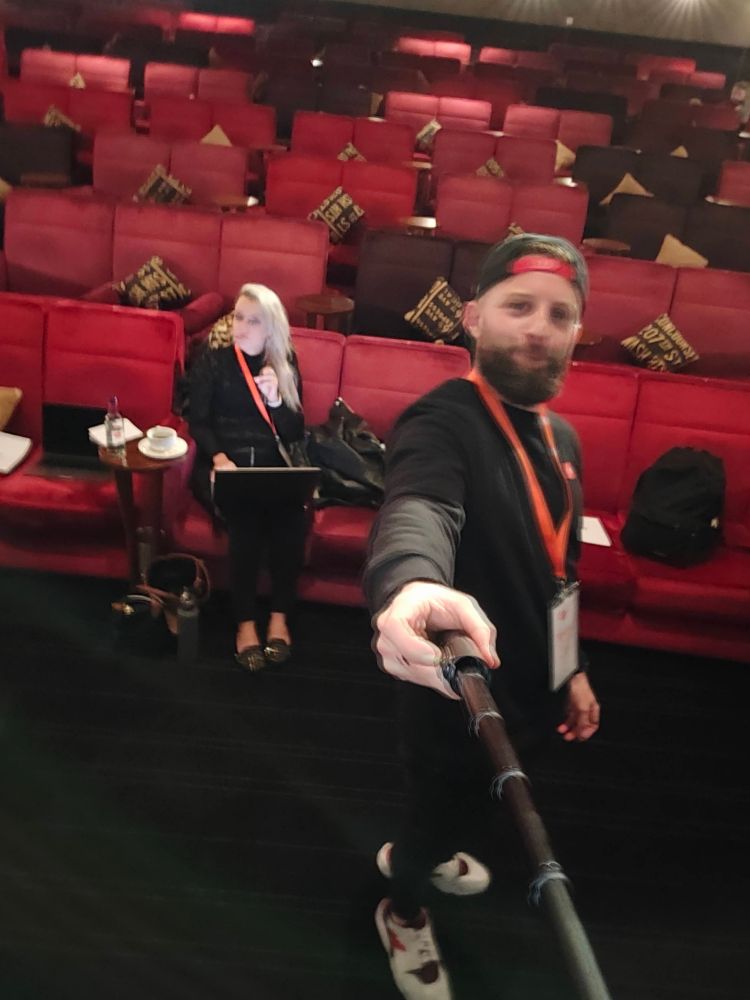
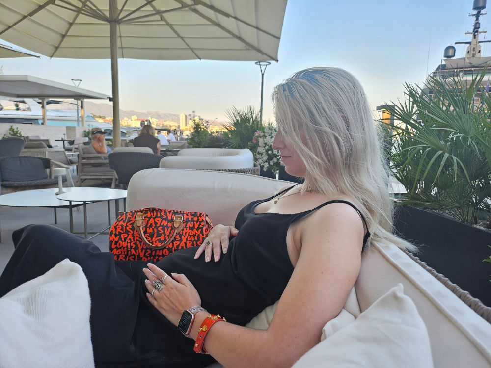
happy birthday to my absolute world @seaotta.dev 🫶
~3 years ago, went to speak at a conference in leeds, the rest is history
~3 years ago, went to speak at a conference in leeds, the rest is history


June 27, 2025 at 1:49 PM
happy birthday to my absolute world @seaotta.dev 🫶
~3 years ago, went to speak at a conference in leeds, the rest is history
~3 years ago, went to speak at a conference in leeds, the rest is history
thank you all – building on CodePen has truly changed my life and shaped my career in ways never imagined

June 23, 2025 at 5:43 PM
thank you all – building on CodePen has truly changed my life and shaped my career in ways never imagined
