grantchalmers.bsky.social
@grantchalmers.bsky.social
The uranium market is not just cyclically tight - it is structurally undersupplied. With inventories fading, production flat or declining, and demand accelerating, the deficit is real, deepening, and unlikely to reverse before the mid-2030s.
October 16, 2025 at 10:29 PM
Reposted
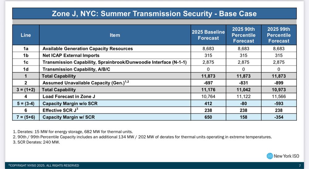
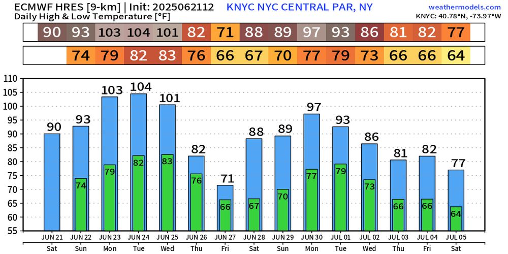
Things are looking pretty bad for the New York City grid next week.

There is a nonzero chance of rolling brownouts on Election Day.

And remember: CUOMO DID THIS. He shut down Indian Point nuclear plant, which provided 2 gigawatts of clean power to the city.

Don’t rank Cuomo.
June 21, 2025 at 7:22 PM
Phu Quoc, Vietnam. A nice alternative to more common holiday jurisdictions like Thailand for a beach/resort.
April 23, 2025 at 2:35 AM
Reposted
Fossil fuel electricity generation is up 29% since New York shut down Indian Point nuclear power plant.

Do not put Cuomo on your ballot!
April 20, 2025 at 4:45 AM
Bearded Dragon on a strainer post.
April 14, 2025 at 10:33 PM
NotebookLM is such a useful tool for learning any new topic. Even more so with the new 'Discover sources' button. Below is a mind map that I created based on my own research topic, uranium supply and demand dynamics.
April 11, 2025 at 3:55 AM
Nuclear reactor constructions (first concrete pour to grid connection) ordered by first concrete date, from top (oldest) to bottom (most recent). Each horizontal bar represents one nuclear reactor (length of the bar = time taken, in days, from first concrete to grid connection).
April 5, 2025 at 11:36 PM
Record surge in zero/negative electricity prices in March 2025 ⚡
14.05% of dispatches across Australia's NEM hit zero or below.
Great for clean energy — but too much cheap power can distort markets & complicate grid ops.
Energy transition = not simple.
April 5, 2025 at 12:28 AM
March 2025 mean CO2 intensity (gCO2eq/kWh) and power consumption breakdown (%). Data via Electricity Maps, table via R {gt} package.
#rstats #gt #energy #energytransition #electricity #datavisualisation
Methodology: lnkd.in/gaXQmQ-P h/t Electricity Maps
April 3, 2025 at 7:01 AM
ASX uranium stock returns. #uranium #asx
April 3, 2025 at 6:59 AM
🌍⚡ How clean is your electricity?
This chart shows the mean CO₂ intensity and power mix breakdown for various regions around the world in March 2025.

📡 Data: @electricitymaps.com
📈 Viz: @grantchalmers.bsky.social

#EnergyTransition #Electricity #CO2 #DataViz
March 29, 2025 at 6:37 AM
This heatmap illustrates the impact of time of day on wind farm output across three major Australian states, highlighting the continued 'hollowing out' of capacity factors in the middle of the day.
March 20, 2025 at 9:41 PM
The heatmap displays the capacity factor (CF) of wind farms in Victoria (VIC) and South Australia (SA) for January across four years (2022 to 2025). The CF is presented in 4-hour time blocks (9 AM - 12 PM and 1 PM - 4 PM). Each row represents a year, and each column corresponds to a wind farm.
March 16, 2025 at 8:36 AM
This visualisation presents cumulative uranium supply deficit scenarios over time, from 2024 to 2040. It illustrates different demand scenarios and the growing shortfall in uranium supply relative to demand. #uranium #demand #supply
March 14, 2025 at 10:46 PM
Februrary 2025 mean CO2 intensity (gCO2eq/kWh) and power consumption breakdown (%). Data via Electricity Maps, table via R {gt} package.
#rstats #gt #energy #energytransition #electricity #datavisualisation
Methodology: lnkd.in/gaXQmQ-P h/t Electricity Maps
March 2, 2025 at 3:53 AM
Cumulative uranium supply deficit scenarios. The scenarios are represented by three lines, each corresponding to different demand forecasts and production ramp-up assumptions:
My Base Case (353 Mlbs demand by 2040)
WNA Mid-point (385 Mlbs demand by 2040)
WNA Upper (455 Mlbs demand by 2040).
February 28, 2025 at 7:59 AM
Reposted
I'm looking forward to chatting with these legends of nuclear advocacy on Monday morning!

Australia's bitter partisan debate has drifted far from the point: cleaning up our energy system. Come along for a refreshing look at what this clean, reliable energy source can offer us.

9am AEST / 10am AEDT
The Australian debate on nuclear energy has gotten ugly. As Californian women who were initially skeptical of nuclear we want to explore an alternative route of engagement & attempt to bring some positive vibes to this conversation.

Join us on Sunday, March 2nd, at 3 PM PT.
WePlanet Conversations: Women for Nuclear 2 | WePlanet Australia
A fireside chat and Q&A with two incredible women fighting for clean energy.
www.weplanetaustralia.org
February 28, 2025 at 6:03 AM
January 2025 mean CO2 intensity (gCO2eq/kWh) and power consumption breakdown (%). Data via Electricity Maps, table via R {gt} package.

#rstats #gt #energy #energytransition #electricity #data #datavisualisation
Methodology: lnkd.in/gaXQmQ-P h/t @electricitymaps.com
February 1, 2025 at 11:26 PM
This chart shows box‐and‐whisker plots of hourly CO₂ intensity (in grams of CO₂ equivalent per kWh) for Germany (left panel) and France (right panel) over a full year (2024). #nuclear #cleanenergy
January 22, 2025 at 9:28 AM
This heatmap illustrates how wind farm output in three major Australian states is strongly influenced by both time of day (with lower midday outputs) and larger‐scale regional wind events (producing simultaneous highs or lows across multiple farms).
#heatmap #windenergy #nem
January 16, 2025 at 11:26 PM
This violin plot shows how each NSW black‐coal generator’s capacity factor (CF) varies across six different 4‐hour windows over the course of 2024. Note how hard they are still working, particularly from 5pm - 8pm. #energy #coal #nsw #nem #transition
January 14, 2025 at 9:57 PM