


Erik Kennedy
@erikdkennedy.bsky.social
Teaching UI design (in a practical way).
Enrollment for my design courses closes at midnight tonight.
Lots of folks saying it's the best career investment they've ever made.
AMA 🫡
Lots of folks saying it's the best career investment they've ever made.
AMA 🫡


October 22, 2025 at 5:37 PM
Enrollment for my design courses closes at midnight tonight.
Lots of folks saying it's the best career investment they've ever made.
AMA 🫡
Lots of folks saying it's the best career investment they've ever made.
AMA 🫡
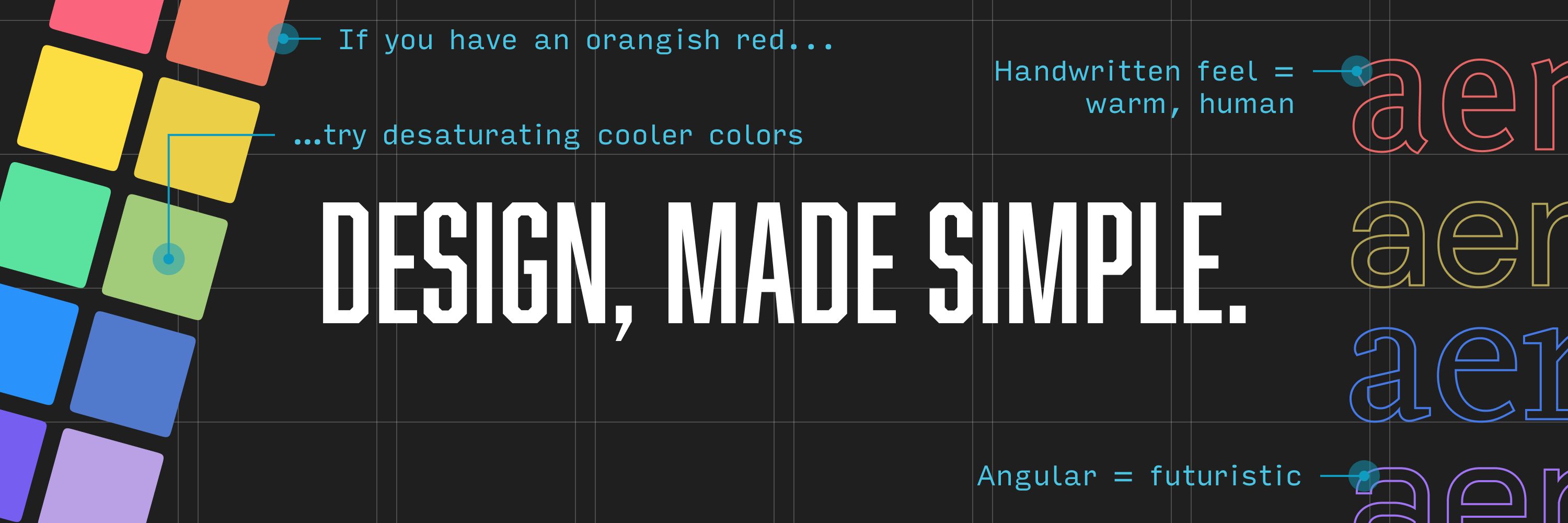
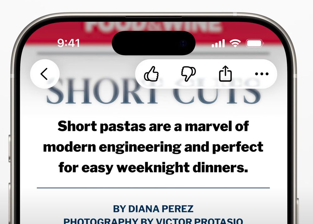
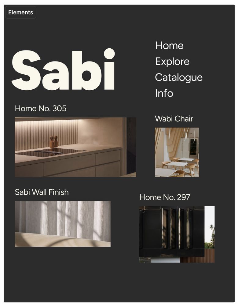
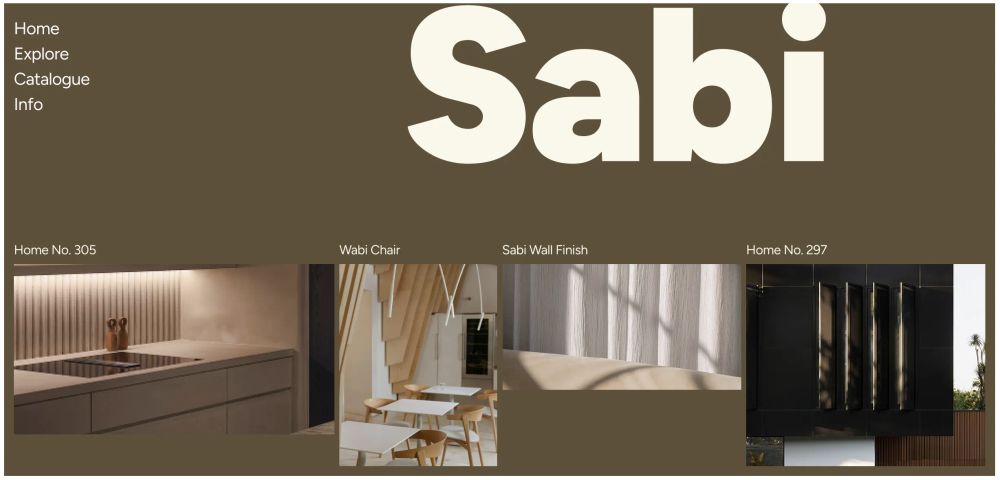
Georgia is a default web font, it's on a billion pages... but here it looks FRESH 🔥
Why? 2 reasons...
Why? 2 reasons...
July 15, 2025 at 8:01 PM
Georgia is a default web font, it's on a billion pages... but here it looks FRESH 🔥
Why? 2 reasons...
Why? 2 reasons...
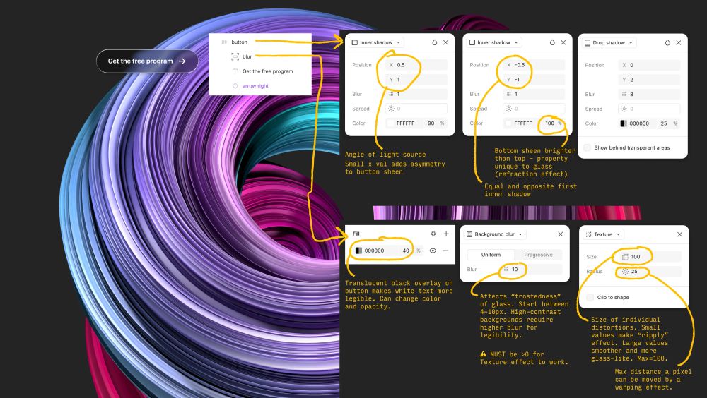
Here's a property-by-property visual breakdown of Liquid Glass in Figma, along with WHAT each property changes.
June 12, 2025 at 8:23 PM
Here's a property-by-property visual breakdown of Liquid Glass in Figma, along with WHAT each property changes.
How to do Apple's Liquid Glass in Figma (a property-by-property visual breakdown)
Time to get nerdy about liquid glass 🤓
👇👇
Time to get nerdy about liquid glass 🤓
👇👇
June 12, 2025 at 8:23 PM
How to do Apple's Liquid Glass in Figma (a property-by-property visual breakdown)
Time to get nerdy about liquid glass 🤓
👇👇
Time to get nerdy about liquid glass 🤓
👇👇
🥃 Refraction through glass effects
⛅ Soft shadow techniques
🌈 Mesh gradients
All in Apple's new visual style, announced yesterday.
All topics covered on Design Hacks (or events I've done, announced on Design Hacks).
Interested in staying on the future of visual design?
👇
⛅ Soft shadow techniques
🌈 Mesh gradients
All in Apple's new visual style, announced yesterday.
All topics covered on Design Hacks (or events I've done, announced on Design Hacks).
Interested in staying on the future of visual design?
👇
June 10, 2025 at 3:00 PM
🥃 Refraction through glass effects
⛅ Soft shadow techniques
🌈 Mesh gradients
All in Apple's new visual style, announced yesterday.
All topics covered on Design Hacks (or events I've done, announced on Design Hacks).
Interested in staying on the future of visual design?
👇
⛅ Soft shadow techniques
🌈 Mesh gradients
All in Apple's new visual style, announced yesterday.
All topics covered on Design Hacks (or events I've done, announced on Design Hacks).
Interested in staying on the future of visual design?
👇
These courses are my life's work. I am extraordinarily lucky to have been born in a moment where I could create and sell them. And if you've signed up, I hope they've been transformative for your design skills and confidence.

May 28, 2025 at 7:04 PM
These courses are my life's work. I am extraordinarily lucky to have been born in a moment where I could create and sell them. And if you've signed up, I hope they've been transformative for your design skills and confidence.
These 3 courses are SO MUCH of what I know about design. In total, they're 69 HOURS of videos about every aspect of digital design: aesthetics, usability, conversion-rate optimization, communication, etc.
And every moment of them is architected to be as practical, as clearly explained as possible.
And every moment of them is architected to be as practical, as clearly explained as possible.


May 28, 2025 at 7:04 PM
These 3 courses are SO MUCH of what I know about design. In total, they're 69 HOURS of videos about every aspect of digital design: aesthetics, usability, conversion-rate optimization, communication, etc.
And every moment of them is architected to be as practical, as clearly explained as possible.
And every moment of them is architected to be as practical, as clearly explained as possible.
Fast forward to now. The course is Learn UI Design. Over 5,000 students have taken it, including from the most respected companies in tech – Stripe, Apple, Meta, etc.
I've added an additional 10 hours of video to it, re-recorded everything from scratch – and created two more courses on top of that.
I've added an additional 10 hours of video to it, re-recorded everything from scratch – and created two more courses on top of that.

May 28, 2025 at 7:04 PM
Fast forward to now. The course is Learn UI Design. Over 5,000 students have taken it, including from the most respected companies in tech – Stripe, Apple, Meta, etc.
I've added an additional 10 hours of video to it, re-recorded everything from scratch – and created two more courses on top of that.
I've added an additional 10 hours of video to it, re-recorded everything from scratch – and created two more courses on top of that.
If there's one time in my life the muse was with me, it was in the house with the Mexican talavera toilet...
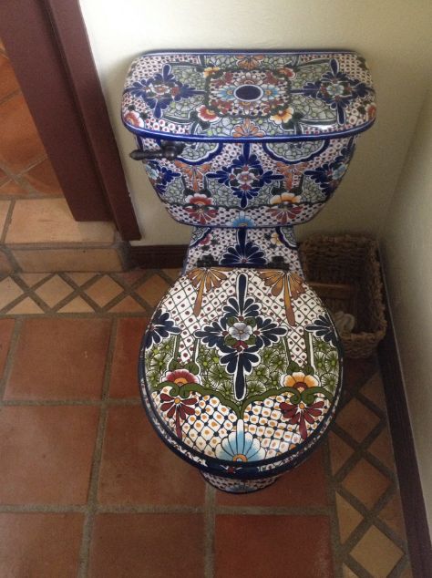
May 28, 2025 at 7:04 PM
If there's one time in my life the muse was with me, it was in the house with the Mexican talavera toilet...
These tips are all in Learn UI Design, which opens for enrollment at midnight tonight 🥳
learnui.design
Enroll your team (5 seats across my 3 courses) for...
💸 30% off
🧐 2 bonus design review/coaching sessions with me
Details here 👉 learnui.design/for-employe...
learnui.design
Enroll your team (5 seats across my 3 courses) for...
💸 30% off
🧐 2 bonus design review/coaching sessions with me
Details here 👉 learnui.design/for-employe...

May 27, 2025 at 5:40 PM
These tips are all in Learn UI Design, which opens for enrollment at midnight tonight 🥳
learnui.design
Enroll your team (5 seats across my 3 courses) for...
💸 30% off
🧐 2 bonus design review/coaching sessions with me
Details here 👉 learnui.design/for-employe...
learnui.design
Enroll your team (5 seats across my 3 courses) for...
💸 30% off
🧐 2 bonus design review/coaching sessions with me
Details here 👉 learnui.design/for-employe...
☝️ Little-known design tip: if you're trying to balance a thicker element with a thinner element, make the thicker element a lower opacity 😉
The goal: get the icons and text feeling really nice *together*
The goal: get the icons and text feeling really nice *together*
May 27, 2025 at 5:40 PM
☝️ Little-known design tip: if you're trying to balance a thicker element with a thinner element, make the thicker element a lower opacity 😉
The goal: get the icons and text feeling really nice *together*
The goal: get the icons and text feeling really nice *together*
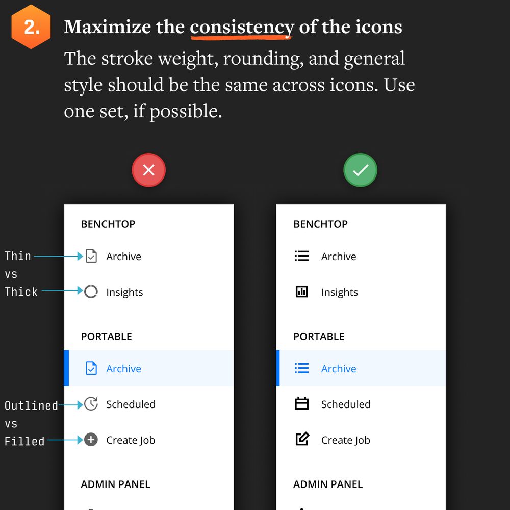
Icon consistency is a common UI mistake in meaty SAAS apps. At the very least, be consistent on:
🐄 Stroke weight thickness
🔘 Border radius
🪣 Fill vs stroke icons
🐄 Stroke weight thickness
🔘 Border radius
🪣 Fill vs stroke icons
May 27, 2025 at 5:40 PM
Icon consistency is a common UI mistake in meaty SAAS apps. At the very least, be consistent on:
🐄 Stroke weight thickness
🔘 Border radius
🪣 Fill vs stroke icons
🐄 Stroke weight thickness
🔘 Border radius
🪣 Fill vs stroke icons
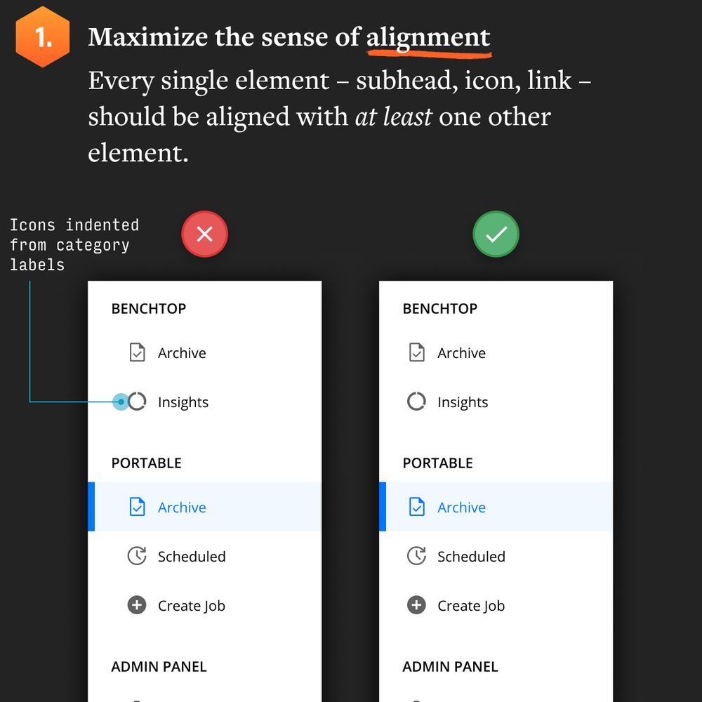
Alignment is critical. You want to buy as much neat/clean feel as you can with the few elements in a sidebar.
May 27, 2025 at 5:40 PM
Alignment is critical. You want to buy as much neat/clean feel as you can with the few elements in a sidebar.
We don't talk enough about the UI of SAAS apps.
Flashy landing pages are one thing, but how do you make data-heavy apps look GREAT?
I'll be posting some tips this month 👇
Flashy landing pages are one thing, but how do you make data-heavy apps look GREAT?
I'll be posting some tips this month 👇
May 27, 2025 at 5:40 PM
We don't talk enough about the UI of SAAS apps.
Flashy landing pages are one thing, but how do you make data-heavy apps look GREAT?
I'll be posting some tips this month 👇
Flashy landing pages are one thing, but how do you make data-heavy apps look GREAT?
I'll be posting some tips this month 👇
this is what i'd put in a time capsule from 2025.
May 16, 2025 at 7:58 PM
this is what i'd put in a time capsule from 2025.
Proud font dad moment: seeing Figtree in Figma's new feature announcements at Config today 😎
May 7, 2025 at 9:34 PM
Proud font dad moment: seeing Figtree in Figma's new feature announcements at Config today 😎
WHAT'S YOUR HARD-TO-DO-IN-FIGMA?
The things that are easy to do in Figma – rectangles, text, images – are the things that feel overused and common place in digital design.
"ooh i stack boxes for a living 🙄"
The antidote? Easy.
The things that are easy to do in Figma – rectangles, text, images – are the things that feel overused and common place in digital design.
"ooh i stack boxes for a living 🙄"
The antidote? Easy.

April 25, 2025 at 3:56 PM
WHAT'S YOUR HARD-TO-DO-IN-FIGMA?
The things that are easy to do in Figma – rectangles, text, images – are the things that feel overused and common place in digital design.
"ooh i stack boxes for a living 🙄"
The antidote? Easy.
The things that are easy to do in Figma – rectangles, text, images – are the things that feel overused and common place in digital design.
"ooh i stack boxes for a living 🙄"
The antidote? Easy.
I made this mesh gradient generator to be the EASIEST and FASTEST way to create and experiment with mesh gradients.
The "Copy SVG" button allows ONE-CLICK copy-and-paste into Figma 🤯
The "Copy SVG" button allows ONE-CLICK copy-and-paste into Figma 🤯
April 24, 2025 at 4:01 PM
I made this mesh gradient generator to be the EASIEST and FASTEST way to create and experiment with mesh gradients.
The "Copy SVG" button allows ONE-CLICK copy-and-paste into Figma 🤯
The "Copy SVG" button allows ONE-CLICK copy-and-paste into Figma 🤯
I think I'm going to get to use a tool I launched earlier this year in a client project 😀
April 24, 2025 at 4:01 PM
I think I'm going to get to use a tool I launched earlier this year in a client project 😀
7. SCRIM
Very subtle, but if you add a highly-blurred, translucent black oval behind white text, it's basically impossible to notice AND makes the text more legible. BAM!
Very subtle, but if you add a highly-blurred, translucent black oval behind white text, it's basically impossible to notice AND makes the text more legible. BAM!

April 21, 2025 at 4:01 PM
7. SCRIM
Very subtle, but if you add a highly-blurred, translucent black oval behind white text, it's basically impossible to notice AND makes the text more legible. BAM!
Very subtle, but if you add a highly-blurred, translucent black oval behind white text, it's basically impossible to notice AND makes the text more legible. BAM!
6. BLUR THE IMAGE
If these techniques aren't working, you likely have a very busy image. One way to make an image less busy – definitionally – is to blur it!
This really only works if the image specifics are sort of secondary to the vibe it's giving off.
If these techniques aren't working, you likely have a very busy image. One way to make an image less busy – definitionally – is to blur it!
This really only works if the image specifics are sort of secondary to the vibe it's giving off.

April 21, 2025 at 4:01 PM
6. BLUR THE IMAGE
If these techniques aren't working, you likely have a very busy image. One way to make an image less busy – definitionally – is to blur it!
This really only works if the image specifics are sort of secondary to the vibe it's giving off.
If these techniques aren't working, you likely have a very busy image. One way to make an image less busy – definitionally – is to blur it!
This really only works if the image specifics are sort of secondary to the vibe it's giving off.
5. FLOOR FADE
Add a gradient from 0% black to 60-70% black at the bottom of the image. Put white text on top. You'll hardly notice the gradient, but the text will be much easier to read.
Bonus: combine with a text shadow or other techniques 👍
Add a gradient from 0% black to 60-70% black at the bottom of the image. Put white text on top. You'll hardly notice the gradient, but the text will be much easier to read.
Bonus: combine with a text shadow or other techniques 👍

April 21, 2025 at 4:01 PM
5. FLOOR FADE
Add a gradient from 0% black to 60-70% black at the bottom of the image. Put white text on top. You'll hardly notice the gradient, but the text will be much easier to read.
Bonus: combine with a text shadow or other techniques 👍
Add a gradient from 0% black to 60-70% black at the bottom of the image. Put white text on top. You'll hardly notice the gradient, but the text will be much easier to read.
Bonus: combine with a text shadow or other techniques 👍
4. RECOLOR THE IMAGE
If the image is just contributing the overall vibe and doesn't need to be seen clearly, just through an overlay on top 🫡
If the image is just contributing the overall vibe and doesn't need to be seen clearly, just through an overlay on top 🫡

April 21, 2025 at 4:01 PM
4. RECOLOR THE IMAGE
If the image is just contributing the overall vibe and doesn't need to be seen clearly, just through an overlay on top 🫡
If the image is just contributing the overall vibe and doesn't need to be seen clearly, just through an overlay on top 🫡
3. TEXT IN A BOX
You can let the image shine through by putting the text inside a translucent box. Nice!
You can let the image shine through by putting the text inside a translucent box. Nice!

April 21, 2025 at 4:01 PM
3. TEXT IN A BOX
You can let the image shine through by putting the text inside a translucent box. Nice!
You can let the image shine through by putting the text inside a translucent box. Nice!
2. TEXT SHADOW
This is fairly subtle, but it's almost always worth trying, IMO.
This is fairly subtle, but it's almost always worth trying, IMO.

April 21, 2025 at 4:01 PM
2. TEXT SHADOW
This is fairly subtle, but it's almost always worth trying, IMO.
This is fairly subtle, but it's almost always worth trying, IMO.