


Gregor Aisch
@driven-by-data.net
Senior Visual Data Journalist at @zeit.de. Co-founder and former CTO of @datawrapper.de. Former @nytimes.com graphics editor #datajournalism #graphics #maps #cartography (he/him)
3. But why would you look at the distributions side by side (horizontally) when you can learn so much more if they're stacked vertically. You almost lose all of the benefits these 3 chart power-horses can offer us when not stacking them orthogonally to the main dimension.


September 15, 2025 at 2:08 PM
3. But why would you look at the distributions side by side (horizontally) when you can learn so much more if they're stacked vertically. You almost lose all of the benefits these 3 chart power-horses can offer us when not stacking them orthogonally to the main dimension.
For my latest Weekly Chart at @datawrapper.de I tried a different way of mapping destruction in Gaza using OSM buildings. www.datawrapper.de/blog/mapping...

September 13, 2025 at 1:37 PM
For my latest Weekly Chart at @datawrapper.de I tried a different way of mapping destruction in Gaza using OSM buildings. www.datawrapper.de/blog/mapping...
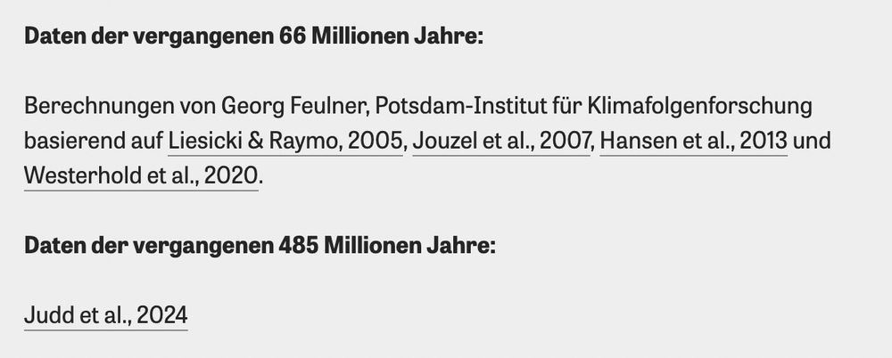
I don't know how many climate scientists where involved in collecting all these samples and turning them into models of past surface temperatures, but we linked to all the related studies in the methodology.
June 22, 2025 at 11:53 AM
I don't know how many climate scientists where involved in collecting all these samples and turning them into models of past surface temperatures, but we linked to all the related studies in the methodology.
People tell me nobody wants to look at climate curves anymore, yet here we are!!! Please enjoy our interactive journey through 485 million years of climate history and dive into the fascinating and important work of paleoclimate scientists.
🎁 www.zeit.de/wissen/umwel...
🎁 www.zeit.de/wissen/umwel...
June 20, 2025 at 9:32 AM
People tell me nobody wants to look at climate curves anymore, yet here we are!!! Please enjoy our interactive journey through 485 million years of climate history and dive into the fascinating and important work of paleoclimate scientists.
🎁 www.zeit.de/wissen/umwel...
🎁 www.zeit.de/wissen/umwel...
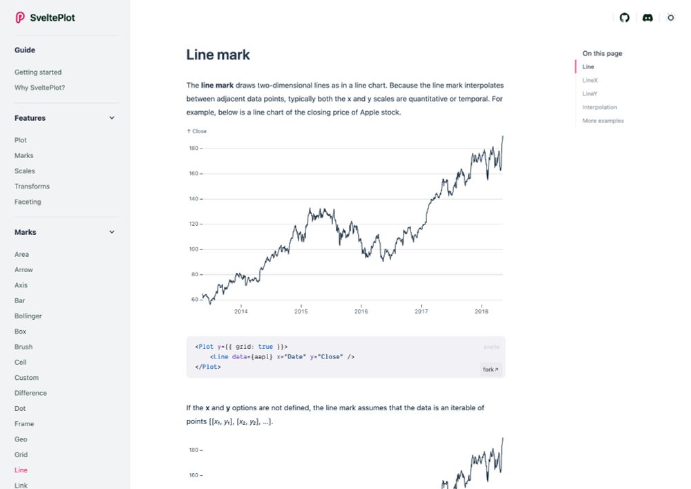
I made a website that documents all the features and shows a lot of examples that you can fork and edit on the Svelte playground. You can help improving this website, too! svelteplot.dev
May 13, 2025 at 11:21 AM
I made a website that documents all the features and shows a lot of examples that you can fork and edit on the Svelte playground. You can help improving this website, too! svelteplot.dev
Last week I had the pleasure of finally releasing the #SveltePlot alpha version during my talk at the #SvelteSummit in Barcelona. It's a new visualization framework for @svelte.dev that I've been working on for the past 18 months, so it's about time for a 🧵
May 13, 2025 at 11:21 AM
Last week I had the pleasure of finally releasing the #SveltePlot alpha version during my talk at the #SvelteSummit in Barcelona. It's a new visualization framework for @svelte.dev that I've been working on for the past 18 months, so it's about time for a 🧵
Insider trading or not? We analyzed minutely stock data for the 20 most traded S&P 500 companies before, during and after Trumps announcement for pausing most tariffs and talked to financial experts about what this means www.zeit.de/geld/2025-04...


April 11, 2025 at 3:49 PM
Insider trading or not? We analyzed minutely stock data for the 20 most traded S&P 500 companies before, during and after Trumps announcement for pausing most tariffs and talked to financial experts about what this means www.zeit.de/geld/2025-04...

Today is officially the day where intraday market charts have their time to shine in the media spotlight.


April 9, 2025 at 9:42 PM
Today is officially the day where intraday market charts have their time to shine in the media spotlight.
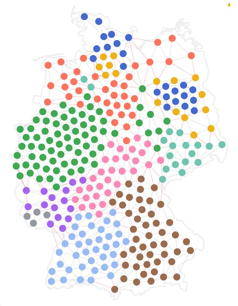
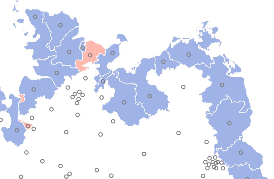
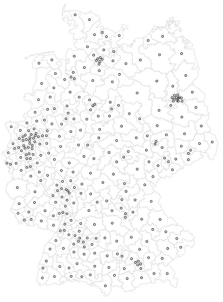
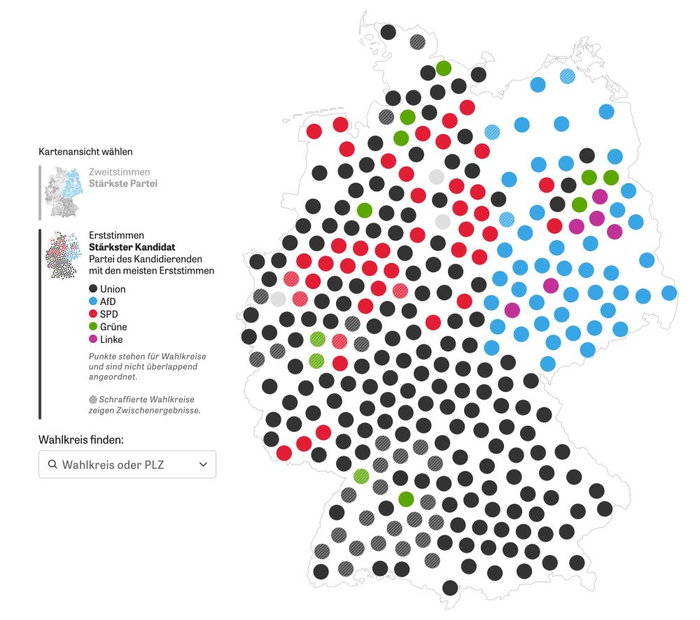
Oh, and the thread may sound a bit like we went straight for the solution, but of course there were a lot of uglier versions before that. One big leap forward was the decision to include the outer country shape, which is often missing in cartograms.


February 27, 2025 at 5:03 PM
Oh, and the thread may sound a bit like we went straight for the solution, but of course there were a lot of uglier versions before that. One big leap forward was the decision to include the outer country shape, which is often missing in cartograms.
Of course, no cartogram comes without distortion. The western states like North-Rhine-Westphalia are heavily populated and push the lesser populated districts to the East. But the final layout worked well during election night, I think.

February 27, 2025 at 4:48 PM
Of course, no cartogram comes without distortion. The western states like North-Rhine-Westphalia are heavily populated and push the lesser populated districts to the East. But the final layout worked well during election night, I think.
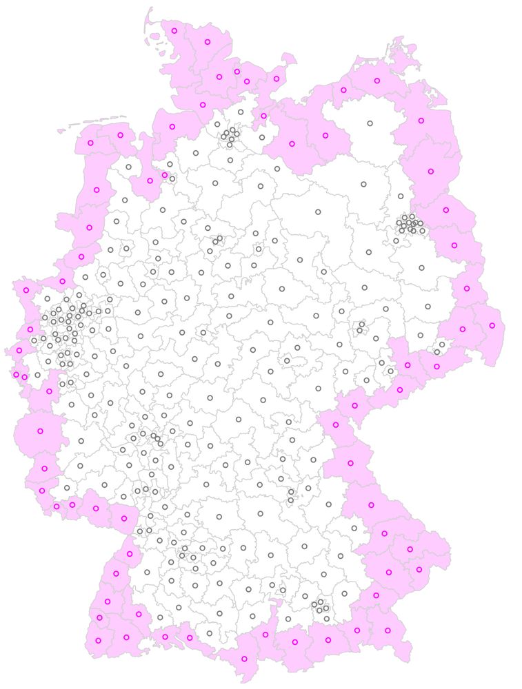
To compute the final layout we use a force simulation with 3 forces: one of them keeps neighboring districts together while another pushes districts away from each other if they are too close. Coloring the nodes helped to identify problems during the process.
February 27, 2025 at 4:48 PM
To compute the final layout we use a force simulation with 3 forces: one of them keeps neighboring districts together while another pushes districts away from each other if they are too close. Coloring the nodes helped to identify problems during the process.
Some of these fixed districts turned out to be too close to each other, so we defined a few exceptions for border districts we want to be free, and also a few custom positions that prevent the nodes to "leave" the country.

February 27, 2025 at 4:48 PM
Some of these fixed districts turned out to be too close to each other, so we defined a few exceptions for border districts we want to be free, and also a few custom positions that prevent the nodes to "leave" the country.
Before running the network layout simulation on this, we marked all the outer districts as fixed. This allows the final layout to stay "in shape" of the country as a whole, which is important for readers to recognize their country.
We used the TopoJSON arcs to automatically find these districts.
We used the TopoJSON arcs to automatically find these districts.
February 27, 2025 at 4:48 PM
Before running the network layout simulation on this, we marked all the outer districts as fixed. This allows the final layout to stay "in shape" of the country as a whole, which is important for readers to recognize their country.
We used the TopoJSON arcs to automatically find these districts.
We used the TopoJSON arcs to automatically find these districts.
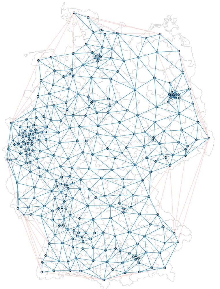
Due to Germany's convex outer shape we removed edges longer than a certain threshold and ended up with this final "network" of nodes and links.
February 27, 2025 at 4:48 PM
Due to Germany's convex outer shape we removed edges longer than a certain threshold and ended up with this final "network" of nodes and links.
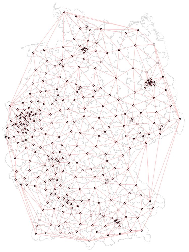
Then we used a Delaunay tessellation of the district centroids. This later helps the districts to stay close to their geographical neighbors.
February 27, 2025 at 4:48 PM
Then we used a Delaunay tessellation of the district centroids. This later helps the districts to stay close to their geographical neighbors.
As input for the cartogram we use a pre-projected TopoJSON basemap of election districts with baked-in centroids (inner points). We used Mapshaper to generate the file.
February 27, 2025 at 4:48 PM
As input for the cartogram we use a pre-projected TopoJSON basemap of election districts with baked-in centroids (inner points). We used Mapshaper to generate the file.
For the German election we wanted to use a cartogram of German election districts but didn't find anything good, so we created our own. Here's a little nerd thread how the final algorithm worked 🤓 🧵 #gis #cartogram #election #datavis #cartography
February 27, 2025 at 4:48 PM
For the German election we wanted to use a cartogram of German election districts but didn't find anything good, so we created our own. Here's a little nerd thread how the final algorithm worked 🤓 🧵 #gis #cartogram #election #datavis #cartography
POV: it’s 2025 and I’m still solving my problems with setTimeout()

February 12, 2025 at 6:20 PM
POV: it’s 2025 and I’m still solving my problems with setTimeout()
The number of options for government coalitions in the upcoming German election heavily depends on how many smaller parties reach the five-percent threshold. We analyzed 50.000 elections to visualize this effect using animated kernel density plots 🤓 (text in 🇩🇪)
www.zeit.de/politik/deut...
www.zeit.de/politik/deut...
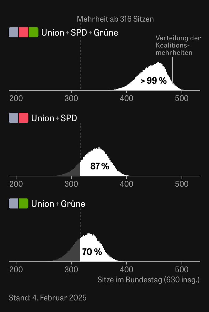
February 4, 2025 at 5:27 PM
The number of options for government coalitions in the upcoming German election heavily depends on how many smaller parties reach the five-percent threshold. We analyzed 50.000 elections to visualize this effect using animated kernel density plots 🤓 (text in 🇩🇪)
www.zeit.de/politik/deut...
www.zeit.de/politik/deut...
Nice animation! I also like to show the Kneeling Curve split into decades as it makes it easier to see the acceleration of the carbon dioxide concentration.

January 2, 2025 at 11:42 PM
Nice animation! I also like to show the Kneeling Curve split into decades as it makes it easier to see the acceleration of the carbon dioxide concentration.
One hundred! This is the first time I see someone outlive his obituary writer by seven years… #jimmycarter www.nytimes.com/2024/12/29/u...


December 30, 2024 at 9:55 AM
One hundred! This is the first time I see someone outlive his obituary writer by seven years… #jimmycarter www.nytimes.com/2024/12/29/u...
Und ja, die Grünen haben 2021 bei der Wahl weniger eingefahren als die Umfragen angedeutet haben, und die Union etwas mehr.

December 5, 2024 at 5:15 PM
Und ja, die Grünen haben 2021 bei der Wahl weniger eingefahren als die Umfragen angedeutet haben, und die Union etwas mehr.
Das sind die Daten, die der SPIEGEL heranzieht. Sieht schon ein bisschen anders aus, oder?

December 1, 2024 at 5:10 PM
Das sind die Daten, die der SPIEGEL heranzieht. Sieht schon ein bisschen anders aus, oder?
To clarify, we're not "correcting" any polls. The polls we list on the page are exactly what the pollsters publish. We're just using the quality metrics to weight the polling average, shown as the line & numbers in the chart at the top.

November 30, 2024 at 1:22 PM
To clarify, we're not "correcting" any polls. The polls we list on the page are exactly what the pollsters publish. We're just using the quality metrics to weight the polling average, shown as the line & numbers in the chart at the top.