


doublearrow.co.uk
@doublearrow64.bsky.social
British Rail Corporate Identity 1965-1994
This ill-conceived sign is one of the worst in the world
Capitals are aggressive, harder to read and just HORRIBLE to look at, a mixture of upper and lower case is also undesirable
Split the legend before ‘THE’ and there would be a massive saving on materials too
Capitals are aggressive, harder to read and just HORRIBLE to look at, a mixture of upper and lower case is also undesirable
Split the legend before ‘THE’ and there would be a massive saving on materials too

November 27, 2025 at 10:41 AM
This ill-conceived sign is one of the worst in the world
Capitals are aggressive, harder to read and just HORRIBLE to look at, a mixture of upper and lower case is also undesirable
Split the legend before ‘THE’ and there would be a massive saving on materials too
Capitals are aggressive, harder to read and just HORRIBLE to look at, a mixture of upper and lower case is also undesirable
Split the legend before ‘THE’ and there would be a massive saving on materials too
Hyphenated at this stage at least…

November 20, 2025 at 10:23 PM
Hyphenated at this stage at least…
Shot from ‘the 1980s‘ according to History of Sussex (Grahame Hawthorn) on Facebook
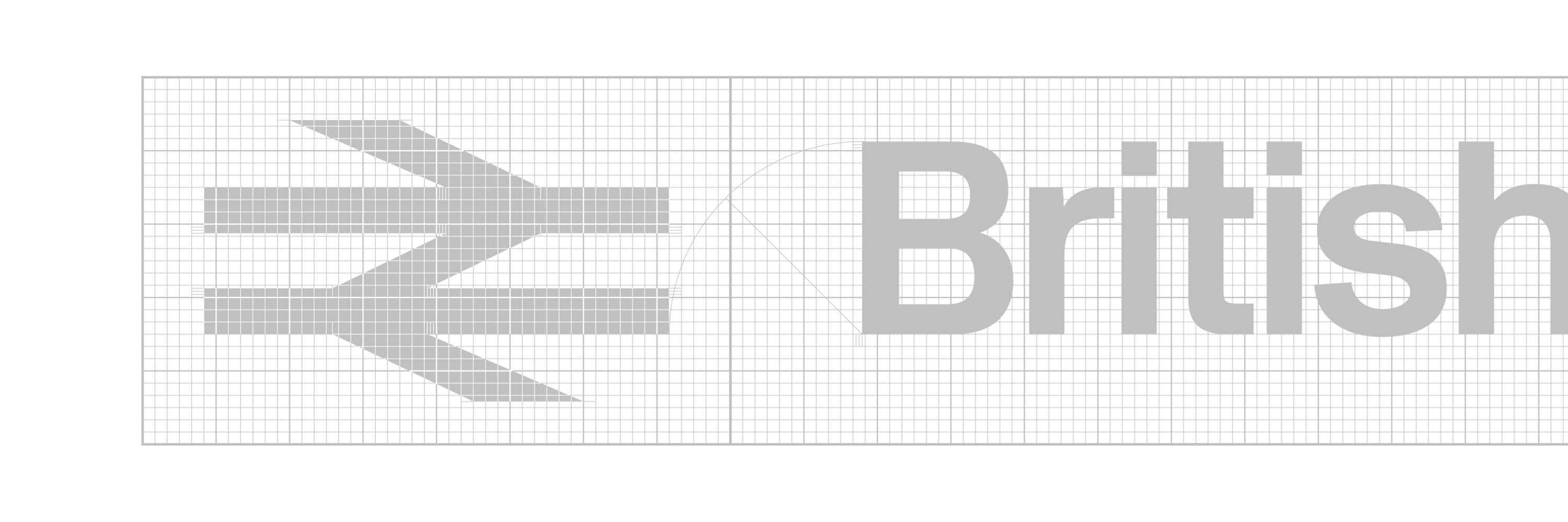
Note the original symbol was negative (the current version is positive but negative metrics whack makes it look a bit light)
Note the original symbol was negative (the current version is positive but negative metrics whack makes it look a bit light)

November 18, 2025 at 7:15 PM
Shot from ‘the 1980s‘ according to History of Sussex (Grahame Hawthorn) on Facebook
Note the original symbol was negative (the current version is positive but negative metrics whack makes it look a bit light)
Note the original symbol was negative (the current version is positive but negative metrics whack makes it look a bit light)
Only just clocked the number (73133) which makes it E6040
www.bluebell-railway.co.uk/bluebell/loc...
www.bluebell-railway.co.uk/bluebell/loc...

November 16, 2025 at 3:52 PM
Only just clocked the number (73133) which makes it E6040
www.bluebell-railway.co.uk/bluebell/loc...
www.bluebell-railway.co.uk/bluebell/loc...
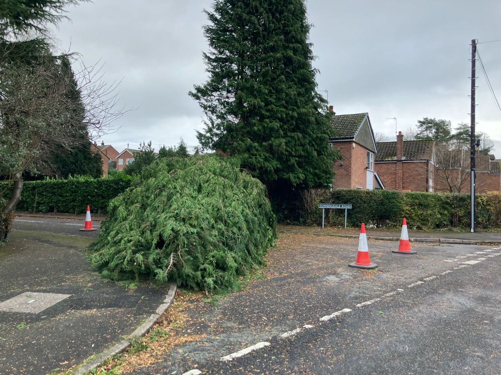
This is my world this morning…
November 15, 2025 at 12:24 PM
This is my world this morning…
Some notes on the design of the Inter-City 125 logotype (and the rationale for the dodgy chubby symbol version)

November 11, 2025 at 9:59 PM
Some notes on the design of the Inter-City 125 logotype (and the rationale for the dodgy chubby symbol version)
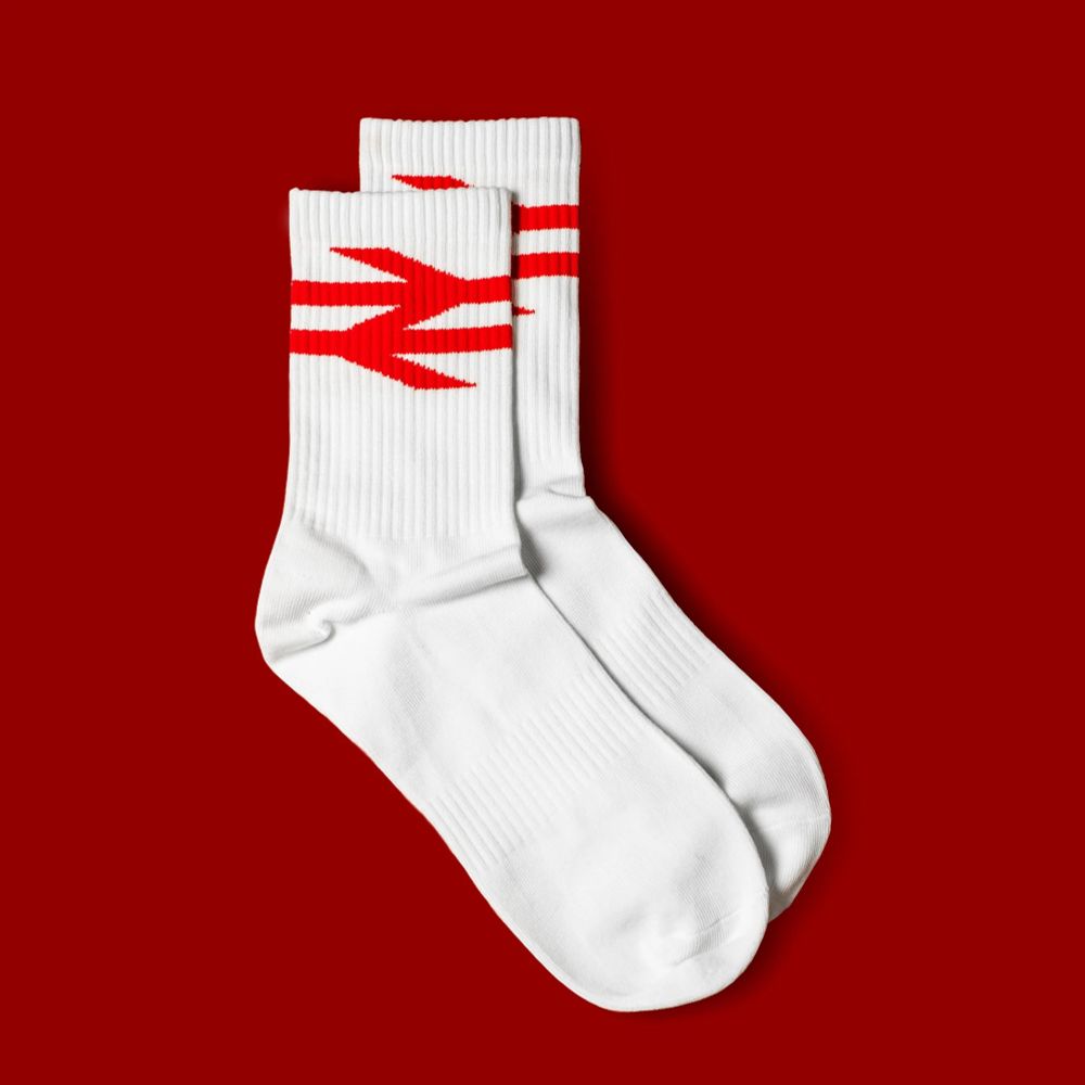
Rail symbol socks available from the Design Museum Shop…
designmuseumshop.com/collections/...
designmuseumshop.com/collections/...

November 7, 2025 at 7:57 PM
Rail symbol socks available from the Design Museum Shop…
designmuseumshop.com/collections/...
designmuseumshop.com/collections/...
Banner unfurled at Ibrox (Rangers) on Thursday night…
www.bbc.co.uk/sport/footba...
www.bbc.co.uk/sport/footba...

November 7, 2025 at 7:26 PM
Banner unfurled at Ibrox (Rangers) on Thursday night…
www.bbc.co.uk/sport/footba...
www.bbc.co.uk/sport/footba...

November 6, 2025 at 8:12 PM
Some of the biggest symbols from the British Rail era were those attached to the funnels of the shipping fleet
(Currently on eBay www.ebay.co.uk/itm/28691109...)
(Currently on eBay www.ebay.co.uk/itm/28691109...)

November 6, 2025 at 8:03 PM
Some of the biggest symbols from the British Rail era were those attached to the funnels of the shipping fleet
(Currently on eBay www.ebay.co.uk/itm/28691109...)
(Currently on eBay www.ebay.co.uk/itm/28691109...)
There always used to be a relationship between the parallel tracks of the symbol and the lowercase x-height; this is nonsense (just like making the whole symbol the same as cap-height, which makes the symbol too small)
Suppose it’s Rail Alphabet 2 so could be worse :)
Suppose it’s Rail Alphabet 2 so could be worse :)


November 5, 2025 at 11:10 AM
There always used to be a relationship between the parallel tracks of the symbol and the lowercase x-height; this is nonsense (just like making the whole symbol the same as cap-height, which makes the symbol too small)
Suppose it’s Rail Alphabet 2 so could be worse :)
Suppose it’s Rail Alphabet 2 so could be worse :)
It’s because this sign follows the totem design (which is the only one which has the arrows on the left) where it makes sense to have the arrows aligned for the sake of neatness, this one on the pillar at Euston just doesn’t have as much info so the messInes problem doesn’t really exist!

November 4, 2025 at 10:12 AM
It’s because this sign follows the totem design (which is the only one which has the arrows on the left) where it makes sense to have the arrows aligned for the sake of neatness, this one on the pillar at Euston just doesn’t have as much info so the messInes problem doesn’t really exist!
They sometimes do…
(Photograph: Paul Johnson)
(Photograph: Paul Johnson)

October 25, 2025 at 9:35 PM
They sometimes do…
(Photograph: Paul Johnson)
(Photograph: Paul Johnson)
This sign uses principles from the original Wayfinding Design Manual; cap-height vertical alignment gives an u&lc legend that sinking feeling plus the symbol is rather small relative to the name (the cap-height actually sits below halfway on this particular sign!)
(Photograph: Jason Carthy-Torbitt)
(Photograph: Jason Carthy-Torbitt)

October 25, 2025 at 6:18 PM
This sign uses principles from the original Wayfinding Design Manual; cap-height vertical alignment gives an u&lc legend that sinking feeling plus the symbol is rather small relative to the name (the cap-height actually sits below halfway on this particular sign!)
(Photograph: Jason Carthy-Torbitt)
(Photograph: Jason Carthy-Torbitt)
In the true spirit of Fibonacci, the numerals (that is, the cap-height) to sign height ratio is 5:8…

October 17, 2025 at 7:56 PM
In the true spirit of Fibonacci, the numerals (that is, the cap-height) to sign height ratio is 5:8…
Also there were cupcakes and merch (which can also be obtained from the Design Museum)


October 16, 2025 at 1:05 PM
Also there were cupcakes and merch (which can also be obtained from the Design Museum)
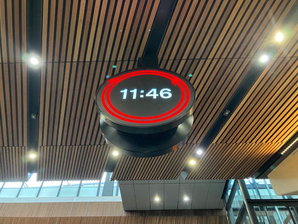
On my way back north after attending the unveiling of the new rail clock at London Bridge; the timepiece is all at once disarmingly simple and delightfully ingenious…
October 16, 2025 at 12:44 PM
On my way back north after attending the unveiling of the new rail clock at London Bridge; the timepiece is all at once disarmingly simple and delightfully ingenious…
Love this pillar (totem) signage treatment at London Euston, very clean and clear

October 16, 2025 at 9:14 AM
Love this pillar (totem) signage treatment at London Euston, very clean and clear
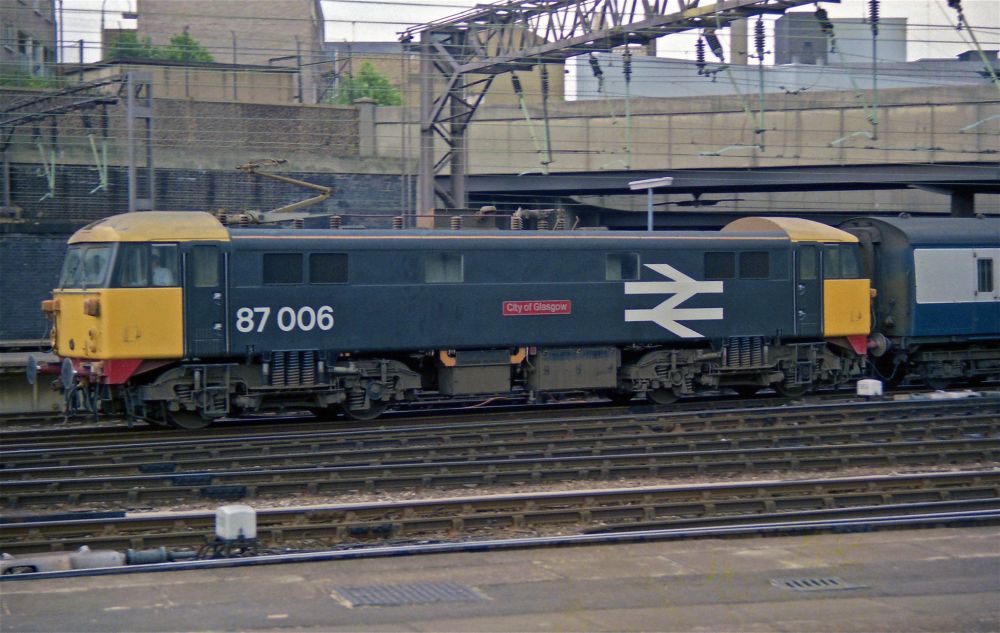
One of five Stratford-painted 87s, I think (012/020/021/030/032) and it should have had a white symbol on the dark grey band (opposite the nameplate)
87021 had an unusually small symbol which might suggest the Stratford had run out of the proper ones
flic.kr/p/FZyFT1 (Alan Tait)
87021 had an unusually small symbol which might suggest the Stratford had run out of the proper ones
flic.kr/p/FZyFT1 (Alan Tait)

October 14, 2025 at 10:41 PM
One of five Stratford-painted 87s, I think (012/020/021/030/032) and it should have had a white symbol on the dark grey band (opposite the nameplate)
87021 had an unusually small symbol which might suggest the Stratford had run out of the proper ones
flic.kr/p/FZyFT1 (Alan Tait)
87021 had an unusually small symbol which might suggest the Stratford had run out of the proper ones
flic.kr/p/FZyFT1 (Alan Tait)
I guess the two windows must have improved visibility, not much difference otherwise to my mind (apart from cables etc)
Not much wrong with this though…
flic.kr/p/cusWK5 (Ian Docwra)
Not much wrong with this though…
flic.kr/p/cusWK5 (Ian Docwra)
October 14, 2025 at 7:21 PM
I guess the two windows must have improved visibility, not much difference otherwise to my mind (apart from cables etc)
Not much wrong with this though…
flic.kr/p/cusWK5 (Ian Docwra)
Not much wrong with this though…
flic.kr/p/cusWK5 (Ian Docwra)
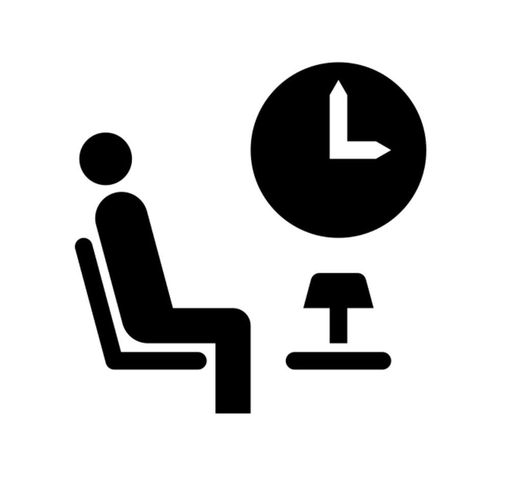
You also get a lamp in the first class lounge; whilst I was responsible for finessing these pictograms for version 3 of the Wayfinding Design Guidelines, I wasn’t responsible for the design idiom itself (their ‘look and feel’)
October 14, 2025 at 5:32 PM
You also get a lamp in the first class lounge; whilst I was responsible for finessing these pictograms for version 3 of the Wayfinding Design Guidelines, I wasn’t responsible for the design idiom itself (their ‘look and feel’)
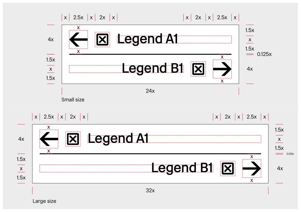
Lastly on the Doncaster signs: This sign’s dividing line is so thin it may as well not be there and probably won’t be there for users with even slightly impaired vision; it’s meant to be 0.125x (one eighth of the legend x-height), not really sure how these things are so easily missed/ignored…

October 14, 2025 at 5:25 PM
Lastly on the Doncaster signs: This sign’s dividing line is so thin it may as well not be there and probably won’t be there for users with even slightly impaired vision; it’s meant to be 0.125x (one eighth of the legend x-height), not really sure how these things are so easily missed/ignored…
And I know blue is a ‘Leeds colour’ but it represents a serious colour clash with LNER oxblood; red (LNER or BR Flame Red) plates would look so much better
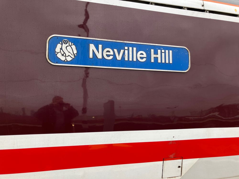
October 14, 2025 at 8:57 AM
And I know blue is a ‘Leeds colour’ but it represents a serious colour clash with LNER oxblood; red (LNER or BR Flame Red) plates would look so much better
I can just about forgive the BR Flame Red buffer beams on both No.1 and No.2 ends (but not the ridiculous white buffer lining which always makes the buffers look wonky); compare BR Flame Red (much more orange) with LNER Red btw…


October 14, 2025 at 8:57 AM
I can just about forgive the BR Flame Red buffer beams on both No.1 and No.2 ends (but not the ridiculous white buffer lining which always makes the buffers look wonky); compare BR Flame Red (much more orange) with LNER Red btw…
Look what just pulled in; the Class 91 is surely still one of the best looking bits of kit on our railways :)

October 14, 2025 at 8:57 AM
Look what just pulled in; the Class 91 is surely still one of the best looking bits of kit on our railways :)