


Deniz Cem Önduygu
@dencemond.bsky.social
(info, data, graphic) design, (evo, mol) biology, (history of) philosophy (bio, mind, ethics, art), memetics, evo algorithms, cog/neuro sci. https://www.denizcemonduygu.com
Thanks, will check it out.
December 20, 2025 at 5:16 PM
Thanks, will check it out.

Here’s another nice video about the project:
www.youtube.com/watch?v=h5G6...
www.youtube.com/watch?v=h5G6...

All 325+ Competing Consciousness Theories In One Video.
YouTube video by Essentia Foundation
www.youtube.com
December 17, 2025 at 3:50 PM
Here’s another nice video about the project:
www.youtube.com/watch?v=h5G6...
www.youtube.com/watch?v=h5G6...
As a long-time enjoyer, I’m delighted to work with Dr Kuhn & his team. I’m in awe of his vision, his diligence, his kindness & energizing attitude, and his ability to reciprocate my long emails with even longer ones. One of the best collaboration experiences I’ve had.
December 17, 2025 at 3:50 PM
As a long-time enjoyer, I’m delighted to work with Dr Kuhn & his team. I’m in awe of his vision, his diligence, his kindness & energizing attitude, and his ability to reciprocate my long emails with even longer ones. One of the best collaboration experiences I’ve had.
Another scatter plot comparing the rankings of theories of consciousness in Google search hits vs Google Scholar search hits, as a rough indicator of discrepancies between public and scholarly/scientific interest.

December 17, 2025 at 3:50 PM
Another scatter plot comparing the rankings of theories of consciousness in Google search hits vs Google Scholar search hits, as a rough indicator of discrepancies between public and scholarly/scientific interest.
A similar connected scatter plot that focuses on theories in the Materialism category, showing their subcategory, order of magnitude, degree brain matters, scholarly/scientific interest, complexity, and connections among them.

December 17, 2025 at 3:50 PM
A similar connected scatter plot that focuses on theories in the Materialism category, showing their subcategory, order of magnitude, degree brain matters, scholarly/scientific interest, complexity, and connections among them.
In this connected scatter version, x-axis positions represent order of magnitude (e.g., quantum level, cellular level, neuronal level, neural networks, whole brain, whole body, extended mind, universe); y-axis positions represent level on a materialism-idealism scale.


December 17, 2025 at 3:50 PM
In this connected scatter version, x-axis positions represent order of magnitude (e.g., quantum level, cellular level, neuronal level, neural networks, whole brain, whole body, extended mind, universe); y-axis positions represent level on a materialism-idealism scale.
A force-directed graph with alignment connections. Colors represent the categories to which the consciousness theories belong. Sizes of the shapes represent scholarly interest, the number of Google Scholar hits. Number of edges of a shape represents the theory’s complexity.


December 17, 2025 at 3:50 PM
A force-directed graph with alignment connections. Colors represent the categories to which the consciousness theories belong. Sizes of the shapes represent scholarly interest, the number of Google Scholar hits. Number of edges of a shape represents the theory’s complexity.
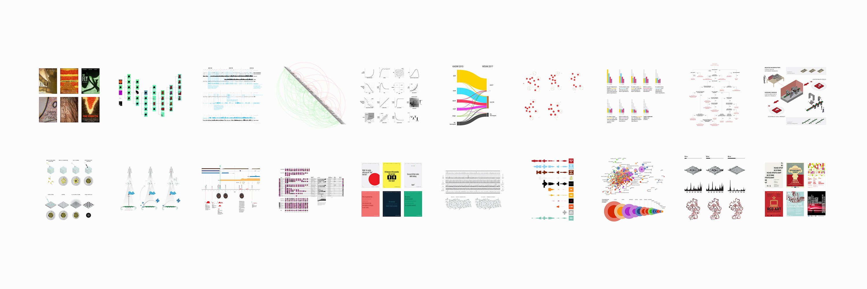
After my proposal in Dec’24, we came up with theory features like order of magnitude, materialism-idealism scale, complexity etc. Eser Aygün and Amaç Herdağdelen used Gemini to get theory scores & similarity degrees. I designed and implemented the visualizations using @kumu.io. ↓
December 17, 2025 at 3:50 PM
After my proposal in Dec’24, we came up with theory features like order of magnitude, materialism-idealism scale, complexity etc. Eser Aygün and Amaç Herdağdelen used Gemini to get theory scores & similarity degrees. I designed and implemented the visualizations using @kumu.io. ↓
I thank Eren Pultar and Konda Research for helping me with the data collection. If you want to use these visualizations, you can cite this post (in Turkish): Önduygu, D.C. (2025). “İl Nüfusları 1927–2023”. www.denizcemonduygu.com/2025/05/il-n...
İl Nüfusları 1927–2023 - Deniz Cem Önduygu
Konda ile hazırladığımız Türkiye 101 projesinin ana temalarından biri kentleşme idi. Ben de bu bağlamda küçük boylarda...
www.denizcemonduygu.com
June 4, 2025 at 1:22 PM
I thank Eren Pultar and Konda Research for helping me with the data collection. If you want to use these visualizations, you can cite this post (in Turkish): Önduygu, D.C. (2025). “İl Nüfusları 1927–2023”. www.denizcemonduygu.com/2025/05/il-n...
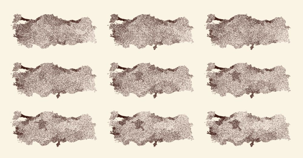
Insight: While working on this, I realized that when we use dots instead of color to represent population on a political map, we’re *visualizing* both the population and the density (population / land area). (It could work better with smaller unit areas than provinces.)
June 4, 2025 at 1:22 PM
Insight: While working on this, I realized that when we use dots instead of color to represent population on a political map, we’re *visualizing* both the population and the density (population / land area). (It could work better with smaller unit areas than provinces.)
And this is a static version that shows the absolute and proportional values for provinces in parallel.

June 4, 2025 at 1:22 PM
And this is a static version that shows the absolute and proportional values for provinces in parallel.
This version uses the absolute numbers to show the total population growth since 1927; each dot represents 3000 people.
June 4, 2025 at 1:22 PM
This version uses the absolute numbers to show the total population growth since 1927; each dot represents 3000 people.