


Cinzia Bongino
@cinzia.bsky.social
Graphic, Information and Web design / One important difference between art and journalism is that art doesn’t get fact-checked.
www.cinziabongino.com
www.cinziabongino.com
Web design and identity for voicesofclimateadaptation.dataclime.com/.
The site showcases the outcomes of Adaptation AGORA, a HORIZON Europe initiative aligned with the EU Mission on Adaptation to Climate Change.
#satellite #website #identity #webdesign #gradients #climate #climatechange
The site showcases the outcomes of Adaptation AGORA, a HORIZON Europe initiative aligned with the EU Mission on Adaptation to Climate Change.
#satellite #website #identity #webdesign #gradients #climate #climatechange


November 7, 2025 at 3:48 PM
Web design and identity for voicesofclimateadaptation.dataclime.com/.
The site showcases the outcomes of Adaptation AGORA, a HORIZON Europe initiative aligned with the EU Mission on Adaptation to Climate Change.
#satellite #website #identity #webdesign #gradients #climate #climatechange
The site showcases the outcomes of Adaptation AGORA, a HORIZON Europe initiative aligned with the EU Mission on Adaptation to Climate Change.
#satellite #website #identity #webdesign #gradients #climate #climatechange
If you’d like to know more head over to my Behance page or my website. www.behance.net/gallery/2286...
#climatechange #italy #climatescenario #uxuidesign #dataviz #datavisualization #map #climatedata #forecast #copernicus
#climatechange #italy #climatescenario #uxuidesign #dataviz #datavisualization #map #climatedata #forecast #copernicus

June 30, 2025 at 9:56 AM
If you’d like to know more head over to my Behance page or my website. www.behance.net/gallery/2286...
#climatechange #italy #climatescenario #uxuidesign #dataviz #datavisualization #map #climatedata #forecast #copernicus
#climatechange #italy #climatescenario #uxuidesign #dataviz #datavisualization #map #climatedata #forecast #copernicus
The user interface design maintains key elements of CMCC branding, prioritising simplicity and functionality. Following these improvements, Dataclime now offers new services and features.


June 30, 2025 at 9:53 AM
The user interface design maintains key elements of CMCC branding, prioritising simplicity and functionality. Following these improvements, Dataclime now offers new services and features.
In 2024, I redesigned the platform beginning with a thorough audit analysis and data collection process. I then enhanced the map visualizations by introducing a suite of responsive color bars with up to 28 steps, respecting accessibility guidelines and optimising the overall user experience.


June 30, 2025 at 9:53 AM
In 2024, I redesigned the platform beginning with a thorough audit analysis and data collection process. I then enhanced the map visualizations by introducing a suite of responsive color bars with up to 28 steps, respecting accessibility guidelines and optimising the overall user experience.
Developed by the Regional Models and Geo-Hydrological Impacts Division (REMHI) of the Institute for Climate Resilience (ICR) at the CMCC Foundation - Centro Euro Mediterraneo sui Cambiamenti Climatici, Dataclime has been operational since 2018.


June 30, 2025 at 9:52 AM
Developed by the Regional Models and Geo-Hydrological Impacts Division (REMHI) of the Institute for Climate Resilience (ICR) at the CMCC Foundation - Centro Euro Mediterraneo sui Cambiamenti Climatici, Dataclime has been operational since 2018.
Dataclime is an advanced climate forecast data platform that translates complex weather predictions into actionable insights. The platform provides comprehensive climate risk analysis, hazard assessments, and adaptation strategy recommendations. (Short thread 🧵) 📊

June 30, 2025 at 9:51 AM
Dataclime is an advanced climate forecast data platform that translates complex weather predictions into actionable insights. The platform provides comprehensive climate risk analysis, hazard assessments, and adaptation strategy recommendations. (Short thread 🧵) 📊
Brand refresh and web design for the UK All-Party Parliamentary Group for the Environment. Crafted with Studio Cronica, developed by Upclose Studio.
environmentappg.co.uk
#webdesign #uxuidesign #nature #uk #appg #brand
environmentappg.co.uk
#webdesign #uxuidesign #nature #uk #appg #brand


May 30, 2025 at 1:17 PM
Brand refresh and web design for the UK All-Party Parliamentary Group for the Environment. Crafted with Studio Cronica, developed by Upclose Studio.
environmentappg.co.uk
#webdesign #uxuidesign #nature #uk #appg #brand
environmentappg.co.uk
#webdesign #uxuidesign #nature #uk #appg #brand


April 23, 2025 at 2:51 PM
Illustrated in the form of a waste sorting facility, one conveyor belt is a visual representation of Europe’s waste production, while the other focuses on Romania’s waste infrastructure.

April 22, 2025 at 12:26 PM
Illustrated in the form of a waste sorting facility, one conveyor belt is a visual representation of Europe’s waste production, while the other focuses on Romania’s waste infrastructure.
"Waste Streams" has been shortlisted for the Information is Beautiful Awards 2024 in the Unusual category.
The video installation investigates the waste management system by analysing statistics, policies, and legislations within Romania and across Europe.
Thanks @datavizsociety.bsky.social!
The video installation investigates the waste management system by analysing statistics, policies, and legislations within Romania and across Europe.
Thanks @datavizsociety.bsky.social!

April 22, 2025 at 12:25 PM
"Waste Streams" has been shortlisted for the Information is Beautiful Awards 2024 in the Unusual category.
The video installation investigates the waste management system by analysing statistics, policies, and legislations within Romania and across Europe.
Thanks @datavizsociety.bsky.social!
The video installation investigates the waste management system by analysing statistics, policies, and legislations within Romania and across Europe.
Thanks @datavizsociety.bsky.social!
𐫱 Digital engravings 𐫱 / sketch


March 16, 2025 at 7:59 PM
𐫱 Digital engravings 𐫱 / sketch
Since October 2024, I joined the faculty of the Master of Arts in Visual Communication in IED Milano as professor of #UX/UI design. This week, my course is going to end. 🧵
February 3, 2025 at 7:11 PM
Since October 2024, I joined the faculty of the Master of Arts in Visual Communication in IED Milano as professor of #UX/UI design. This week, my course is going to end. 🧵
Illustrations update for Userclouds (which I originally designed in 2021), based on the new brand color palette.
Userclouds is a privacy-aware data infrastructure application helping large-scale businesses to protect customers and company #data.
#product #illustration #design #diagram #interface
Userclouds is a privacy-aware data infrastructure application helping large-scale businesses to protect customers and company #data.
#product #illustration #design #diagram #interface


July 5, 2024 at 3:05 PM
Illustrations update for Userclouds (which I originally designed in 2021), based on the new brand color palette.
Userclouds is a privacy-aware data infrastructure application helping large-scale businesses to protect customers and company #data.
#product #illustration #design #diagram #interface
Userclouds is a privacy-aware data infrastructure application helping large-scale businesses to protect customers and company #data.
#product #illustration #design #diagram #interface
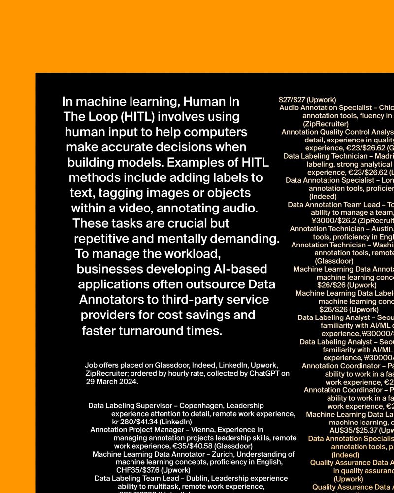
The poster is a list of data annotation job offers collected by #ChatGPT, ordered by hourly rate. Tasked with identical prompts, #Gemini and #MicrosoftCoPilot presented fictional or vague results. The design adopts a slanted layout to evoke a subtle feeling of discomfort.

April 5, 2024 at 12:26 PM
The poster is a list of data annotation job offers collected by #ChatGPT, ordered by hourly rate. Tasked with identical prompts, #Gemini and #MicrosoftCoPilot presented fictional or vague results. The design adopts a slanted layout to evoke a subtle feeling of discomfort.
These tasks are crucial but repetitive and mentally demanding. To manage the workload, businesses developing AI-based applications often outsource #DataAnnotators to third-party service providers for cost savings and faster turnaround times.

April 5, 2024 at 12:25 PM
These tasks are crucial but repetitive and mentally demanding. To manage the workload, businesses developing AI-based applications often outsource #DataAnnotators to third-party service providers for cost savings and faster turnaround times.
In #machinelearning, Human In The Loop (HITL) involves using human input to help computers make accurate decisions when building models. Examples of #HITL methods include adding labels to text, tagging images or objects within a video, annotating audio. 🧵
April 5, 2024 at 12:25 PM
In #machinelearning, Human In The Loop (HITL) involves using human input to help computers make accurate decisions when building models. Examples of #HITL methods include adding labels to text, tagging images or objects within a video, annotating audio. 🧵
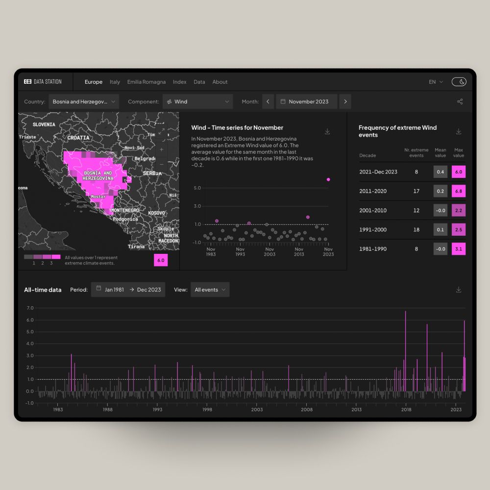
The interface allows users to seamlessly integrate time, geographical location, and index components on every page.


February 12, 2024 at 11:49 AM
The interface allows users to seamlessly integrate time, geographical location, and index components on every page.
An interactive dashboard presents the latest data of each administrative unit through different visual models: a map, a plot chart, a table and a bar chart. The varying shades of color and the size/position of each data point convey the intensity of weather events. 📊

February 12, 2024 at 11:47 AM
An interactive dashboard presents the latest data of each administrative unit through different visual models: a map, a plot chart, a table and a bar chart. The varying shades of color and the size/position of each data point convey the intensity of weather events. 📊
The platform presents up-to-date weather information organized into three administrative units: country (including all European nations), region (for the twenty Italian regions), and province (only available for the Emilia Romagna region).

February 12, 2024 at 11:42 AM
The platform presents up-to-date weather information organized into three administrative units: country (including all European nations), region (for the twenty Italian regions), and province (only available for the Emilia Romagna region).
The European Climate Index provides insights into weather events experienced across European countries. It combines seven components: Extreme Max and Min Temperature, Drought, Extreme Precipitation, Hail, Fire, and Extreme Wind, with data from January 1981 until today.
datastation.climateindex.eu
datastation.climateindex.eu

February 12, 2024 at 11:41 AM
The European Climate Index provides insights into weather events experienced across European countries. It combines seven components: Extreme Max and Min Temperature, Drought, Extreme Precipitation, Hail, Fire, and Extreme Wind, with data from January 1981 until today.
datastation.climateindex.eu
datastation.climateindex.eu
European Extreme Events Climate Index. datastation.climateindex.eu
A new tool to understand the impact of climate change across European countries.
A new tool to understand the impact of climate change across European countries.


January 29, 2024 at 9:54 AM
European Extreme Events Climate Index. datastation.climateindex.eu
A new tool to understand the impact of climate change across European countries.
A new tool to understand the impact of climate change across European countries.
torinodesign.info is part of the exhibition "ITALY: A New Collective Landscape", which debuted last year at ADI Design Museum and now open at HKDI Gallery, Hong Kong.


January 23, 2024 at 7:40 PM
torinodesign.info is part of the exhibition "ITALY: A New Collective Landscape", which debuted last year at ADI Design Museum and now open at HKDI Gallery, Hong Kong.
The glacier area was calculated in QGIS, with the shapefile data from years 1850, 1931, 1973, 2010, and 2016. Chart powered by RAWGraph, layout in Figma.

December 13, 2023 at 10:45 AM
The glacier area was calculated in QGIS, with the shapefile data from years 1850, 1931, 1973, 2010, and 2016. Chart powered by RAWGraph, layout in Figma.
ESA - Little Pictures competition: runner-up.
This Picture illustrates the reduction of a few glaciers in south-west Switzerland. The Area Chart is designed to resemble a mountain skyline, with the height shifting based on extension of the glacier over time.
🏔️ admin.climate.esa.int/en/little-pi...
This Picture illustrates the reduction of a few glaciers in south-west Switzerland. The Area Chart is designed to resemble a mountain skyline, with the height shifting based on extension of the glacier over time.
🏔️ admin.climate.esa.int/en/little-pi...

December 13, 2023 at 10:44 AM
ESA - Little Pictures competition: runner-up.
This Picture illustrates the reduction of a few glaciers in south-west Switzerland. The Area Chart is designed to resemble a mountain skyline, with the height shifting based on extension of the glacier over time.
🏔️ admin.climate.esa.int/en/little-pi...
This Picture illustrates the reduction of a few glaciers in south-west Switzerland. The Area Chart is designed to resemble a mountain skyline, with the height shifting based on extension of the glacier over time.
🏔️ admin.climate.esa.int/en/little-pi...