


athe52
@athe52.bsky.social
graphic designer & artist. aroace 🏳🌈. expect random posts every now and then

so fun fact: I once made a furry OC. mentioned it during one of the auxline game nights during fibbage eay, centesis wanted a picture of it, so here you go:

December 7, 2025 at 2:16 PM
so fun fact: I once made a furry OC. mentioned it during one of the auxline game nights during fibbage eay, centesis wanted a picture of it, so here you go:
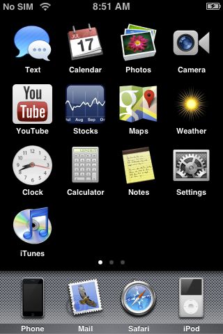
iPhone OS 1.0...? (2007)
Little experiment I did to see what iOS would've looked like if they never used squircle shaped icons, kinda like what Android did. Also semi-inspired by macOS' shift from various shaped icons to just squircles in Big Sur/Tahoe as well, just in reverse.
Little experiment I did to see what iOS would've looked like if they never used squircle shaped icons, kinda like what Android did. Also semi-inspired by macOS' shift from various shaped icons to just squircles in Big Sur/Tahoe as well, just in reverse.
December 7, 2025 at 12:55 AM
iPhone OS 1.0...? (2007)
Little experiment I did to see what iOS would've looked like if they never used squircle shaped icons, kinda like what Android did. Also semi-inspired by macOS' shift from various shaped icons to just squircles in Big Sur/Tahoe as well, just in reverse.
Little experiment I did to see what iOS would've looked like if they never used squircle shaped icons, kinda like what Android did. Also semi-inspired by macOS' shift from various shaped icons to just squircles in Big Sur/Tahoe as well, just in reverse.
Windows Iodine (2010)
Looked up a bunch of old official Microsoft concepts and tried to make a mockup based on them - some medical concept around the Metro era in this case. The boot screen turned out alright but the desktop (not posted) didn't turn out so well IMO.
Looked up a bunch of old official Microsoft concepts and tried to make a mockup based on them - some medical concept around the Metro era in this case. The boot screen turned out alright but the desktop (not posted) didn't turn out so well IMO.

December 6, 2025 at 6:13 AM
Windows Iodine (2010)
Looked up a bunch of old official Microsoft concepts and tried to make a mockup based on them - some medical concept around the Metro era in this case. The boot screen turned out alright but the desktop (not posted) didn't turn out so well IMO.
Looked up a bunch of old official Microsoft concepts and tried to make a mockup based on them - some medical concept around the Metro era in this case. The boot screen turned out alright but the desktop (not posted) didn't turn out so well IMO.
Windows Classic (2010)
Essentially Windows 7 SP1 with a bunch of features and apps from 1.0-Whistler ported over, with various themes and a built-in "Windows Museum" app as well, detailing various tidbits/screenshots/etc. from Windows history.
Essentially Windows 7 SP1 with a bunch of features and apps from 1.0-Whistler ported over, with various themes and a built-in "Windows Museum" app as well, detailing various tidbits/screenshots/etc. from Windows history.

December 5, 2025 at 12:23 AM
Windows Classic (2010)
Essentially Windows 7 SP1 with a bunch of features and apps from 1.0-Whistler ported over, with various themes and a built-in "Windows Museum" app as well, detailing various tidbits/screenshots/etc. from Windows history.
Essentially Windows 7 SP1 with a bunch of features and apps from 1.0-Whistler ported over, with various themes and a built-in "Windows Museum" app as well, detailing various tidbits/screenshots/etc. from Windows history.
Windows Artist Suite 2003

December 4, 2025 at 6:06 AM
Windows Artist Suite 2003
Windows Artist Suite (1998)

December 4, 2025 at 1:15 AM
Windows Artist Suite (1998)

OS/2 Warp 5 (2000) and OS/2 Warp 6 (2003)


December 2, 2025 at 9:45 PM
OS/2 Warp 5 (2000) and OS/2 Warp 6 (2003)
nintendo acknowledges bowser porn (2025, colourised)

November 12, 2025 at 2:21 PM
nintendo acknowledges bowser porn (2025, colourised)
if the News Channel and Forecast Channel for the Wii were also available on the 3DS:


November 12, 2025 at 7:22 AM
if the News Channel and Forecast Channel for the Wii were also available on the 3DS:
Flipnote Studio Showcase

November 8, 2025 at 9:49 AM
Flipnote Studio Showcase
does anyone else remember presentasia os

November 6, 2025 at 11:07 PM
does anyone else remember presentasia os

An old VHS tape containing an early PS1 startup sequence
November 1, 2025 at 9:36 AM
An old VHS tape containing an early PS1 startup sequence
an early ps2 BIOS, discovered on a prototype ps2 from mid 1998 (this is fake, nothing more than an art piece)

October 31, 2025 at 10:47 PM
an early ps2 BIOS, discovered on a prototype ps2 from mid 1998 (this is fake, nothing more than an art piece)
PlayStation 3 if it had the New Xbox Experience/NXE from the Xbox 360

October 24, 2025 at 11:10 PM
PlayStation 3 if it had the New Xbox Experience/NXE from the Xbox 360
Xbox 360 if it had the XrossMediaBar/XMB from the PS3

October 19, 2025 at 12:02 AM
Xbox 360 if it had the XrossMediaBar/XMB from the PS3
macOS Tahoe if it was Mac OS 9/in the Platinum theme

October 18, 2025 at 5:10 AM
macOS Tahoe if it was Mac OS 9/in the Platinum theme

Mac OS Leopard in the style of Windows Vista
(inspired by a currently-unreleased-on-bluesky work by
@mondyspartan.bsky.social )
(inspired by a currently-unreleased-on-bluesky work by
@mondyspartan.bsky.social )

October 17, 2025 at 3:06 PM
Mac OS Leopard in the style of Windows Vista
(inspired by a currently-unreleased-on-bluesky work by
@mondyspartan.bsky.social )
(inspired by a currently-unreleased-on-bluesky work by
@mondyspartan.bsky.social )
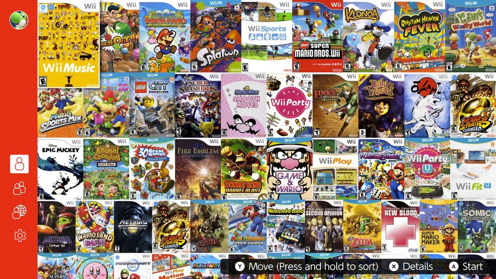
Wii and Wii U games on Nintendo Switch Online/NSO/Nintendo Classics


September 30, 2025 at 11:17 PM
Wii and Wii U games on Nintendo Switch Online/NSO/Nintendo Classics
Nintendo 3DS if it was on NSO/Nintendo Classics


September 30, 2025 at 3:47 AM
Nintendo 3DS if it was on NSO/Nintendo Classics
about project fossil:

September 15, 2025 at 5:13 AM
about project fossil:

