


Amit Sheen
@amitsheen.bsky.social
Experienced web developer, specializing in design systems, animation, and creative coding. Passionate about pushing CSS to its limits.
Posts (mostly) front-of-the-frontend stuff and animations. Don't follow people who post or share about politics.
Posts (mostly) front-of-the-frontend stuff and animations. Don't follow people who post or share about politics.
Pinned
Amit Sheen
@amitsheen.bsky.social
· Aug 6
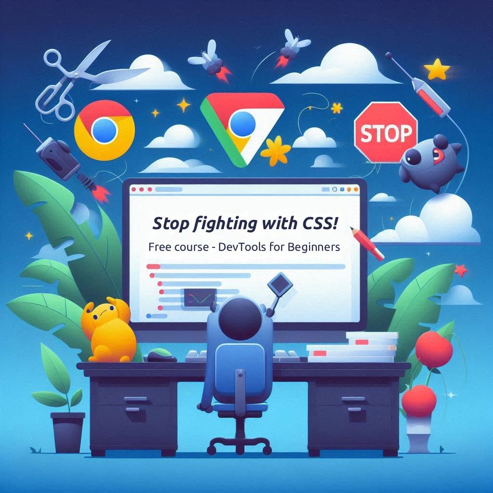
🚨 New Course Alert 🚨
DevTools for Beginners
@kevinpowell.co and I just released a brand new (and totally free!) email course all about DevTools and how to use them in ways that actually help you debug and improve your CSS.
🔗 Full details and free signup here: devtoolsforbeginners.kevinpowell.co
DevTools for Beginners
@kevinpowell.co and I just released a brand new (and totally free!) email course all about DevTools and how to use them in ways that actually help you debug and improve your CSS.
🔗 Full details and free signup here: devtoolsforbeginners.kevinpowell.co
Inspired by Temani’s brilliant work, where he created a box using only `border-radius` and `corner-shape`, I built on his code, played with different angles, and came up with this dynamic demo.
Live demo on @codepen.io: codepen.io/amit_sheen/f...
Live demo on @codepen.io: codepen.io/amit_sheen/f...
September 26, 2025 at 8:23 PM
Inspired by Temani’s brilliant work, where he created a box using only `border-radius` and `corner-shape`, I built on his code, played with different angles, and came up with this dynamic demo.
Live demo on @codepen.io: codepen.io/amit_sheen/f...
Live demo on @codepen.io: codepen.io/amit_sheen/f...
✨ New article ✨
Are we at the start of a new era?
Chrome 140 introduced CSS Typed Arithmetic. It might seem like a minor change, but I believe it's huge as it opens the door to countless new possibilities and a whole new era of Computational CSS.
What do you think?
css-tricks.com/css-typed-ar...
Are we at the start of a new era?
Chrome 140 introduced CSS Typed Arithmetic. It might seem like a minor change, but I believe it's huge as it opens the door to countless new possibilities and a whole new era of Computational CSS.
What do you think?
css-tricks.com/css-typed-ar...

September 24, 2025 at 1:04 PM
✨ New article ✨
Are we at the start of a new era?
Chrome 140 introduced CSS Typed Arithmetic. It might seem like a minor change, but I believe it's huge as it opens the door to countless new possibilities and a whole new era of Computational CSS.
What do you think?
css-tricks.com/css-typed-ar...
Are we at the start of a new era?
Chrome 140 introduced CSS Typed Arithmetic. It might seem like a minor change, but I believe it's huge as it opens the door to countless new possibilities and a whole new era of Computational CSS.
What do you think?
css-tricks.com/css-typed-ar...
Reposted by Amit Sheen

You know how we can’t calc() numbers with mixed data types? Well, that's changing (Chrome 140) and it might be a bigger deal that @amitsheen.bsky.social describes as "self-aware” CSS.
css-tricks.com/css-typed-ar...
css-tricks.com/css-typed-ar...

CSS Typed Arithmetic | CSS-Tricks
Starting in Chrome 140, we'll be able to calculate numeric values with mixed data types. Sounds small, but Amit demonstrates how big a deal this is, calling it Computational CSS.
css-tricks.com
September 24, 2025 at 12:55 PM
You know how we can’t calc() numbers with mixed data types? Well, that's changing (Chrome 140) and it might be a bigger deal that @amitsheen.bsky.social describes as "self-aware” CSS.
css-tricks.com/css-typed-ar...
css-tricks.com/css-typed-ar...
I was inspired by another amazing animation from Jon Kantner, so I made a pure CSS version. 400 squares, using sibling-index() and sibling-count(), a bunch of trig functions, and some typed arithmetic. (Currently works in Chrome 140+ only)
Live demo on @codepen.io: codepen.io/amit_sheen/f...
Live demo on @codepen.io: codepen.io/amit_sheen/f...
September 20, 2025 at 12:37 AM
I was inspired by another amazing animation from Jon Kantner, so I made a pure CSS version. 400 squares, using sibling-index() and sibling-count(), a bunch of trig functions, and some typed arithmetic. (Currently works in Chrome 140+ only)
Live demo on @codepen.io: codepen.io/amit_sheen/f...
Live demo on @codepen.io: codepen.io/amit_sheen/f...
Reposted by Amit Sheen

🚀The new CSS sibling-index() and sibling-count() functions let us create staggered animations, dynamic color palettes, and even complex circular layouts with ease.
I wrote about my first experiments with these fantastic new CSS additions. So much fun! ♥️ ✨
#CSS
utilitybend.com/blog/styling...
I wrote about my first experiments with these fantastic new CSS additions. So much fun! ♥️ ✨
#CSS
utilitybend.com/blog/styling...

Styling siblings with CSS has never been easier. Experimenting with sibling-count and sibling-index | utilitybend
Ready to spice up your CSS? This article dives into the new sibling-count() and sibling-index() functions, showing you how they can simplify your styling and create cool effects.
utilitybend.com
September 12, 2025 at 11:37 AM
🚀The new CSS sibling-index() and sibling-count() functions let us create staggered animations, dynamic color palettes, and even complex circular layouts with ease.
I wrote about my first experiments with these fantastic new CSS additions. So much fun! ♥️ ✨
#CSS
utilitybend.com/blog/styling...
I wrote about my first experiments with these fantastic new CSS additions. So much fun! ♥️ ✨
#CSS
utilitybend.com/blog/styling...
A couple of days ago I came across Jon Kantner’s excellent color palette generator, and it reminded me that a few years back I built something quite similar (great minds and all that) back when HSL was the hot new thing.
(Links in comment 👇)
(Links in comment 👇)
September 5, 2025 at 10:58 AM
A couple of days ago I came across Jon Kantner’s excellent color palette generator, and it reminded me that a few years back I built something quite similar (great minds and all that) back when HSL was the hot new thing.
(Links in comment 👇)
(Links in comment 👇)
Reposted by Amit Sheen

Big fan of the educational demos in @amitsheen.bsky.social's post here about `offset-path`. frontendmasters.com/blog/the-pat...

The `-path` of Least Resistance (Part 2)
This time we're looking at offset-path (and friends), which can be used to create movement when animated and benefits from all the same fancy functions that we learned about with clip-path.
frontendmasters.com
September 3, 2025 at 1:34 PM
Big fan of the educational demos in @amitsheen.bsky.social's post here about `offset-path`. frontendmasters.com/blog/the-pat...
✨ The `-path` of Least Resistance (part 2) ✨
From shapes that define boundaries to paths that drive motion. We shift to `offset-path`, where elements no longer get clipped but flow along custom routes. 🤩
🔗 Read and share your thoughts on @frontendmasters.com:
frontendmasters.com/blog/the-pat...
From shapes that define boundaries to paths that drive motion. We shift to `offset-path`, where elements no longer get clipped but flow along custom routes. 🤩
🔗 Read and share your thoughts on @frontendmasters.com:
frontendmasters.com/blog/the-pat...
August 30, 2025 at 2:18 PM
✨ The `-path` of Least Resistance (part 2) ✨
From shapes that define boundaries to paths that drive motion. We shift to `offset-path`, where elements no longer get clipped but flow along custom routes. 🤩
🔗 Read and share your thoughts on @frontendmasters.com:
frontendmasters.com/blog/the-pat...
From shapes that define boundaries to paths that drive motion. We shift to `offset-path`, where elements no longer get clipped but flow along custom routes. 🤩
🔗 Read and share your thoughts on @frontendmasters.com:
frontendmasters.com/blog/the-pat...
Reposted by Amit Sheen

The `-path` of Least Resistance (Part 2)
This time we're looking at offset-path (and friends), which can be used to create movement when animated and benefits from all the same fancy functions that we learned about with clip-path.
This time we're looking at offset-path (and friends), which can be used to create movement when animated and benefits from all the same fancy functions that we learned about with clip-path.

The `-path` of Least Resistance (Part 2)
This time we're looking at offset-path (and friends), which can be used to create movement when animated and benefits from all the same fancy functions that we learned about with clip-path.
frontendmasters.com
August 30, 2025 at 7:39 AM
The `-path` of Least Resistance (Part 2)
This time we're looking at offset-path (and friends), which can be used to create movement when animated and benefits from all the same fancy functions that we learned about with clip-path.
This time we're looking at offset-path (and friends), which can be used to create movement when animated and benefits from all the same fancy functions that we learned about with clip-path.
✨ New article: The `-Path` of Least Resistance ✨
First part of a series on the power of paths in CSS, kicking off with clip-path. From the basics to functions and syntax, all the way to advanced shape logic.
🔗 Read and share your thoughts on @frontendmasters.com
frontendmasters.com/blog/the-pat...
First part of a series on the power of paths in CSS, kicking off with clip-path. From the basics to functions and syntax, all the way to advanced shape logic.
🔗 Read and share your thoughts on @frontendmasters.com
frontendmasters.com/blog/the-pat...

The `-path` of Least Resistance (Part 1)
A deep dive into `clip-path` from Amit Sheen, a very powerful tool in shape creation on the web, particularly now with `shape()`.
frontendmasters.com
August 28, 2025 at 9:21 AM
✨ New article: The `-Path` of Least Resistance ✨
First part of a series on the power of paths in CSS, kicking off with clip-path. From the basics to functions and syntax, all the way to advanced shape logic.
🔗 Read and share your thoughts on @frontendmasters.com
frontendmasters.com/blog/the-pat...
First part of a series on the power of paths in CSS, kicking off with clip-path. From the basics to functions and syntax, all the way to advanced shape logic.
🔗 Read and share your thoughts on @frontendmasters.com
frontendmasters.com/blog/the-pat...
Reposted by Amit Sheen
The `-path` of Least Resistance (Part 1)
A deep dive into `clip-path` from Amit Sheen, a very powerful tool in shape creation on the web, particularly now with `shape()`.
A deep dive into `clip-path` from Amit Sheen, a very powerful tool in shape creation on the web, particularly now with `shape()`.

The `-path` of Least Resistance (Part 1)
A deep dive into `clip-path` from Amit Sheen, a very powerful tool in shape creation on the web, particularly now with `shape()`.
frontendmasters.com
August 28, 2025 at 7:39 AM
The `-path` of Least Resistance (Part 1)
A deep dive into `clip-path` from Amit Sheen, a very powerful tool in shape creation on the web, particularly now with `shape()`.
A deep dive into `clip-path` from Amit Sheen, a very powerful tool in shape creation on the web, particularly now with `shape()`.
✨ Part three (and final) is out now! ✨
This series has been a deep dive into 3D layered text, and in this part we explore some advanced interactions while making the code cleaner and more dynamic with a touch of JS. 🤩
🔗 Read and share your thoughts on @css-tricks.com
css-tricks.com/3d-layered-t...
This series has been a deep dive into 3D layered text, and in this part we explore some advanced interactions while making the code cleaner and more dynamic with a touch of JS. 🤩
🔗 Read and share your thoughts on @css-tricks.com
css-tricks.com/3d-layered-t...
August 22, 2025 at 2:48 PM
✨ Part three (and final) is out now! ✨
This series has been a deep dive into 3D layered text, and in this part we explore some advanced interactions while making the code cleaner and more dynamic with a touch of JS. 🤩
🔗 Read and share your thoughts on @css-tricks.com
css-tricks.com/3d-layered-t...
This series has been a deep dive into 3D layered text, and in this part we explore some advanced interactions while making the code cleaner and more dynamic with a touch of JS. 🤩
🔗 Read and share your thoughts on @css-tricks.com
css-tricks.com/3d-layered-t...
Reposted by Amit Sheen
Alright, we're capping off @amitsheen.bsky.social's CSS-Tricks takeover with the final chapter in his series — this time making fully responsive bulging text that follows your mouse in real time. ✨
css-tricks.com/3d-layered-t...
css-tricks.com/3d-layered-t...
August 22, 2025 at 2:08 PM
Alright, we're capping off @amitsheen.bsky.social's CSS-Tricks takeover with the final chapter in his series — this time making fully responsive bulging text that follows your mouse in real time. ✨
css-tricks.com/3d-layered-t...
css-tricks.com/3d-layered-t...
✨ 3D layered text - Part two is here! ✨
If this series of articles were a meal, this part would definitely be the main course. 😋
19(!) live examples of 3D text animations, and if you want to build them yourself, check it out on @css-tricks.com.
🔗 css-tricks.com/3d-layered-t...
If this series of articles were a meal, this part would definitely be the main course. 😋
19(!) live examples of 3D text animations, and if you want to build them yourself, check it out on @css-tricks.com.
🔗 css-tricks.com/3d-layered-t...
August 20, 2025 at 3:28 PM
✨ 3D layered text - Part two is here! ✨
If this series of articles were a meal, this part would definitely be the main course. 😋
19(!) live examples of 3D text animations, and if you want to build them yourself, check it out on @css-tricks.com.
🔗 css-tricks.com/3d-layered-t...
If this series of articles were a meal, this part would definitely be the main course. 😋
19(!) live examples of 3D text animations, and if you want to build them yourself, check it out on @css-tricks.com.
🔗 css-tricks.com/3d-layered-t...
Reposted by Amit Sheen
It's still the @amitsheen.bsky.social show over here at CSS-Tricks! Now up: the second piece of his series about 3D text effects... this time with ✨ motion ✨.
css-tricks.com/3d-layered-t...
css-tricks.com/3d-layered-t...

3D Layered Text: Motion and Variations | CSS-Tricks
In this chapter, we will explore ways to animate the effect, add transitions, and play with different variations. We will look at how motion can enhance depth, and how subtle tweaks can create a whole...
css-tricks.com
August 20, 2025 at 1:57 PM
It's still the @amitsheen.bsky.social show over here at CSS-Tricks! Now up: the second piece of his series about 3D text effects... this time with ✨ motion ✨.
css-tricks.com/3d-layered-t...
css-tricks.com/3d-layered-t...
✨ New article! ✨
This time it’s a three-part exploration of 3D layered text. 😎
The first part is all about the basics, from the very first line to text with real depth that feels like it pops off the page. 🤩
Check it out and share your thoughts on @css-tricks.com:
🔗 css-tricks.com/3d-layered-t...
This time it’s a three-part exploration of 3D layered text. 😎
The first part is all about the basics, from the very first line to text with real depth that feels like it pops off the page. 🤩
Check it out and share your thoughts on @css-tricks.com:
🔗 css-tricks.com/3d-layered-t...
August 18, 2025 at 8:54 PM
✨ New article! ✨
This time it’s a three-part exploration of 3D layered text. 😎
The first part is all about the basics, from the very first line to text with real depth that feels like it pops off the page. 🤩
Check it out and share your thoughts on @css-tricks.com:
🔗 css-tricks.com/3d-layered-t...
This time it’s a three-part exploration of 3D layered text. 😎
The first part is all about the basics, from the very first line to text with real depth that feels like it pops off the page. 🤩
Check it out and share your thoughts on @css-tricks.com:
🔗 css-tricks.com/3d-layered-t...
Reposted by Amit Sheen
Alright, we're letting @amitsheen.bsky.social take over CSS-Tricks... all week! He's got a three-parter that's a super deep dive into 3D layered text.
Part one is all about creating an index of layers for adding depth, and it's full of goodies.
css-tricks.com/3d-layered-t...
Part one is all about creating an index of layers for adding depth, and it's full of goodies.
css-tricks.com/3d-layered-t...
August 18, 2025 at 1:53 PM
Alright, we're letting @amitsheen.bsky.social take over CSS-Tricks... all week! He's got a three-parter that's a super deep dive into 3D layered text.
Part one is all about creating an index of layers for adding depth, and it's full of goodies.
css-tricks.com/3d-layered-t...
Part one is all about creating an index of layers for adding depth, and it's full of goodies.
css-tricks.com/3d-layered-t...
I'm just loving the fact that we can now create such complex interactions with only a few simple lines of CSS. 🤯
(This demo is from an upcoming article I’m working on)
(This demo is from an upcoming article I’m working on)
August 17, 2025 at 11:07 AM
I'm just loving the fact that we can now create such complex interactions with only a few simple lines of CSS. 🤯
(This demo is from an upcoming article I’m working on)
(This demo is from an upcoming article I’m working on)
📣 The State of CSS 2025 results are live!
There are some really interesting findings this year! 🤯
And if the Conclusion feels like a love letter to the future of CSS, well… guilty as charged. 😉
🔗 2025.stateofcss.com
There are some really interesting findings this year! 🤯
And if the Conclusion feels like a love letter to the future of CSS, well… guilty as charged. 😉
🔗 2025.stateofcss.com

State of CSS 2025
2025.stateofcss.com
August 9, 2025 at 6:34 PM
📣 The State of CSS 2025 results are live!
There are some really interesting findings this year! 🤯
And if the Conclusion feels like a love letter to the future of CSS, well… guilty as charged. 😉
🔗 2025.stateofcss.com
There are some really interesting findings this year! 🤯
And if the Conclusion feels like a love letter to the future of CSS, well… guilty as charged. 😉
🔗 2025.stateofcss.com
Does the new `stretch` keyword in CSS mark the end of `box-sizing: border-box;` in our reset files? 🤔

August 8, 2025 at 8:24 AM
Does the new `stretch` keyword in CSS mark the end of `box-sizing: border-box;` in our reset files? 🤔
Reposted by Amit Sheen

If you're new to CSS, one of the best ways to make your life easier is to take advantage of all the CSS debugging features in your devtools.
To help, I teamed up with @amitsheen.bsky.social to create a free, 5-part beginner course on getting started with them: devtoolsforbeginners.kevinpowell.co
To help, I teamed up with @amitsheen.bsky.social to create a free, 5-part beginner course on getting started with them: devtoolsforbeginners.kevinpowell.co
DevTools for CSS Developers - Free 5 part course
devtoolsforbeginners.kevinpowell.co
August 7, 2025 at 12:24 PM
If you're new to CSS, one of the best ways to make your life easier is to take advantage of all the CSS debugging features in your devtools.
To help, I teamed up with @amitsheen.bsky.social to create a free, 5-part beginner course on getting started with them: devtoolsforbeginners.kevinpowell.co
To help, I teamed up with @amitsheen.bsky.social to create a free, 5-part beginner course on getting started with them: devtoolsforbeginners.kevinpowell.co
🚨 New Course Alert 🚨
DevTools for Beginners
@kevinpowell.co and I just released a brand new (and totally free!) email course all about DevTools and how to use them in ways that actually help you debug and improve your CSS.
🔗 Full details and free signup here: devtoolsforbeginners.kevinpowell.co
DevTools for Beginners
@kevinpowell.co and I just released a brand new (and totally free!) email course all about DevTools and how to use them in ways that actually help you debug and improve your CSS.
🔗 Full details and free signup here: devtoolsforbeginners.kevinpowell.co
August 6, 2025 at 3:10 PM
🚨 New Course Alert 🚨
DevTools for Beginners
@kevinpowell.co and I just released a brand new (and totally free!) email course all about DevTools and how to use them in ways that actually help you debug and improve your CSS.
🔗 Full details and free signup here: devtoolsforbeginners.kevinpowell.co
DevTools for Beginners
@kevinpowell.co and I just released a brand new (and totally free!) email course all about DevTools and how to use them in ways that actually help you debug and improve your CSS.
🔗 Full details and free signup here: devtoolsforbeginners.kevinpowell.co
✨ Been waiting for this one! ✨
24 layers on the cannon, 64 balls, and not a single inline variable. All powered by sibling-index() and sibling-count().
Working with multiple elements just got way easier! 🤩
(Currently on Chromium only)
🔗 Live demo on @codepen.io: codepen.io/amit_sheen/f...
24 layers on the cannon, 64 balls, and not a single inline variable. All powered by sibling-index() and sibling-count().
Working with multiple elements just got way easier! 🤩
(Currently on Chromium only)
🔗 Live demo on @codepen.io: codepen.io/amit_sheen/f...
July 31, 2025 at 4:46 PM
✨ Been waiting for this one! ✨
24 layers on the cannon, 64 balls, and not a single inline variable. All powered by sibling-index() and sibling-count().
Working with multiple elements just got way easier! 🤩
(Currently on Chromium only)
🔗 Live demo on @codepen.io: codepen.io/amit_sheen/f...
24 layers on the cannon, 64 balls, and not a single inline variable. All powered by sibling-index() and sibling-count().
Working with multiple elements just got way easier! 🤩
(Currently on Chromium only)
🔗 Live demo on @codepen.io: codepen.io/amit_sheen/f...
** This animation is 100% linear! **
Sure, there are spheres, curvy lines, and circular motion. Made with a few #CSS animations and some tricky keyframes. But the timing functions? Pure linear easing across the board.
🔗 Live demo on @codepen.io: codepen.io/amit_sheen/f...
Sure, there are spheres, curvy lines, and circular motion. Made with a few #CSS animations and some tricky keyframes. But the timing functions? Pure linear easing across the board.
🔗 Live demo on @codepen.io: codepen.io/amit_sheen/f...
July 26, 2025 at 10:31 AM
** This animation is 100% linear! **
Sure, there are spheres, curvy lines, and circular motion. Made with a few #CSS animations and some tricky keyframes. But the timing functions? Pure linear easing across the board.
🔗 Live demo on @codepen.io: codepen.io/amit_sheen/f...
Sure, there are spheres, curvy lines, and circular motion. Made with a few #CSS animations and some tricky keyframes. But the timing functions? Pure linear easing across the board.
🔗 Live demo on @codepen.io: codepen.io/amit_sheen/f...
This is the simplest complex animation I’ve ever made (with #CSS). It uses only two animations: a single keyframe to rotate on the Y axis, and another with a simple Y-axis translate. That's it.
The trick is knowing how to combine them in a clever way. 😉
🔗 On @codepen.io: codepen.io/amit_sheen/f...
The trick is knowing how to combine them in a clever way. 😉
🔗 On @codepen.io: codepen.io/amit_sheen/f...
July 23, 2025 at 9:23 AM
This is the simplest complex animation I’ve ever made (with #CSS). It uses only two animations: a single keyframe to rotate on the Y axis, and another with a simple Y-axis translate. That's it.
The trick is knowing how to combine them in a clever way. 😉
🔗 On @codepen.io: codepen.io/amit_sheen/f...
The trick is knowing how to combine them in a clever way. 😉
🔗 On @codepen.io: codepen.io/amit_sheen/f...