


Alice
@alicenox.bsky.social
🔞 Dumb witch. She/Her. Gay mess. Amateur FFXIV gposer.
I mostly follow art accounts and people I like.
/c/alice%20nox
I mostly follow art accounts and people I like.
/c/alice%20nox
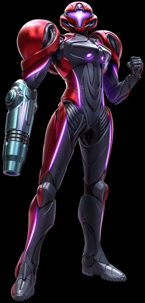
As a bonus for reading this far, have an honorable mention: the suit Samus wears in Smash 4 and Ultimate.
It's based on the Other M suit, but gets rid of the plastic-y feel and adds some much-needed detailing and a metallic sheen. Still kinda smooth and bland, but a marked improvement over Other M.
It's based on the Other M suit, but gets rid of the plastic-y feel and adds some much-needed detailing and a metallic sheen. Still kinda smooth and bland, but a marked improvement over Other M.


November 25, 2025 at 4:00 PM
As a bonus for reading this far, have an honorable mention: the suit Samus wears in Smash 4 and Ultimate.
It's based on the Other M suit, but gets rid of the plastic-y feel and adds some much-needed detailing and a metallic sheen. Still kinda smooth and bland, but a marked improvement over Other M.
It's based on the Other M suit, but gets rid of the plastic-y feel and adds some much-needed detailing and a metallic sheen. Still kinda smooth and bland, but a marked improvement over Other M.
Speaking of Prime 4, I'm already really liking its suits. While I wish they had the iconic Varia Suit shoulders, I think they both look pretty great.
I also feel like there will be another one; the white suit was shown on Nintendo JP's website, and it's not like them to show everything like that.
I also feel like there will be another one; the white suit was shown on Nintendo JP's website, and it's not like them to show everything like that.

November 25, 2025 at 4:00 PM
Speaking of Prime 4, I'm already really liking its suits. While I wish they had the iconic Varia Suit shoulders, I think they both look pretty great.
I also feel like there will be another one; the white suit was shown on Nintendo JP's website, and it's not like them to show everything like that.
I also feel like there will be another one; the white suit was shown on Nintendo JP's website, and it's not like them to show everything like that.
Even in the upcoming Metroid Prime 4, the design of Prime 2's Varia Suit is still largely unchanged. The green and orange lighting of the armor and arm cannon have been changed to purple to suit the game's identity, and the "third eye" was added, but the suit itself is more or less exactly the same.

November 25, 2025 at 4:00 PM
Even in the upcoming Metroid Prime 4, the design of Prime 2's Varia Suit is still largely unchanged. The green and orange lighting of the armor and arm cannon have been changed to purple to suit the game's identity, and the "third eye" was added, but the suit itself is more or less exactly the same.
Other further details involve an overall thicker look to the outer Varia Suit plating, more detailing on the yellow Power Suit base layer, and more visible segments on the red chest plate. The facemask is also recessed further into the visor, helping it appear more form-fitting.

November 25, 2025 at 4:00 PM
Other further details involve an overall thicker look to the outer Varia Suit plating, more detailing on the yellow Power Suit base layer, and more visible segments on the red chest plate. The facemask is also recessed further into the visor, helping it appear more form-fitting.
The lights lining Samus's legs were embellished upon, recessed into the suit itself and made brighter to make it look like they're shining through a gap in the armor plating rather than simply running along the surface, adding a sense of depth and layering to the suit's look.

November 25, 2025 at 4:00 PM
The lights lining Samus's legs were embellished upon, recessed into the suit itself and made brighter to make it look like they're shining through a gap in the armor plating rather than simply running along the surface, adding a sense of depth and layering to the suit's look.
The biggest room for improvement in Prime 1's Varia Suit design was the helmet, and boy was there improvement in Prime 2. The rounded parts on the side were narrowed, as well as the facemask part near the bottom. The visor has a more angular design as well, giving Samus a much fiercer look overall.

November 25, 2025 at 4:00 PM
The biggest room for improvement in Prime 1's Varia Suit design was the helmet, and boy was there improvement in Prime 2. The rounded parts on the side were narrowed, as well as the facemask part near the bottom. The visor has a more angular design as well, giving Samus a much fiercer look overall.
As far as I can tell, there is no actual difference between the Varia Suit in Prime 2 and Prime 3, other than the slight improvements in model detail and lighting thanks to the Wii's marginally more powerful hardware. That is, of course, a good thing; no need to mess with perfection.

November 25, 2025 at 4:00 PM
As far as I can tell, there is no actual difference between the Varia Suit in Prime 2 and Prime 3, other than the slight improvements in model detail and lighting thanks to the Wii's marginally more powerful hardware. That is, of course, a good thing; no need to mess with perfection.
1: Varia Suit (Prime 2)
Many people are unaware that there's even a difference between Prime 1 and 2's Varia Suits. But Prime 2 tweaked the design it in various ways to end up with what is absolutely the best look the suit has ever had.
I'm going to need a few posts to go over why it's so amazing.
Many people are unaware that there's even a difference between Prime 1 and 2's Varia Suits. But Prime 2 tweaked the design it in various ways to end up with what is absolutely the best look the suit has ever had.
I'm going to need a few posts to go over why it's so amazing.

November 25, 2025 at 4:00 PM
1: Varia Suit (Prime 2)
Many people are unaware that there's even a difference between Prime 1 and 2's Varia Suits. But Prime 2 tweaked the design it in various ways to end up with what is absolutely the best look the suit has ever had.
I'm going to need a few posts to go over why it's so amazing.
Many people are unaware that there's even a difference between Prime 1 and 2's Varia Suits. But Prime 2 tweaked the design it in various ways to end up with what is absolutely the best look the suit has ever had.
I'm going to need a few posts to go over why it's so amazing.
2: Phazon Suit (Prime)
Prime's Varia Suit corrupted by Phazon. It sports a very dark black-and-silver color scheme with a red visor and highlights, as well as a vignette around the suit in-game that shows the Phazon radiation literally... well, radiating off of it. This would be #1, if not for...
Prime's Varia Suit corrupted by Phazon. It sports a very dark black-and-silver color scheme with a red visor and highlights, as well as a vignette around the suit in-game that shows the Phazon radiation literally... well, radiating off of it. This would be #1, if not for...

November 25, 2025 at 4:00 PM
2: Phazon Suit (Prime)
Prime's Varia Suit corrupted by Phazon. It sports a very dark black-and-silver color scheme with a red visor and highlights, as well as a vignette around the suit in-game that shows the Phazon radiation literally... well, radiating off of it. This would be #1, if not for...
Prime's Varia Suit corrupted by Phazon. It sports a very dark black-and-silver color scheme with a red visor and highlights, as well as a vignette around the suit in-game that shows the Phazon radiation literally... well, radiating off of it. This would be #1, if not for...
3: Varia Suit (Prime)
Prime's Varia Suit is not without its flaws. Mostly, the head and visor are too rounded, and the segments between the armor's plates are a bit poorly defined; but it approached perfection of the design.
Prime's Varia Suit is not without its flaws. Mostly, the head and visor are too rounded, and the segments between the armor's plates are a bit poorly defined; but it approached perfection of the design.

November 25, 2025 at 4:00 PM
3: Varia Suit (Prime)
Prime's Varia Suit is not without its flaws. Mostly, the head and visor are too rounded, and the segments between the armor's plates are a bit poorly defined; but it approached perfection of the design.
Prime's Varia Suit is not without its flaws. Mostly, the head and visor are too rounded, and the segments between the armor's plates are a bit poorly defined; but it approached perfection of the design.
4: Gravity Suit (Prime)
I'll talk more about Prime's Varia Suit design in a moment, but its Gravity Suit is a perfect alternative. With a duller color scheme than most of the Gravity Suits in the series, with bright light blue highlights and visor, it has a very clean look, especially underwater.
I'll talk more about Prime's Varia Suit design in a moment, but its Gravity Suit is a perfect alternative. With a duller color scheme than most of the Gravity Suits in the series, with bright light blue highlights and visor, it has a very clean look, especially underwater.

November 25, 2025 at 4:00 PM
4: Gravity Suit (Prime)
I'll talk more about Prime's Varia Suit design in a moment, but its Gravity Suit is a perfect alternative. With a duller color scheme than most of the Gravity Suits in the series, with bright light blue highlights and visor, it has a very clean look, especially underwater.
I'll talk more about Prime's Varia Suit design in a moment, but its Gravity Suit is a perfect alternative. With a duller color scheme than most of the Gravity Suits in the series, with bright light blue highlights and visor, it has a very clean look, especially underwater.
5: Gravity Suit (Zero Mission)
A Zero Mission exclusive that didn't exist in the original Metroid, this was, chronologically, the first time Samus acquired her "full-powered suit" that she'd wear for the rest of the series. Slightly more embellished than Super Metroid's, and ranks higher for it.
A Zero Mission exclusive that didn't exist in the original Metroid, this was, chronologically, the first time Samus acquired her "full-powered suit" that she'd wear for the rest of the series. Slightly more embellished than Super Metroid's, and ranks higher for it.

November 25, 2025 at 4:00 PM
5: Gravity Suit (Zero Mission)
A Zero Mission exclusive that didn't exist in the original Metroid, this was, chronologically, the first time Samus acquired her "full-powered suit" that she'd wear for the rest of the series. Slightly more embellished than Super Metroid's, and ranks higher for it.
A Zero Mission exclusive that didn't exist in the original Metroid, this was, chronologically, the first time Samus acquired her "full-powered suit" that she'd wear for the rest of the series. Slightly more embellished than Super Metroid's, and ranks higher for it.
6: Varia Suit (Super)
There isn't much to say about this one. It's the same as what you just saw above, only with the usual Varia Suit colors. Fantastic, but not without room for improvement.
There isn't much to say about this one. It's the same as what you just saw above, only with the usual Varia Suit colors. Fantastic, but not without room for improvement.

November 25, 2025 at 4:00 PM
6: Varia Suit (Super)
There isn't much to say about this one. It's the same as what you just saw above, only with the usual Varia Suit colors. Fantastic, but not without room for improvement.
There isn't much to say about this one. It's the same as what you just saw above, only with the usual Varia Suit colors. Fantastic, but not without room for improvement.
7: Gravity Suit (Super)
The first appearance of the Gravity Suit in game order release. The image provided is also a fan mock-up, a color edit of the Varia Suit art. It's everything the Varia Suit should be, with what would become an iconic color scheme for the Gravity Suit. No notes, great design.
The first appearance of the Gravity Suit in game order release. The image provided is also a fan mock-up, a color edit of the Varia Suit art. It's everything the Varia Suit should be, with what would become an iconic color scheme for the Gravity Suit. No notes, great design.

November 25, 2025 at 4:00 PM
7: Gravity Suit (Super)
The first appearance of the Gravity Suit in game order release. The image provided is also a fan mock-up, a color edit of the Varia Suit art. It's everything the Varia Suit should be, with what would become an iconic color scheme for the Gravity Suit. No notes, great design.
The first appearance of the Gravity Suit in game order release. The image provided is also a fan mock-up, a color edit of the Varia Suit art. It's everything the Varia Suit should be, with what would become an iconic color scheme for the Gravity Suit. No notes, great design.
8: Gravity Suit (Samus Returns)
While I bemoaned a bit of the mechanical bulk of Samus Returns's other suits, I think it fits the Gravity Suit very well, between the darker color scheme and, again, the implication that each suit upgrade builds upon what's underneath it. Very good design overall.
While I bemoaned a bit of the mechanical bulk of Samus Returns's other suits, I think it fits the Gravity Suit very well, between the darker color scheme and, again, the implication that each suit upgrade builds upon what's underneath it. Very good design overall.

November 25, 2025 at 4:00 PM
8: Gravity Suit (Samus Returns)
While I bemoaned a bit of the mechanical bulk of Samus Returns's other suits, I think it fits the Gravity Suit very well, between the darker color scheme and, again, the implication that each suit upgrade builds upon what's underneath it. Very good design overall.
While I bemoaned a bit of the mechanical bulk of Samus Returns's other suits, I think it fits the Gravity Suit very well, between the darker color scheme and, again, the implication that each suit upgrade builds upon what's underneath it. Very good design overall.
9: Varia Suit (Return of Samus)
It's actually impressive that the iconic Varia Suit design was nearly perfected all the way back at Metroid 2. It's got its flaws, but this overall look would become the basis that all of Samus's future suits were designed after.
It's actually impressive that the iconic Varia Suit design was nearly perfected all the way back at Metroid 2. It's got its flaws, but this overall look would become the basis that all of Samus's future suits were designed after.

November 25, 2025 at 4:00 PM
9: Varia Suit (Return of Samus)
It's actually impressive that the iconic Varia Suit design was nearly perfected all the way back at Metroid 2. It's got its flaws, but this overall look would become the basis that all of Samus's future suits were designed after.
It's actually impressive that the iconic Varia Suit design was nearly perfected all the way back at Metroid 2. It's got its flaws, but this overall look would become the basis that all of Samus's future suits were designed after.
10: Varia Suit (Dread)
The Varia Suit upgrade in Dread builds onto the Power Suit's redesign, while restoring some of the iconic color scheme. The white body and sinewy-looking underlayer helps it maintain its weakened look, which keeps its unique feel compared to other Varia Suits.
The Varia Suit upgrade in Dread builds onto the Power Suit's redesign, while restoring some of the iconic color scheme. The white body and sinewy-looking underlayer helps it maintain its weakened look, which keeps its unique feel compared to other Varia Suits.

November 25, 2025 at 4:00 PM
10: Varia Suit (Dread)
The Varia Suit upgrade in Dread builds onto the Power Suit's redesign, while restoring some of the iconic color scheme. The white body and sinewy-looking underlayer helps it maintain its weakened look, which keeps its unique feel compared to other Varia Suits.
The Varia Suit upgrade in Dread builds onto the Power Suit's redesign, while restoring some of the iconic color scheme. The white body and sinewy-looking underlayer helps it maintain its weakened look, which keeps its unique feel compared to other Varia Suits.
11: Power Suit (Dread)
The lore behind this suit is that Samus's Power Suit from Fusion is slowly recovering its form after the events of that game. It wonderfully blends the organic look of Fusion's suits with a more standard overall shape, and has a wonderfully angular shape to the visor.
The lore behind this suit is that Samus's Power Suit from Fusion is slowly recovering its form after the events of that game. It wonderfully blends the organic look of Fusion's suits with a more standard overall shape, and has a wonderfully angular shape to the visor.

November 25, 2025 at 4:00 PM
11: Power Suit (Dread)
The lore behind this suit is that Samus's Power Suit from Fusion is slowly recovering its form after the events of that game. It wonderfully blends the organic look of Fusion's suits with a more standard overall shape, and has a wonderfully angular shape to the visor.
The lore behind this suit is that Samus's Power Suit from Fusion is slowly recovering its form after the events of that game. It wonderfully blends the organic look of Fusion's suits with a more standard overall shape, and has a wonderfully angular shape to the visor.
12: Gravity Suit (Dread)
Dread's suits looked great overall, and I'll talk about them more shortly. But what really harms this one is the shoulders, with the iconic ridges appearing thicker and hollow, giving it an incomplete look despite being the most upgraded suit Samus receives in Dread.
Dread's suits looked great overall, and I'll talk about them more shortly. But what really harms this one is the shoulders, with the iconic ridges appearing thicker and hollow, giving it an incomplete look despite being the most upgraded suit Samus receives in Dread.

November 25, 2025 at 4:00 PM
12: Gravity Suit (Dread)
Dread's suits looked great overall, and I'll talk about them more shortly. But what really harms this one is the shoulders, with the iconic ridges appearing thicker and hollow, giving it an incomplete look despite being the most upgraded suit Samus receives in Dread.
Dread's suits looked great overall, and I'll talk about them more shortly. But what really harms this one is the shoulders, with the iconic ridges appearing thicker and hollow, giving it an incomplete look despite being the most upgraded suit Samus receives in Dread.
13: Light Suit (Prime 2)
The polar opposite of the Dark Suit. The Light Suit is Luminoth technology, and its overall look encapsulates that very well, with moth-like features, monochrome color, and a smooth, pale, almost delicate appearance. Great design and even better with the lore supporting it.
The polar opposite of the Dark Suit. The Light Suit is Luminoth technology, and its overall look encapsulates that very well, with moth-like features, monochrome color, and a smooth, pale, almost delicate appearance. Great design and even better with the lore supporting it.

November 25, 2025 at 4:00 PM
13: Light Suit (Prime 2)
The polar opposite of the Dark Suit. The Light Suit is Luminoth technology, and its overall look encapsulates that very well, with moth-like features, monochrome color, and a smooth, pale, almost delicate appearance. Great design and even better with the lore supporting it.
The polar opposite of the Dark Suit. The Light Suit is Luminoth technology, and its overall look encapsulates that very well, with moth-like features, monochrome color, and a smooth, pale, almost delicate appearance. Great design and even better with the lore supporting it.
14: Fusion Suit (Fusion)
Before Dread and the Metroid Suit, Fusion was the first game to incorporate Metroid DNA into Samus, and Metroid design elements into her suit. The blue and yellow look is eye-catching and visually pleasing, especially with the pinker shade to her helmet and chestplate.
Before Dread and the Metroid Suit, Fusion was the first game to incorporate Metroid DNA into Samus, and Metroid design elements into her suit. The blue and yellow look is eye-catching and visually pleasing, especially with the pinker shade to her helmet and chestplate.

November 25, 2025 at 4:00 PM
14: Fusion Suit (Fusion)
Before Dread and the Metroid Suit, Fusion was the first game to incorporate Metroid DNA into Samus, and Metroid design elements into her suit. The blue and yellow look is eye-catching and visually pleasing, especially with the pinker shade to her helmet and chestplate.
Before Dread and the Metroid Suit, Fusion was the first game to incorporate Metroid DNA into Samus, and Metroid design elements into her suit. The blue and yellow look is eye-catching and visually pleasing, especially with the pinker shade to her helmet and chestplate.
15: Gravity Suit (Fusion)
Comparatively, the Gravity Suit's cooler colors fit quite nicely. It's still lacking a bit in the contrast department, but the colors work great with the later environments in Fusion where you acquire it.
Comparatively, the Gravity Suit's cooler colors fit quite nicely. It's still lacking a bit in the contrast department, but the colors work great with the later environments in Fusion where you acquire it.

November 25, 2025 at 4:00 PM
15: Gravity Suit (Fusion)
Comparatively, the Gravity Suit's cooler colors fit quite nicely. It's still lacking a bit in the contrast department, but the colors work great with the later environments in Fusion where you acquire it.
Comparatively, the Gravity Suit's cooler colors fit quite nicely. It's still lacking a bit in the contrast department, but the colors work great with the later environments in Fusion where you acquire it.
16: "Omega Suit" (Fusion)
Fusion's suits are all the exact same shape, only differing in color. The "Omega Suit" matches Samus's iconic color scheme, but the lack of color contrast hurts the already slim and toned down shape of the suit. Still miles better than Fusion's Varia Suit, at least.
Fusion's suits are all the exact same shape, only differing in color. The "Omega Suit" matches Samus's iconic color scheme, but the lack of color contrast hurts the already slim and toned down shape of the suit. Still miles better than Fusion's Varia Suit, at least.

November 25, 2025 at 4:00 PM
16: "Omega Suit" (Fusion)
Fusion's suits are all the exact same shape, only differing in color. The "Omega Suit" matches Samus's iconic color scheme, but the lack of color contrast hurts the already slim and toned down shape of the suit. Still miles better than Fusion's Varia Suit, at least.
Fusion's suits are all the exact same shape, only differing in color. The "Omega Suit" matches Samus's iconic color scheme, but the lack of color contrast hurts the already slim and toned down shape of the suit. Still miles better than Fusion's Varia Suit, at least.
17: Dark Suit (Prime 2)
The Dark Suit is VERY unique among Samus's suit designs. It has the classic silhouette of the Varia Suit, but looks rougher and less sophisticated than her usual suits, as if made of crude salvaged metal. Quite fitting for its use in the much more primordial Dark Aether.
The Dark Suit is VERY unique among Samus's suit designs. It has the classic silhouette of the Varia Suit, but looks rougher and less sophisticated than her usual suits, as if made of crude salvaged metal. Quite fitting for its use in the much more primordial Dark Aether.

November 25, 2025 at 4:00 PM
17: Dark Suit (Prime 2)
The Dark Suit is VERY unique among Samus's suit designs. It has the classic silhouette of the Varia Suit, but looks rougher and less sophisticated than her usual suits, as if made of crude salvaged metal. Quite fitting for its use in the much more primordial Dark Aether.
The Dark Suit is VERY unique among Samus's suit designs. It has the classic silhouette of the Varia Suit, but looks rougher and less sophisticated than her usual suits, as if made of crude salvaged metal. Quite fitting for its use in the much more primordial Dark Aether.
18: Varia Suit (Samus Returns)
The first proper Varia Suit we've seen so far on this list. The Varia Suit's iconic shoulders are here, but they feel oddly disjointed from the rest of the suit, and the suit has an overly bulky feel in parts. Very solid though, and only comparatively falls short.
The first proper Varia Suit we've seen so far on this list. The Varia Suit's iconic shoulders are here, but they feel oddly disjointed from the rest of the suit, and the suit has an overly bulky feel in parts. Very solid though, and only comparatively falls short.

November 25, 2025 at 4:00 PM
18: Varia Suit (Samus Returns)
The first proper Varia Suit we've seen so far on this list. The Varia Suit's iconic shoulders are here, but they feel oddly disjointed from the rest of the suit, and the suit has an overly bulky feel in parts. Very solid though, and only comparatively falls short.
The first proper Varia Suit we've seen so far on this list. The Varia Suit's iconic shoulders are here, but they feel oddly disjointed from the rest of the suit, and the suit has an overly bulky feel in parts. Very solid though, and only comparatively falls short.