


Simon Kuestenmacher
@simongerman600.bsky.social
German #geographer and #demographer in #Melbourne. I love and share #maps and #data that explain how the #world works.
In this map @eurostats shows us that the total fertility rate in the EU stood at 1.38 live births per woman in 2023. My beloved Tenerife recorded the lowest rate of the whole of Europe (0.79). Source: link.europa.eu/p8WYPC

November 28, 2025 at 10:55 AM
In this map @eurostats shows us that the total fertility rate in the EU stood at 1.38 live births per woman in 2023. My beloved Tenerife recorded the lowest rate of the whole of Europe (0.79). Source: link.europa.eu/p8WYPC
One of the world’s most famous fertility rate charts must be this one. China is now down to one child per woman on average.

November 27, 2025 at 10:49 PM
One of the world’s most famous fertility rate charts must be this one. China is now down to one child per woman on average.
There are more international ferry services in the Mediterranean than I expected. Great map by @viola__alba.

November 27, 2025 at 8:42 PM
There are more international ferry services in the Mediterranean than I expected. Great map by @viola__alba.
Age profile of British nationals leaving / entering the area over the last 12 months. The age profile is typical as 18 to 39 is “migration age”. Still a surprisingly high outflow of British nationals.

November 27, 2025 at 6:38 PM
Age profile of British nationals leaving / entering the area over the last 12 months. The age profile is typical as 18 to 39 is “migration age”. Still a surprisingly high outflow of British nationals.
Oops, I thought it was just a colour preference 😅

November 27, 2025 at 4:30 PM
Oops, I thought it was just a colour preference 😅
A simple, yet beautiful, map by @milosmakesmaps shows Italy’s topography and bathymetry. It’s always nice to see the Po Valley stand out so clearly.

November 27, 2025 at 2:26 PM
A simple, yet beautiful, map by @milosmakesmaps shows Italy’s topography and bathymetry. It’s always nice to see the Po Valley stand out so clearly.
To be fair, it is to be expected that there are fewer large than small countries. Still an interesting list.

November 27, 2025 at 10:55 AM
To be fair, it is to be expected that there are fewer large than small countries. Still an interesting list.
The north eastern US states want their piece of the maple syrup market. Reminded me of this awesome podcast episode about the economics of maple syrup: podcasts.apple.com/au/podcast/1... map credit to @hdk_maps (totally worth a follow).

November 26, 2025 at 10:49 PM
The north eastern US states want their piece of the maple syrup market. Reminded me of this awesome podcast episode about the economics of maple syrup: podcasts.apple.com/au/podcast/1... map credit to @hdk_maps (totally worth a follow).
Big shoutout to @geodatarankings for showing us this basic geography trivia in map form: what countries are home to 100+ people?

November 26, 2025 at 8:42 PM
Big shoutout to @geodatarankings for showing us this basic geography trivia in map form: what countries are home to 100+ people?
I’m almost impressed by countries voting “against” in a vote against torture. You gotta respect honesty, I guess?

November 26, 2025 at 6:38 PM
I’m almost impressed by countries voting “against” in a vote against torture. You gotta respect honesty, I guess?
For now Europe dominates the global export of pharmaceuticals. Source: buff.ly/6bWCvGj

November 26, 2025 at 4:30 PM
For now Europe dominates the global export of pharmaceuticals. Source: buff.ly/6bWCvGj
How good is the soil in your part of Europe? Ukraine has some of the best soil.

November 26, 2025 at 2:26 PM
How good is the soil in your part of Europe? Ukraine has some of the best soil.
US aligned economies are still much stronger than Chinese aligned economies. Keep that in mind when philosophizing about geopolitical and economical developments.

November 26, 2025 at 10:55 AM
US aligned economies are still much stronger than Chinese aligned economies. Keep that in mind when philosophizing about geopolitical and economical developments.
This is a very interesting map by @researchremora (follow this account!!!). The measure of biodiversity intactness was new to me. The food producing “fly over” states have very little intact biodiversity. Europe looks relatively intact.

November 25, 2025 at 10:49 PM
This is a very interesting map by @researchremora (follow this account!!!). The measure of biodiversity intactness was new to me. The food producing “fly over” states have very little intact biodiversity. Europe looks relatively intact.
In the US, among conservative women, the old "Career first, then kids" script appears to increasingly be flipped to a "Kids first, then career" script. Each to their own, but it's super interesting to see cultural shifts live in action. Source: buff.ly/9EI9Ol6

November 25, 2025 at 6:38 PM
In the US, among conservative women, the old "Career first, then kids" script appears to increasingly be flipped to a "Kids first, then career" script. Each to their own, but it's super interesting to see cultural shifts live in action. Source: buff.ly/9EI9Ol6
As this map shows, Australia’s Highway 1 is the world’s longest national highway. For many Australian circumnavigating the country this way is a lifelong dream. Source: buff.ly/WsTcKUR

November 25, 2025 at 4:30 PM
As this map shows, Australia’s Highway 1 is the world’s longest national highway. For many Australian circumnavigating the country this way is a lifelong dream. Source: buff.ly/WsTcKUR

Winters in most of the US are colder than they are in Canada's warmest city (Victoria). That's a bumper sticker slogan that should sell well in Victoria?! Source: buff.ly/WsTcKUR
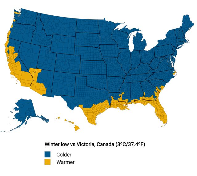
November 25, 2025 at 10:55 AM
Winters in most of the US are colder than they are in Canada's warmest city (Victoria). That's a bumper sticker slogan that should sell well in Victoria?! Source: buff.ly/WsTcKUR
This map shows the share of homes across the US with at least one air conditioner.

November 24, 2025 at 10:49 PM
This map shows the share of homes across the US with at least one air conditioner.
New payment offers (total package) made to Senior Software Engineers (SWE) at the biggest tech companies in the US are juicy! A lot of money to be made. Source: buff.ly/WsTcKUR

November 24, 2025 at 8:42 PM
New payment offers (total package) made to Senior Software Engineers (SWE) at the biggest tech companies in the US are juicy! A lot of money to be made. Source: buff.ly/WsTcKUR
Turns out I knew all (well, except for one) of the biggest German companies by market cap. As a German this is kinda expected though...

November 24, 2025 at 6:38 PM
Turns out I knew all (well, except for one) of the biggest German companies by market cap. As a German this is kinda expected though...
Same phenomenon, different area, different name.

November 24, 2025 at 4:30 PM
Same phenomenon, different area, different name.
He ain't named Sideshow Bob everywhere! Tahiti Bob is kind of a wild name...

November 24, 2025 at 2:26 PM
He ain't named Sideshow Bob everywhere! Tahiti Bob is kind of a wild name...
The UN predicts that as the Australian population continues to grow, the share of people living in the big cities further increases. The share of people living in regional towns continues to drop. The rural / remote population remains stable. Source: buff.ly/rXn3HJP

November 24, 2025 at 10:55 AM
The UN predicts that as the Australian population continues to grow, the share of people living in the big cities further increases. The share of people living in regional towns continues to drop. The rural / remote population remains stable. Source: buff.ly/rXn3HJP
Really cool little map of the Black Sea. Quite a bit of drama in this visual I would say. Source: buff.ly/2ZPPHoo

November 23, 2025 at 10:49 PM
Really cool little map of the Black Sea. Quite a bit of drama in this visual I would say. Source: buff.ly/2ZPPHoo