Sarah Susan Designs
banner
sarahsusandesigns.bsky.social
Sarah Susan Designs
@sarahsusandesigns.bsky.social
4 followers 13 following 38 posts
Design and marketing, made in beautiful Michigan for beautiful you. sarahsusandesigns.com
Posts Media Videos Starter Packs

July 10, 1973, marked the #Bahamas' independence from the #UK and the raising of this fine-looking flag—a black triangle pointing a laser beam of sunlight over aqua waters. Dramatic contrasts and direction—this composition commands the elements. 🇧🇸
#BahamasFlag #FlagDesign #LogoDesign
A nation's flag is its #logo. The flag of #Kazakhstan features a #SteppeEagle flying beneath a sun with 32 rays. Centralized but dynamic, with an uplifting theme. To the side, the #koshkarMuiz bears the standard. All on a turquoise background—what a winner! Learn more: bit.ly/3Kj11Tz
AI Art Critique #3: The sense of depth is fantastic. But the background isn't fading; it's melting, like a nuclear holocaust. Not a good look. Kind of scary.
#VanGogh #StarryNight #LinearPerspective #AerialPerspective #FadeOut #DepthPerception #AI #VisualDesign #ArtIllusions #DepthOfField #AIArt
#AI Art Critique #2: *Why* is this hideous? Because AI split the baby in half, right down the middle. The top is cool and bright; the bottom is warm and murky. Pancaked between them, another dead-center sunset? #Transitions matter.
#composition #DesignCritique #DesignTips #VanGogh #StarryNight
AI Art Critique #1: The focal point is dead center, and not in a good way. (See #DaVinci's Last Supper for a master class in dead-center focal points.) Here, AI draws us into a blob of blobs, pierced unnervingly by the church spire. What else is wrong?
"We can either have democracy in this country or we can have great wealth concentrated in the hands of a few, but we can’t have both." —Louis Brandeis
To everyone who works: #HappyLaborDay!
#Brandeis #WealthDistribution #FairWages #ChildLaborLaws #EightHourWorkday #WorkerSafety #RightToOrganize
Is a tasty morsel enough to get people's attention? No, you need a surprise, a twist, an ironic pivot. That's a hook.
---------------------
#contentWriting #writing #copywriting #writingCopy #ContentDevelopment #SEO #WebWriting #Marketing
Pretty colors aren't a rainbow until they line up in their assigned positions. 🌈 🌈 🌈
----------------------------
#Rainbows #RainbowColors #ROYGBIV #VisibleSpectrum #ColorTips #DesignTips #RainbowOrder #Rainbow
An overcrowded, chaotic composition repels the eye. Make sure your designs include places for the eye to rest. Aren't we all busy enough as it is?
-----------------
#Design #DesignTips #Composition #VisualComposition #RestingSpace #RestingSpot #Rest #NegativeSpace #CleanCompositions #GraphicDesign
#AltText is an attribute added to an image tag in HTML: (your image description) Describing your image provides access for users with low or no vision. Can you skip this step? Sure. But what would your mother say?
sarahsusandesigns.com/
#usability #accessibility #GuiltTrip
If you underline all of your text, you're *emphasizing* none of it. Use capitalization, italics, boldface, and underlining sparingly and only when it really packs a punch.
sarahsusandesigns.com/
-----------------
#emphsais #Typography #graphicDesign #overEmphasis #LessIsMore
Why do cool colors recede while warm colors advance? Because our brains process longer wavelengths of light, like red, more quickly, making us think they're closer to us. Now, how *cool* is that?
sarahsusandesigns.com/
#color #colorTemperature #designTips #VisualCognition
The #GoldenRatio is based on the mathematical #FibonacciSequence, and it defines the logarithmic spirals we see in nature: seashells, flowers, trees, hurricanes, and even galaxies. Use the golden ratio in your own compositions, and you'll see the difference right away.
#GraphicDesign
Color theory in a nutshell: Complements cancel each other out and turn to gray. The more precise the complements, the more neutral the gray.
sarahsusandesigns.com/
#ComplementaryColors #NeutralColors #ColorTheory #DesignTips #DesignElements #Color #ColorScience
I'm glad you like both together! Just sharing some design pointers. This post was about framing and how it impacts our perception. (The bonsais were random, but I'm glad you found you're way here! 🌳)
To contain or not contain, that is the question. Images that *bleed* to the edges surround the viewer's eye, demanding intimacy. Framed images create distance and separation. Which one's better? Both!
sarahsusandesigns.com/
#design #GraphicDesign #Bleeds #FullBleed
Kerning is how we adjust the space between letters. Fonts are not always crafted with optimal spacing. And once you see it, you can't unsee it. Scratch your kerning itch here: type.method.ac/
You're welcome.
#kerning #graphicDesign #design #typography #letterSpacing #KerningGame
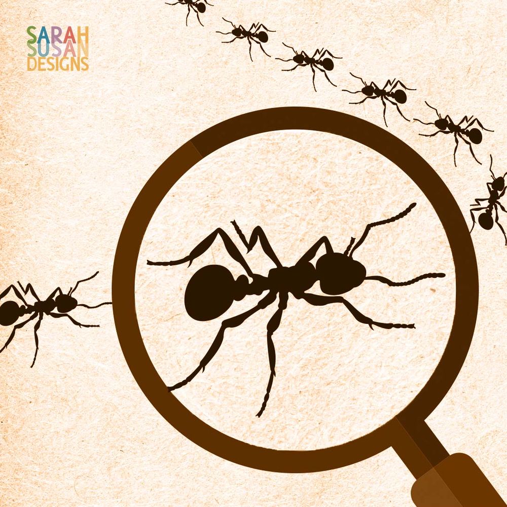
Zooming in on a very small subject transforms our perspective, creating both intimacy and awe. Macro photographers know this!
------------
#composition #scale #Design #DesignTips #VisualDesign #VisualComposition #Macrophotography #Ants
Is your website sending users into a labyrinth from which there is no escape? Being lost is unnerving even without a lurking Minotaur. Structure your website and style your navigation so anyone can find their way.
#webDesign #Usability #WebsiteNavigation #InformationArchitecture
Looking for a writer for a law blog. Must be able to research and write clearly without AI. This is a contract job. See post on LinkedIn: www.linkedin.com/jobs/view/42...
-----------------------
#writers #bloggers #seekingWriter#writersB#bloggersl#seekingWriters
Green means purity and paradise in Islam—unless you're in Indonesia where green clothing can incur the wrath of the Goddess of the Southern Sea. Orange signals royalty in the Netherlands... or mourning in Egypt. When it comes to color, know your audience!
#Color #Culture #Religion #Usability