


𝚖𝚊𝚌𝚔𝚊 𝚜𝚣𝚎𝚌𝚑𝚗𝚘
@mackaszechno.bsky.social
#rstats geospatial data analyst. GIS expert, of a sort. Sci-fi fan and would be writer. Black cat owner. Occasionally apocalyptical. Can't DM.
WORDS ARE QUICK AND WORDS ARE VAIN, THE SINGLE SURE AND FINAL ANSWER MUST BE PAIN. -Dan Simmons, Olympos
WORDS ARE QUICK AND WORDS ARE VAIN, THE SINGLE SURE AND FINAL ANSWER MUST BE PAIN. -Dan Simmons, Olympos
Pinned

Reposted by 𝚖𝚊𝚌𝚔𝚊 𝚜𝚣𝚎𝚌𝚑𝚗𝚘

In R's mapgl package, use `add_image_source()` to add a terra raster to your map, then display it with `add_raster_layer()`.
Drape it over Mapbox's Standard style for built-in 3D!
#30DayMapChallenge Day 29: Raster
Drape it over Mapbox's Standard style for built-in 3D!
#30DayMapChallenge Day 29: Raster
November 29, 2025 at 1:27 PM
In R's mapgl package, use `add_image_source()` to add a terra raster to your map, then display it with `add_raster_layer()`.
Drape it over Mapbox's Standard style for built-in 3D!
#30DayMapChallenge Day 29: Raster
Drape it over Mapbox's Standard style for built-in 3D!
#30DayMapChallenge Day 29: Raster
Reposted by 𝚖𝚊𝚌𝚔𝚊 𝚜𝚣𝚎𝚌𝚑𝚗𝚘

Reposted by 𝚖𝚊𝚌𝚔𝚊 𝚜𝚣𝚎𝚌𝚑𝚗𝚘

#30daymapchallenge | Day 29 Raster | Algal Bloom
Raster isn’t my particular area of cartographic expertise… but here’s a stylization of Sentinel 2 imagery capturing a particularly gnarly algal bloom in May 2023. This particular event led to beach closures quite early in the summer season.
Raster isn’t my particular area of cartographic expertise… but here’s a stylization of Sentinel 2 imagery capturing a particularly gnarly algal bloom in May 2023. This particular event led to beach closures quite early in the summer season.

November 29, 2025 at 1:10 PM
#30daymapchallenge | Day 29 Raster | Algal Bloom
Raster isn’t my particular area of cartographic expertise… but here’s a stylization of Sentinel 2 imagery capturing a particularly gnarly algal bloom in May 2023. This particular event led to beach closures quite early in the summer season.
Raster isn’t my particular area of cartographic expertise… but here’s a stylization of Sentinel 2 imagery capturing a particularly gnarly algal bloom in May 2023. This particular event led to beach closures quite early in the summer season.
Reposted by 𝚖𝚊𝚌𝚔𝚊 𝚜𝚣𝚎𝚌𝚑𝚗𝚘

#30DayMapChallenge
Day 29: Raster
Made a joyplot of Switzerland following @aasmith.bsky.social's instructions.
I'm sure it can be improved but I really like how it looks already!
For anyone interested: antonioantoine.com/2025/11/23/c...
Day 29: Raster
Made a joyplot of Switzerland following @aasmith.bsky.social's instructions.
I'm sure it can be improved but I really like how it looks already!
For anyone interested: antonioantoine.com/2025/11/23/c...

November 29, 2025 at 12:09 PM
#30DayMapChallenge
Day 29: Raster
Made a joyplot of Switzerland following @aasmith.bsky.social's instructions.
I'm sure it can be improved but I really like how it looks already!
For anyone interested: antonioantoine.com/2025/11/23/c...
Day 29: Raster
Made a joyplot of Switzerland following @aasmith.bsky.social's instructions.
I'm sure it can be improved but I really like how it looks already!
For anyone interested: antonioantoine.com/2025/11/23/c...
Faith No More - Sol Invictus
www.youtube.com/watch?v=CcUn...
www.youtube.com/watch?v=CcUn...

Faith No More - Sol Invictus
YouTube video by Ballad2Grave
www.youtube.com
November 28, 2025 at 10:43 PM
Faith No More - Sol Invictus
www.youtube.com/watch?v=CcUn...
www.youtube.com/watch?v=CcUn...
Maybe after Sunday, I can concentrate on either GW2 or my writing once more 🤷♂️
November 28, 2025 at 10:32 PM
Maybe after Sunday, I can concentrate on either GW2 or my writing once more 🤷♂️
Reposted by 𝚖𝚊𝚌𝚔𝚊 𝚜𝚣𝚎𝚌𝚑𝚗𝚘

Day 28 - Black
The Longest Nights (2025)
Polar night (+24 hr night) occurs just beyond the Arctic Circle. This is due to the Earth's gravitational pull on light. The ramp up from just beyond the Arctic Circle 67.4°N (24 hrs) to 67.5°N (11 days) is wild.
#30DayMapChallenge
The Longest Nights (2025)
Polar night (+24 hr night) occurs just beyond the Arctic Circle. This is due to the Earth's gravitational pull on light. The ramp up from just beyond the Arctic Circle 67.4°N (24 hrs) to 67.5°N (11 days) is wild.
#30DayMapChallenge

November 28, 2025 at 9:33 PM
Day 28 - Black
The Longest Nights (2025)
Polar night (+24 hr night) occurs just beyond the Arctic Circle. This is due to the Earth's gravitational pull on light. The ramp up from just beyond the Arctic Circle 67.4°N (24 hrs) to 67.5°N (11 days) is wild.
#30DayMapChallenge
The Longest Nights (2025)
Polar night (+24 hr night) occurs just beyond the Arctic Circle. This is due to the Earth's gravitational pull on light. The ramp up from just beyond the Arctic Circle 67.4°N (24 hrs) to 67.5°N (11 days) is wild.
#30DayMapChallenge
Raster map of West Sussex in England from Ordnance Survey Open Data. 'tis been a long month and I didn't feel like fighting {terra} on this one. Raster map overlaid with vector data representing the border of West Sussex and the 3 relevant OS grid squares.
#30DayMapChallenge | Day 29 - Raster #QGIS
#30DayMapChallenge | Day 29 - Raster #QGIS

November 28, 2025 at 10:00 PM
Raster map of West Sussex in England from Ordnance Survey Open Data. 'tis been a long month and I didn't feel like fighting {terra} on this one. Raster map overlaid with vector data representing the border of West Sussex and the 3 relevant OS grid squares.
#30DayMapChallenge | Day 29 - Raster #QGIS
#30DayMapChallenge | Day 29 - Raster #QGIS
Reposted by 𝚖𝚊𝚌𝚔𝚊 𝚜𝚣𝚎𝚌𝚑𝚗𝚘

Steve Dillon / Kevin Walker

November 28, 2025 at 6:29 PM
Steve Dillon / Kevin Walker
Reposted by 𝚖𝚊𝚌𝚔𝚊 𝚜𝚣𝚎𝚌𝚑𝚗𝚘
Now through Sunday, I'm offering my workshops on this tech at their lowest price ever:
- $50 for this year's series on Modern Web Mapping: walkerdata.gumroad.com/l/modern-map...
- $200 for all workshops given in 2023 and 2024 (22.5 hours of training!): walkerdata.gumroad.com/l/all-worksh...
- $50 for this year's series on Modern Web Mapping: walkerdata.gumroad.com/l/modern-map...
- $200 for all workshops given in 2023 and 2024 (22.5 hours of training!): walkerdata.gumroad.com/l/all-worksh...

Modern Web Mapping Bundle
Modern Web Mapping and High-Performance Shiny Apps BundleGet two workshops with over three hours of instruction and master the complete modern R mapping stack. Learn to create beautiful maps in Worksh...
walkerdata.gumroad.com
November 28, 2025 at 5:10 PM
Now through Sunday, I'm offering my workshops on this tech at their lowest price ever:
- $50 for this year's series on Modern Web Mapping: walkerdata.gumroad.com/l/modern-map...
- $200 for all workshops given in 2023 and 2024 (22.5 hours of training!): walkerdata.gumroad.com/l/all-worksh...
- $50 for this year's series on Modern Web Mapping: walkerdata.gumroad.com/l/modern-map...
- $200 for all workshops given in 2023 and 2024 (22.5 hours of training!): walkerdata.gumroad.com/l/all-worksh...
Reposted by 𝚖𝚊𝚌𝚔𝚊 𝚜𝚣𝚎𝚌𝚑𝚗𝚘

somehow missed @hrbrmstr.dev book on @duckdb.org
Full of great tips, tricks and overview how to use duckdb CLI and r interface
duckdb.hrbrmstr.app
Full of great tips, tricks and overview how to use duckdb CLI and r interface
duckdb.hrbrmstr.app
November 28, 2025 at 1:43 PM
somehow missed @hrbrmstr.dev book on @duckdb.org
Full of great tips, tricks and overview how to use duckdb CLI and r interface
duckdb.hrbrmstr.app
Full of great tips, tricks and overview how to use duckdb CLI and r interface
duckdb.hrbrmstr.app
Reposted by 𝚖𝚊𝚌𝚔𝚊 𝚜𝚣𝚎𝚌𝚑𝚗𝚘

Happy to see new newest member of the #geocompx family up on the geocompx.org website: Spatial Data Visualization with tmap is an awesome book that is still in progress 🏗️ Well worth a read to launch your reproducible map making journey 🚀

November 28, 2025 at 3:24 PM
Happy to see new newest member of the #geocompx family up on the geocompx.org website: Spatial Data Visualization with tmap is an awesome book that is still in progress 🏗️ Well worth a read to launch your reproducible map making journey 🚀
Reposted by 𝚖𝚊𝚌𝚔𝚊 𝚜𝚣𝚎𝚌𝚑𝚗𝚘
#30DayMapChallenge Day 28: Black
In the @Mapbox Standard Style, set the `lightPreset` in the style's basemap config property to "night" for a stunning dark theme.
Try it out with the Standard Satellite style as well!
In the @Mapbox Standard Style, set the `lightPreset` in the style's basemap config property to "night" for a stunning dark theme.
Try it out with the Standard Satellite style as well!


November 28, 2025 at 3:01 PM
#30DayMapChallenge Day 28: Black
In the @Mapbox Standard Style, set the `lightPreset` in the style's basemap config property to "night" for a stunning dark theme.
Try it out with the Standard Satellite style as well!
In the @Mapbox Standard Style, set the `lightPreset` in the style's basemap config property to "night" for a stunning dark theme.
Try it out with the Standard Satellite style as well!
Reposted by 𝚖𝚊𝚌𝚔𝚊 𝚜𝚣𝚎𝚌𝚑𝚗𝚘

Starring in a few minutes: It’s QGIS Open Day today! 🎉 Don’t miss our two awesome talks. Grab all links and info on the wiki: https://github.com/qgis/QGIS/wiki/QOD-November-2025
#qgis #gischat
#qgis #gischat

QOD November 2025
QGIS is a free, open source, cross platform (lin/win/mac) geographical information system (GIS) - qgis/QGIS
github.com
November 28, 2025 at 1:38 PM
Starring in a few minutes: It’s QGIS Open Day today! 🎉 Don’t miss our two awesome talks. Grab all links and info on the wiki: https://github.com/qgis/QGIS/wiki/QOD-November-2025
#qgis #gischat
#qgis #gischat
Reposted by 𝚖𝚊𝚌𝚔𝚊 𝚜𝚣𝚎𝚌𝚑𝚗𝚘

🔍 David O’Sullivan explores how to generate random points on the globe in R -- from uniform random to Halton sequences and blue-noise sampling.
Read more: dosull.github.io/posts/2025-0...
#RStats #RSpatial #GISchat
Read more: dosull.github.io/posts/2025-0...
#RStats #RSpatial #GISchat


November 25, 2025 at 2:04 PM
🔍 David O’Sullivan explores how to generate random points on the globe in R -- from uniform random to Halton sequences and blue-noise sampling.
Read more: dosull.github.io/posts/2025-0...
#RStats #RSpatial #GISchat
Read more: dosull.github.io/posts/2025-0...
#RStats #RSpatial #GISchat
Reposted by 𝚖𝚊𝚌𝚔𝚊 𝚜𝚣𝚎𝚌𝚑𝚗𝚘

{BlackMarbleR} is a R package that provides a simple way to use nighttime lights data from NASA’s Black Marble.
#rstats
#rstats
Black Marble Data and Statistics
Geographically referenced data and statistics of nighttime lights from NASA Black Marble <https://blackmarble.gsfc.nasa.gov/>.
worldbank.github.io
November 28, 2025 at 1:33 PM
{BlackMarbleR} is a R package that provides a simple way to use nighttime lights data from NASA’s Black Marble.
#rstats
#rstats
Reposted by 𝚖𝚊𝚌𝚔𝚊 𝚜𝚣𝚎𝚌𝚑𝚗𝚘
Day 28 #30DayMapChallenge - Night time lights
How did night time lights compare in North Korea and its neighbours during October 2025?
I used the {blackmarbleR} for this one and it's great package. Instructions in how to access (and more) are linked in the first reply.
#rstats #dataviz #gischat
How did night time lights compare in North Korea and its neighbours during October 2025?
I used the {blackmarbleR} for this one and it's great package. Instructions in how to access (and more) are linked in the first reply.
#rstats #dataviz #gischat

November 28, 2025 at 1:33 PM
Day 28 #30DayMapChallenge - Night time lights
How did night time lights compare in North Korea and its neighbours during October 2025?
I used the {blackmarbleR} for this one and it's great package. Instructions in how to access (and more) are linked in the first reply.
#rstats #dataviz #gischat
How did night time lights compare in North Korea and its neighbours during October 2025?
I used the {blackmarbleR} for this one and it's great package. Instructions in how to access (and more) are linked in the first reply.
#rstats #dataviz #gischat
Reposted by 𝚖𝚊𝚌𝚔𝚊 𝚜𝚣𝚎𝚌𝚑𝚗𝚘

Lights off, brightness up, it’s #30DayMapChallenge day 28: Black
Try it here: erw.one/apps/30DMC/b...
Try it here: erw.one/apps/30DMC/b...
November 28, 2025 at 12:38 PM
Lights off, brightness up, it’s #30DayMapChallenge day 28: Black
Try it here: erw.one/apps/30DMC/b...
Try it here: erw.one/apps/30DMC/b...
Reposted by 𝚖𝚊𝚌𝚔𝚊 𝚜𝚣𝚎𝚌𝚑𝚗𝚘

ICYMI: this week, the #Copernicus Sentinel-5 instrument aboard EUMETSAT’s Metop-SGA1 released its first images - and this global view of ozone is our image of the week!
The image shows a map of global ozone, and the hole in stratospheric ozone above Antarctica.
Find out more ➡️ bit.ly/4pEWN8o
The image shows a map of global ozone, and the hole in stratospheric ozone above Antarctica.
Find out more ➡️ bit.ly/4pEWN8o

November 28, 2025 at 11:30 AM
ICYMI: this week, the #Copernicus Sentinel-5 instrument aboard EUMETSAT’s Metop-SGA1 released its first images - and this global view of ozone is our image of the week!
The image shows a map of global ozone, and the hole in stratospheric ozone above Antarctica.
Find out more ➡️ bit.ly/4pEWN8o
The image shows a map of global ozone, and the hole in stratospheric ozone above Antarctica.
Find out more ➡️ bit.ly/4pEWN8o
Firefly map of West Sussex in England, showing areas of light pollution
#30DayMapChallenge | Day 28 - Dark #rstats
(code in reply)
#30DayMapChallenge | Day 28 - Dark #rstats
(code in reply)

November 28, 2025 at 8:45 AM
Firefly map of West Sussex in England, showing areas of light pollution
#30DayMapChallenge | Day 28 - Dark #rstats
(code in reply)
#30DayMapChallenge | Day 28 - Dark #rstats
(code in reply)
Reposted by 𝚖𝚊𝚌𝚔𝚊 𝚜𝚣𝚎𝚌𝚑𝚗𝚘
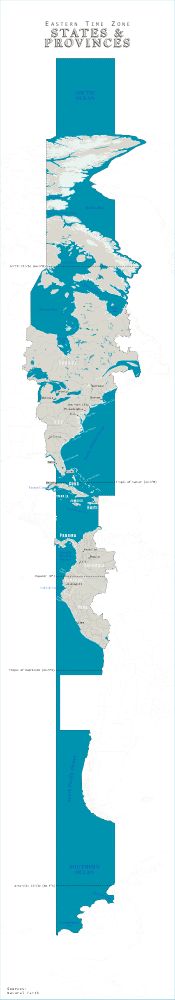
Day 27 - Boundaries
EST States & Provinces
How many states and provinces share the same time zone as Rhode Island?
#30DayMapChallenge
EST States & Provinces
How many states and provinces share the same time zone as Rhode Island?
#30DayMapChallenge
November 27, 2025 at 6:58 PM
Day 27 - Boundaries
EST States & Provinces
How many states and provinces share the same time zone as Rhode Island?
#30DayMapChallenge
EST States & Provinces
How many states and provinces share the same time zone as Rhode Island?
#30DayMapChallenge
Reposted by 𝚖𝚊𝚌𝚔𝚊 𝚜𝚣𝚎𝚌𝚑𝚗𝚘
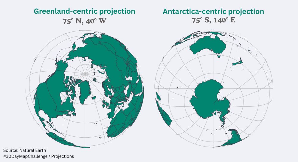
#30DayMapChallenge 19 Projections
šis ir mēģinājums izveidot savu koordinātu sistēmu, imitējot ierasto Rietumu/Austrumu puslodes skatu un centrā liekot Grenlandi un Antarktīdu
šis ir mēģinājums izveidot savu koordinātu sistēmu, imitējot ierasto Rietumu/Austrumu puslodes skatu un centrā liekot Grenlandi un Antarktīdu
November 27, 2025 at 7:16 PM
#30DayMapChallenge 19 Projections
šis ir mēģinājums izveidot savu koordinātu sistēmu, imitējot ierasto Rietumu/Austrumu puslodes skatu un centrā liekot Grenlandi un Antarktīdu
šis ir mēģinājums izveidot savu koordinātu sistēmu, imitējot ierasto Rietumu/Austrumu puslodes skatu un centrā liekot Grenlandi un Antarktīdu
Reposted by 𝚖𝚊𝚌𝚔𝚊 𝚜𝚣𝚎𝚌𝚑𝚗𝚘

November 27, 2025 at 4:59 PM


Reposted by 𝚖𝚊𝚌𝚔𝚊 𝚜𝚣𝚎𝚌𝚑𝚗𝚘
The world's time zones visualized on a spinnable, interactive globe.
Try out the code - it'll default to your current time zone and show you times around the world!
#30DayMapChallenge Day 27: Boundaries
Code: gist.github.com/walkerke/c4a...
Try out the code - it'll default to your current time zone and show you times around the world!
#30DayMapChallenge Day 27: Boundaries
Code: gist.github.com/walkerke/c4a...
November 27, 2025 at 2:28 PM
The world's time zones visualized on a spinnable, interactive globe.
Try out the code - it'll default to your current time zone and show you times around the world!
#30DayMapChallenge Day 27: Boundaries
Code: gist.github.com/walkerke/c4a...
Try out the code - it'll default to your current time zone and show you times around the world!
#30DayMapChallenge Day 27: Boundaries
Code: gist.github.com/walkerke/c4a...