Fabio Sasso
abduzeedo.bsky.social
Fabio Sasso
@abduzeedo.bsky.social
New blog post: London Type Foundry taps Ian Ritchie for two fresh faces
London Type Foundry taps Ian Ritchie for two fresh faces
London Type Foundry taps Ian Ritchie for two fresh faces ibby 11/10 — 2025 London Type Foundry launches IR Lüthold Sans and IR Lüthold Sans Text by Ian Ritchie—two DIN-inspired typefaces crafted for branding, editorial design, and digital typography with precision and modern character. Big news from London Type: the foundry just rolled out the typographic red carpet for Ian Ritchie, former partner at Jones Knowles Ritchie and he didn’t arrive empty-handed. Call it a JKR → LTF evolution with serious typographic pedigree. Ritchie drops not one but two new type families, each rooted in the structured beauty of DIN 1451 and lovingly engineered into something sharper, cooler, and decidedly contemporary. Meet The Typefaces: IR Lüthold Sans Born from Ritchie’s art-school sign-writing days in the ’70s (yes, analog hustle!), IR Lüthold Sans carries industrial DNA with graphic finesse. Think DIN meets design-studio swagger: condensed proportions, authoritative stance, and those delicious ink traps and high-contrast spines that give it both precision and personality. 12 styles, italics across the board, and enough weights to take your headline hierarchy from whisper to thunder. Also Introducing its Softer-Spoken Sibling: IR Lüthold Sans Text Every hero needs a partner. Enter IR Lüthold Sans Text, same lineage, re-tuned for warmth, rhythm, and reliable long-form readability. Where Lüthold Sans brings the billboard energy, Text handles the captions, UI labels, decks, and paragraphs without breaking a sweat. Slightly wider, lower contrast strokes, and optimized for keeping the eyes happy. A dynamic duo: one makes the statement, the other keeps the story moving. A Collaboration with Heritage Originally sketched by Ritchie and refined alongside Paul Harpin (and once cheekily named “Günther!” — we love a font with lore), Lüthold continues a lineage of real-world utility elevated by designer sensibility. This is industrial heritage rebuilt for modern brand systems, editorial layouts, and identity work that requires both muscle and finesse. New Fonts, New site, Same impeccable taste Both families debut exclusively on London Type Foundry’s freshly redesigned site that boasts a clean, confident platform worthy of its roster. IR Lüthold Sans & IR Lüthold Sans Text now live at londontype.co.uk. Go forth and kern responsibly.
dlvr.it
November 10, 2025 at 7:15 PM
In case you missed it: New blog post: Fight for Kindness 2025 — Explore the Global Poster Gallery
Fight for Kindness 2025 — Explore the Global Poster Gallery
Fight for Kindness 2025 — Explore the Global Poster Gallery ibby 11/04 — 2025 See how designers worldwide reinterpret kindness through typography in the Fight for Kindness 2025 gallery — a creative call for empathy and inclusion.  Every typeface, every letter spool, every bold headline has the power to influence how we feel and how we act. That’s the core idea behind Fight for Kindness 2025, a global typographic initiative by TypeCampus in partnership with Zetafonts. The 2025 Poster Gallery is now live. What’s happening The Fight for Kindness 2025 poster gallery is now live bringing together a global community of designers using typography as a tool for empathy and connection. This edition showcases expressive type experiments, cultural scripts, motion-inspired forms, and bold visual storytelling, all created in celebration of World Kindness Day on November 13. Alongside the online showcase, exhibitions will roll out in cities worldwide, inviting creatives to reflect on how design can shift culture in subtle and meaningful ways. Organized as a non-profit creative initiative, the project remains open to anyone who believes in design as a force for generosity, inclusion, and shared humanity. Why this matters For designers and creatives, Fight for Kindness represents more than a poster competition. It offers: A platform for social impact through visual culture where letterforms become vehicles of change. A chance to see global voices, across scripts, languages and regions, offering perspectives that often go under-represented. A timely moment: art meets advocacy as the world marks a day dedicated to kindness. How you can engage Take a moment to dive into the full gallery and share the works that resonate most. Consider how scale, spacing, color, and form turn typography into a vessel for emotion and meaning. Let these pieces seep into your own creative practice, whether you’re designing, teaching, or sparking conversation in your community. And with November 13 on the horizon, keep an eye out for local exhibitions so you can experience this global celebration of kindness and design in person. Yypography isn’t just about what you read, it’s about what you feel. The Fight for Kindness 2025 gallery invites us to feel and then act. Abduzeedo’s Favorite Posters from Fight for Kindness 2025
dlvr.it
November 9, 2025 at 8:51 PM
In case you missed it: New blog post: Danish Football Branding: Identity and Visuals
Danish Football Branding: Identity and Visuals
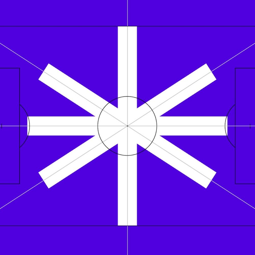
Danish Football Branding: Identity and Visuals abduzeedo 11/04 — 2025 The Danish women's football league new branding for its visual identity and branding to elevate the sport and focus on the game. Globally, women’s football is growing in popularity. In 2024, it was deemed to be the most valuable women's sport in the world with an estimated global yearly revenue of €500+ million. Danish clubs also benefit from this international trend. So much so, the association behind the Danish women’s football league decided to embark on a rebrand to support this national growth and ambition. "Our most important task is to further accelerate the development of elite women's football in Denmark. This requires a significant amount of money. Therefore, our success depends on making elite women's football much more attractive, not least to sponsors. In this context, we decided to do something about the names of our leagues and our visual identity, so that we could better match our product and ambition," says Marie Greve, director of the League Association, formerly the Women's Division Association. To help with this rebrand, NORD ID’s Copenhagen team was brought on to explore and develop the new chapter for the association. New focus, new name Despite increasing global interest, NORD ID had to understand the local context and perception. Through market analysis and interviews, the team and association understood they had to reevaluate how they wanted the league to be perceived moving forward. “For too long, Danish women’s football has been standing in the shadow of men’s football,” explains Frederik Sommer, COO at NORD ID. “Not intentional, but because of how it’s been framed. We built a naming system that is intuitive and helps elevate the entire league. The focus should be on the game, not the gender.” The result was to remove the gendered part of the name. The entire division has been renamed from “Women’s Division Association" (in Danish, Kvindedivisionsforeningen) to “the League Association" (Ligaforbundet). Each division has also been renamed from “Women’s League” (Kvindeligaen), 1st division and 2nd division to now being called “Division A”, “Division B division” and “Division C” (A-Liga, B-Liga, C-Liga). “We don’t want to position the Danish women’s soccer league as a derivative of the men’s league. It’s the complete opposite of The Champions League and The Women’s Champions League. We deliberately chose to move away from a gendered name to ensure that the league stands on its own, that it’s an independent and proud brand,” Frederik Sommer sums up. Motion and emotion in a modular system Each and every match is an epos, emotions playing out on the field. NORD ID brought this intensity and passion into a new visual identity for the association and league. “The lines and angles on the pitch inspired a new symbol, an asterisk,” explains Michael Mandrup, Design Director at NORD ID. “It serves as a recognizable focal point in a simple and modular design system that unifies the look and provides flexibility in use.” The straight lines also inspired the typeface, custom-made for A-ligaen. Together with Danish type designer Trine Rask, NORD ID developed a monospaced typeface which unites functionality and character. A brand element that will help build consistency and identity across all touchpoints, like websites, social media and TV. The new identity is live across websites and social media, implemented by the association itself. Branding and visual identity artifacts
dlvr.it
November 9, 2025 at 5:28 PM
In case you missed it: New blog post: Café Olimpico Heritage Tin: Packaging Design Meets Montréal Soul
Café Olimpico Heritage Tin: Packaging Design Meets Montréal Soul
Café Olimpico Heritage Tin: Packaging Design Meets Montréal Soul ibby 11/03 — 2025 Montréal’s Café Olimpico celebrates its legacy with the Heritage Tin, a vintage-inspired packaging design by stnmtl capturing Italian craft and community spirit. If you’ve ever been to Montréal, your must-do list probably looks something like this: bagels from St-Viateur, smoked meat from Schwartz’s, and an espresso from Café Olimpico. Established in 1970 by Italian immigrant Rocco Furfaro, Café Olimpico began as a neighborhood hangout where Rocco and his friends could watch La Liga matches. Over five decades later, it’s become a cultural institution, a place where coffee, community, and conversation blend as seamlessly as the crema on your espresso. The Mile End café’s charm isn’t just in the coffee. It’s in the atmosphere, the laughter, the walls layered with stories, and that unmistakable warmth that makes even first-time visitors feel like regulars. So the question became: how do you capture that history, that feeling, in an object? A Tin Steeped in Heritage Enter stnmtl, the Montréal-based creative studio behind one of their favorite projects to date — the Café Olimpico Heritage Tin. This limited-edition release pays homage to the vintage Italian coffee tins you’d find in every Nonna’s kitchen, a testament to Italian craft, storytelling, and timeless design. Every detail of the tin is rooted in the café’s architecture and history. The studio drew inspiration from the ornamental ceilings, wood engravings, and interior flourishes that define Olimpico’s space. The result is an intricate, tactile object that feels both nostalgic and new — a collectible piece of design that literally contains the spirit of the café. “We literally took everything that made the café, and put it in a tin — in traditional Italian fashion,” says the team at stnmtl. Design Meets Memory Beyond its beauty, the Heritage Tin is an exercise in storytelling through design. Each curve, emboss, and typographic detail is a celebration of cultural legacy aka Italian roots meeting Montréal soul. Since its release, the tin has become Café Olimpico’s best-selling product, cherished by both locals and tourists eager to bring a piece of the city, and its coffee culture, home. Available online and at all four Café Olimpico locations, the tin has quickly become more than packaging. It’s a design object that captures time, place, and community, brewed with care, layered with memory, and sealed with affection. Design by: stnmtl Client: Café Olimpico Photography: Courtesy of stnmtl / Café Olimpico
dlvr.it
November 8, 2025 at 6:45 PM
In case you missed it: New blog post: Dalziel & Pow and Pixel Artworks Reimagine the Guinness Yeast Room Through Experiential Design
Dalziel & Pow and Pixel Artworks Reimagine the Guinness Yeast Room Through Experiential Design
Dalziel & Pow and Pixel Artworks Reimagine the Guinness Yeast Room Through Experiential Design ibby 11/03 — 2025 When design meets storytelling, the result can be something close to alchemy and few places celebrate that magic better than the Guinness Storehouse in Dublin. This year, the landmark attraction celebrates its 25th anniversary with a reimagined Yeast Room, an immersive new experience designed by Dalziel & Pow in collaboration with Pixel Artworks. Part of the Storehouse’s acclaimed Ingredients Experience, the Yeast Room transforms one of Guinness’s most essential, yet invisible, ingredients into an environment that feels alive, mysterious, and quietly scientific. An Ingredient Reimagined Guinness yeast is legendary, a direct descendant of the strain first stored in the Guinness Yeast Library in 1903, known for giving the stout its signature depth and flavor. The new Yeast Room celebrates this hidden hero through a mix of digital art, sensory storytelling, and spatial design. Visitors are introduced to the space through a corridor of glowing screens that share stories of the scientists and brewers who care for the yeast and reveal that, to this day, it’s stored in liquid nitrogen at the St. James’s Gate brewery. Inside, the experience becomes truly immersive. Four synchronized projectors create a circular focal point representing a petri dish, a living, moving digital organism that responds to the presence of visitors. As guests walk through the projection, sensors translate their movement into rippling patterns of motion, allowing them to “move” budding yeast cells with a gesture. Above, mirrored ceilings extend the illusion, while digital fog, ambient lighting, and subtle sound and scent cues envelop the senses. It’s science through the lens of storytelling — equal parts educational and enchanting. Design as Discovery For Sarah Fairhurst, Design Director at Dalziel & Pow, the challenge was to make the unseen both visible and emotional: “With the Yeast Room, we wanted to transform an invisible but vital ingredient into a truly memorable experience. Yeast is the soul of Guinness, and our aim was to capture its mystery, science, and legacy through immersive storytelling that’s as playful as it is meaningful.” That balance of playfulness and depth defines the space. The room is both installation and laboratory — a hands-on design experience that invites participation, reflection, and yes, the occasional selfie (thanks to the mirrored ceiling). Technology That Breathes Pixel Artworks, known for creating environments that blend digital craft and emotion, used Notch and TouchDesigner to build a real-time system of generative visuals. “We wanted to create a living, breathing real-time system of yeast in liquid nitrogen; something as delicate as it is dynamic,” says Riaz Farooq, Senior Creative Director at Pixel Artworks. “Our aim was to make the science not just visible, but immersive and tangible.” By combining multi-projector mapping with motion tracking, the installation achieves an uncanny sense of tactility, as if visitors are floating through a living culture, suspended in nitrogen and light. A Living Tribute to Craft For a brand so deeply tied to craft and chemistry, the Yeast Room is both an homage and a metaphor: a space where invisible processes are made visible through the language of design. The project extends the legacy of the Guinness Storehouse as a place where history, innovation, and storytelling converge, now reimagined for a generation raised on interactivity and immersion. Design by: Dalziel & Pow Collaboration with: Pixel Artworks Photography: Courtesy of Guinness Storehouse / Dalziel & Pow
dlvr.it
November 8, 2025 at 6:04 PM
New blog post: Bellissimo gives Lavazza’s Tablì a bold new identity, reimagining the coffee ritual
Bellissimo gives Lavazza’s Tablì a bold new identity, reimagining the coffee ritual
Bellissimo gives Lavazza’s Tablì a bold new identity, reimagining the coffee ritual ibby 11/07 — 2025 Bellissimo designs Lavazza’s Tablì system—100% coffee tabs with no capsules. Debuted at Milan Design Week 2025, the identity blends clarity, sustainability, and Italian design. Lavazza introduces Tablì, a system that replaces single-use capsules with compostable tabs made of 100% coffee, no foil, no plastic, just pure ground coffee pressed into precise discs. It’s a quiet but meaningful shift toward cleaner design and cleaner consumption. Design First, Sustainability Forward Unveiled at Milan Design Week 2025, Tablì represents a rethink of the home coffee ritual. The visual identity, led by Turin-based studio Bellissimo, balances innovation and restraint. The tab, the core product, becomes the organizing shape for the entire identity system, signaling the product’s purpose with both clarity and confidence. This structure delivers immediate recognition and a visual hierarchy that makes sense at a glance. The tab silhouette drives the layout across SKUs. * Upper band: Lavazza and Tablì on crisp white   * Lower band: Bold, clean blocks of color for each blend   * Inside the tab: The message “100% coffee” — a direct statement of intent   A Typographic Accent With Purpose The logotype’s accent mark becomes a flexible brand signal, shifting color across the line to drive product differentiation. Paired with a black-on-white core palette and Lavazza’s signature gold, the system cuts through crowded shelves while maintaining brand heritage. An Ecosystem Designed With Restraint Machine, tabs, and accessories share one visual language — refined, minimal, timeless. Rather than shouting “innovation,” the design sits with quiet confidence, reflecting trust between Lavazza and Bellissimo, whose decade-long collaboration includes the restyling of Qualità Oro. Where Tradition Meets Future As Tablì expands globally, Bellissimo continues to shape the system’s evolution, a union of design, sustainability, and ritual for a modern coffee experience rooted in Italian heritage. Original project: Bellissimo — https://bellissimo.it/projects/tabli/
dlvr.it
November 7, 2025 at 5:27 PM
New blog post: Trellis Rebrand by How&How: A New Digital Blueprint for Generational Healthcare
Trellis Rebrand by How&How: A New Digital Blueprint for Generational Healthcare
Trellis Rebrand by How&How: A New Digital Blueprint for Generational Healthcare ibby 11/06 — 2025 Trellis rebrand by How&How reimagines generational healthcare with a thoughtful identity, modular grid system, and human-first visuals designed to bring clarity to motherhood and medical history. Design can clarify chaos. And if there’s a category begging for clarity it’s healthcare. Especially the part quietly powered by moms. In the US, nine out of ten mothers manage their family’s medical history in Apple Notes. Not because they want to but because the system leaves them nowhere else to put it. Records scattered across states. Insurance portals that feel like escape rooms. A data trail so fragmented it almost guarantees something gets lost along the way. Enter Trellis, a new platform designed to organize and preserve generational health built for the realities of mothers today, and the families who come after them. London- and LA-based studio How&How partnered with Trellis to craft a brand and interface that honors complexity without letting it overwhelm. A Framework for Life The identity starts with structure — a flexible, modular grid that becomes a quiet stage for stories, data, and personal detail. It grows and shifts like family life itself, a system that adapts instead of forcing users to. Soft-toned, natural photography grounds the platform in real families — pregnancy, postpartum, and the everyday chapters in between. It’s not stock photo perfect; it’s honest, warm, human. Look closely and you’ll find a fingerprint motif threaded throughout, a subtle reminder that medical data isn’t abstract — it’s personal. It also shapes the new Trellis mark, a fingerprint swirl forming a hidden “T”, anchoring the identity in this idea of personal legacy. Tone with Tender Strength Trellis introduces a voice borrowed from midwives — grounded, direct, fearless, and empathetic. It’s design language that knows when to soften and when to tell the truth with clarity. No sugar-coating, no jargon, no confusion. The result is a platform that feels equal parts medical vault and emotional archive — a place where data becomes continuity, memory, and future planning. A Brand That Stands Up to the System “For mothers today and generations to come” isn’t just a line. With Trellis, generational health becomes something that isn’t just hoped for, but designed for. A rare example of healthcare tech where the branding is as thoughtful as the mission. Mother of all healthcare apps. Explore the full case study: Explore the full project here: how.studio/branding/trellis
dlvr.it
November 6, 2025 at 9:25 PM
In case you missed it: New blog post: Ghosts of Design Past: The Eames Gauze Study and the Art of the In-Between
Ghosts of Design Past: The Eames Gauze Study and the Art of the In-Between
Ghosts of Design Past: The Eames Gauze Study and the Art of the In-Between ibby 10/31 — 2025 Celebrate Halloween with the Eames Gauze Study, a hauntingly beautiful look at form, material, and process from design legends Charles and Ray Eames. To celebrate Halloween here in the U.S., we’re summoning a design experiment that perfectly balances form, material, and mystery: the Gauze Study for Side Shell by Charles and Ray Eames. Preserved in the Eames Institute collection, this piece feels like the spirit of design itself. Translucent, delicate, and suspended between idea and object, it’s as if a ghostly chair materialized mid-thought, whispering clues about the creative process. Ray and Charles Eames were never ones to design from a distance. They preferred to think through making, prototyping directly with their hands, testing ideas in real time. They built everything from small mock-ups to full-scale models like this one. Formed from a gauzy textile that stiffened as it dried, the study was a material experiment — an exploration of what shape could emerge when you let the process lead. By watching what the material could and couldn’t do, the Eameses let design evolve naturally, each discovery informing the next. The result? A chair that seems to hover between states — part idea, part apparition. Halloween Meets Mid-Century Modern Look closer and you’ll see it: the gauze draped like a shroud, the skeletal frame beneath, the way shadows cling to every curve. It’s mid-century modern by way of the supernatural, a ghost of innovation made visible. The gauze isn’t just a surface; it’s the residue of an idea, caught in the moment before it solidified. What We Learn Material as Medium: The Eameses didn’t force their materials into form they learned from them. The gauze wasn’t decorative; it was instructive. Process as Presence: Every fold, wrinkle, and tension mark is a record of curiosity. It’s what happens when you let making be a form of thinking. The Beauty of the In-Between: Like Halloween itself, the Gauze Study celebrates what’s ephemeral, the in-between phase where imagination meets matter. So as you carve pumpkins or tweak your latest prototype, take a cue from the Eameses: embrace the ghostly, the uncertain, the not-yet-finished. Happy Halloween from the Abduzeedo design fam and may your ideas take shape in mysterious and beautiful ways! 
dlvr.it
November 5, 2025 at 9:55 PM
New blog post: Fight for Kindness 2025 — Explore the Global Poster Gallery
Fight for Kindness 2025 — Explore the Global Poster Gallery
Fight for Kindness 2025 — Explore the Global Poster Gallery ibby 11/04 — 2025 See how designers worldwide reinterpret kindness through typography in the Fight for Kindness 2025 gallery — a creative call for empathy and inclusion.  Every typeface, every letter spool, every bold headline has the power to influence how we feel and how we act. That’s the core idea behind Fight for Kindness 2025, a global typographic initiative by TypeCampus in partnership with Zetafonts. The 2025 Poster Gallery is now live. What’s happening The Fight for Kindness 2025 poster gallery is now live bringing together a global community of designers using typography as a tool for empathy and connection. This edition showcases expressive type experiments, cultural scripts, motion-inspired forms, and bold visual storytelling, all created in celebration of World Kindness Day on November 13. Alongside the online showcase, exhibitions will roll out in cities worldwide, inviting creatives to reflect on how design can shift culture in subtle and meaningful ways. Organized as a non-profit creative initiative, the project remains open to anyone who believes in design as a force for generosity, inclusion, and shared humanity. Why this matters For designers and creatives, Fight for Kindness represents more than a poster competition. It offers: A platform for social impact through visual culture where letterforms become vehicles of change. A chance to see global voices, across scripts, languages and regions, offering perspectives that often go under-represented. A timely moment: art meets advocacy as the world marks a day dedicated to kindness. How you can engage Take a moment to dive into the full gallery and share the works that resonate most. Consider how scale, spacing, color, and form turn typography into a vessel for emotion and meaning. Let these pieces seep into your own creative practice, whether you’re designing, teaching, or sparking conversation in your community. And with November 13 on the horizon, keep an eye out for local exhibitions so you can experience this global celebration of kindness and design in person. Yypography isn’t just about what you read, it’s about what you feel. The Fight for Kindness 2025 gallery invites us to feel and then act. Abduzeedo’s Favorite Posters from Fight for Kindness 2025
dlvr.it
November 4, 2025 at 8:50 PM
New blog post: Danish Football Branding: Identity and Visuals
Danish Football Branding: Identity and Visuals
Danish Football Branding: Identity and Visuals abduzeedo 11/04 — 2025 The Danish women's football league new branding for its visual identity and branding to elevate the sport and focus on the game. Globally, women’s football is growing in popularity. In 2024, it was deemed to be the most valuable women's sport in the world with an estimated global yearly revenue of €500+ million. Danish clubs also benefit from this international trend. So much so, the association behind the Danish women’s football league decided to embark on a rebrand to support this national growth and ambition. "Our most important task is to further accelerate the development of elite women's football in Denmark. This requires a significant amount of money. Therefore, our success depends on making elite women's football much more attractive, not least to sponsors. In this context, we decided to do something about the names of our leagues and our visual identity, so that we could better match our product and ambition," says Marie Greve, director of the League Association, formerly the Women's Division Association. To help with this rebrand, NORD ID’s Copenhagen team was brought on to explore and develop the new chapter for the association. New focus, new name Despite increasing global interest, NORD ID had to understand the local context and perception. Through market analysis and interviews, the team and association understood they had to reevaluate how they wanted the league to be perceived moving forward. “For too long, Danish women’s football has been standing in the shadow of men’s football,” explains Frederik Sommer, COO at NORD ID. “Not intentional, but because of how it’s been framed. We built a naming system that is intuitive and helps elevate the entire league. The focus should be on the game, not the gender.” The result was to remove the gendered part of the name. The entire division has been renamed from “Women’s Division Association" (in Danish, Kvindedivisionsforeningen) to “the League Association" (Ligaforbundet). Each division has also been renamed from “Women’s League” (Kvindeligaen), 1st division and 2nd division to now being called “Division A”, “Division B division” and “Division C” (A-Liga, B-Liga, C-Liga). “We don’t want to position the Danish women’s soccer league as a derivative of the men’s league. It’s the complete opposite of The Champions League and The Women’s Champions League. We deliberately chose to move away from a gendered name to ensure that the league stands on its own, that it’s an independent and proud brand,” Frederik Sommer sums up. Motion and emotion in a modular system Each and every match is an epos, emotions playing out on the field. NORD ID brought this intensity and passion into a new visual identity for the association and league. “The lines and angles on the pitch inspired a new symbol, an asterisk,” explains Michael Mandrup, Design Director at NORD ID. “It serves as a recognizable focal point in a simple and modular design system that unifies the look and provides flexibility in use.” The straight lines also inspired the typeface, custom-made for A-ligaen. Together with Danish type designer Trine Rask, NORD ID developed a monospaced typeface which unites functionality and character. A brand element that will help build consistency and identity across all touchpoints, like websites, social media and TV. The new identity is live across websites and social media, implemented by the association itself. Branding and visual identity artifacts
dlvr.it
November 4, 2025 at 5:27 PM
In case you missed it: New blog post: Agentic AI in Adobe: A New Chapter in Creative Workflows
Agentic AI in Adobe: A New Chapter in Creative Workflows
Agentic AI in Adobe: A New Chapter in Creative Workflows ibby 10/29 — 2025 At Adobe MAX 2025, Adobe unveiled agentic AI assistants across its apps, introducing conversational tools that transform how creatives design and collaborate.  This week at Adobe MAX 2025, Adobe unveiled significant AI innovations designed to redefine the entire creative process, from concept to content. Among the most notable is the introduction of agentic AI across its suite of apps. This shift brings conversational experiences to Adobe tools like creative assistants that respond to natural language prompts, helping anyone create using their own words. Why this matters for designers For seasoned creatives, this isn’t about replacing skill but rather speed, flow, and exploration. Imagine asking: “Give me five variations of this logo with subtle typography tweaks.”   “Clean up the audio on this clip and match it to the tone of the soundtrack.”   “Recolor this moodboard with a palette inspired by Bauhaus posters.”   The assistant can handle the technical lift, freeing you to refine, curate, and push the craft further. A wider creative audience Adobe’s move also lowers the barrier for those outside traditional design circles, like yours truly. With conversational AI, non-designers can experiment, prototype, and communicate visually without mastering complex interfaces. That inclusivity could spark entirely new creative communities and ease collaboration cross-functionally. Our take Abduzeedo has always been about design inspiration and tools that expand what’s possible. Agentic AI feels like one of those pivotal shifts, where technology not only improves workflows but also reshapes how we think about authorship, collaboration, and design’s role in everyday life. We’ll be following how these assistants roll out across Adobe apps. If you’ve worked with AI in your own projects, you already know the balance of excitement and caution it brings.  With Adobe’s ecosystem, this moment feels especially worth watching.
dlvr.it
November 4, 2025 at 6:21 AM
New blog post: Café Olimpico Heritage Tin: Packaging Design Meets Montréal Soul
Café Olimpico Heritage Tin: Packaging Design Meets Montréal Soul
Café Olimpico Heritage Tin: Packaging Design Meets Montréal Soul ibby 11/03 — 2025 Montréal’s Café Olimpico celebrates its legacy with the Heritage Tin, a vintage-inspired packaging design by stnmtl capturing Italian craft and community spirit. If you’ve ever been to Montréal, your must-do list probably looks something like this: bagels from St-Viateur, smoked meat from Schwartz’s, and an espresso from Café Olimpico. Established in 1970 by Italian immigrant Rocco Furfaro, Café Olimpico began as a neighborhood hangout where Rocco and his friends could watch La Liga matches. Over five decades later, it’s become a cultural institution, a place where coffee, community, and conversation blend as seamlessly as the crema on your espresso. The Mile End café’s charm isn’t just in the coffee. It’s in the atmosphere, the laughter, the walls layered with stories, and that unmistakable warmth that makes even first-time visitors feel like regulars. So the question became: how do you capture that history, that feeling, in an object? A Tin Steeped in Heritage Enter stnmtl, the Montréal-based creative studio behind one of their favorite projects to date — the Café Olimpico Heritage Tin. This limited-edition release pays homage to the vintage Italian coffee tins you’d find in every Nonna’s kitchen, a testament to Italian craft, storytelling, and timeless design. Every detail of the tin is rooted in the café’s architecture and history. The studio drew inspiration from the ornamental ceilings, wood engravings, and interior flourishes that define Olimpico’s space. The result is an intricate, tactile object that feels both nostalgic and new — a collectible piece of design that literally contains the spirit of the café. “We literally took everything that made the café, and put it in a tin — in traditional Italian fashion,” says the team at stnmtl. Design Meets Memory Beyond its beauty, the Heritage Tin is an exercise in storytelling through design. Each curve, emboss, and typographic detail is a celebration of cultural legacy aka Italian roots meeting Montréal soul. Since its release, the tin has become Café Olimpico’s best-selling product, cherished by both locals and tourists eager to bring a piece of the city, and its coffee culture, home. Available online and at all four Café Olimpico locations, the tin has quickly become more than packaging. It’s a design object that captures time, place, and community, brewed with care, layered with memory, and sealed with affection. Design by: stnmtl Client: Café Olimpico Photography: Courtesy of stnmtl / Café Olimpico
dlvr.it
November 3, 2025 at 6:44 PM
New blog post: Dalziel & Pow and Pixel Artworks Reimagine the Guinness Yeast Room Through Experiential Design
Dalziel & Pow and Pixel Artworks Reimagine the Guinness Yeast Room Through Experiential Design
Dalziel & Pow and Pixel Artworks Reimagine the Guinness Yeast Room Through Experiential Design ibby 11/03 — 2025 When design meets storytelling, the result can be something close to alchemy and few places celebrate that magic better than the Guinness Storehouse in Dublin. This year, the landmark attraction celebrates its 25th anniversary with a reimagined Yeast Room, an immersive new experience designed by Dalziel & Pow in collaboration with Pixel Artworks. Part of the Storehouse’s acclaimed Ingredients Experience, the Yeast Room transforms one of Guinness’s most essential, yet invisible, ingredients into an environment that feels alive, mysterious, and quietly scientific. An Ingredient Reimagined Guinness yeast is legendary, a direct descendant of the strain first stored in the Guinness Yeast Library in 1903, known for giving the stout its signature depth and flavor. The new Yeast Room celebrates this hidden hero through a mix of digital art, sensory storytelling, and spatial design. Visitors are introduced to the space through a corridor of glowing screens that share stories of the scientists and brewers who care for the yeast and reveal that, to this day, it’s stored in liquid nitrogen at the St. James’s Gate brewery. Inside, the experience becomes truly immersive. Four synchronized projectors create a circular focal point representing a petri dish, a living, moving digital organism that responds to the presence of visitors. As guests walk through the projection, sensors translate their movement into rippling patterns of motion, allowing them to “move” budding yeast cells with a gesture. Above, mirrored ceilings extend the illusion, while digital fog, ambient lighting, and subtle sound and scent cues envelop the senses. It’s science through the lens of storytelling — equal parts educational and enchanting. Design as Discovery For Sarah Fairhurst, Design Director at Dalziel & Pow, the challenge was to make the unseen both visible and emotional: “With the Yeast Room, we wanted to transform an invisible but vital ingredient into a truly memorable experience. Yeast is the soul of Guinness, and our aim was to capture its mystery, science, and legacy through immersive storytelling that’s as playful as it is meaningful.” That balance of playfulness and depth defines the space. The room is both installation and laboratory — a hands-on design experience that invites participation, reflection, and yes, the occasional selfie (thanks to the mirrored ceiling). Technology That Breathes Pixel Artworks, known for creating environments that blend digital craft and emotion, used Notch and TouchDesigner to build a real-time system of generative visuals. “We wanted to create a living, breathing real-time system of yeast in liquid nitrogen; something as delicate as it is dynamic,” says Riaz Farooq, Senior Creative Director at Pixel Artworks. “Our aim was to make the science not just visible, but immersive and tangible.” By combining multi-projector mapping with motion tracking, the installation achieves an uncanny sense of tactility, as if visitors are floating through a living culture, suspended in nitrogen and light. A Living Tribute to Craft For a brand so deeply tied to craft and chemistry, the Yeast Room is both an homage and a metaphor: a space where invisible processes are made visible through the language of design. The project extends the legacy of the Guinness Storehouse as a place where history, innovation, and storytelling converge, now reimagined for a generation raised on interactivity and immersion. Design by: Dalziel & Pow Collaboration with: Pixel Artworks Photography: Courtesy of Guinness Storehouse / Dalziel & Pow
dlvr.it
November 3, 2025 at 6:03 PM
In case you missed it: New blog post: Jolene Bakery: Hand-Drawn Brand Identity with Heart and History
Jolene Bakery: Hand-Drawn Brand Identity with Heart and History
Jolene Bakery: Hand-Drawn Brand Identity with Heart and History ibby 10/28 — 2025 Jolene Bakery’s brand identity blends childlike sketches, authentic craft, and a history of regenerative baking—where design rises like the bread itself. There’s something about bread that always brings people together, and in North London, Jolene Bakery has built not only a cult following for its loaves and pastries, but also a brand identity that rises with the same care and craft as the baking itself. A Bakery With Roots Founded in 2018 by Jeremie Cometto-Lingenheim and Chef David Gingell, the team behind Primeur and Westerns Laundry, Jolene emerged with a clear philosophy: food should nourish physically, mentally, and spiritually. Inspired by regenerative wheat farms in France and a commitment to milling bespoke flour, Jolene grounded its reputation in honest sourcing and a daily ritual of fresh baking. The result? Bread, viennoiserie, and seasonal menus that taste as intentional as the process behind them. The Brand That Literally Drew Itself For Jolene’s visual identity, the founders turned to Frith Kerr of Studio Frith, who made an inspired choice: embracing a hand-drawn sketch by her six-year-old son. What might have seemed like child’s play became the bakery’s defining mark, a logo rooted in simplicity, spontaneity, and unpolished charm. Rolled out across bags, signage, menus, and interiors, the logomark celebrates imperfection and playfulness, perfectly mirroring Jolene’s ethos. Partnerships That Feel Personal What further endears Jolene to its community is its approach to collaboration. The bakery has nurtured strategic and heartfelt partnerships with like-minded brands to create curated merchandise, from limited-run totes to custom ceramics, that carry the same authenticity as its bread. These objects aren’t afterthoughts; they’re designed extensions of the bakery experience, building loyalty and broadening Jolene’s cultural footprint beyond the café table. Design, Craft, and Community The entire experience feels consistent without being over-designed: zinc-topped tables with chalk-written bookings, dusty pink walls, and packaging that feels as tactile as the bread itself. It’s a reminder that design isn’t just aesthetic polish, it’s the invisible thread tying together values, community, and culture. Why We Love This Identity at Abduzeedo Design with personality: The hand-drawn mark resists generic branding. Values baked in: From regenerative sourcing to curated collaborations, the identity is inseparable from the story. Imperfection as strength: Jolene’s look proves that warmth and character matter more than polish. Jolene Bakery is more than a place to grab a loaf. It’s a living brand identity, one that blends history, heartfelt partnerships, and a playful visual system to create a bakery that feels as nourishing as it tastes.
dlvr.it
November 2, 2025 at 5:00 PM
In case you missed it: New blog post: Timedash: Where Retro Watch Aesthetics Meet Modern Widgets
Timedash: Where Retro Watch Aesthetics Meet Modern Widgets
Timedash: Where Retro Watch Aesthetics Meet Modern Widgets ibby 10/27 — 2025 Timedash reimagines the 70s Ana Digi spirit with customizable widgets for iPhone, iPad, and Mac. Designed by ex-Pentagram creatives, it fuses style and function. There’s something about 70s design that keeps ticking. From lava lamps to velour tracksuits, nostalgia for that era seems unstoppable but few artifacts have aged as gracefully as the Ana Digi watch. Half analog, half digital, these cult classics were at the heart of Japan’s LCD revolution and laid the groundwork for every Casio and Seiko that followed. Fast forward to today: enter Timedash, a clever app that channels that same spirit of analog-digital fusion into widgets for your iPhone, iPad, and Mac. Think of it as time well spent — bringing steps, weather, date, and more together in a single modular design you can customize to match your mood or mission. A Design-Driven Team Timedash isn’t just another productivity app. It began as a passion project inside a design studio run by Vincent and Johan, two designers with pedigrees at some of the world’s most influential studios: Pentagram (NY), Local Projects (NY), and Lava (Amsterdam/Beijing). Pairing up with seasoned iOS developer Dimitri, they released the first version in 2021 and it quickly found a following among designers and tech enthusiasts who appreciated its sharp, graphic-driven approach. Four years later, the team went back to the drawing board (and Xcode) to create Timedash Widgets 2, a completely new version with a modular system that lets you build widgets from scratch. Their belief? Digital tools shouldn’t feel bland or disposable. They should carry a distinct personality while remaining intuitive and simple to use. The ambition is clear: to evolve Timedash into the most elegant, intuitive platform for personal data visualization, pushing the boundaries of what widgets can be while staying true to their roots in design culture. Playful Modularity The beauty of Timedash is in its design flexibility. You pick your data points, tweak the colors, and arrange your own dashboard. It’s like LEGO for productivity nerds — snap together exactly what you want, no more, no less. And if you’re feeling fancy, the Special Edition Widgets nod to cultural icons from Star Wars to Pop Art to the minimalist ethos of Dieter Rams. (Yes, even Rams would probably say: “Less, but better… widget.”) What sets it apart from the flood of widget apps? The design pedigree. These aren’t just functional squares on your screen; they’re crafted with a retro-futurist eye, echoing the geometry and graphic charm of their Ana Digi ancestors. In other words, they’re built to last longer than your morning coffee buzz. So whether you’re commuting, traveling, or just trying to watch your step count rise, Timedash gives you a dashboard that’s as fun as it is functional. The 70s may have been analog-digital, but 2025 is officially widget-digital. → Download Timedash Widgets  
dlvr.it
November 1, 2025 at 6:19 PM
In case you missed it: New blog post: Kindred Motorworks: Steering Vintage Icons Toward a Modern Future on Mare Island in California
Kindred Motorworks: Steering Vintage Icons Toward a Modern Future on Mare Island in California
Kindred Motorworks: Steering Vintage Icons Toward a Modern Future on Mare Island in California ibby 10/26 — 2025 On Mare Island, California, Kindred Motorworks transforms vintage icons into modern masterpieces—blending classic style with cutting-edge design and tech. Walk through the doors of Kindred Motorworks’ 100-square-foot headquarters on Mare Island in Vallejo, California and you’re immediately struck by the hum of creation. The space, once a naval shipyard, is now a cathedral of modern craftsmanship. On one side, gleaming vintage Ford Broncos in various stages of rebirth. On another, Volkswagen Buses stripped, restored, and reimagined for today. This is no ordinary assembly line. Behind every vehicle are more than 10,000 hours of prototyping, testing, and designing to ensure the reliability and performance of a modern car. Every detail, from Italian leather upholstery and stitching to the drivetrain, has been reconsidered. Customers can choose between gas-powered builds or fully electric versions, bridging nostalgia with future-forward sustainability. The Founder’s Vision Kindred was founded in 2019 by Rob Howard, whose automotive love started early with Matchbox cars, Road & Track magazines, and Porsche 911 posters taped to his bedroom wall. But the real spark came in Philadelphia, working alongside his dad and brothers to fix whatever broke in their house. Howard recalls: “Whenever something broke, it was me, my brothers, and my dad who grabbed the wrenches, got our hands dirty, and figured out how to make it work again. That instinct—to fix, to learn, to bring something back to life, became a lifelong passion.” That passion shaped Kindred’s ethos. As Howard puts it: “What if restoration were streamlined, transparent, and modernized, so enthusiasts like me could spend less time chasing parts and more time enjoying the drive?” Kindred was born from that idea, to make the dream of owning a vintage vehicle possible without the constant headaches of repair. The Team Behind the Builds Kindred today is more than a founder’s vision. It’s a team of over 100 employees including technicians, software developers, and mechanical engineers, all working in harmony to bring each vehicle back to life. This diverse crew embodies the dual spirit of the company: honoring classic design while building with the precision of modern technology. Their collective expertise ensures that every Bronco, VW Bus or other special project rolling off the line is equal parts heritage and innovation. Branding and Design The Kindred Motorworks logo captures the spirit of the company in a single handwritten wordmark. Its flowing, script-style typography feels personal and approachable, like a signature, hinting at the hands-on craftsmanship that goes into every build. Beneath it, the small, sans-serif “Motorworks” grounds the mark in modernity, balancing nostalgia with clarity. Together, they communicate the company’s mission to merge classic design with future-ready performance, keeping the brand firmly in the driver’s seat. Branding across their website and materials leans into simplicity and trust, echoing the uncluttered geometry of the Ford Bronco and VW Bus. The identity doesn’t shout; it reflects confidence in craftsmanship and the timelessness of the cars themselves. A Modern Classic What sets Kindred apart isn’t just the vehicles, it’s the vision of reviving icons while respecting both form and function. Their Mare Island headquarters hums with activity, but beneath the buzz lies a philosophy of design: one that sees the past not as something to preserve in amber, but as something to reimagine for today. Kindred reminds us that the cars we love can be timeless, if treated with care, imagination, and a touch of modern engineering magic. Explore Kindred Motorworks →  
dlvr.it
November 1, 2025 at 3:01 AM
New blog post: Ghosts of Design Past: The Eames Gauze Study and the Art of the In-Between
Ghosts of Design Past: The Eames Gauze Study and the Art of the In-Between
Ghosts of Design Past: The Eames Gauze Study and the Art of the In-Between ibby 10/31 — 2025 Celebrate Halloween with the Eames Gauze Study, a hauntingly beautiful look at form, material, and process from design legends Charles and Ray Eames. To celebrate Halloween here in the U.S., we’re summoning a design experiment that perfectly balances form, material, and mystery: the Gauze Study for Side Shell by Charles and Ray Eames. Preserved in the Eames Institute collection, this piece feels like the spirit of design itself. Translucent, delicate, and suspended between idea and object, it’s as if a ghostly chair materialized mid-thought, whispering clues about the creative process. Ray and Charles Eames were never ones to design from a distance. They preferred to think through making, prototyping directly with their hands, testing ideas in real time. They built everything from small mock-ups to full-scale models like this one. Formed from a gauzy textile that stiffened as it dried, the study was a material experiment — an exploration of what shape could emerge when you let the process lead. By watching what the material could and couldn’t do, the Eameses let design evolve naturally, each discovery informing the next. The result? A chair that seems to hover between states — part idea, part apparition. Halloween Meets Mid-Century Modern Look closer and you’ll see it: the gauze draped like a shroud, the skeletal frame beneath, the way shadows cling to every curve. It’s mid-century modern by way of the supernatural, a ghost of innovation made visible. The gauze isn’t just a surface; it’s the residue of an idea, caught in the moment before it solidified. What We Learn Material as Medium: The Eameses didn’t force their materials into form they learned from them. The gauze wasn’t decorative; it was instructive. Process as Presence: Every fold, wrinkle, and tension mark is a record of curiosity. It’s what happens when you let making be a form of thinking. The Beauty of the In-Between: Like Halloween itself, the Gauze Study celebrates what’s ephemeral, the in-between phase where imagination meets matter. So as you carve pumpkins or tweak your latest prototype, take a cue from the Eameses: embrace the ghostly, the uncertain, the not-yet-finished. Happy Halloween from the Abduzeedo design fam and may your ideas take shape in mysterious and beautiful ways! 
dlvr.it
October 31, 2025 at 9:54 PM
New blog post: Agentic AI in Adobe: A New Chapter in Creative Workflows
Agentic AI in Adobe: A New Chapter in Creative Workflows
Agentic AI in Adobe: A New Chapter in Creative Workflows ibby 10/29 — 2025 At Adobe MAX 2025, Adobe unveiled agentic AI assistants across its apps, introducing conversational tools that transform how creatives design and collaborate.  This week at Adobe MAX 2025, Adobe unveiled significant AI innovations designed to redefine the entire creative process, from concept to content. Among the most notable is the introduction of agentic AI across its suite of apps. This shift brings conversational experiences to Adobe tools like creative assistants that respond to natural language prompts, helping anyone create using their own words. Why this matters for designers For seasoned creatives, this isn’t about replacing skill but rather speed, flow, and exploration. Imagine asking: “Give me five variations of this logo with subtle typography tweaks.”   “Clean up the audio on this clip and match it to the tone of the soundtrack.”   “Recolor this moodboard with a palette inspired by Bauhaus posters.”   The assistant can handle the technical lift, freeing you to refine, curate, and push the craft further. A wider creative audience Adobe’s move also lowers the barrier for those outside traditional design circles, like yours truly. With conversational AI, non-designers can experiment, prototype, and communicate visually without mastering complex interfaces. That inclusivity could spark entirely new creative communities and ease collaboration cross-functionally. Our take Abduzeedo has always been about design inspiration and tools that expand what’s possible. Agentic AI feels like one of those pivotal shifts, where technology not only improves workflows but also reshapes how we think about authorship, collaboration, and design’s role in everyday life. We’ll be following how these assistants roll out across Adobe apps. If you’ve worked with AI in your own projects, you already know the balance of excitement and caution it brings.  With Adobe’s ecosystem, this moment feels especially worth watching.
dlvr.it
October 30, 2025 at 6:20 AM
In case you missed it: New blog post: Harry Nuriev’s Objets Trouvés at Paris Design Week
Harry Nuriev’s Objets Trouvés at Paris Design Week
Harry Nuriev’s Objets Trouvés at Paris Design Week ibby 10/24 — 2025 At Paris Design Week, Harry Nuriev’s Objets Trouvés transforms forgotten objects into certified art, blending analog exchange with contemporary design. Paris Design Week always delivers its share of polished showrooms and forward-looking concepts, but one of the most unexpected installations this year came from Harry Nuriev. Known for his chrome-laden, hyper-modern aesthetic, Nuriev flipped his own reputation inside out with Objets Trouvés, a participatory installation staged on the Left Bank. Rows of aluminum boxes set the stage, each one filled with what could only be described as “junk”: a broken tennis racket, a tattered tote bag, a stack of mismatched items that feel at once disposable and oddly intimate. But here’s the catch, to enter you are required to leave something of your own behind, while departure demand you take something away. Each object is then certified by Nuriev’s team, transforming it into art with a traceable lineage. Analog Exchange in a Digital Era What makes Objets Trouvés so striking is its analog simplicity. It’s almost an anti-tech gesture from a designer celebrated for futuristic interiors and digital aesthetics. Instead of VR headsets or reflective surfaces, the installation embraced human ritual, browsing, trading, and valuing the overlooked. The setup borrowed from the marketplace or flea fair, but it was stripped of commerce. No money exchanged hands, only stories and objects. In juxtaposition to the rest of Paris Design Week’s sleek showcases, Nuriev reminded us that design isn’t just about producing the new, it’s also about recontextualizing the familiar. Why It Matters Participation as design: Visitors became co-authors of the work, contributing their own objects and narratives. Value redefined: Junk became certified art, sparking conversations around consumption, memory, and authenticity. Contrast as commentary: By stepping away from his chrome-futurism, Nuriev underscored how much the low-tech, human gesture still resonates in design. In a week where innovation often means pushing forward, Objets Trouvés looked backward, and inward, making us rethink what it means to give, take, and trade in the design world. View more from Harry Nuriev here. All images courtesy of Nuriev.   
dlvr.it
October 29, 2025 at 9:03 PM
In case you missed it: New blog post: United States Mint Drops 2026 American Innovation $1 Coin Designs
United States Mint Drops 2026 American Innovation $1 Coin Designs
United States Mint Drops 2026 American Innovation $1 Coin Designs ibby 10/23 — 2025 The U.S. Mint unveils 2026 American Innovation $1 coin designs featuring Steve Jobs, Norman Borlaug, the Cray-1 supercomputer, and mobile refrigeration. Talk about pocket change with real design chops. The United States Mint has unveiled the 2026 American Innovation® $1 Coin Program designs, and they honor the past while striking fresh inspiration. This year’s lineup puts the spotlight on Iowa, Wisconsin, California, and Minnesota, turning history’s heavyweights into some very shiny souvenirs. Iowa: The Father of the Green Revolution First up, Iowa honors Dr. Norman Borlaug, Nobel Peace Prize winner and agricultural pioneer. The coin depicts him holding a sheaf of wheat, a nod to his groundbreaking work developing resilient crops. Translation: he put the bread in breadbasket. Wisconsin: Computing Power in the Round Wisconsin gets nerdy (in the best way) with the Cray-1 Supercomputer. The design shows off its iconic circular form, stylized into a “C” for Cray. Back in the 1970s, this machine made supercomputing cool before “cloud” was more than just a weather term. California: Make Something Wonderful California pays tribute to none other than Steve Jobs, captured sitting in front of Northern California’s oak-dotted hills. His contemplative pose feels almost Zen, echoing his vision to make technology as intuitive as nature. Inscribed on the coin? Make Something Wonderful. A design mantra if there ever was one. Minnesota: Keepin’ It Cool Minnesota rolls in with mobile refrigeration, honoring the 1940s innovation that transformed global trade. The coin shows a vintage truck with an early front-mounted cooling unit, the unsung hero that made ice cream trucks (and vaccines) possible. Now that’s chilling design. Obverse: Liberty with a Twist The common obverse for 2026 features the Statue of Liberty in profile, complete with a privy mark of a stylized gear and Liberty Bell engraved with “250” to celebrate America’s Semiquincentennial (say that five times fast). Talk about ringing in 250 years of design and innovation. About the Program: The Mint has been running this multi-year series since 2018, with each coin honoring a state or territory’s role in American ingenuity. And in true design fashion, the details matter: every line, inscription, and symbolic element is carefully chosen with the input of governors, experts, and artists before being signed off by the Secretary of the Treasury. The takeaway? These coins aren’t just currency, they’re miniature canvases, tiny lessons in design, innovation, and history that jingle in your pocket. See more at the U.S. Mint →  
dlvr.it
October 28, 2025 at 5:25 PM
New blog post: Jolene Bakery: Hand-Drawn Brand Identity with Heart and History
Jolene Bakery: Hand-Drawn Brand Identity with Heart and History
Jolene Bakery: Hand-Drawn Brand Identity with Heart and History ibby 10/28 — 2025 Jolene Bakery’s brand identity blends childlike sketches, authentic craft, and a history of regenerative baking—where design rises like the bread itself. There’s something about bread that always brings people together, and in North London, Jolene Bakery has built not only a cult following for its loaves and pastries, but also a brand identity that rises with the same care and craft as the baking itself. A Bakery With Roots Founded in 2018 by Jeremie Cometto-Lingenheim and Chef David Gingell, the team behind Primeur and Westerns Laundry, Jolene emerged with a clear philosophy: food should nourish physically, mentally, and spiritually. Inspired by regenerative wheat farms in France and a commitment to milling bespoke flour, Jolene grounded its reputation in honest sourcing and a daily ritual of fresh baking. The result? Bread, viennoiserie, and seasonal menus that taste as intentional as the process behind them. The Brand That Literally Drew Itself For Jolene’s visual identity, the founders turned to Frith Kerr of Studio Frith, who made an inspired choice: embracing a hand-drawn sketch by her six-year-old son. What might have seemed like child’s play became the bakery’s defining mark, a logo rooted in simplicity, spontaneity, and unpolished charm. Rolled out across bags, signage, menus, and interiors, the logomark celebrates imperfection and playfulness, perfectly mirroring Jolene’s ethos. Partnerships That Feel Personal What further endears Jolene to its community is its approach to collaboration. The bakery has nurtured strategic and heartfelt partnerships with like-minded brands to create curated merchandise, from limited-run totes to custom ceramics, that carry the same authenticity as its bread. These objects aren’t afterthoughts; they’re designed extensions of the bakery experience, building loyalty and broadening Jolene’s cultural footprint beyond the café table. Design, Craft, and Community The entire experience feels consistent without being over-designed: zinc-topped tables with chalk-written bookings, dusty pink walls, and packaging that feels as tactile as the bread itself. It’s a reminder that design isn’t just aesthetic polish, it’s the invisible thread tying together values, community, and culture. Why We Love This Identity at Abduzeedo Design with personality: The hand-drawn mark resists generic branding. Values baked in: From regenerative sourcing to curated collaborations, the identity is inseparable from the story. Imperfection as strength: Jolene’s look proves that warmth and character matter more than polish. Jolene Bakery is more than a place to grab a loaf. It’s a living brand identity, one that blends history, heartfelt partnerships, and a playful visual system to create a bakery that feels as nourishing as it tastes.
dlvr.it
October 28, 2025 at 4:59 PM
In case you missed it: New blog post: Mediated Matter: Neri Oxman’s Vision for a New Biological Age
Mediated Matter: Neri Oxman’s Vision for a New Biological Age
Mediated Matter: Neri Oxman’s Vision for a New Biological Age ibby 10/22 — 2025 Discover Mediated Matter: Design and Invention in the New Biological Age, the first comprehensive monograph by Neri Oxman. Featuring two decades of groundbreaking projects at the crossroads of design, science, and nature, this visionary book arrives November 18, 2025.  Design at its best asks us to rethink our relationship with the world around us. Few voices embody that challenge more fully than Neri Oxman, the pioneering designer and researcher whose first comprehensive monograph, Mediated Matter: Design and Invention in the New Biological Age, arrives on November 18, 2025. The book is a landmark with over 1,200 images, unpublished sketches, lab notes, and essays that capture two decades of Oxman’s work leading The Mediated Matter Group at the MIT Media Lab. For those who’ve followed her journey, this is the first time her groundbreaking philosophy of “Material Ecology” has been gathered in one place. Nature, Technology, and the Future of Design Oxman’s work asks a bold question: what if design didn’t fight against nature but collaborated with it? Her research shows what happens when biology, computation, and fabrication intertwine. Think of a pavilion spun by thousands of silkworms (Silk Pavilion), glass 3D-printed into luminous new forms (Glass), bio-plastics made from apple skins and shrimp shells (Aguahoja), and even an experimental habitat for bees (Synthetic Apiary). The result is not just futuristic design, but a philosophy that reframes the discipline itself. It proposes that every stage of making, from conception to end-of-life, belongs within nature’s cycles. About Neri Oxman Neri Oxman is an award-winning designer, architect, and inventor whose work sits at the intersection of design, biology, computing, and materials science. She is best known for pioneering Material Ecology, a discipline that considers nature’s processes as integral to design, from sourcing to fabrication to decomposition. As the founder of The Mediated Matter Group at the MIT Media Lab, Oxman led research that produced some of the most influential and provocative projects in contemporary design. Her work has been exhibited at the MoMA, the Smithsonian, the Pompidou, and the Design Museum in London, cementing her status as one of the most visionary voices shaping the future of design. Pre-order Mediated Matter: Design and Invention in the New Biological Age — available in bookstores November 18, 2025. Pre-order here →
dlvr.it
October 27, 2025 at 11:25 PM
New blog post: Timedash: Where Retro Watch Aesthetics Meet Modern Widgets
Timedash: Where Retro Watch Aesthetics Meet Modern Widgets
Timedash: Where Retro Watch Aesthetics Meet Modern Widgets ibby 10/27 — 2025 Timedash reimagines the 70s Ana Digi spirit with customizable widgets for iPhone, iPad, and Mac. Designed by ex-Pentagram creatives, it fuses style and function. There’s something about 70s design that keeps ticking. From lava lamps to velour tracksuits, nostalgia for that era seems unstoppable but few artifacts have aged as gracefully as the Ana Digi watch. Half analog, half digital, these cult classics were at the heart of Japan’s LCD revolution and laid the groundwork for every Casio and Seiko that followed. Fast forward to today: enter Timedash, a clever app that channels that same spirit of analog-digital fusion into widgets for your iPhone, iPad, and Mac. Think of it as time well spent — bringing steps, weather, date, and more together in a single modular design you can customize to match your mood or mission. A Design-Driven Team Timedash isn’t just another productivity app. It began as a passion project inside a design studio run by Vincent and Johan, two designers with pedigrees at some of the world’s most influential studios: Pentagram (NY), Local Projects (NY), and Lava (Amsterdam/Beijing). Pairing up with seasoned iOS developer Dimitri, they released the first version in 2021 and it quickly found a following among designers and tech enthusiasts who appreciated its sharp, graphic-driven approach. Four years later, the team went back to the drawing board (and Xcode) to create Timedash Widgets 2, a completely new version with a modular system that lets you build widgets from scratch. Their belief? Digital tools shouldn’t feel bland or disposable. They should carry a distinct personality while remaining intuitive and simple to use. The ambition is clear: to evolve Timedash into the most elegant, intuitive platform for personal data visualization, pushing the boundaries of what widgets can be while staying true to their roots in design culture. Playful Modularity The beauty of Timedash is in its design flexibility. You pick your data points, tweak the colors, and arrange your own dashboard. It’s like LEGO for productivity nerds — snap together exactly what you want, no more, no less. And if you’re feeling fancy, the Special Edition Widgets nod to cultural icons from Star Wars to Pop Art to the minimalist ethos of Dieter Rams. (Yes, even Rams would probably say: “Less, but better… widget.”) What sets it apart from the flood of widget apps? The design pedigree. These aren’t just functional squares on your screen; they’re crafted with a retro-futurist eye, echoing the geometry and graphic charm of their Ana Digi ancestors. In other words, they’re built to last longer than your morning coffee buzz. So whether you’re commuting, traveling, or just trying to watch your step count rise, Timedash gives you a dashboard that’s as fun as it is functional. The 70s may have been analog-digital, but 2025 is officially widget-digital. → Download Timedash Widgets  
dlvr.it
October 27, 2025 at 6:18 PM
New blog post: Kindred Motorworks: Steering Vintage Icons Toward a Modern Future on Mare Island in California
Kindred Motorworks: Steering Vintage Icons Toward a Modern Future on Mare Island in California
Kindred Motorworks: Steering Vintage Icons Toward a Modern Future on Mare Island in California ibby 10/26 — 2025 On Mare Island, California, Kindred Motorworks transforms vintage icons into modern masterpieces—blending classic style with cutting-edge design and tech. Walk through the doors of Kindred Motorworks’ 100-square-foot headquarters on Mare Island in Vallejo, California and you’re immediately struck by the hum of creation. The space, once a naval shipyard, is now a cathedral of modern craftsmanship. On one side, gleaming vintage Ford Broncos in various stages of rebirth. On another, Volkswagen Buses stripped, restored, and reimagined for today. This is no ordinary assembly line. Behind every vehicle are more than 10,000 hours of prototyping, testing, and designing to ensure the reliability and performance of a modern car. Every detail, from Italian leather upholstery and stitching to the drivetrain, has been reconsidered. Customers can choose between gas-powered builds or fully electric versions, bridging nostalgia with future-forward sustainability. The Founder’s Vision Kindred was founded in 2019 by Rob Howard, whose automotive love started early with Matchbox cars, Road & Track magazines, and Porsche 911 posters taped to his bedroom wall. But the real spark came in Philadelphia, working alongside his dad and brothers to fix whatever broke in their house. Howard recalls: “Whenever something broke, it was me, my brothers, and my dad who grabbed the wrenches, got our hands dirty, and figured out how to make it work again. That instinct—to fix, to learn, to bring something back to life, became a lifelong passion.” That passion shaped Kindred’s ethos. As Howard puts it: “What if restoration were streamlined, transparent, and modernized, so enthusiasts like me could spend less time chasing parts and more time enjoying the drive?” Kindred was born from that idea, to make the dream of owning a vintage vehicle possible without the constant headaches of repair. The Team Behind the Builds Kindred today is more than a founder’s vision. It’s a team of over 100 employees including technicians, software developers, and mechanical engineers, all working in harmony to bring each vehicle back to life. This diverse crew embodies the dual spirit of the company: honoring classic design while building with the precision of modern technology. Their collective expertise ensures that every Bronco, VW Bus or other special project rolling off the line is equal parts heritage and innovation. Branding and Design The Kindred Motorworks logo captures the spirit of the company in a single handwritten wordmark. Its flowing, script-style typography feels personal and approachable, like a signature, hinting at the hands-on craftsmanship that goes into every build. Beneath it, the small, sans-serif “Motorworks” grounds the mark in modernity, balancing nostalgia with clarity. Together, they communicate the company’s mission to merge classic design with future-ready performance, keeping the brand firmly in the driver’s seat. Branding across their website and materials leans into simplicity and trust, echoing the uncluttered geometry of the Ford Bronco and VW Bus. The identity doesn’t shout; it reflects confidence in craftsmanship and the timelessness of the cars themselves. A Modern Classic What sets Kindred apart isn’t just the vehicles, it’s the vision of reviving icons while respecting both form and function. Their Mare Island headquarters hums with activity, but beneath the buzz lies a philosophy of design: one that sees the past not as something to preserve in amber, but as something to reimagine for today. Kindred reminds us that the cars we love can be timeless, if treated with care, imagination, and a touch of modern engineering magic. Explore Kindred Motorworks →  
dlvr.it
October 27, 2025 at 3:00 AM
In case you missed it: New blog post: A Fresh Look at Art Brut in Paris—And Why Designers Should Take Notice
A Fresh Look at Art Brut in Paris—And Why Designers Should Take Notice
A Fresh Look at Art Brut in Paris—And Why Designers Should Take Notice ibby 10/21 — 2025 If your design radar is tuned to the unexpected, the expressive, and the borderline raw, then the third edition of Outsider Paris (October 21–26, 2025 at the Bastille Design Center) should be on your travel wish-list. Unlike your typical art fair, Outsider Paris focuses on art brut, works created beyond academic norms, by self-taught artists, outsiders to the mainstream art world.  For designers, creatives and culture-seekers, that means this is fertile ground: where bold gesture meets raw authenticity, where composition isn’t polished but deeply personal. Why It Matters to You New materials, new voices: Exhibitors like Creative Growth Art Center (Oakland) join international galleries and bring fresh outsider perspectives to Paris.   Design-forward setting: Held at the Bastille Design Center in the 11th arrondissement, the architecture and atmosphere lean into bold industrial aesthetics and open exhibition flows.   Visual innovation: Art brut is less about perfection and more about presence, material, gesture, texture, volume. For anyone in branding, packaging, or spatial design, it’s a chance to re-see what “finished” can mean.   Quick Practicals Where: Bastille Design Center — 74 bd Richard-Lenoir, Paris 11e. When: Oct 21–26 2025. Press opening on Oct 21 at 15:00. Free admission for public days. Under the radar. But within design + contemporary culture spheres, the outsider art movement is gaining serious traction—this is your chance to follow it close.   For the Abduzeedo Audience Consider how this ties back to our themes: brand identity, materiality, narrative. Art brut challenges constraints, and in doing so, it presents ideas worth borrowing: how boundary-pushing visuals can disrupt norms, how character can out-perform polish, how the “outsider” aesthetic can become the next design mainstream. So, if you’re in Paris this week, add this to your list. Walk the fair, soak in the texture, and allow the raw, outsider energy to feed your next creative move.
dlvr.it
October 26, 2025 at 6:52 PM