Typofonderie: fonts & typography
@typofonderie.com
1.5K followers 300 following 1K posts
https://typofonderie.com/links 
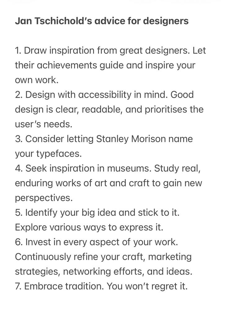
Join any graphic designer, art director, web designer who use our fonts! Buy the best quality typefaces you need. Est. 1994. 👋 Annual graphic & typography design conference + learn type design @typeparis.com
Posts Media Videos Starter Packs
typofonderie.com
C’est la semaine des égyptiennes!
Reposted by Typofonderie: fonts & typography
typofonderie.com
If you are looking for imposing, ultra-compressed, if not fat headlines, try our Akhen! 1/2

bsky.app/profile/typo...
Reposted by Typofonderie: fonts & typography
typofonderie.com
🐪Akhen, our NEW Egypto-Slab remixed🐪
typofonderie.com/fonts/akhen-...

Akhen designed by Jean François Porchez, is new typeface family inspired by French 19th-century metal and wood types, featuring three narrow widths and a large range of weights.
1/4
Reposted by Typofonderie: fonts & typography
jf.porchez.com
👍 Heureux d’être parmi les 50 designers qui fêtent les 10 ans de @letterformarchive.org #100Tens
Reposted by Typofonderie: fonts & typography
letterformarchive.org
To celebrate our 10th anniversary, Letterform Archive partnered with the San Francisco office of COLLINS on 100 Tens — 50 “1”s from the Archive’s collection paired with 50 new works from a range of today’s leading designers.

#LetterformArchive #100Tens
typofonderie.com
If you are looking for imposing, ultra-compressed, if not fat headlines, try our Akhen! 1/2

bsky.app/profile/typo...
typofonderie.com
Launched in 2025, Ahken was started in 2021. For the production of the typeface, Jean François Porchez has been accompanied by Jean-Baptiste Pernette, Svetlana Postikova, Burke Smithers, Malo Haffreingue. For the launch of Akhen: Benjamin Rouzand, Emma Rouguet where deeply involved.
4/4
typofonderie.com
The name Akhen is a nod to this typographic history, paying tribute to this period and the fascination with Egyptian civilisation. Akhen is a shortened version of the name of Pharaoh Akhenaten. During the French Directory, antiquity was highly fashionable in French art.
3/4
typofonderie.com
Akhen pays homage to French égyptienne typefaces, offering versatility with OpenType features for stylistic combinations and a comprehensive glyph set. Its rigourous design and short serifs make it a great choice for creating visually appealing designs.

typofonderie.com/gazette/Akhe...
2/4
typofonderie.com
🐪Akhen, our NEW Egypto-Slab remixed🐪
typofonderie.com/fonts/akhen-...

Akhen designed by Jean François Porchez, is new typeface family inspired by French 19th-century metal and wood types, featuring three narrow widths and a large range of weights.
1/4
Reposted by Typofonderie: fonts & typography
typofonderie.com
Apolline! typofonderie.com/fonts/apolline

On the left: final drawings.

On the right: first stage at 2cm xheight. It’s a good size to operate your eyes and hands rather than measuring tools.
Reposted by Typofonderie: fonts & typography
typofonderie.com
🚀Astronef Base 7 widths, 126 fonts + Astronef Super 7 fonts. Let’s be crazy using all Astronef fonts mixed all together.

typofonderie.com/fonts/astron...

— Astronef Super is the futuristic display version.
— Astronef Base, a tribute to 60s french sans serifs.
typofonderie.com
Apolline! typofonderie.com/fonts/apolline

On the left: final drawings.

On the right: first stage at 2cm xheight. It’s a good size to operate your eyes and hands rather than measuring tools.
Reposted by Typofonderie: fonts & typography
pixelambacht.bsky.social
I added a site-wide font size slider to the Wakamai Fondue bètà. It will change *all* font previews, even the ones that didn't have a font-size slider before!

wakamaifondue.com/beta/

Give it a spin and let me know what you think!
Screenshot of Wakamai Fondue with arrows pointing to the font slider.
Reposted by Typofonderie: fonts & typography
typofonderie.com
Beautiful a lowercase.
A. Jacoby Fils, Manufacture de caractères en bois. 1910
typofonderie.com
Beautiful a lowercase.
A. Jacoby Fils, Manufacture de caractères en bois. 1910
typofonderie.com
Arny Sans minuscules in particular!
Reposted by Typofonderie: fonts & typography
typofonderie.com
Today was a day of searching for references for an article about a new Typofonderie typeface inspired by the French foundries of the 19th that should be published in October 2025.
typofonderie.com
Today was a day of searching for references for an article about a new Typofonderie typeface inspired by the French foundries of the 19th that should be published in October 2025.
typofonderie.com
🚀Astronef Base 7 widths, 126 fonts + Astronef Super 7 fonts. Let’s be crazy using all Astronef fonts mixed all together.

typofonderie.com/fonts/astron...

— Astronef Super is the futuristic display version.
— Astronef Base, a tribute to 60s french sans serifs.
Reposted by Typofonderie: fonts & typography
typofonderie.com
“Mastery of language also naturalized power. It is no accident that emperors were trained in rhetoric and that speeches were fundamental instruments of government.”

Good reading in Spanish + or English below.
wirehaired-hovercraft-b76.notion.site/7-8-Escriptu...

(Photo @jf.porchez.com)
Reposted by Typofonderie: fonts & typography
typofonderie.com
Jan Tschichold’s advice for designers.