


Pivot Chart in Excel Part 53:
A Pivot Chart in Excel is a visual representation of PivotTable data that lets you quickly analyse and compare trends, patterns, and summaries interactively.
#Excel #PivotChart #PivotTable #ExcelTips #DataAnalysis #ExcelCharts #DataVisualization #ExcelTutorial
A Pivot Chart in Excel is a visual representation of PivotTable data that lets you quickly analyse and compare trends, patterns, and summaries interactively.
#Excel #PivotChart #PivotTable #ExcelTips #DataAnalysis #ExcelCharts #DataVisualization #ExcelTutorial
September 9, 2025 at 12:41 PM
Pivot Chart in Excel Part 53:
A Pivot Chart in Excel is a visual representation of PivotTable data that lets you quickly analyse and compare trends, patterns, and summaries interactively.
#Excel #PivotChart #PivotTable #ExcelTips #DataAnalysis #ExcelCharts #DataVisualization #ExcelTutorial
A Pivot Chart in Excel is a visual representation of PivotTable data that lets you quickly analyse and compare trends, patterns, and summaries interactively.
#Excel #PivotChart #PivotTable #ExcelTips #DataAnalysis #ExcelCharts #DataVisualization #ExcelTutorial
Recommended Charts in Excel Part 51:
Recommended Charts in Excel suggests the most suitable chart types for your selected data, saving time and improving clarity.
#ExcelTips #ExcelCharts #MicrosoftExcel #ExcelTutorial #DataVisualization #ExcelForBeginners #ProductivityTips
Recommended Charts in Excel suggests the most suitable chart types for your selected data, saving time and improving clarity.
#ExcelTips #ExcelCharts #MicrosoftExcel #ExcelTutorial #DataVisualization #ExcelForBeginners #ProductivityTips
August 10, 2025 at 8:46 PM
Recommended Charts in Excel Part 51:
Recommended Charts in Excel suggests the most suitable chart types for your selected data, saving time and improving clarity.
#ExcelTips #ExcelCharts #MicrosoftExcel #ExcelTutorial #DataVisualization #ExcelForBeginners #ProductivityTips
Recommended Charts in Excel suggests the most suitable chart types for your selected data, saving time and improving clarity.
#ExcelTips #ExcelCharts #MicrosoftExcel #ExcelTutorial #DataVisualization #ExcelForBeginners #ProductivityTips
August 9, 2025 at 6:25 AM
Recommended Charts in Excel Part 51:
Recommended Charts in Excel suggests the most suitable chart types for your selected data, saving time and improving clarity.
#ExcelTips #ExcelCharts #MicrosoftExcel #ExcelTutorial #DataVisualization #ExcelForBeginners #ProductivityTips
Recommended Charts in Excel suggests the most suitable chart types for your selected data, saving time and improving clarity.
#ExcelTips #ExcelCharts #MicrosoftExcel #ExcelTutorial #DataVisualization #ExcelForBeginners #ProductivityTips

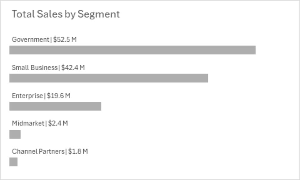
Nice Bar Chart Data Labels
This quick tutorial shows how to create data labels for your bar chart which are attractive, informative, and legible.
#excelcharts #peltiertech
peltiertech.com/nice-bar-cha...
This quick tutorial shows how to create data labels for your bar chart which are attractive, informative, and legible.
#excelcharts #peltiertech
peltiertech.com/nice-bar-cha...
Nice Bar Chart Data Labels - Peltier Tech
This quick tutorial shows how to create data labels for your bar chart which are attractive, informative, and legible.
peltiertech.com
January 20, 2025 at 10:16 PM
Nice Bar Chart Data Labels
This quick tutorial shows how to create data labels for your bar chart which are attractive, informative, and legible.
#excelcharts #peltiertech
peltiertech.com/nice-bar-cha...
This quick tutorial shows how to create data labels for your bar chart which are attractive, informative, and legible.
#excelcharts #peltiertech
peltiertech.com/nice-bar-cha...