I really think that it's a nice app, and the best proof is when you advertise something (either for money or not) is to show that you actually use it.
For example, there is a music for focus app called BrainFM. Once I had a streak of listening to it for 40 weeks.
I really think that it's a nice app, and the best proof is when you advertise something (either for money or not) is to show that you actually use it.
For example, there is a music for focus app called BrainFM. Once I had a streak of listening to it for 40 weeks.
Anyway, now I at least heard about "CIE 1931", "Rec.2020", "HDR", "Gamut", "OKLAB", "OKLCH", "P3", "Adobe RGB", "sRGB"
guys 3 years ago it was color: #aabbcc :D Or HSL
Anyway, now I at least heard about "CIE 1931", "Rec.2020", "HDR", "Gamut", "OKLAB", "OKLCH", "P3", "Adobe RGB", "sRGB"
guys 3 years ago it was color: #aabbcc :D Or HSL
R G B
#00FF00
But in oklch, I don't how what hue corresponds to green? Am I wrong here?
L = understood, lightness
C = understood, "how vibrant the color is"
H = understood, but how to know without looking, what color I'll get :)
R G B
#00FF00
But in oklch, I don't how what hue corresponds to green? Am I wrong here?
L = understood, lightness
C = understood, "how vibrant the color is"
H = understood, but how to know without looking, what color I'll get :)
Btw, I still don't fully get it how to use oklch, I mean, their values may go beyond visible areas and it's like... well, without a ready palette (or color picker) I wouldn't be able to choose a proper color.
Although, same for HEX
Btw, I still don't fully get it how to use oklch, I mean, their values may go beyond visible areas and it's like... well, without a ready palette (or color picker) I wouldn't be able to choose a proper color.
Although, same for HEX
I've been writing a newsletter issue and realized that instead it should be at least a book 🤯
I've been writing a newsletter issue and realized that instead it should be at least a book 🤯
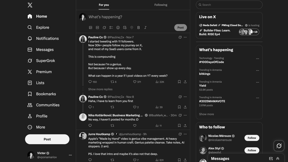
This way you can look at your app from a different perspective and see how it looks grayscaled.
It is useful if you want to see what draws users' attention most, whether interactive elements are recognizable without colors.

This way you can look at your app from a different perspective and see how it looks grayscaled.
It is useful if you want to see what draws users' attention most, whether interactive elements are recognizable without colors.
Not only it's not written by me, but also the last time I used it, half of the recepients got "This is a test message" as a text! And it wasn't my fault.
Plus they still require $3-5 maybe per letter.
Any thoughts?
Not only it's not written by me, but also the last time I used it, half of the recepients got "This is a test message" as a text! And it wasn't my fault.
Plus they still require $3-5 maybe per letter.
Any thoughts?
Or maybe someone knows how to reduce costs.
Or maybe someone knows how to reduce costs.


