


Riordan Frost
@riordanfrost.bsky.social
Researcher at @harvard-jchs.bsky.social focused on housing, demographics, migration, inequality, and climate change.
In just five years, the income needed to afford the median-priced home nearly doubled—from $68k to $131k. Getting payments back to 2020 levels would require interest rates to be nearly zero, per @harvard-jchs.bsky.social
www.jchs.harvard.edu/blog/lower-i...
#FigureFriday #housing #affordability
www.jchs.harvard.edu/blog/lower-i...
#FigureFriday #housing #affordability

November 7, 2025 at 3:09 PM
In just five years, the income needed to afford the median-priced home nearly doubled—from $68k to $131k. Getting payments back to 2020 levels would require interest rates to be nearly zero, per @harvard-jchs.bsky.social
www.jchs.harvard.edu/blog/lower-i...
#FigureFriday #housing #affordability
www.jchs.harvard.edu/blog/lower-i...
#FigureFriday #housing #affordability
Happy #MapMonday! How much did each metro area depend on immigration for growth last year, and which ones will therefore feel the effects of the recent slowdown most acutely? Find out in the interactive map in my new @harvard-jchs.bsky.social blog post: www.jchs.harvard.edu/blog/metro-a....
September 8, 2025 at 2:15 PM
Happy #MapMonday! How much did each metro area depend on immigration for growth last year, and which ones will therefore feel the effects of the recent slowdown most acutely? Find out in the interactive map in my new @harvard-jchs.bsky.social blog post: www.jchs.harvard.edu/blog/metro-a....
Happy #MapMonday! How much did counties gain/lose from domestic migration in 2024? In my new @harvard-jchs.bsky.social paper, I show that inflows to lower-density places were elevated through 2024. Explore the map: www.datawrapper.de/_/cGxny and the paper: www.jchs.harvard.edu/blog/five-wa...

April 7, 2025 at 6:43 PM
Happy #MapMonday! How much did counties gain/lose from domestic migration in 2024? In my new @harvard-jchs.bsky.social paper, I show that inflows to lower-density places were elevated through 2024. Explore the map: www.datawrapper.de/_/cGxny and the paper: www.jchs.harvard.edu/blog/five-wa...
Happy #MapMonday! Here's a map from my new @harvard-jchs.bsky.social paper on pandemic-era changes in residential mobility! Shifts are emerging in Midwest and Northeast states, while much (but not all) of the Sunbelt keeps drawing more inflows. Explore the map: www.jchs.harvard.edu/blog/five-wa...

March 31, 2025 at 1:33 PM
Happy #MapMonday! Here's a map from my new @harvard-jchs.bsky.social paper on pandemic-era changes in residential mobility! Shifts are emerging in Midwest and Northeast states, while much (but not all) of the Sunbelt keeps drawing more inflows. Explore the map: www.jchs.harvard.edu/blog/five-wa...
Happy #MapMonday! What was the largest source of population growth by county in 2024? Immigration played a *big* role, esp. in higher-density areas. Domestic migration remained elevated in lower-density areas. Natural change played a smaller role. Explore the map: www.datawrapper.de/_/U6L0i/

March 24, 2025 at 2:48 PM
Happy #MapMonday! What was the largest source of population growth by county in 2024? Immigration played a *big* role, esp. in higher-density areas. Domestic migration remained elevated in lower-density areas. Natural change played a smaller role. Explore the map: www.datawrapper.de/_/U6L0i/
Happy #MapMonday! What was the largest source of population growth in each county in 2023? Many urban counties relied most on natural change, many Sunbelt counties relied on domestic migration, and immigration played a role throughout the country. Explore the map: datawrapper.dwcdn.net/QrDYw/4/.

March 10, 2025 at 3:00 PM
Happy #MapMonday! What was the largest source of population growth in each county in 2023? Many urban counties relied most on natural change, many Sunbelt counties relied on domestic migration, and immigration played a role throughout the country. Explore the map: datawrapper.dwcdn.net/QrDYw/4/.
Happy #MapMonday! I’ve been thinking about baby boomers aging into older adulthood (61-79 this year), and it is apparent from this median age by county map that the effects of an aging population will be felt unevenly. Explore the map here: datawrapper.dwcdn.net/xFm4W/2/

March 3, 2025 at 7:04 PM
Happy #MapMonday! I’ve been thinking about baby boomers aging into older adulthood (61-79 this year), and it is apparent from this median age by county map that the effects of an aging population will be felt unevenly. Explore the map here: datawrapper.dwcdn.net/xFm4W/2/
Happy #MapMonday! Is the draw of the Pacific Northwest over? There was a notable downturn during the pandemic in net inflows in Washington and Oregon, which were previously migration magnets, especially for young adults. These two maps show the slowdown in 26-34yo net inflows b/t 2019 and 2021.


February 24, 2025 at 2:09 PM
Happy #MapMonday! Is the draw of the Pacific Northwest over? There was a notable downturn during the pandemic in net inflows in Washington and Oregon, which were previously migration magnets, especially for young adults. These two maps show the slowdown in 26-34yo net inflows b/t 2019 and 2021.
Happy #MapMonday! Building on recent analysis by @yfreemark.bsky.social & Lindiwe Rennert at @urbaninstitute.bsky.social of the US DOT's plan to prioritize funding to places with high birth and marriage rates, here is a state map showing which states had above-national rates in 2023.

February 10, 2025 at 7:15 PM
Happy #MapMonday! Building on recent analysis by @yfreemark.bsky.social & Lindiwe Rennert at @urbaninstitute.bsky.social of the US DOT's plan to prioritize funding to places with high birth and marriage rates, here is a state map showing which states had above-national rates in 2023.
For #MapMonday, I wanted to add a different angle to the discussion of HUD's 2024 #homelessness point-in-time count by showing changes by state since the onset of the pandemic (i.e. Jan 2020–Jan 2024). Only 4 states had any decline, while 9 states saw increases of 50% or more. [Corrected legend]

February 4, 2025 at 12:53 PM
For #MapMonday, I wanted to add a different angle to the discussion of HUD's 2024 #homelessness point-in-time count by showing changes by state since the onset of the pandemic (i.e. Jan 2020–Jan 2024). Only 4 states had any decline, while 9 states saw increases of 50% or more. [Corrected legend]
Happy #MapMonday! This map of natural population change in 2024 shows that most states had more births than deaths, which is true even for states with net migrant outflows (e.g. CA). Migration or immigration drive population change in most states, though, due to steadily declining natural change.


January 27, 2025 at 8:19 PM
Happy #MapMonday! This map of natural population change in 2024 shows that most states had more births than deaths, which is true even for states with net migrant outflows (e.g. CA). Migration or immigration drive population change in most states, though, due to steadily declining natural change.
Happy #MapMonday! Further insight into the surge in immigration in the past few years is now available from the revised 2023 and 2024 estimates from Census Vintage 2024 PEP data. The maps below show that many states have had relatively high immigration rates, even some you might not expect.


January 13, 2025 at 5:27 PM
Happy #MapMonday! Further insight into the surge in immigration in the past few years is now available from the revised 2023 and 2024 estimates from Census Vintage 2024 PEP data. The maps below show that many states have had relatively high immigration rates, even some you might not expect.
Happy #MapMonday! Census 2024 state population estimates came out last month, and the domestic migration patterns are fascinating. Sunbelt is still gaining the most migrants but the flows have slowed, most notably for Texas and Florida. Bonus map to show change from 2023.


January 6, 2025 at 3:22 PM
Happy #MapMonday! Census 2024 state population estimates came out last month, and the domestic migration patterns are fascinating. Sunbelt is still gaining the most migrants but the flows have slowed, most notably for Texas and Florida. Bonus map to show change from 2023.
One immigration data issue recently has been the discrepancy b/t Census data and CBO estimates on levels of immigration, with CBO estimates being *much* higher. Well, Census retroactively updates its estimates with each new vintage of PEP data, and wow v2024 had a BIG change on immigration numbers:

January 3, 2025 at 4:38 PM
One immigration data issue recently has been the discrepancy b/t Census data and CBO estimates on levels of immigration, with CBO estimates being *much* higher. Well, Census retroactively updates its estimates with each new vintage of PEP data, and wow v2024 had a BIG change on immigration numbers:
Happy #MapMonday! At this time of year I think much more about how we stay warm, which relates to my state of electrification work from earlier this year. That included an interactive map showing share of HHs using only electricity for various uses (2020 RECS): www.jchs.harvard.edu/blog/decarbo...

December 16, 2024 at 5:05 PM
Happy #MapMonday! At this time of year I think much more about how we stay warm, which relates to my state of electrification work from earlier this year. That included an interactive map showing share of HHs using only electricity for various uses (2020 RECS): www.jchs.harvard.edu/blog/decarbo...
Happy #MapMonday! I've been researching domestic migration in the pandemic years, and one notable finding has been the uptick in rural migration. This county map shows net domestic migration in 2021, when there was a sudden shift in inflows to rural areas (and suburbs and smaller metros).

December 9, 2024 at 3:17 PM
Happy #MapMonday! I've been researching domestic migration in the pandemic years, and one notable finding has been the uptick in rural migration. This county map shows net domestic migration in 2021, when there was a sudden shift in inflows to rural areas (and suburbs and smaller metros).
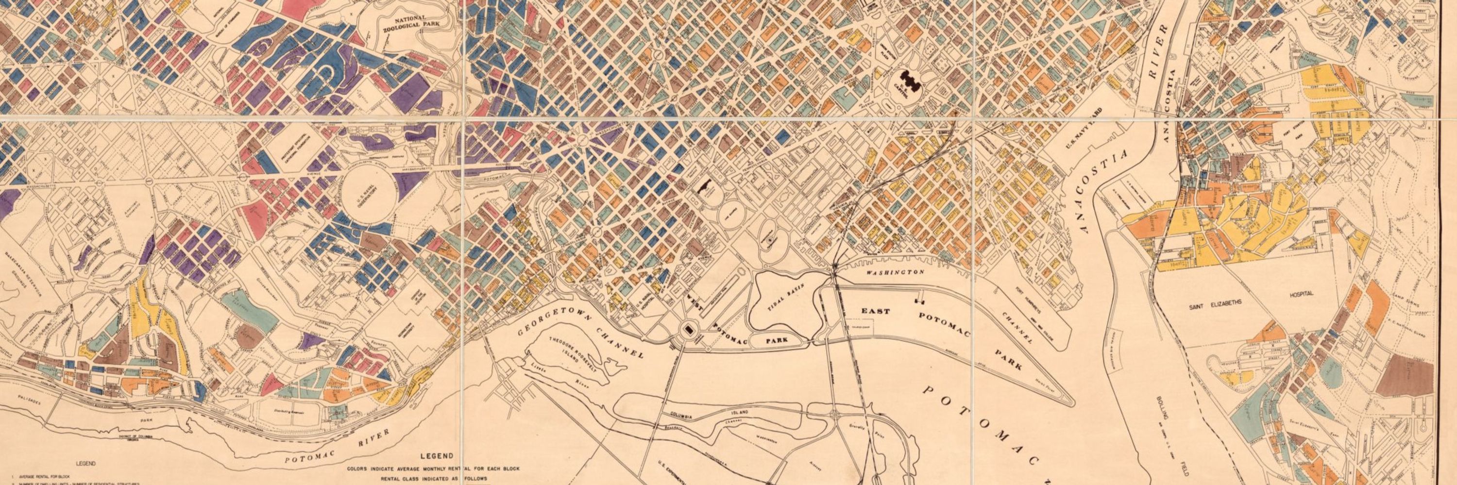
Happy #MapMonday! This week, a map I made for a @harvard-jchs.bsky.social paper on the history of public housing, which notes that PHA residents are concentrated in the eastern US. Big bonus that the data allowed me to include Puerto Rico! Alex's paper summary: www.jchs.harvard.edu/blog/can-pub...

December 2, 2024 at 3:05 PM
Happy #MapMonday! This week, a map I made for a @harvard-jchs.bsky.social paper on the history of public housing, which notes that PHA residents are concentrated in the eastern US. Big bonus that the data allowed me to include Puerto Rico! Alex's paper summary: www.jchs.harvard.edu/blog/can-pub...
Happy #MapMonday! (A former Twitter tradition that I'm happy to revive in this cheerier place). Here's a state map showing how much immigrants make up the construction trades workforce around the US, which is substantial in many high-demand states. Source: ACS 2023.

November 25, 2024 at 3:04 PM
Happy #MapMonday! (A former Twitter tradition that I'm happy to revive in this cheerier place). Here's a state map showing how much immigrants make up the construction trades workforce around the US, which is substantial in many high-demand states. Source: ACS 2023.